
Toggle selector
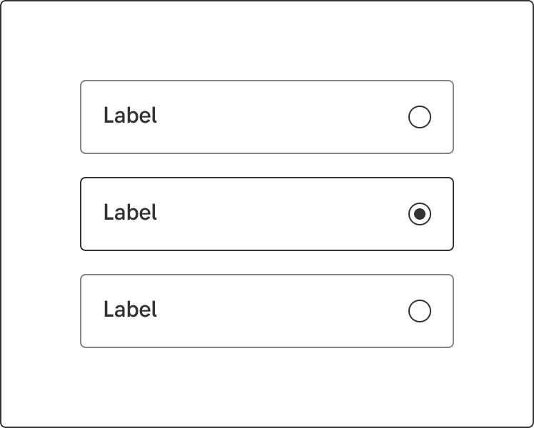
A toggle selector has the same functionality as a checkbox or radio button group.
Component meta
Component identifier
- component-toggleselector
Design principles
- Trigger insightFrictionless
Guidelines
Short description
The toggle selector has the same functionality as radiobuttons and checkboxes. Early versions of this component used pictograms but they are no longer a part of our design. This component will be deprecated in the future and instead belong to the" radio button and checkbox family" in some form. But for now, use it if you’d like!
When and how to use it
The component can be used for both single and multiple selections and works well for both desktop and mobile contexts. Make sure you keep texts short and sweet, and never more than two lines for both label or the optional label information.
Behaviour
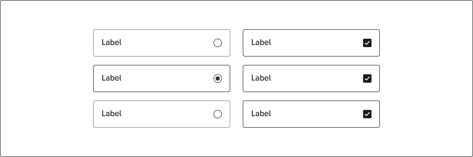
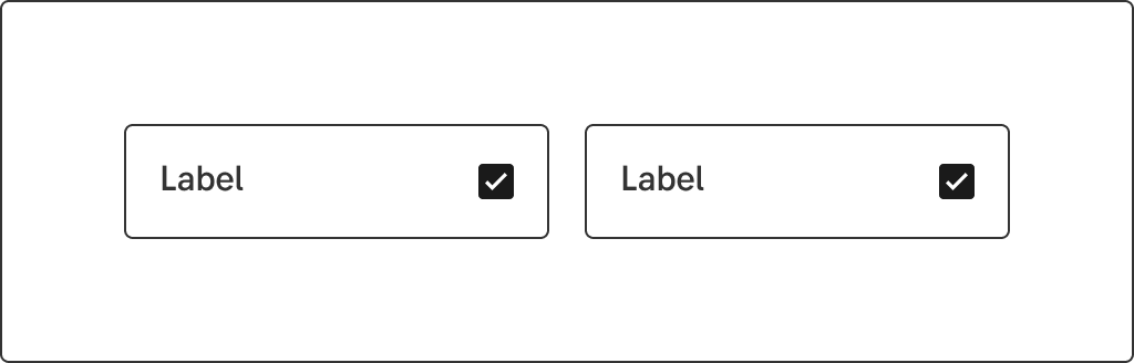
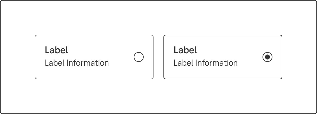
Can act like both single (with radiobutton) and multi select (checkbox).
Horizontal multi
Horizontal single
Vertical multi
Vertical single
Do's and don'ts
Do
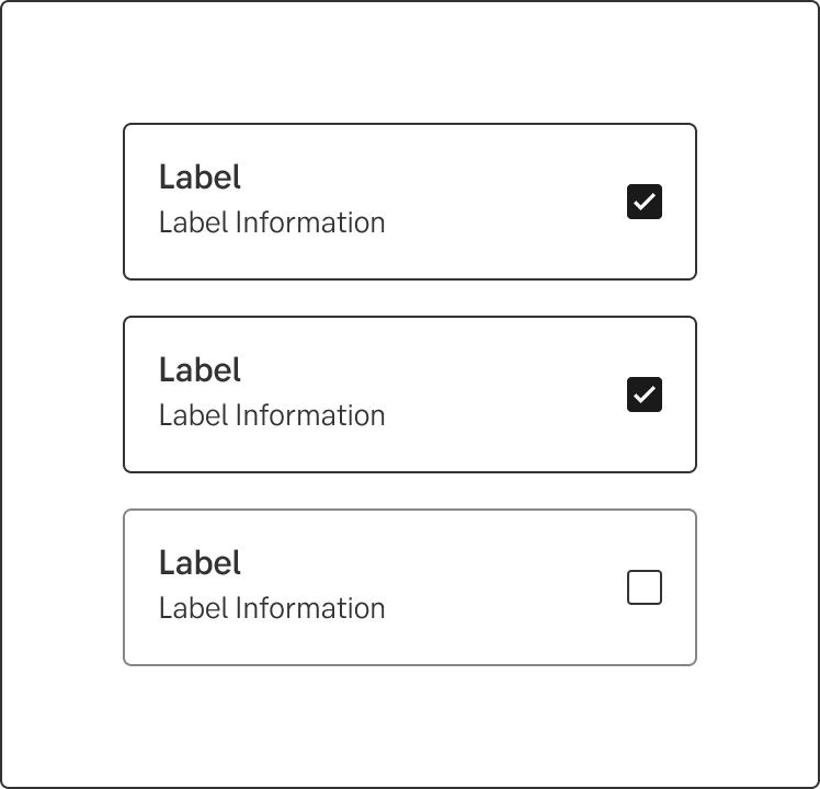
- Always left align the label and label information.
- Use max 4 options per group.
Don't
- Don't use different heights and widths when placed next to each other.
UX text
-
Accessibility
-
Specification
- Details: Specification in Figma
- Instruction: How to access Figma