
Column customiser
Lets the user customise columns to display in a table.
Component meta
Component identifier
- component-columncustomiser
Design version
- 2021-05-06
Design principles
- Everyday firstFrictionless
Guideline
Short description
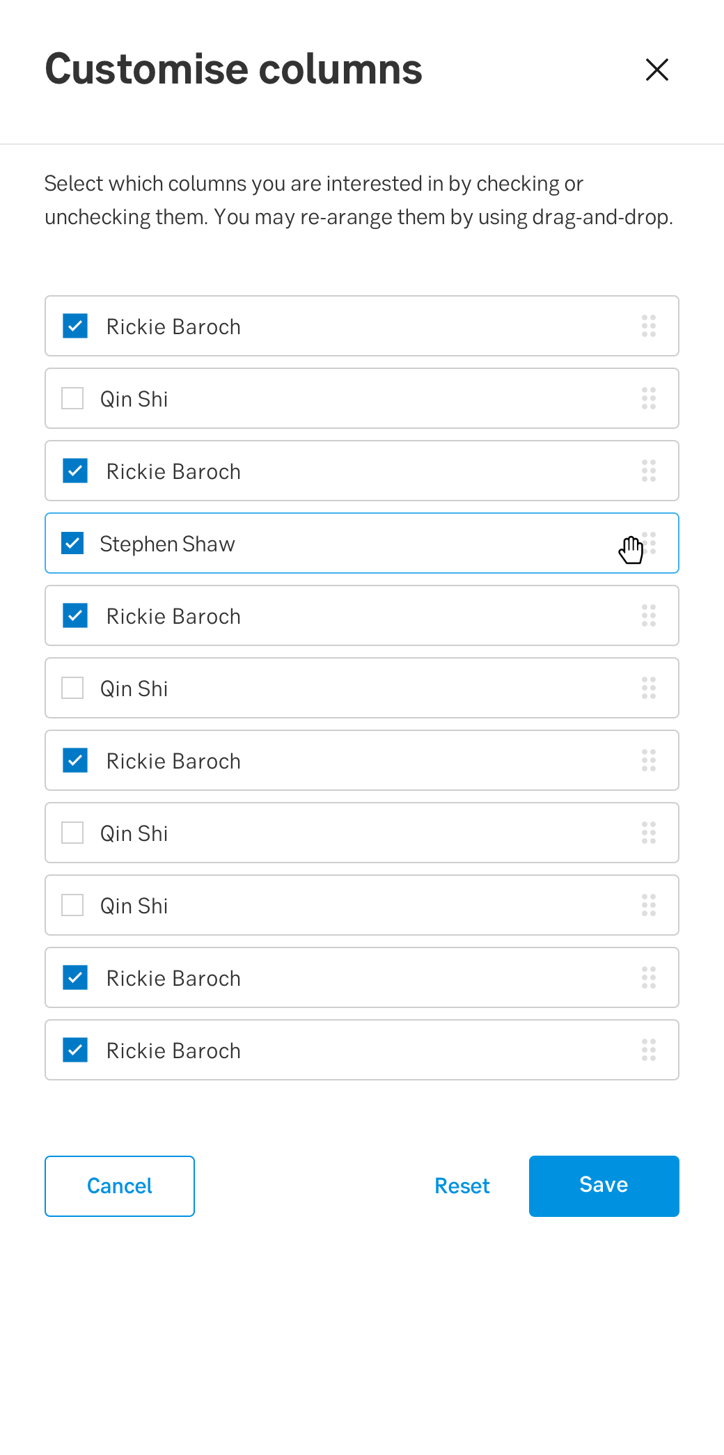
Sometimes we are limited in what we can display, depending on the width of the table. When several headers and columns of data are objects for usage, being able to select between them to customise your display is a good solution.
When enabling the possibility to customise columns in a table, the user can easily select which columns they are interested in by checking or unchecking them. The user can further re-arrange them by using drag-and-drop. When re-arranging the items in the slide-out, the order of the items will be displayed in the same order as the user has customised the items in the slide-out.
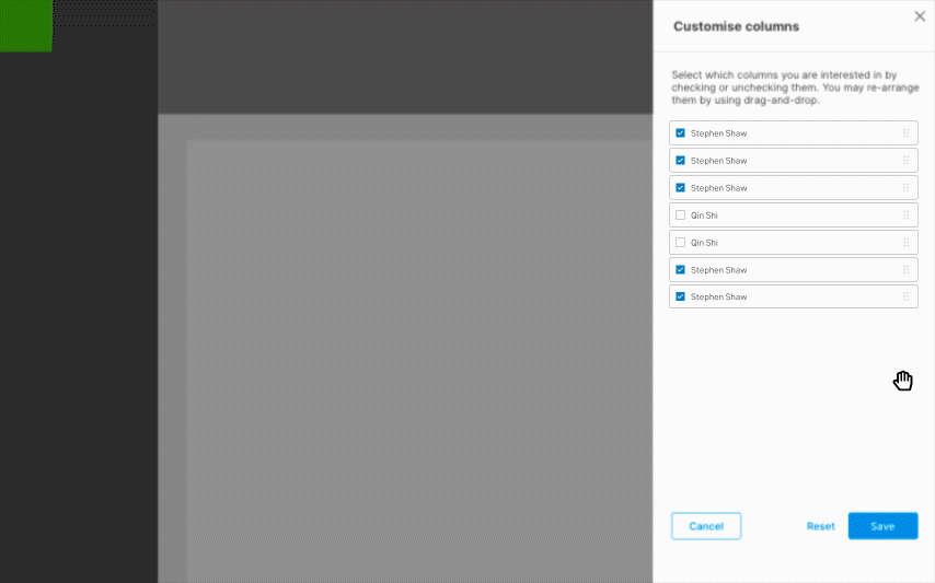
Above: Gif-example of how a user uses drag-and-drop
When and how to use it
When to use it?
Customisation can involve different factors, such as moving around items to create a customised interface that reflects upon the users priority and interest. Using customisation is a good solution when there are limited space for columns or when there is a lot of data to show.
It is important to remember that if you want users to engage with the customisation tool, the feature need to provide a clear benefit. However, it is also important to not rely on users engagement with customisation. A part of motivating users to use the feature is to offer a strong “default state”, with an opportunity to customise the view to meet the users specific needs.
How to use it?
The component should be displayed in a slide-out, offering the user the following functionality:
- Select which items are to be shown
- Deselect which items are not to be shown
- Re-arrange the items with drag-and-drop, regardless of them being selected or deselected
- Use the rock and paper hand as cursor, see: Behavior of the cursor
- Support all states described under States
Why use customisation?
Because it enhances the user experience as the user gets the opportunity to be in control over what the user actually want to see.
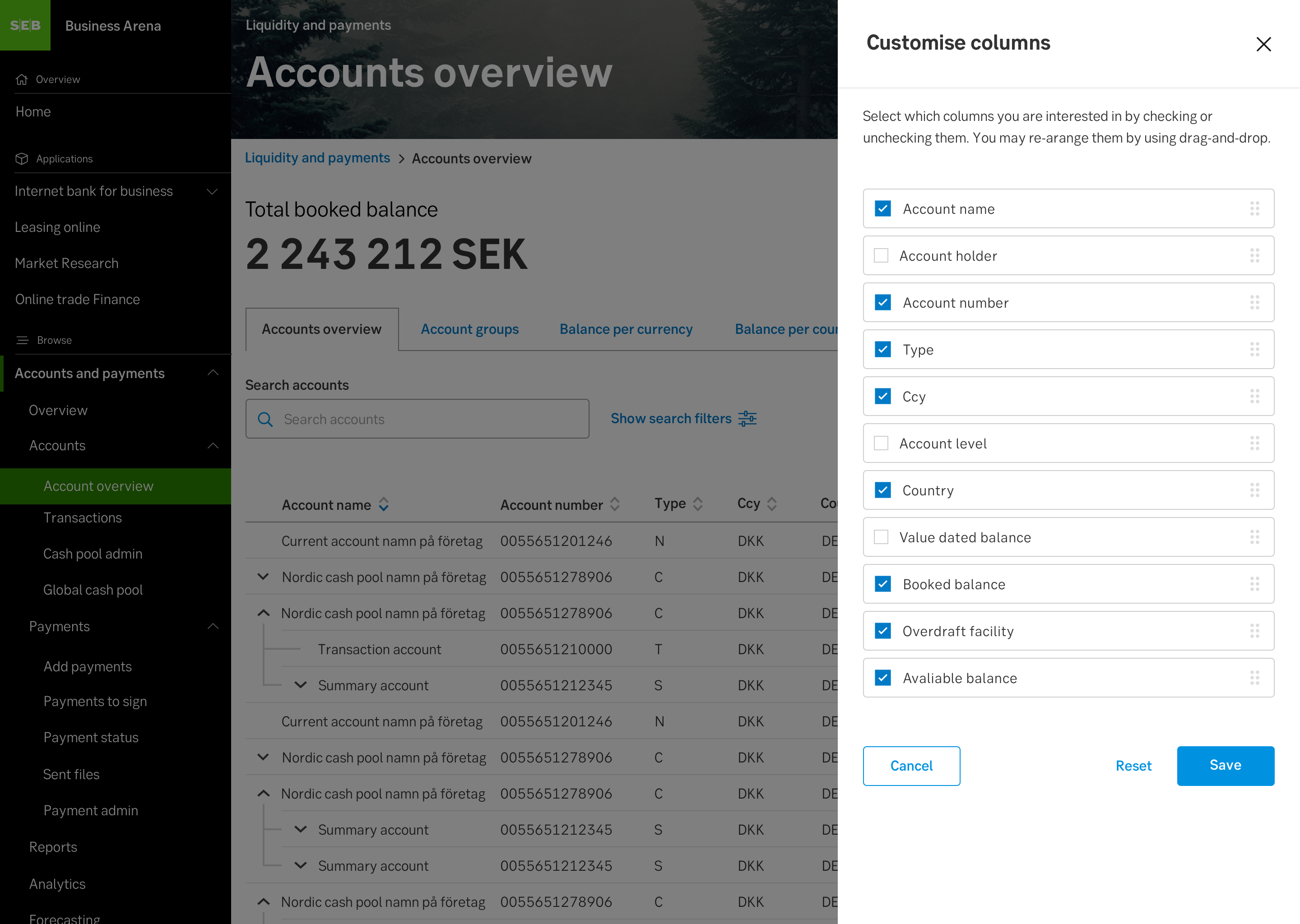
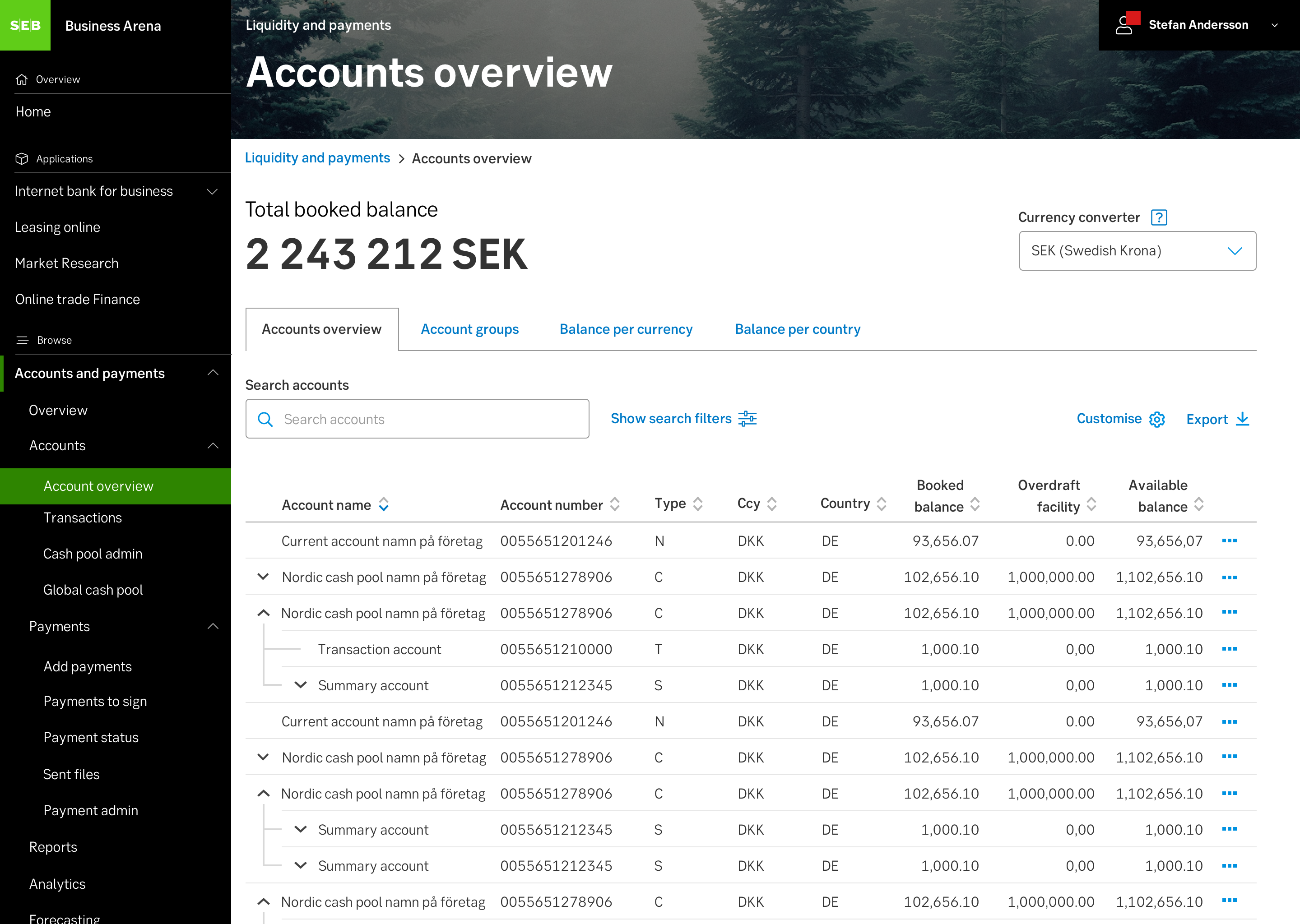
Above: Example of column customiser used in context
Behaviour
The items that are selected will be displayed as a column in the list view, in the order the user has placed them in the customise colums slide-out. The items that are deselected will not be displayed as a column in the list view. The items can be moved regardless if they are selected or deselected.
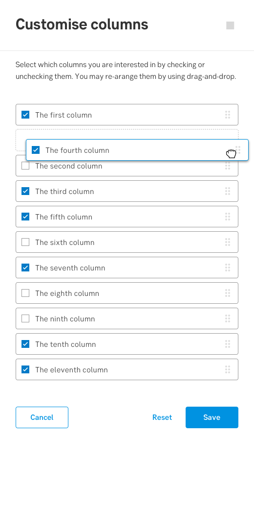
When a selected item is being pressed, the object can be moved by navigating with the hand-cursor, this is the drag-and-drop functionality. The grab-handle icon placed on the right side of the box of each item communicates that interaction with drag-and-drop is possible. This icon provide a safe target to click and drag without activating other nearby controls. Even if the user does not need to click on the exact area of the icon, the purpose remains the same. When moving the item, a dashed area will be shown in order to communicate to the user where the item will be placed if they drop the item.

Above: Selected item in default state displayin the grab-handle icon
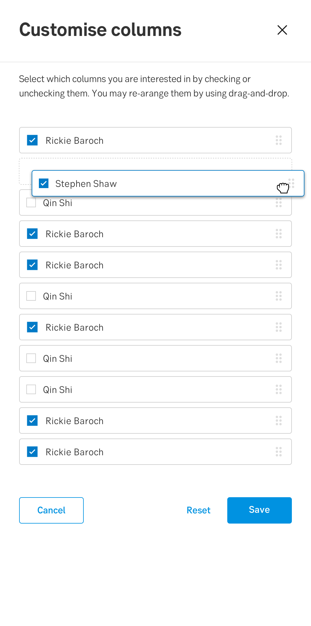
Above: Selected item in drag-and-drop (pressed) state showing the dashed area
Remember that keyboard navigation does not support the drag-and-drop functionality. Although, some keyboard navigation should be supported. If the user for example tabs between the items, the list of items and the checkboxes should behave as follows:
- User tabs to first item, first item now in Focus state (See states)
- User press tab again, the checkbox in the first item box is now Focus state
- User can now select/deselect the checkbox by pressing enter or continue to tab to the next following item box.
Behaviour of the cursor
In mouse-driven interfaces different cursors than the default cursor can be used to enhance that drag-and-drop is possible. See above picture for the cursors pressed state, and below picture for the cursors hover state.
Above: Selected item in hover state accompanied with the cursors hover state
When the user encounter the cursor and interacts with it by “grabbing” an item, three types of feedback are needed:
- The state of the cursor needs to change from the hover state (hand-paper) to the pressed state (hand-rock).
- The state of the item box needs to change from hover state to pressed state.
- Feedback previewing where the item will be placed before the user “drops” it.
When the user encounter the cursor and interacts with it by “grabbing” an item, three types of feedback are needed:
- The state of the cursor needs to change from the hover state (grab) to the pressed state (grabbing).
- The state of the item box needs to change from hover state to pressed state.
- Feedback previewing where the item will be placed before the user “drops” it.
When changing icons, use the HTML cursor properties "grab" and "grabbing":
<p class="grab">grab</p>
<p class="grabbing">grabbing</p>
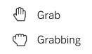
Above: Cursor states
Mobile behaviour
The components behavior for mobile does not differ a lot from desktop use. However the cursor should be excluded for mobile use as its not a mouse-driven interface.
Do's and don'ts
Do
- Have a strong "default state" of items in a table
- Consider if the component has a clear benefit before including it in your design
- Always include the grab-handle icon placed to the right of the item.
- Show users that customisation is available:
Above: Example of how to show users that customisation is available
Don't
- Don't rely on customisation
Related links
- https://www.nngroup.com/articles/drag-drop/
- https://www.nngroup.com/articles/customization-of-uis-and-products/
Specification
- Details: Specification in Figma
- Instruction: How to access Figma