Chlorophyll
Styles
The last version of Internet Explorer, version 11, was released on October 17, 2013. This is a very long time ago when taking into account the rapid development of web technologies. These days it is often difficult and time consuming to get modern technologies to work well in this old browser. More and more frameworks are dropping support, and even Microsoft themselves has announced that they will fully drop support for IE in their own services in 2021.
Consequently, we have decided to not include support for IE in the Design Library website.
Luckily, there are modern options in active development. Please use Firefox, Edge or Chrome instead.

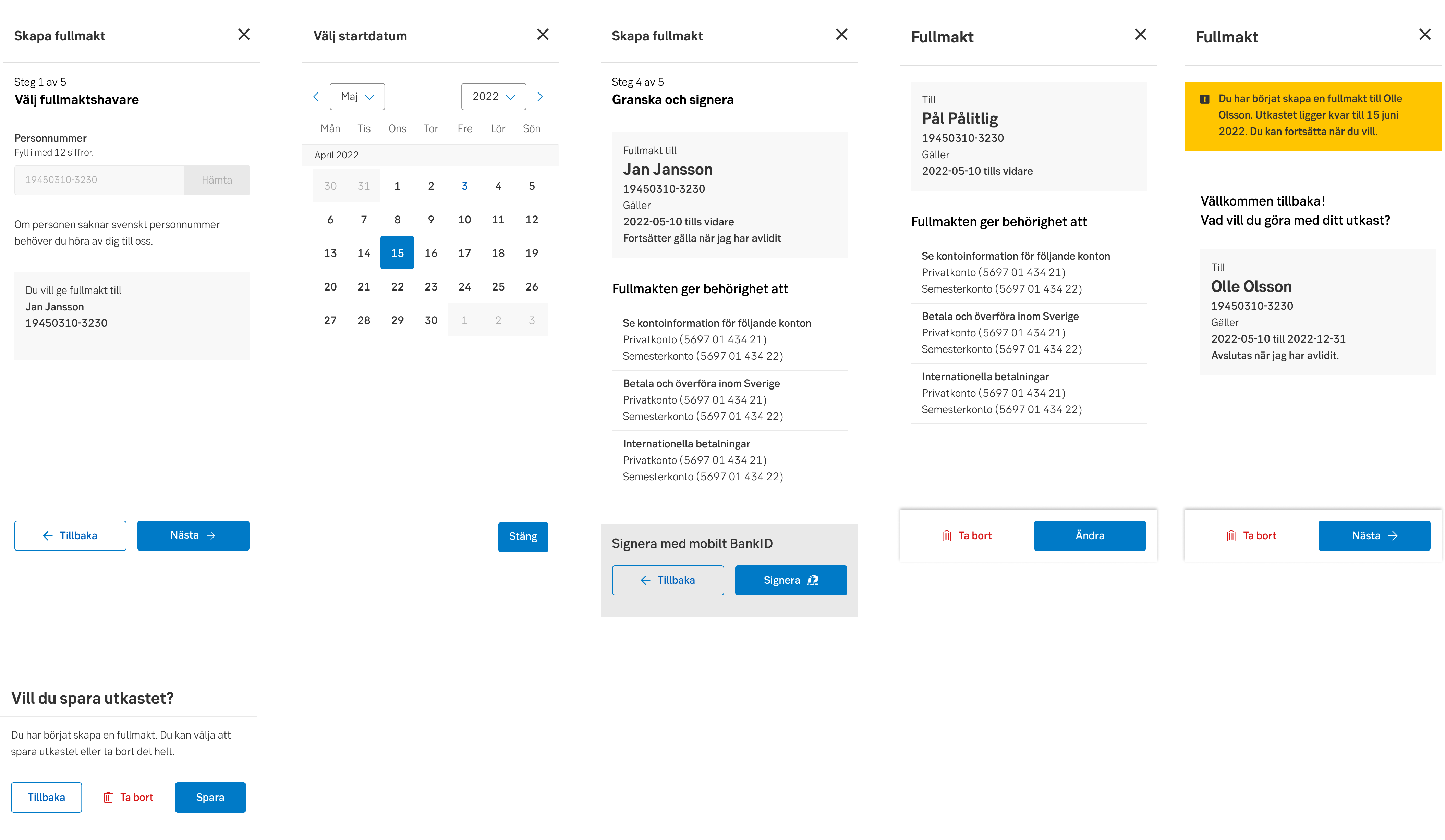
Buttons are an essential element of interaction design. Their primary role is to help people take actions quickly.

Styles
Javascript
Javascript
Buttons communicate actions that users can take.
Differentiate the buttons in the context if you have more than one action. Primary buttons require the most attention from your users. Secondary, as the name says, is the second most likely choice.
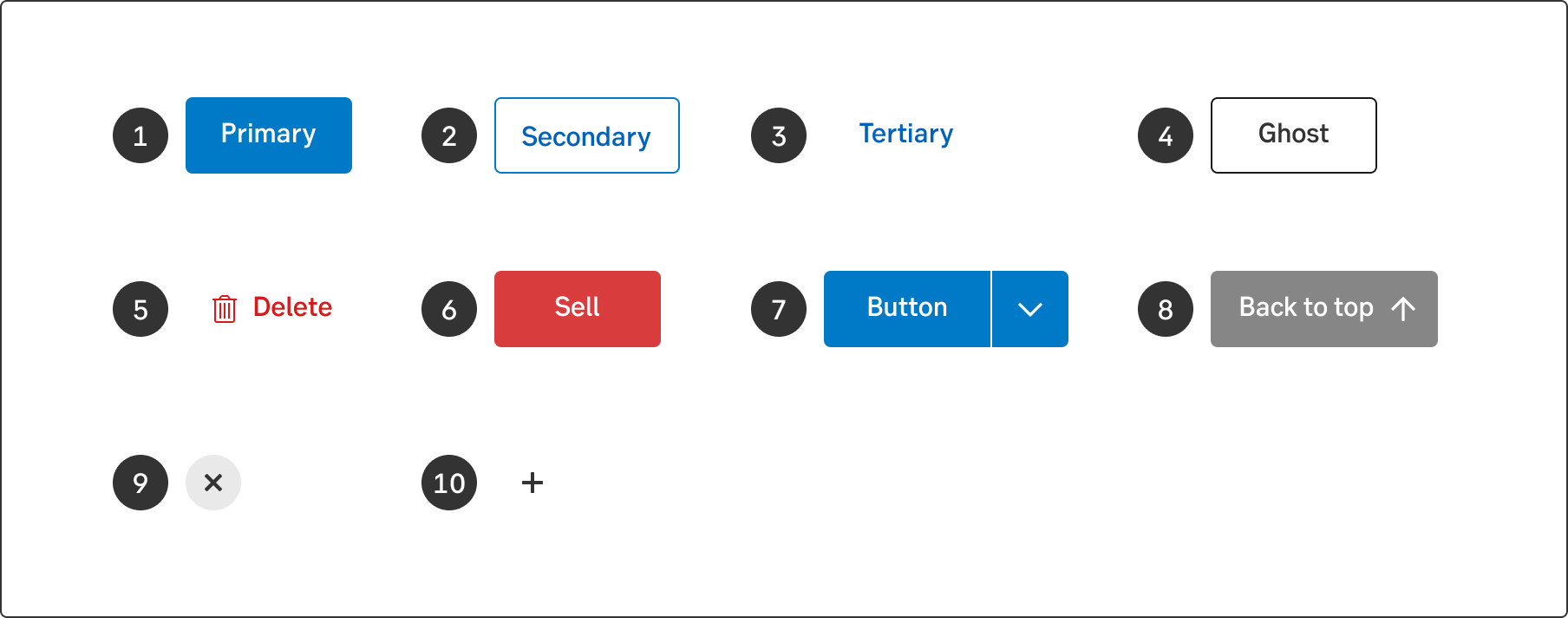
1. Primary button, 2. Secondary button, 3. Tertiary button, 4. Ghost button, 5. Delete button, 6. Sell button, 7. Split button, 8. Up button, 9. Close button, 10. Icon button
Buttons are placed throughout your UI, in places like dialogs, modals, forms, cards and toolbars.
A general rule is to always strive to place buttons in connection to the items they control. Modals and flows move the user from left to right, therefore the buttons are placed to the right. In overviews and widgets, the user tends to read from top to bottom, therefore the buttons are kept to the left.
Use this highlighted button for the primary call-to-action. Strive to use only one primary button in the same context.
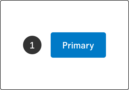
The secondary button is often used together with a primary button. For example, in a step flow the Next button is primary, whilst the Previous button is secondary. This is because we want to lead the user forward. Another example is in a context where a customer must be able to get the help they need. Become a customer (Primary) or Already a customer (Secondary).
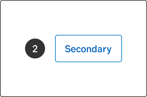
Used to be called text button or button link. The tertiary button can be used in a flow where we already have a primary Next button and a secondary Previous button, and also need a Cancel option. The Cancel option would be a tertiary button.
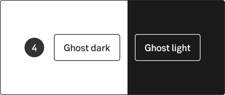
This button is mostly used on a coloured background or a photo. There is a light and a dark version to be visible on different backgrounds. On public web, the ghost button is used for primary actions more frequently to make a difference between buttons that links to a logged-in environment.
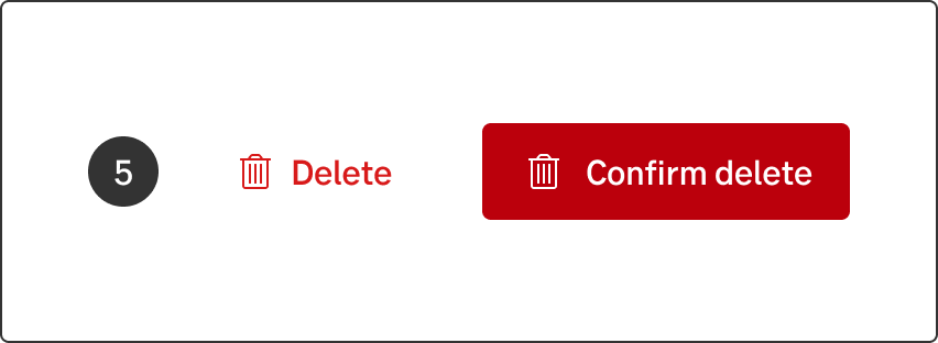
The delete button is used for actions that cannot easily be undone by the user. To reach accessibility, always use both label and icon left in order make it clear that this button is designed to be destructive.
The delete button has two types. When users take this action, include an additional step in a dialogue modal where the user need to confirm the action. In this step, the delete button is solid red to clearly stand out to be the primary action in the modal. Also give the user the possibility to cancel the delete with a secondary button alternative.
Read about the Delete-pattern
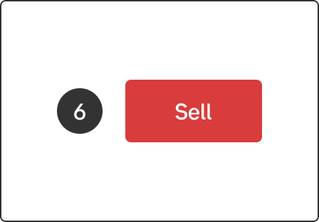
This button is only used in the context of buy and sell. The red colour is a bit different from the red used on the delete button. The reason for this is to tone down the alert-feeling on the sell button, but still let it be obvious that it is something we discard.
Read about the Buy and sell-pattern
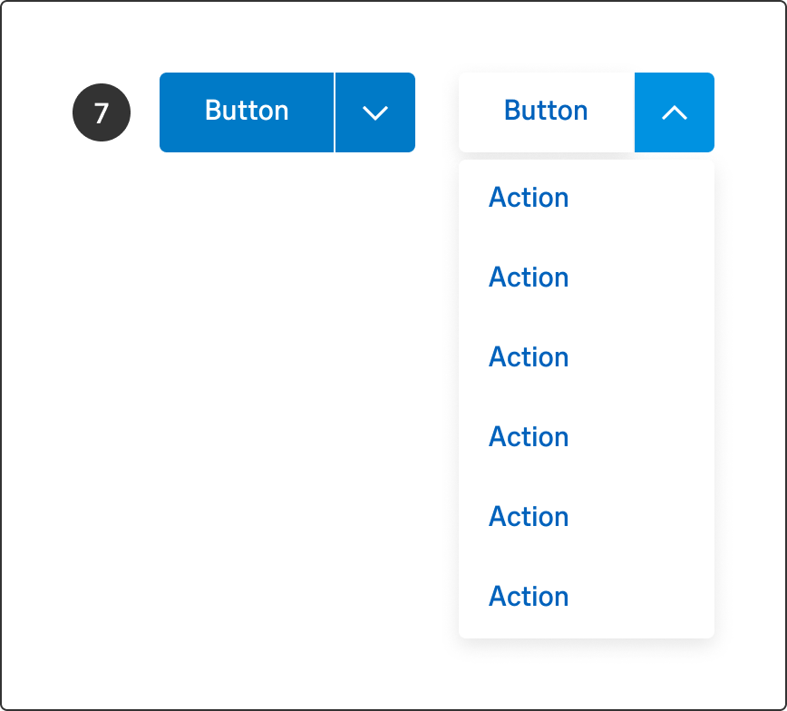
A split button groups related commands together into a list of actions and offers one-click access to a default choice that doesn't require opening the list. Split buttons are used when there are many actions available for the user, but not the space or real-estate to have individual buttons for each action. The list of options can be opened above or below the button and may overflow to either side of the button width, based on where the button is placed on the screen or in the flow. Avoid more than one split button in each flow.
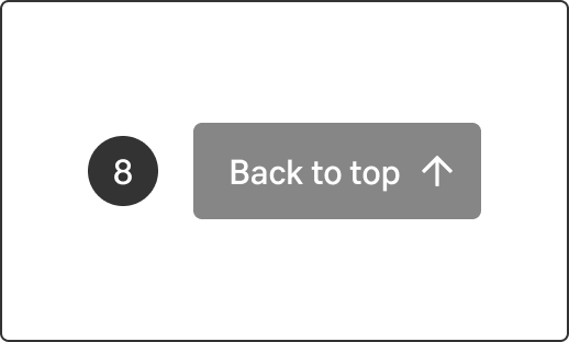
The up button is a site feature to help the visitor to easier get back to the top of the current page. The button will be visible once the visitor scrolls past a certain number of pixels (900 px by default) and starts an upward scroll motion. It then disappears again if the visitor clicks on it or starts to scroll downwards again.
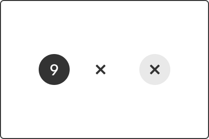
Use the close button to allow the user to close and exit current contexts (slide-out, slide-up, wizard, etc) in both desktop, hybrid and mobile. Place it in the top right corner.
When the space is available, you can choose to add the label. Close to the left of the icon. In mobile, the icon has the background circle default.
The icon button can only be used when the icon is commonly known, since it doesn't have a label. Use it only when space is very limited. It's wise to use a hover-effect with a tooltip stating what action will be taken.
Without border is default (used in a defined context, like corners, next to something or in a table) but it can be outlined (if used more standalone).
As a rule, the text on a button should answer the question “What happens?”, but if the purpose of the button is to convert, it should answer the question “What do I get?”.
Phrase the text on the buttons so that it is evident for the user what happens when they click on it. If the button leads to another page, links are often preferred instead.
You should primarily use verbs in the imperative mood, which is the form of the verb that conveys commands or requests, for example Order, Apply, Submit and Sign. If needed, you can add what happens, for example Write a new message or Add row. In special cases, the button may consist of another type of text, for example This solution suits me.
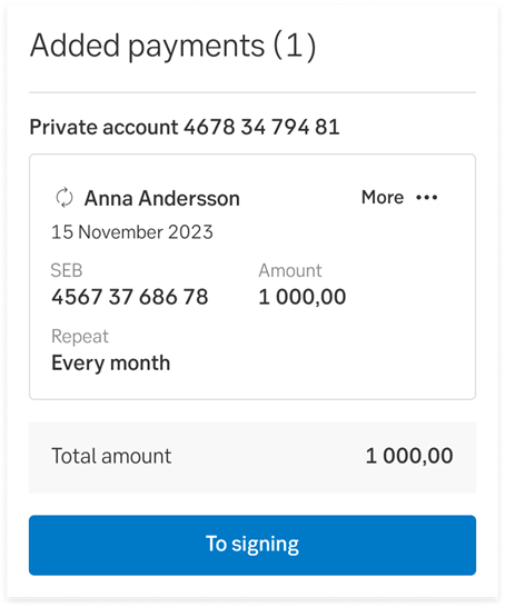
When the actual signing happens in the next step, the button opens a signing module where the user will complete the process, and sign. This is a common pattern for us. That's why we don't use the word Sign before the user is actually signing. In this case, we're making an exception to our usual button text guidelines and using To signing instead. A common example of this is when a user is about to make a payment—first, they add payments to their cart and then move on to the signing module.
Avoid using words like Utför/Perform (too formal) and Ok (too vague) on buttons. Ok doesn’t say anything about what happens when the user clicks the button. If the button is shown in a dialogue or modal, it is better to write Stäng/Close than Ok.
When the customer is making a payment and is searching for the Bic code for the receiving bank, it is better to write Hämta/Fetch than Ok, since Hämta more clearly explains what happens when the user presses the button.
Don't start each word in headings and labels with upper case. Only use upper case in:
Use the standard buttons for reoccurring actions like these:
Examples of button text
Accessibility must be met for those who can not see colours. The primary button has a solid background. The secondary only a border and the tertiary has neither.
From an accessibility perspective, it is important to assign an alt text to every button. This is extra important on pages where there are a lot of buttons with identical text, for example on overview pages where there are several Apply buttons. In those cases, the alt text should read “Apply for A”, “Apply for B” and so on.
Result from the latest accessibility review of the component (All): 2023-06-13