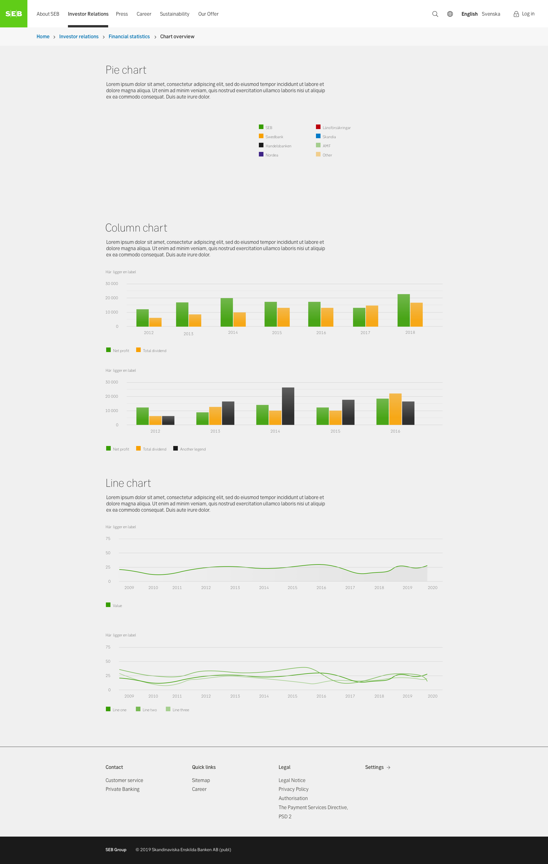
Charts & graphs
A chart or a graph is a visualization of different types of data, such as showing the increase of a certain share for the last month. Graphs should be used to make data more digestive and easier to understand.
Component meta
Component identifier
- component-chart
Tags
- Inspiration
Design version
- 2018-03-07
Design principles
- It's for youTrigger insightBe the good guy
Guidelines
Short description
Data is typically represented in plain numbers or a table with an option to visualize it in a graph. To cater for different needs, it can be useful to allow users to select the type of diagram that suits them and have the option to switch between diagrams and table.
Using graphs is a good exemple of how we as a bank can present insights to our users, rather than just numbers. The idea is that the user feels like they have learnt something after having spent time in our applications.
When and how to use it
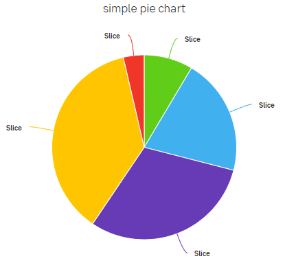
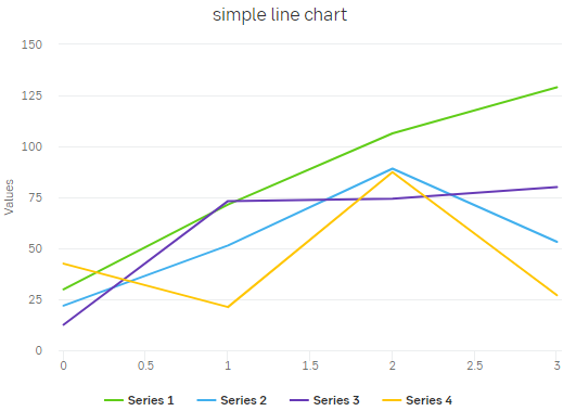
We use basic geometric shapes as the foundation of our graphs and charts. When possible, choose to use mainly line diagrams or bar charts, instead of circle charts - as our brand concept is based on a square. The shapes are without visual effect. Outlines and graphs should be flat and not in 3D.
Development
The preferred library for implementing interactive grahps is High charts. We are working simplifying the use of charts and graphs into your build, but for now you can ask frontx@seb.se if you have any questions.
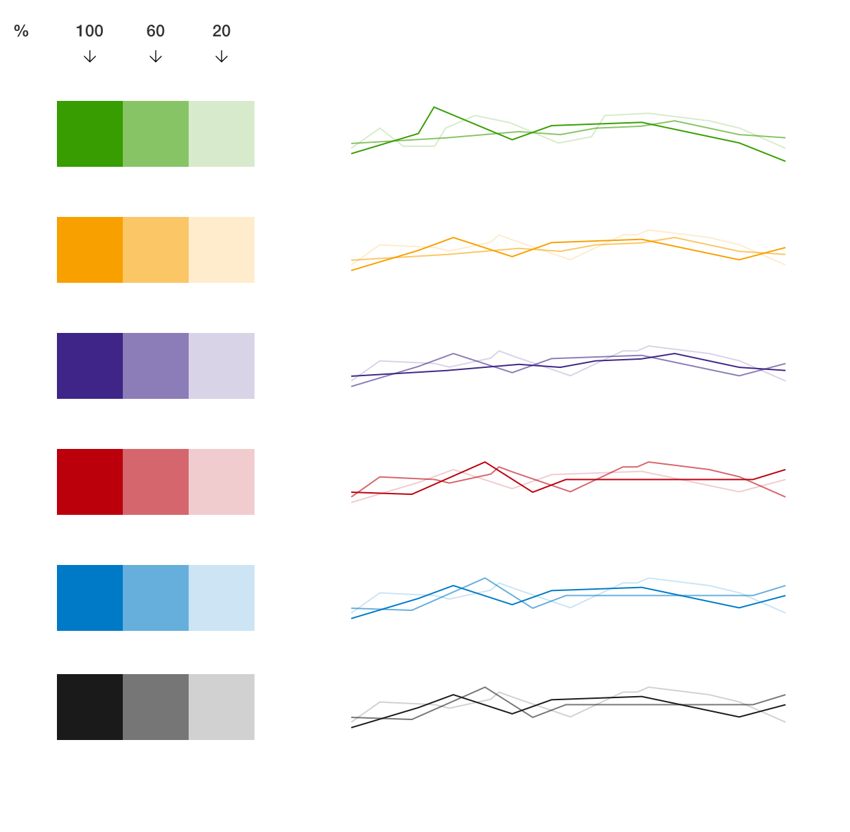
Colours
When there is a need for multiple colours in charts and graphs, use percentages of SEB's primary colours and tints. They can be used freely but make sure that the contrast between the colour tints chosen are sufficient. It is common to use blue to show positive result, and red to show negative result.
Do's and don'ts
Do
- Use SEB's colours. How the colours are used is up to each individual project. Use contrasting and obvious colours.
- Present a legend that explains what data is showing. Depending on the graph, it could be a good idea to allow the user to turn on and off legends.
- Ensure consistent spacing between shapes. Always aim for small spacing between shapes, such as columns.
- When a user hovers over a section in the graph, make sure to highlight that part. Try to make it possible for users to select and highlight certain information in the graph.
- Lines used in grids for graphs are always greyscale or black/white. The lines can be dotted if necessary.
- Be cautious of combining more than two different types of diagrams in the same graph, because it can hard to interpret and can become overwhelming.
Don't
- Don’t use static images, because they don’t scale well and it’s hard for users to extract any additional information.
Accessibility
Accessibility in graphs
- Colour contrast: Use high-contrast colours and avoid relying solely on colour to convey information.
- Alternative text: Provide descriptive alternative text for all visual elements to assist users of screen readers.
- Keyboard navigation: Ensure all graph elements are accessible via keyboard navigation.
- Screen reader compatibility: Test with screen reader software to ensure all content and functionality are accessible.
- Semantic markup: Use semantic HTML elements for meaningful structure and interpretation by assistive technologies.
- Resize and zoom compatibility: Ensure the graph remains usable and readable when users adjust their browser settings.
- Colourblind-friendly design: Use distinct shapes, patterns, or labels in addition to colors to differentiate data categories.
- User testing: Conduct usability testing with diverse users, including those with disabilities, to identify and address accessibility issues.
Examples