Chlorophyll
Styles
The last version of Internet Explorer, version 11, was released on October 17, 2013. This is a very long time ago when taking into account the rapid development of web technologies. These days it is often difficult and time consuming to get modern technologies to work well in this old browser. More and more frameworks are dropping support, and even Microsoft themselves has announced that they will fully drop support for IE in their own services in 2021.
Consequently, we have decided to not include support for IE in the Design Library website.
Luckily, there are modern options in active development. Please use Firefox, Edge or Chrome instead.
The simplest way of listing data in an orderly fashion with labels and associated data.

Styles
List are used to list many datapoints with labels in a structured way. They may be grouped under heading and they may have a link or button added to act on the data being displayed.
Lists are used when the added functionality of tables is not required. Use lists to present data about one thing, such as account details. Use tables to list many items, such as accounts.
We use a couple of different layout for lists depending on situation:
The spaced version left align labels and right aligns all values. This is the most basic version of the list.
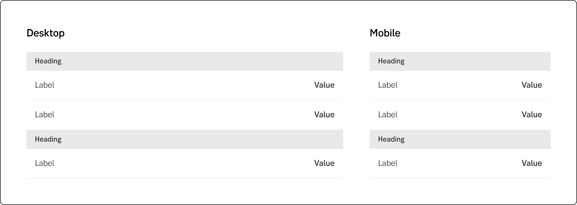
Spaced list
In this version the labels are still left aligned, but the data is in a column in the center (also left aligned). If there is an action added its presented as a button. If there’s additional information that may be added as a link. The link/button is placed in the right side. Dual column is mostly used to display details in the main content area. It needs a larger space to work well. In a mobile version it behaves exactly like the vertical version.
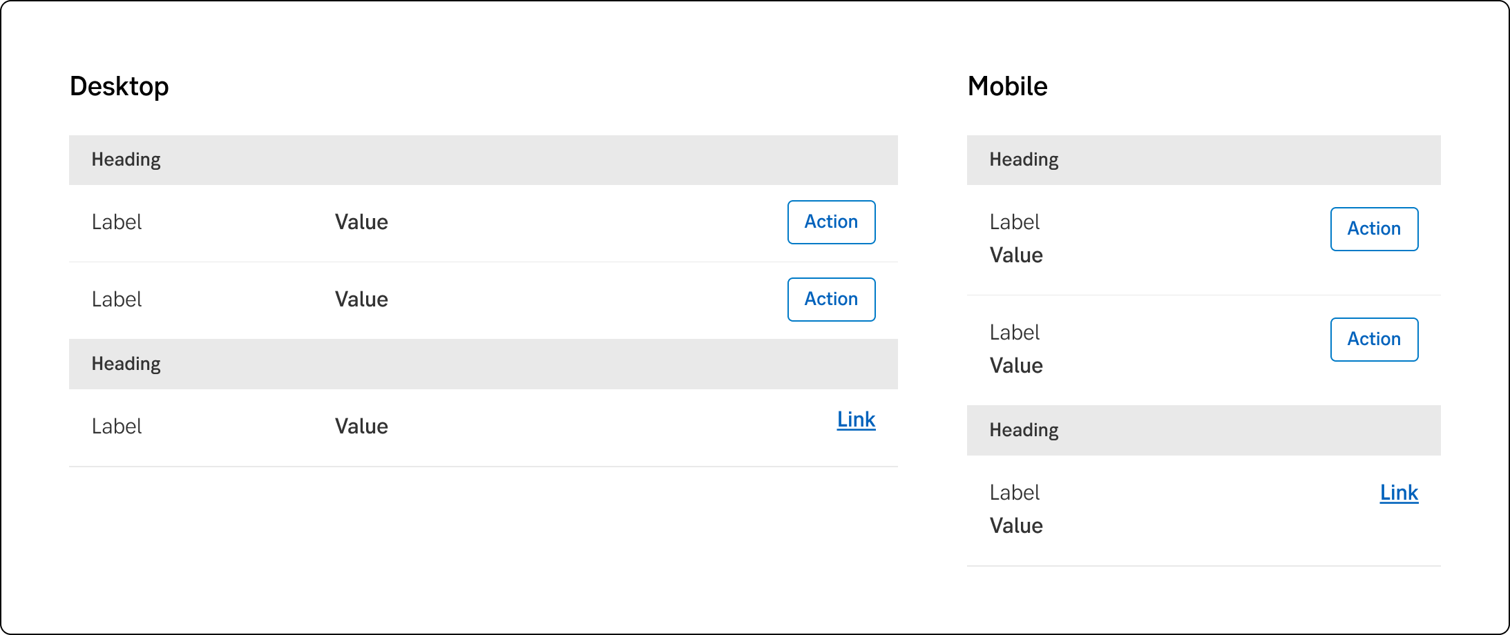
Dual column
If there’s a need for action/link to the items in the list but the space in width is limited the vertical option might be better. In this version both label and value is left aligned and stacked on top of each other, but the link/button is still to the right.
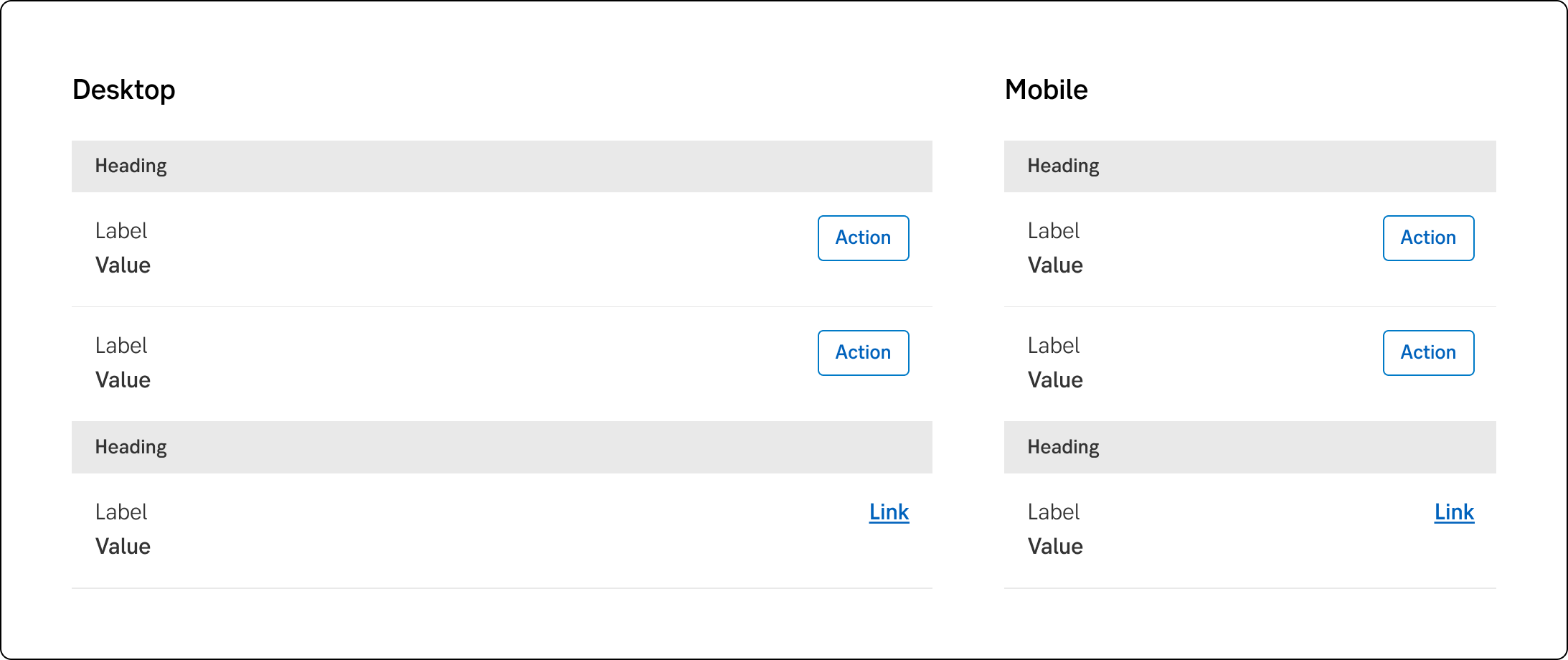
Vertical list
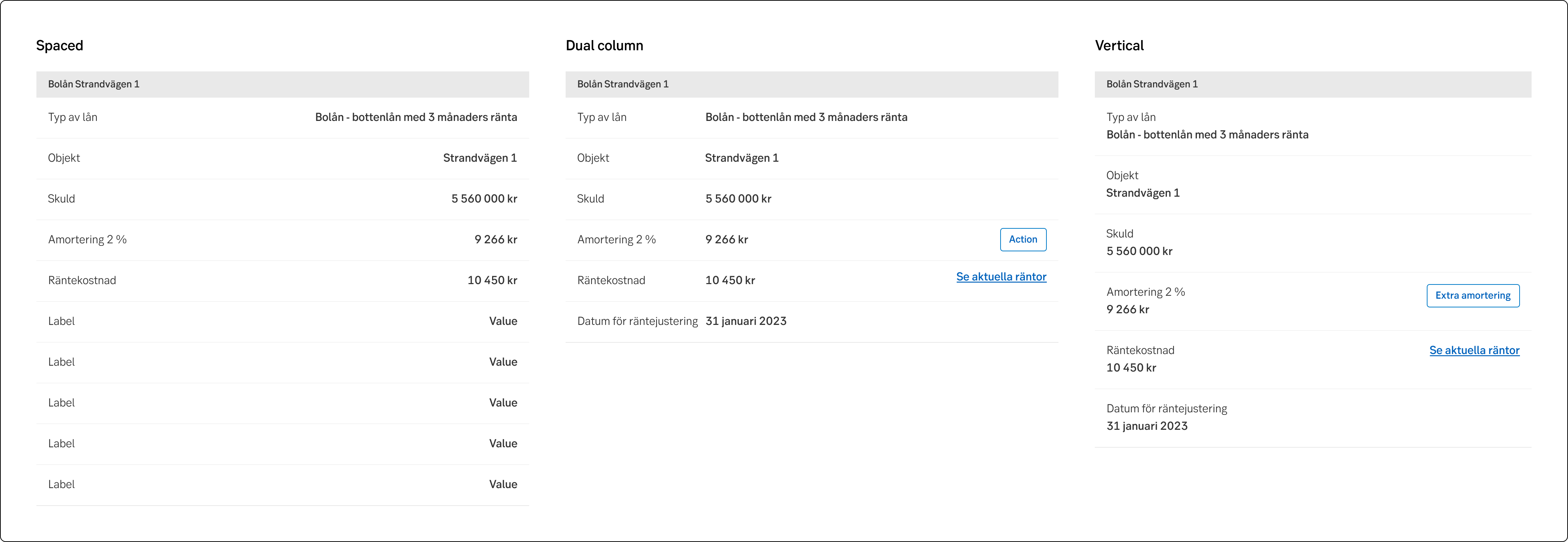
List versions in light mode
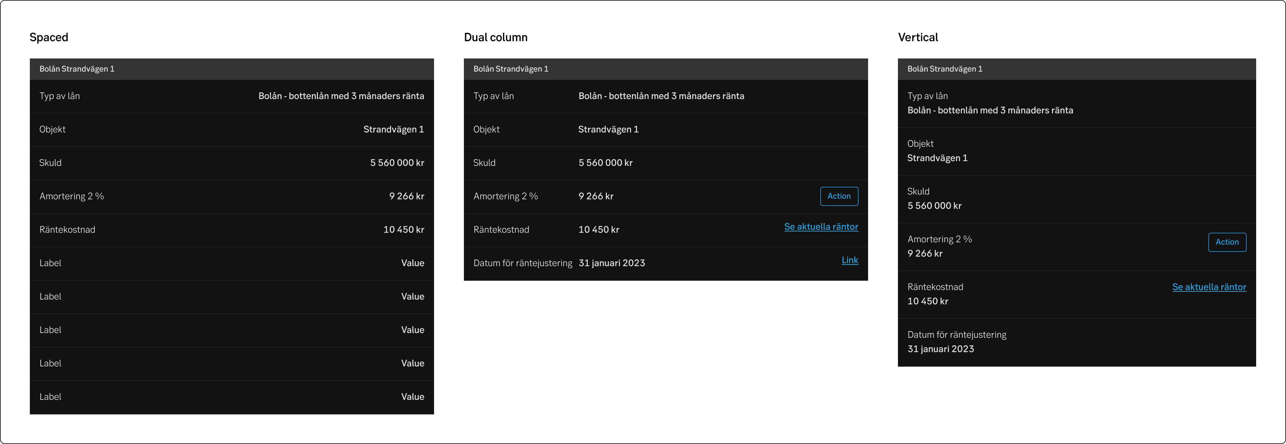
List versions in dark mode
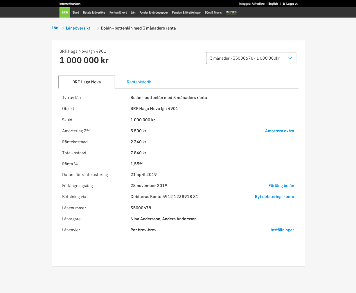
Example of details of a mortgage in desktop
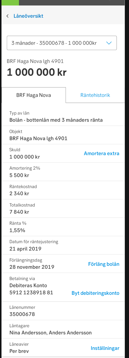
Example of details of a mortgage in mobile
-
-