Chlorophyll
Styles
The last version of Internet Explorer, version 11, was released on October 17, 2013. This is a very long time ago when taking into account the rapid development of web technologies. These days it is often difficult and time consuming to get modern technologies to work well in this old browser. More and more frameworks are dropping support, and even Microsoft themselves has announced that they will fully drop support for IE in their own services in 2021.
Consequently, we have decided to not include support for IE in the Design Library website.
Luckily, there are modern options in active development. Please use Firefox, Edge or Chrome instead.

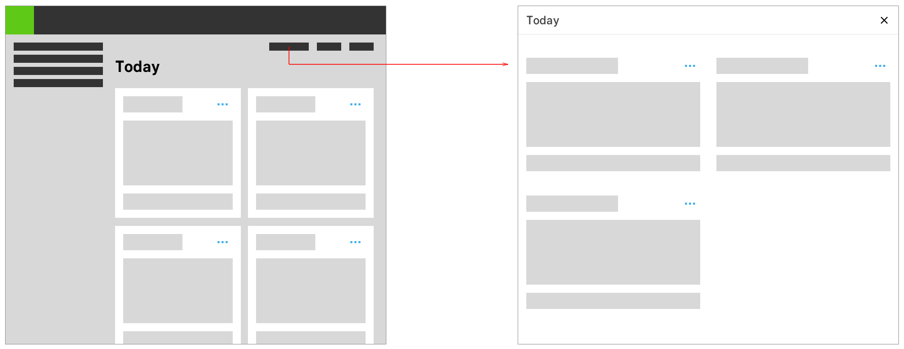
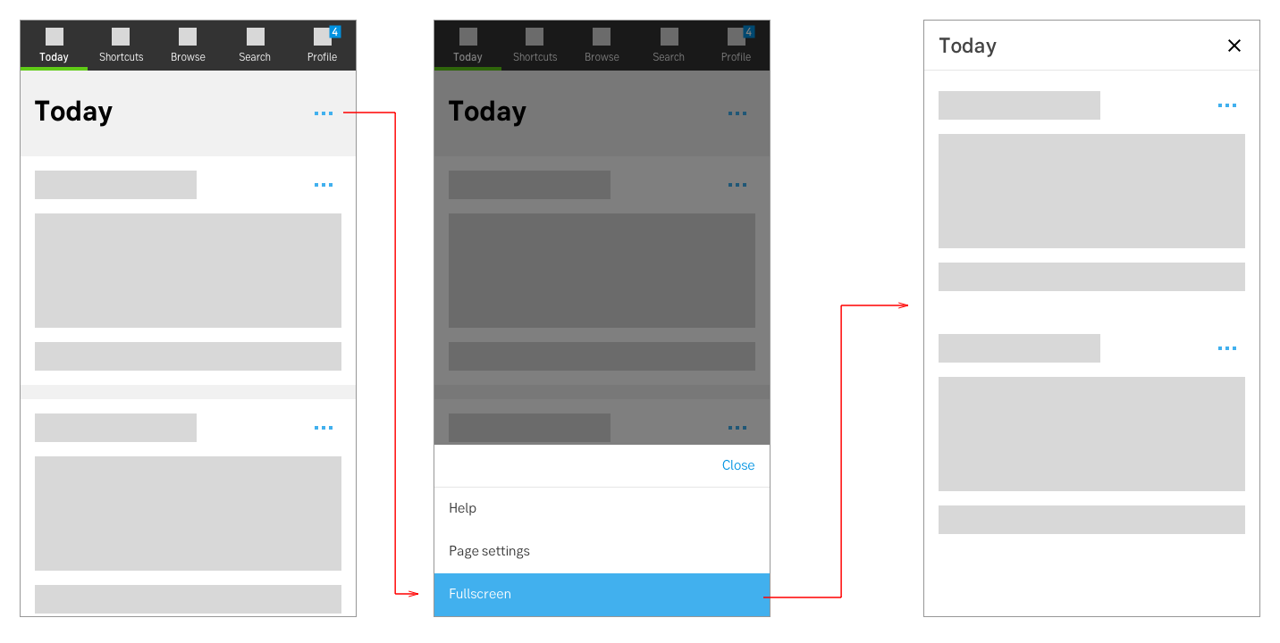
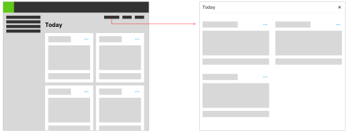
Takeover modals enable a user to focus on a specific task while having the ability to go back to their previous view quickly.
Styles
Javascript
Javascript
A full screen modal that temporary blocks interaction with the main view of a site and set the actual task in focus.
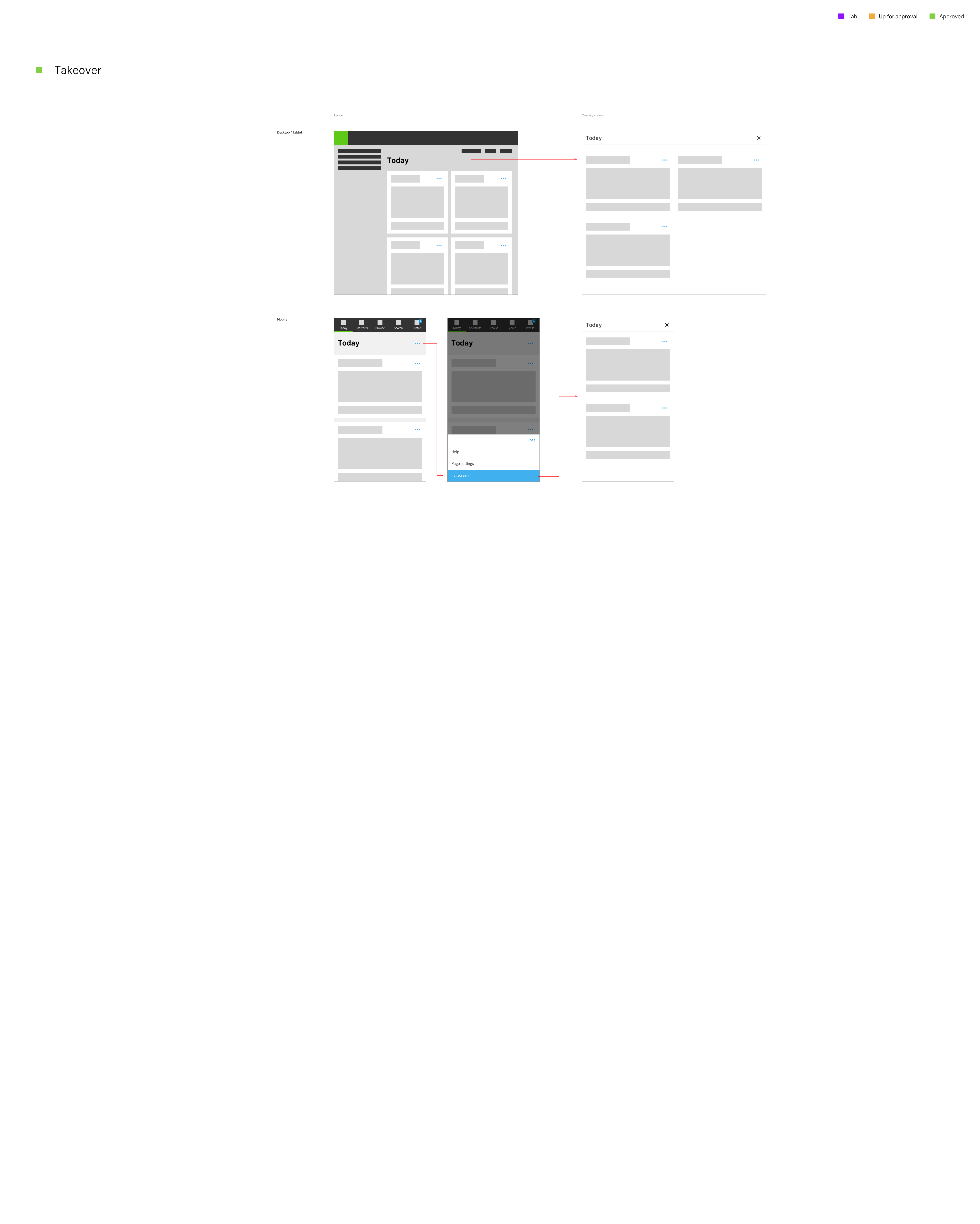
Take-over
Use a takeover modal when a task needs the full attention from a user, for example when making a payment. Heavier tasks such as a multi step wizard also benefit from the focused experience of removing not needed UI chrome of the original site.
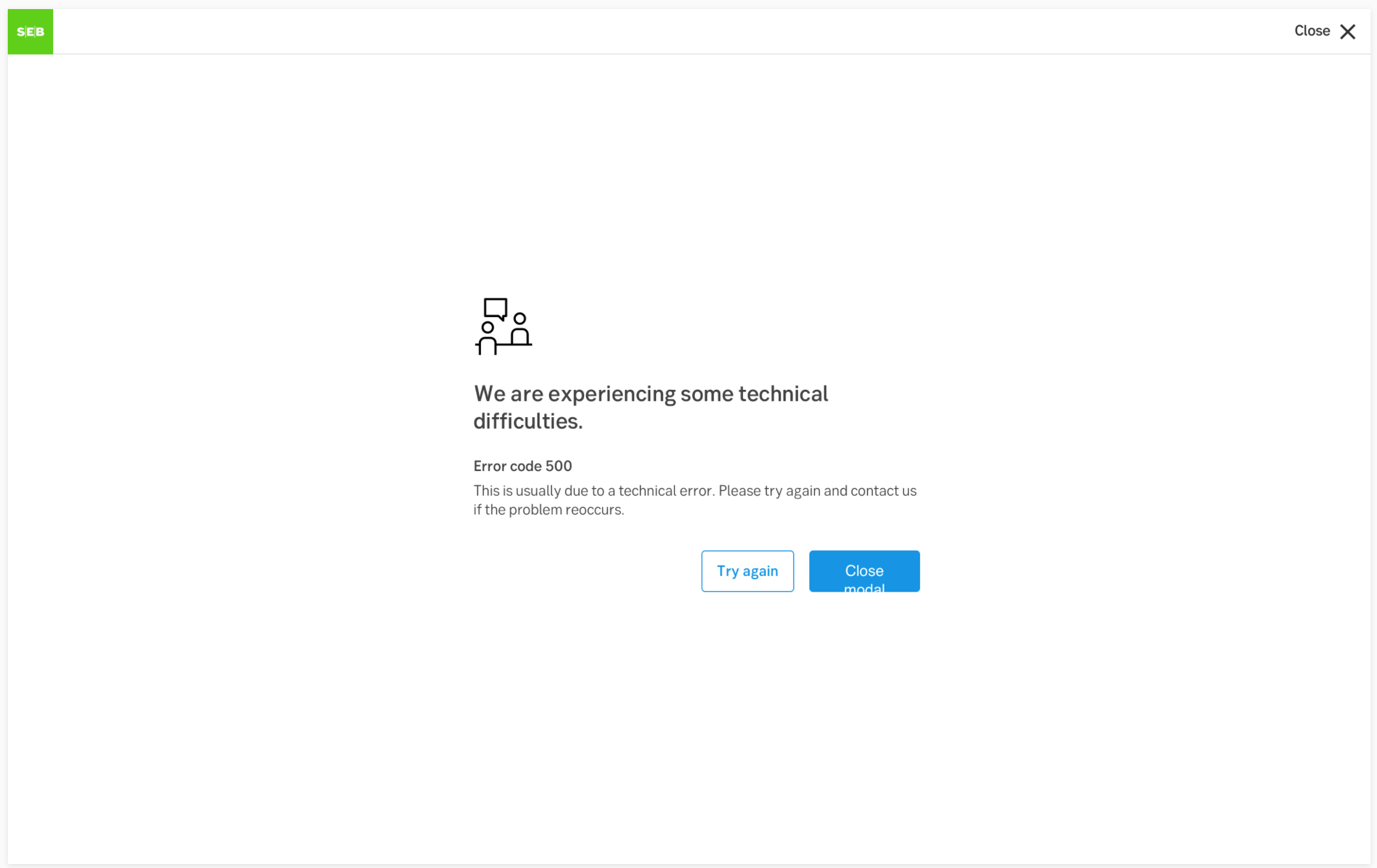
This example is from an centered empty state message (hybrid) where the primary button is placed to the right.
See examples and full accessibility guide on W3’s ARIA pattern guide for Modals
Make sure the modal is announced, and that the focus and tabbing order is limited to the modal. The user should not be able to reach content outside of the modal without exiting the modal (same as for mouse-users).
A modal’s main header always be a H2. While it is not wrong to make it a H1 since it is technically a new context, it is still experienced by the user as within the same context as the triggering page. Hence a H1 might be confusing. All following headers within the modal should descend below H2 as on a main page.
Some modals include navigation. This could be pagination, Previous/next buttons for modals with several steps etc. Putting these in a <nav> element allows the user to find the navigation buttons more conveniently. If you cannot use <nav> in your context, aria role="navigation" can be used as a fallback.
Result from the latest accessibility review of the component (Chlorophyll): 2024-07-31