
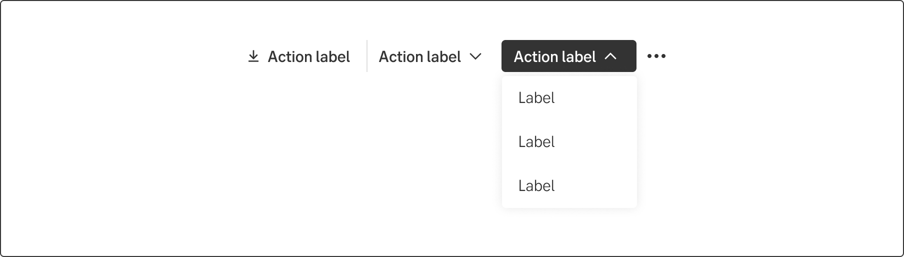
Toolbar
A toolbar is a series of buttons that enables the user to reach actions or tools related to its' table.
Component meta
Component identifier
- component-toolbar
Design version
- 2022-11-25
Design principles
- Everyday first
Guidelines
Short description
A toolbar allows the user to easily find more or less frequently used actions and tools that modifies, manipulates or in other ways affects the content to which the toolbar belongs. The items in the toolbar may vary based on what the toolbar relates to.
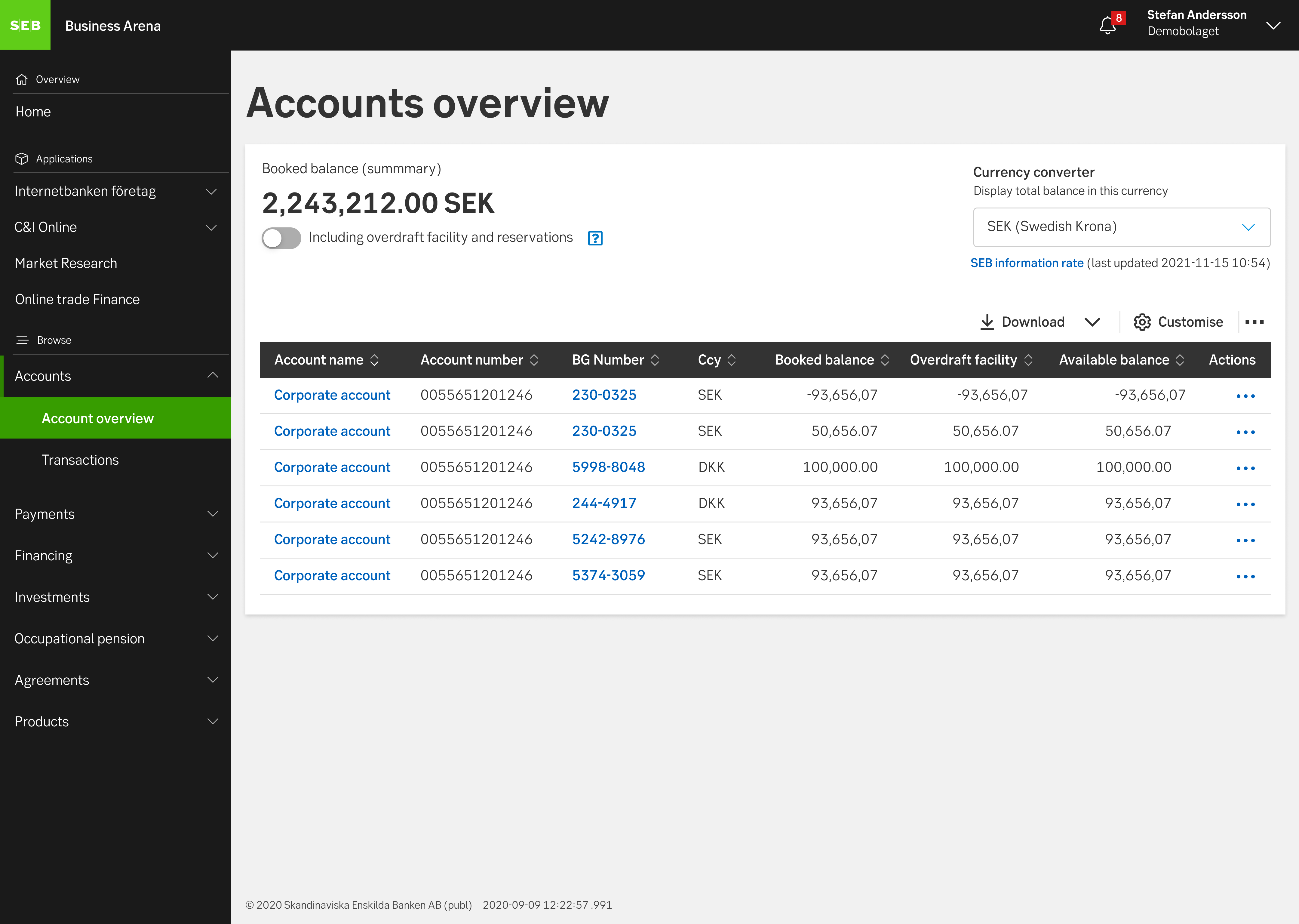
Example of toolbar used as an add-on to a table
When and how to use it
When to use it?
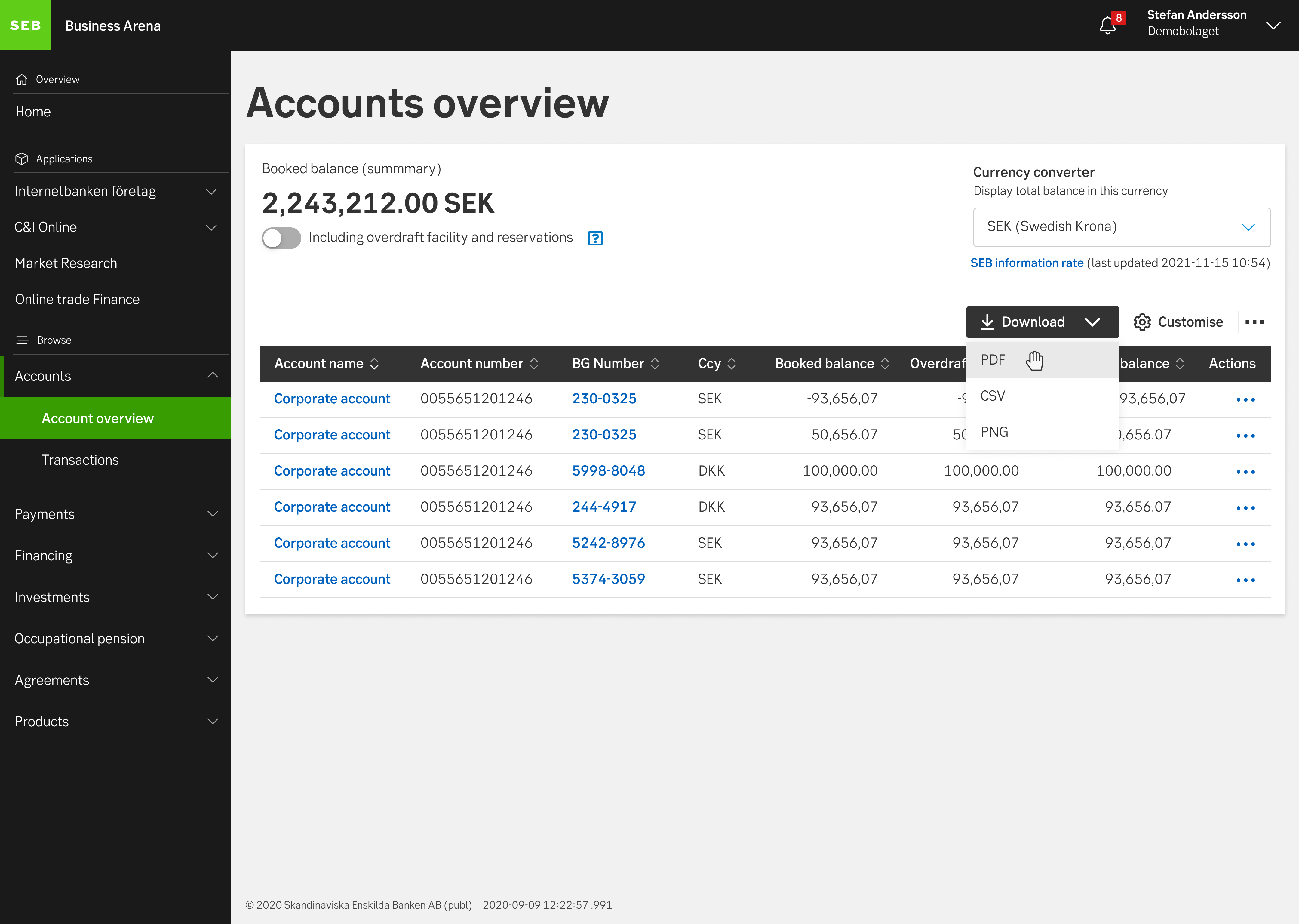
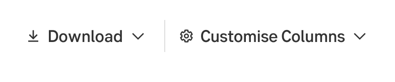
Being able to collect actions in a bar is useful when several actions relate to the same component. A toolbar can involve different actions or tools such as Export, Customise or a More menu. The More menu allows the user to choose from a series of actions and groups the more more infrequent options.
How to use it?
Placement
The toolbar should be placed at the top, horisontally and aligned to the right in relation to the component to which the toolbar belongs. Place the toolbar 8 pixels above the component.
Content
Frequently used actions should be placed to the left in the toolbar. The More menu should always be placed to the right.
Examples of actions and tools that can be used with the toolbar:
- Actions, such as Export or Customize
- A More menu (with the least frequently used actions), i.e advanced settings, Advanced export
Icons and labels
The buttons contain a label with an icon or lable only.
Behaviour
The user has no opportunity to customise the toolbar on their own, however, the tools in the toolbar may vary based on what the toolbar relates to. To clarify, a toolbar can contain different actions because the ability to perform different actions can vary. Sometimes the user may be able to download the contents of a table and sometimes not, in the latter case, a download button may not be relevant.

Toolbar button when user hovers over it

Toolbar button when selected
Toolbar button when selected and list object hovered
Mobile version
As the screen width is decreasing, all actions should end up under the More menu.
Do's and don'ts
Do
- Consider which actions are used most frequently (no more than three) and place them outside the more menu.
- When designing the buttons, assume that a label should be combined with a symbol. Place the symbol to the left and the label to the right.
- Consider whether a toolbar is actually necessary.
- Make sure that all actions in the toolbar relate to the same component.
Don't
- Don't place less frequent actions outside the more menu.
- Don't place anything other than buttons in the toolbar.
- Don't put a search field in a toolbar. Use a search button and label instead.
UX text
- Write short and to the point
- Make it clear what content the user can expect when clicking
- Only use upper case on the first word, unless it is a proper name or abbreviation.

Do this
Don't do this
Accessibility
-
Specification
- Details: Specification in Figma
- Instruction: How to access Figma