Chlorophyll
Styles
The last version of Internet Explorer, version 11, was released on October 17, 2013. This is a very long time ago when taking into account the rapid development of web technologies. These days it is often difficult and time consuming to get modern technologies to work well in this old browser. More and more frameworks are dropping support, and even Microsoft themselves has announced that they will fully drop support for IE in their own services in 2021.
Consequently, we have decided to not include support for IE in the Design Library website.
Luckily, there are modern options in active development. Please use Firefox, Edge or Chrome instead.

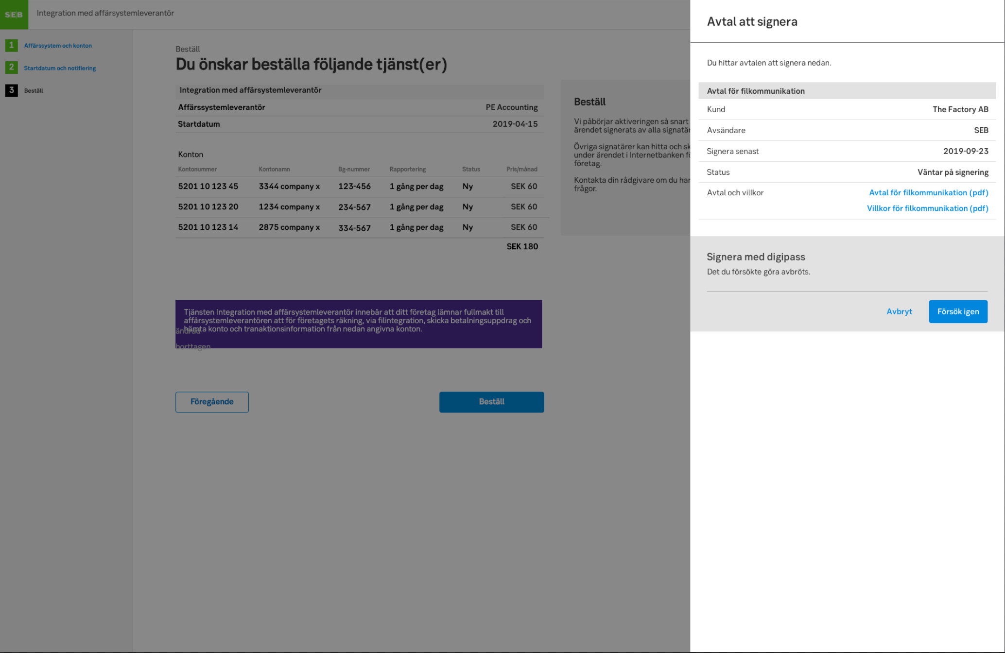
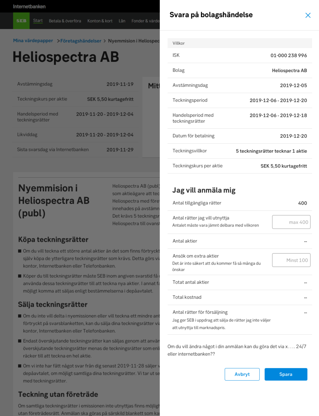
Slide-out modals allow for details, flows and interactions while not navigating away from the current view.
Styles
Javascript
Javascript
A slide-out modal is a panel that slides in above the main view, leaving the underlying content partially visible.
Use a slide-out modal when the user needs additional content or related functionality, whilst not leaving the current view. This component is recommended for content such as advanced filtering, show item details (instead of expanding a row), simplified wizards (flows) and small functions.
The slide-out is beneficial to use when you want to reuse a mobile view in a desktop environment.
The component should slide into position in the viewport from the right, partially covering the main content for desktop.
For mobile, the slide-out modal can be presented in two ways. Either it slides up (read more below) in the viewport, or it covers the whole mobile viewport to make use of the available space.
A modal can be closed in multiple ways depending on context.
Sometimes you may want to stop involuntary closing of the modal. This is especially important if users have filled in information in a form and risks to loose data. A dialog may be triggered to confirm that the user did want to close and is aware of the consequences.
The slide-out should not contain too much information. However, if you have information that could be considered secondary content (such as Terms & Conditions, help texts or related information):
Example of a sub view navigation
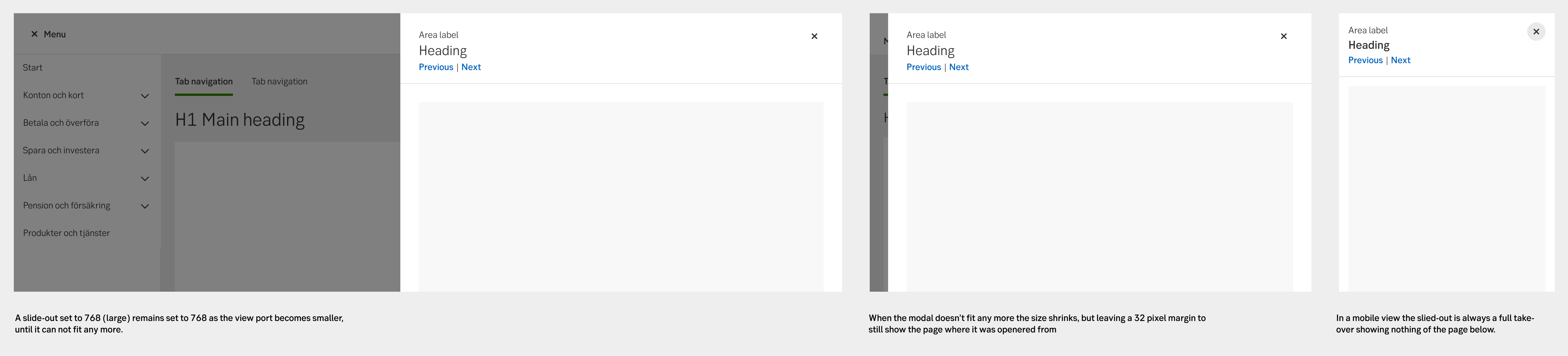
The width of the slide-out is based on the function/content that lives inside. Consider choosing a small version to make the transition to mobile views easier.
A slide-out remains the set width as the browser window decreases (doesn't scale). When the modal can no longer fit in the viewport, it starts to shrink, but leaving a 32 px margin to still show the dark overlay and the underlaying page.
In a mobile view the slide-out is always a full takeover leaving nothing of the page below visible.
Responsive behaviour
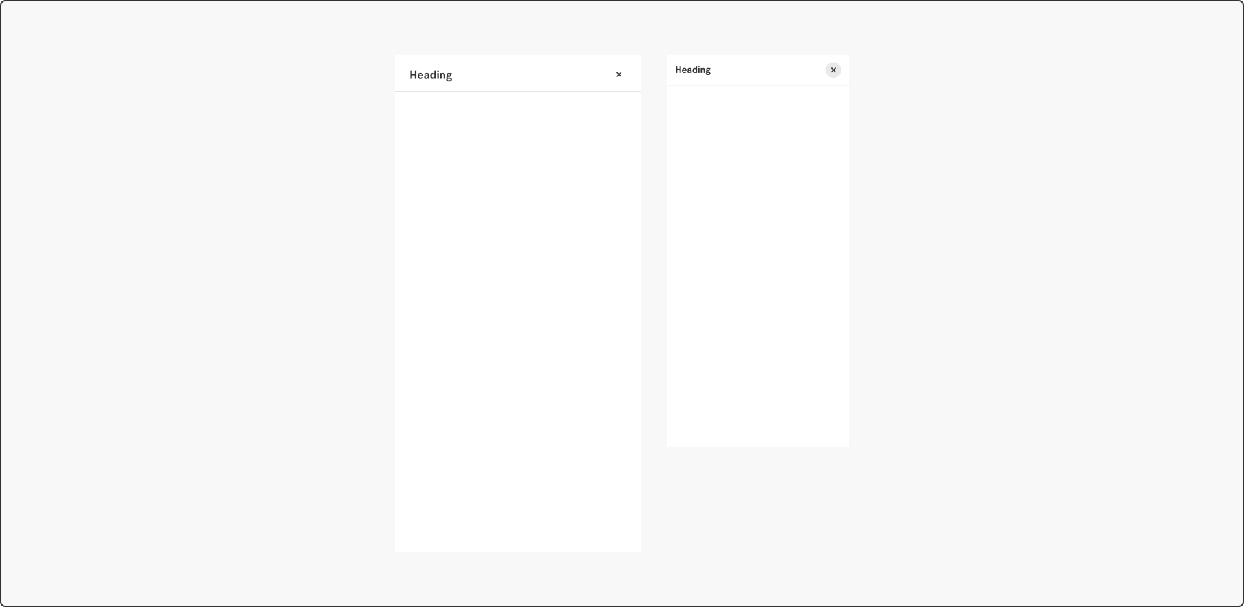
Header alternatives
When a slide-out triggers a dialogue, ensure that the dialogue is always centered on the screen. The overlay should cover everything behind the dialogue to create a clear separation between the foreground and the background.
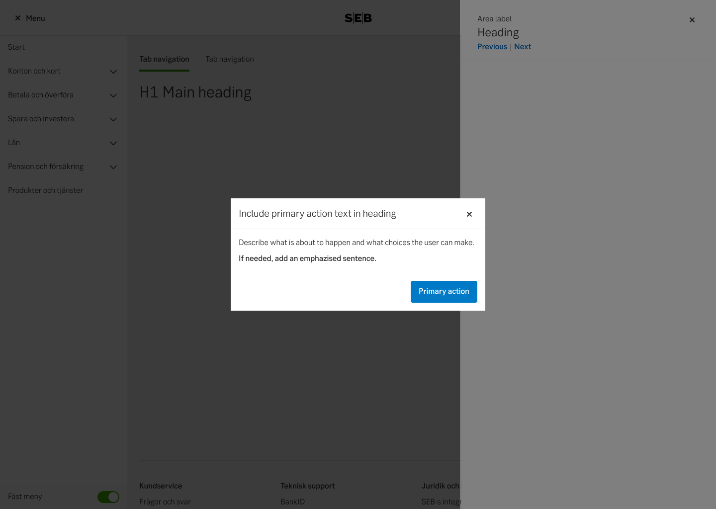
Do this
Don't do this
-
See examples and full accessibility guide on W3’s ARIA pattern guide for Modals
Make sure the modal is announced, and that the focus and tabbing order is limited to the modal. The user should not be able to reach content outside of the modal without exiting the modal (same as for mouse-users).
A modal’s main header always be a H2. While it is not wrong to make it a H1 since it is technically a new context, it is still experienced by the user as within the same context as the triggering page. Hence a H1 might be confusing. All following headers within the modal should descend below H2 as on a main page.
Some modals include navigation. This could be pagination, Previous/next buttons for modals with several steps etc. Putting these in a <nav> element allows the user to find the navigation buttons more conveniently. If you cannot use <nav> in your context, aria role="navigation" can be used as a fallback.
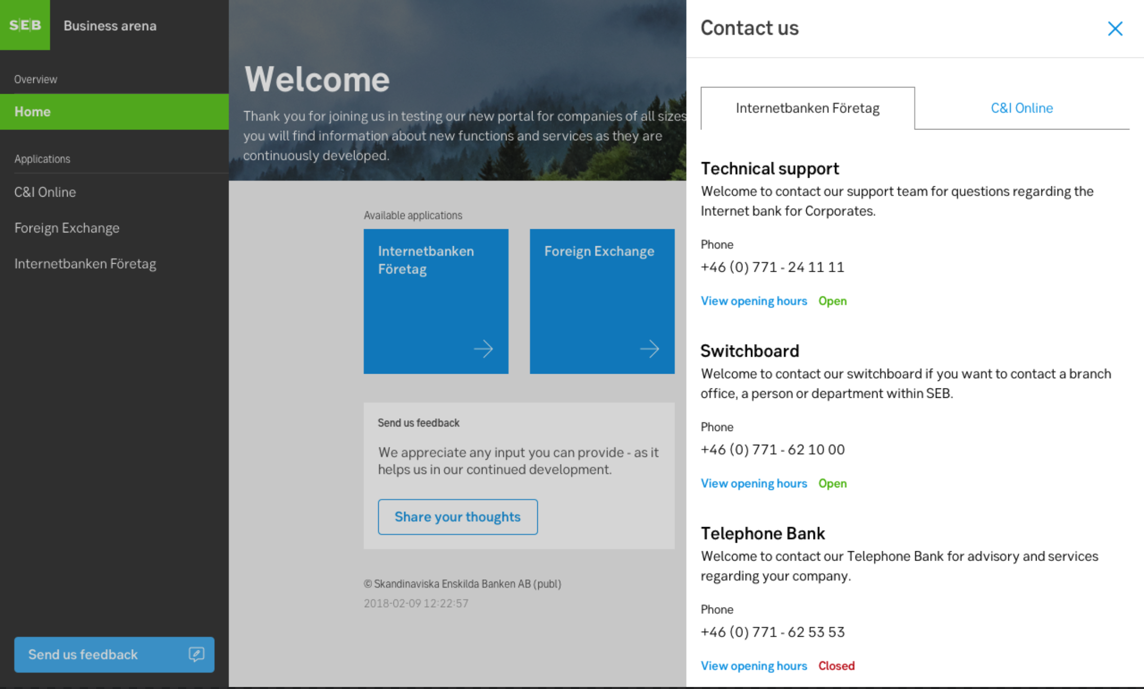
Arena
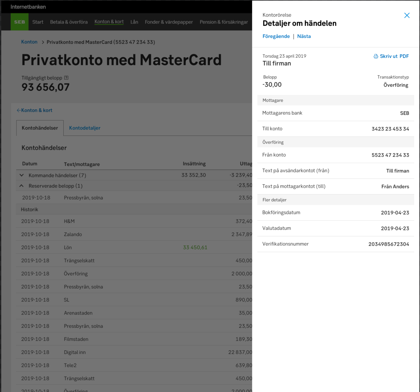
Transaction details, IBP
DAP
Corporate actions

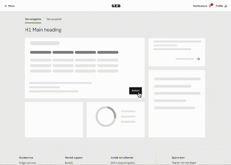
Light wizard in a slide-out
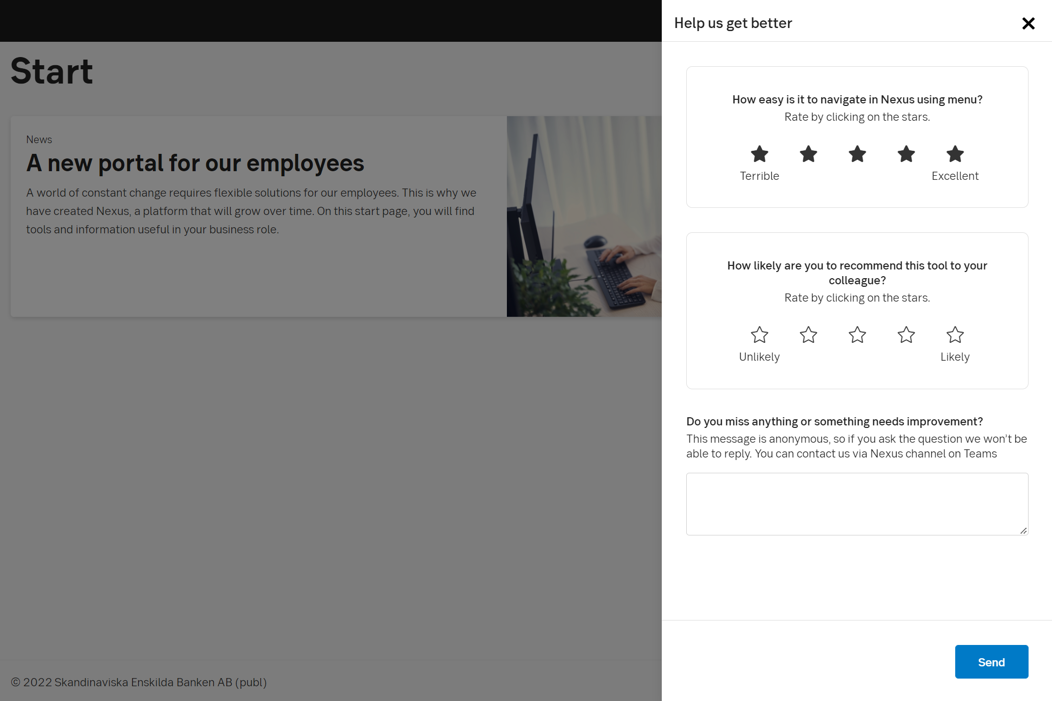
Nexus