
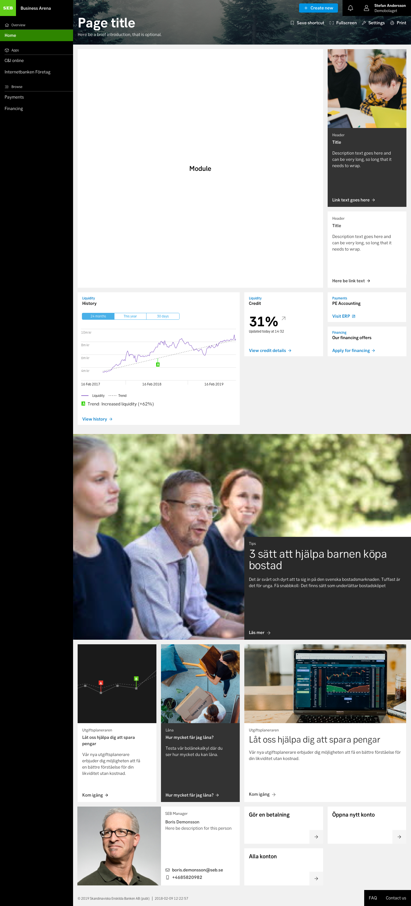
Related Large
This is used to highlight a story, article, news or a product that is related to the current content, or in other ways relevant to the reader.
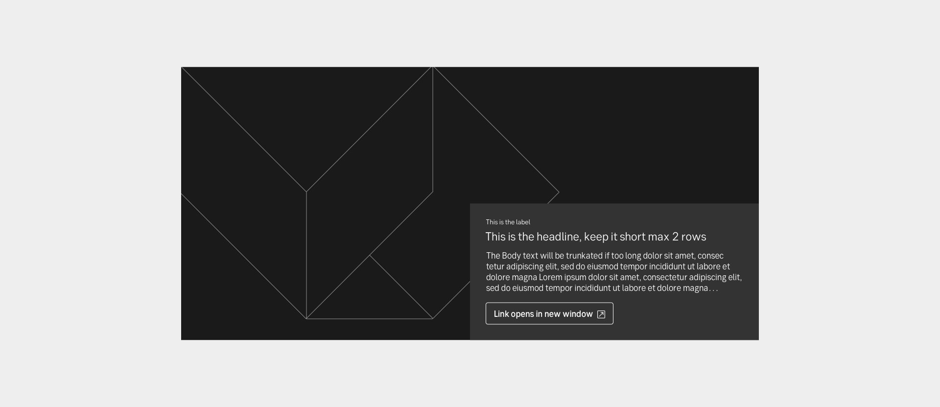
Guidelines
Short description
Gives the user an easy way to explore more content relevant and related to the current content they are reading. Or highlighted content on a landing or startpage.
When and how to use it
Use this block to add a relevant story, article, news or a product that is related to the current content, or in other ways relevant to the reader.
The content is fitted in cards, with good contrast to the grey background, to show that it is content living on another page. They show a glint on the content they are linked to.
The related blocks are designed to fit well together. An editor can give the user a package of related information in three different sizes, where content is placed in each type of related block size, depending on its importance or business.
Behaviour
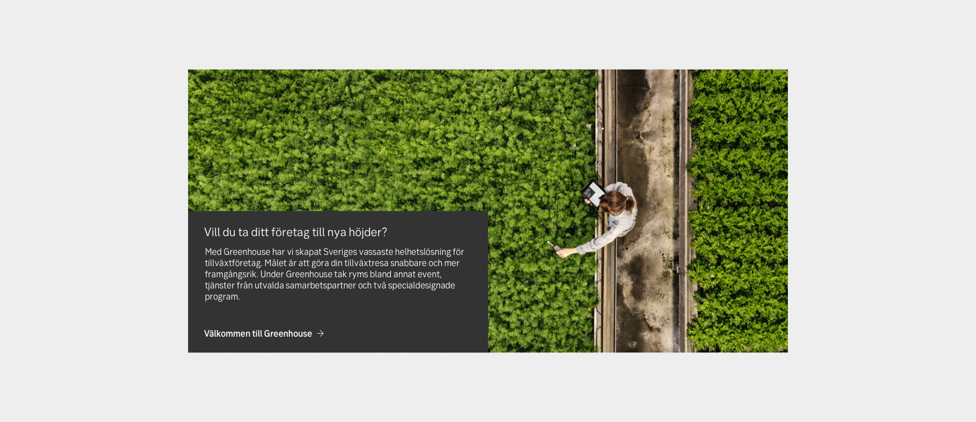
The Large block contains an image, optional label, header, body text and link on a solid grey background. The text area can switch places, right or left aligned.
On mobile devices, the text area will float 2 rems under the picture to give the user a clear difference between the Large, Medium and Small Related blocks. Best practice is to place text area and the picture motive so they work well together.
Do's and don'ts
Do
- Always give the user a headline, a glint of the preamble or body text.
- Always link the content with a link or button.
- Always take time to place the image and the text box so they work together.
Don't
- Use this as a block with all the information. Always link to other content. This is supposed to show a glint of content on another page.
Examples
Content to the left (desktop)
Content to the right (desktop)
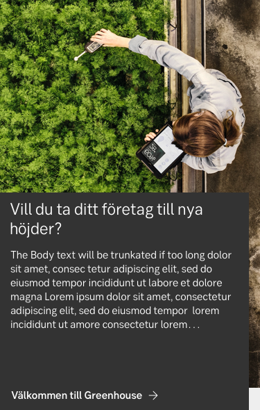
Content to the left (mobile)
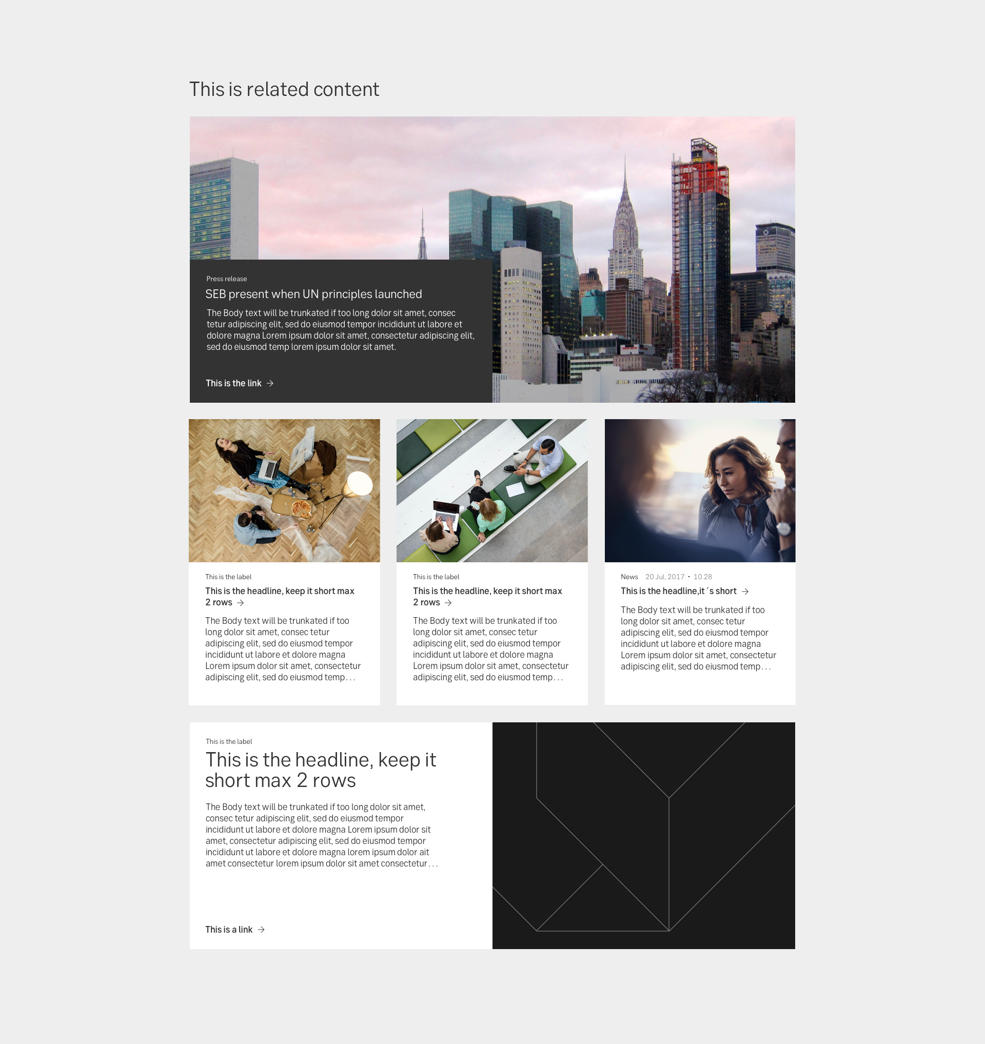
An overview of all of the Related blocks together
Exploration of Related blocks in zone 3 for Business Arena