Chlorophyll
Styles
The last version of Internet Explorer, version 11, was released on October 17, 2013. This is a very long time ago when taking into account the rapid development of web technologies. These days it is often difficult and time consuming to get modern technologies to work well in this old browser. More and more frameworks are dropping support, and even Microsoft themselves has announced that they will fully drop support for IE in their own services in 2021.
Consequently, we have decided to not include support for IE in the Design Library website.
Luckily, there are modern options in active development. Please use Firefox, Edge or Chrome instead.

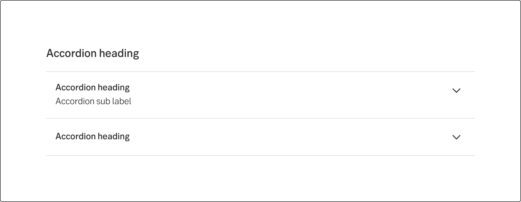
An accordion lets users show and hide sections of related content on a page.
Styles
Javascript
Javascript
Accordions can make information processing more effective. Best suited for plain text, lists, tables and inline links. A good example for use could be a FAQ and Terms and conditions.
Use the accordions to "hide" information that users doesn't necessarily need to read or only need to read occasionally. If the majority of users will read it, it should be visible.
Depending on what suits the situation best, an accordion can have one section open and the rest closed, or many sections open at the same time.
The default accordion is collapsed with the chevron pointing down. There is a grey hover on the header "cell". When the user clicks anywhere on the "cell", the expanded area is displayed and the chevron points up. The expanded content background is white or grey, depending on what suits best.
Let's say the user is interested in opening an account. The information about the account can be divided into categories such as “About”, “How do I open an account” and “Terms and conditions”. With the accordion, the user gets a quick overview of the information and can decide what section to expand to read more.
https://www.w3.org/WAI/ARIA/apg/patterns/accordion/examples/accordion/
Result from the latest accessibility review of the component (Chlorophyll): 2023-07-19