
Native app - Information card
Information cards are used for "good to know" and general information the user benefits of knowing.
Component meta
Component identifier
- native-informationcard
Tags
- Native
Design principles
Guidelines
Short description
For a passive notification, such as information "good to know" or general information we want to let the user know on a page, we use the Information card.
An action-required notification such as a warning or an error needs more emphasis, in that case consider using an error card or alert instead to attract user's attention.
When and how to use it
Use an information card for passive notifications that provide general or "good to know" information without requiring immediate action. These cards help users stay informed without disrupting their workflow. Information Cards are best suited for cases where:
- The message is helpful but not urgent.
- There's no issue affecting functionality.
- Users might benefit from additional context or details.
Behaviour
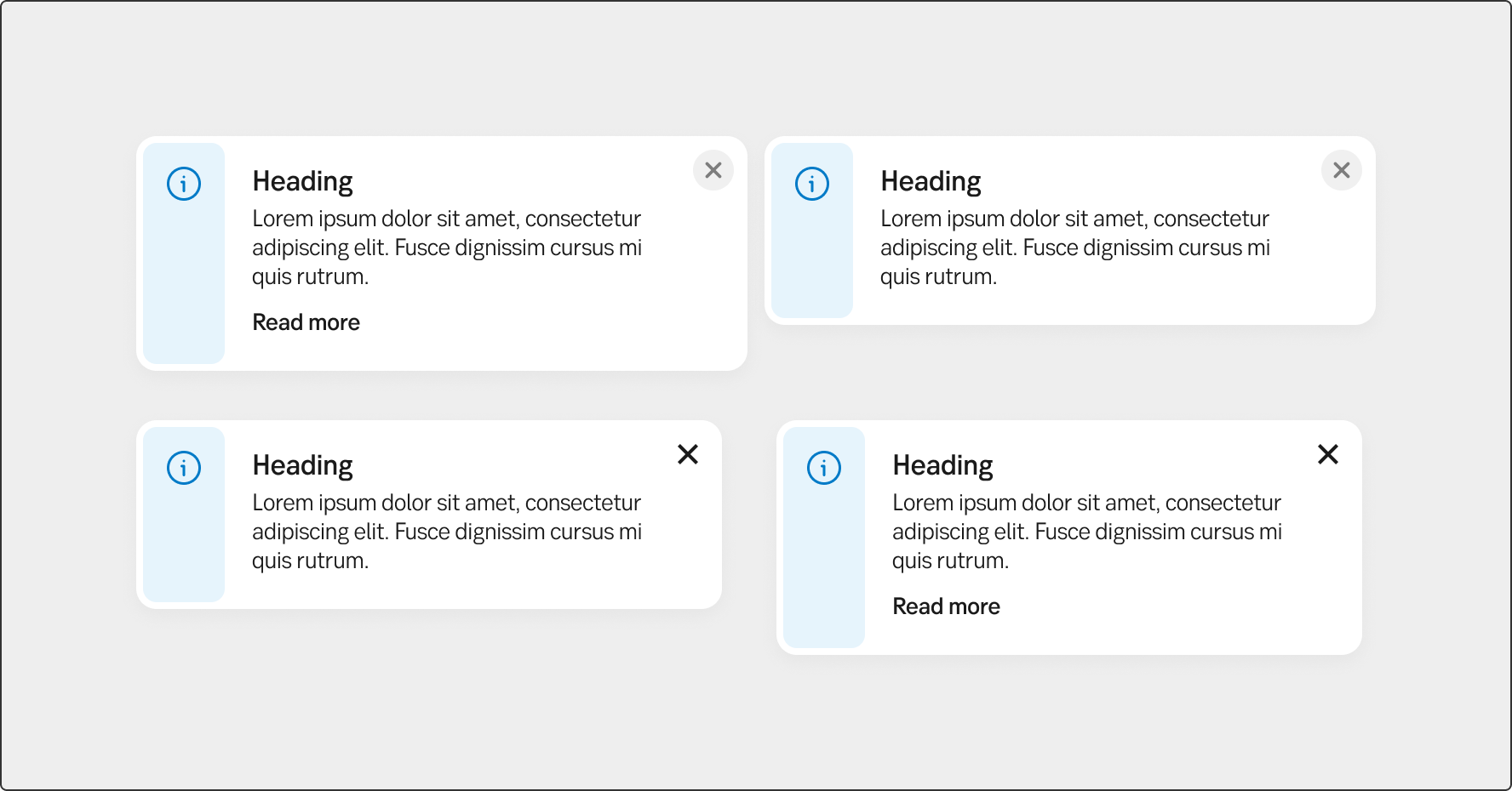
Information cards can be:
- Fixed – Always visible and no option to close
- Dismissable – Users can close them manually.
All types of cards can include a link for more details if needed. Dismissable cards have a close button in the upper-right corner.
Placement
Information cards should be positioned near the relevant content based on context:
- Page – At the top of a specific page (e.g., information affecting the whole area/page).
- Group – Within a page (e.g., a feature-specific notice more relating to a certain section of a page).
Do's and don'ts
Do
- Use for passive info – Ideal for general or "good to know" messages that don't need immediate action.
- Place near content – Position at the top of a page or within a specific section if relevant.
- Make dismissable if needed – Allow users to close non-essential messages.
- Include links if helpful – Add links for more details when necessary.
Don't
- Don't use for critical alerts – Use an error card or alert for urgent issues.
- Don't overload with text – Keep messages short and clear.
- Don't dismiss essential info – Use fixed cards for important messages.
- Don't place randomly – Position cards logically for clarity.
- Don't overuse – Too many notifications reduce their impact.