Chlorophyll
Styles
The last version of Internet Explorer, version 11, was released on October 17, 2013. This is a very long time ago when taking into account the rapid development of web technologies. These days it is often difficult and time consuming to get modern technologies to work well in this old browser. More and more frameworks are dropping support, and even Microsoft themselves has announced that they will fully drop support for IE in their own services in 2021.
Consequently, we have decided to not include support for IE in the Design Library website.
Luckily, there are modern options in active development. Please use Firefox, Edge or Chrome instead.

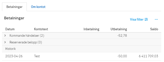
The tab component allows the user to navigate between groups of content that are related and at the same level of hierarchy.

Styles
Tabs organise content across different screens, data sets, and other interactions. They make it easy to explore and switch between different views.
Use tabs as a local navigation to organise your content in logical groupings.
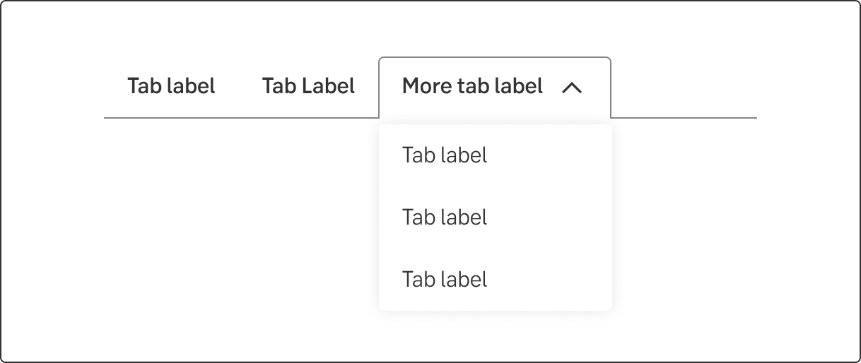
When the tabs overflows (exceeds) the width of the area available, all the tabs that can't fit are grouped into a list in a fold-out modal.
If there are only two tabs, size them both 50% of the width.
When there are more tabs, use the same behaviour as for desktop. When the tabs overflow the width, present the active tab and group all others into a list in a fold-out modal.
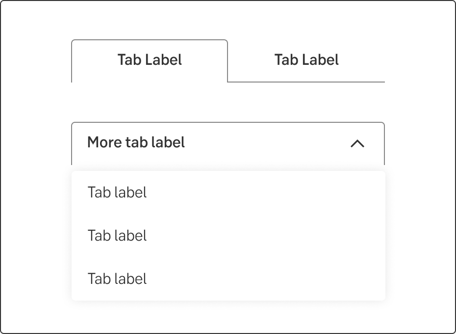
Overflow example
Tab labels are considered as both menu labels and sub-headings.
Do this
Don't do this
Don’t start each word in headings and labels with upper case. Only use upper case in:
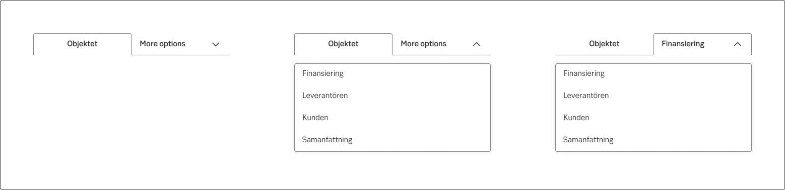
On overviews, consequent and recognizable labels should be used for corresponding menu choices (tabs). These tab labels are common in overviews:
If applicable, the area is also included in the menu label (tab label), for example About the loans and Fund transactions.
Result from the latest accessibility review of the component (Chlorophyll): 2023-04-24