Chlorophyll
Styles
The last version of Internet Explorer, version 11, was released on October 17, 2013. This is a very long time ago when taking into account the rapid development of web technologies. These days it is often difficult and time consuming to get modern technologies to work well in this old browser. More and more frameworks are dropping support, and even Microsoft themselves has announced that they will fully drop support for IE in their own services in 2021.
Consequently, we have decided to not include support for IE in the Design Library website.
Luckily, there are modern options in active development. Please use Firefox, Edge or Chrome instead.

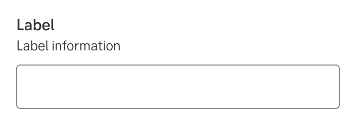
Input fields allow users to add and edit text.
Styles
Javascript
Javascript
Input fields typically reside in forms, but can appear in other places like dialog boxes and search. Input fields can help users validate input and fix errors, they can also autocomplete words and provide suggestions.
It is is a versatile component:
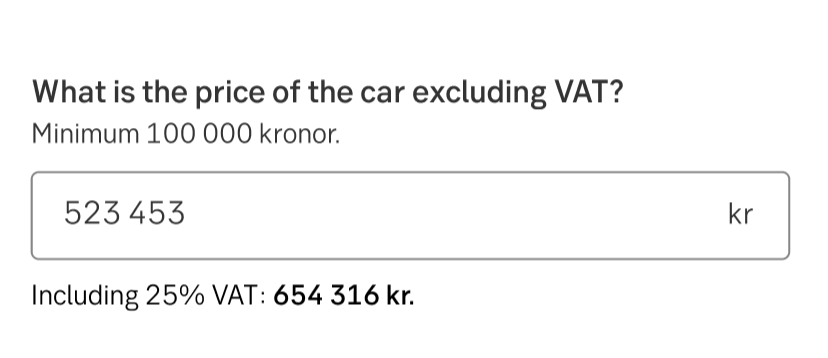
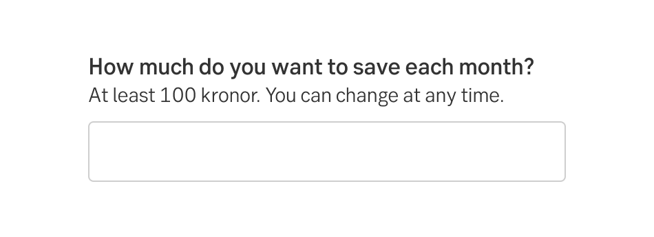
Input field labels describes the type of input a field requires and is key to making an accessible UI. Labels are placed above an input field. Use short and descriptive labels (a word or two) so that users can quickly scan your form.
Placed between the label and field, it helps the user with instructions for what to enter (i.e the format) in the field or how to interpret the label. If multiple form-fields are placed horizontally, the instruction is placed under the field to help alignment of the fields.
If more help is needed, use Contextual help with a tooltip for short descriptions, or a slide-out modal for longer ones.
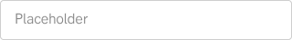
Avoid using placeholder text. Use the label information for all necessary explanation. (A placeholder text needs to reach contrast to be accessible, therefore the field could be perceived as prefilled. Hiding the information when the user clicks inside the text control strains the user’s short-term memory.)
Use for very short, helpful information that does not fit or belong in the label information. Make sure to keep text concise and to the point. If more text is needed, consider using Expandable label information instead.
Pattern: Contextual help (Expandable label information)
Dynamic information text
Dynamic information text with error
Input fields can be formatted to indicate the types of data a field accepts, using placeholder text. The inputted text is also formatted. Characters can be formatted using:
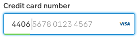
Pattern: Formatting guidelines
To indicate that a field is optional, display the word “optional” (or "valfritt") in parentheses next to the field label. Generally strive for only having fields that we actually need the user to fill in. If it’s not needed, then it can perhaps be removed from the form.
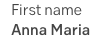
Make static data stand out from its' label header.
Input text can be used with auto complete to help users who have limited literacy or who write in a foreign language.
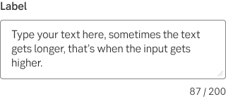
Use character or word counters where there is a character or word limit.
Also known as text area.
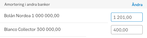
The smaller input fields can be used in tables and lists.
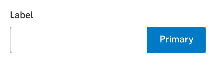
Use this when a button is needed next to an input field and it needs to be clear that an action is linked to the input field. For example, fetching information from a database, signing up to a newsletter, etc.
In a mobile viewport, the group is seen as one module and shares the width.
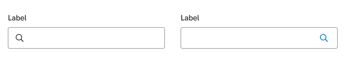
Use the search component to help users find data. There are two versions of the component, functional (button to the right) and decorative (icon to the left).
Some components are available in two sizes to support different layout needs and use cases:
Note.The small variant is fully supported only in the interim design, which visually aligns more closely with DV23.
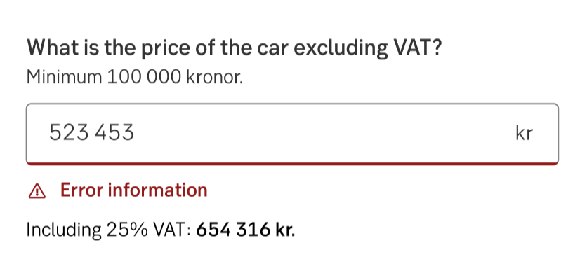
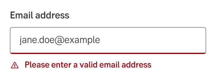
When input isn’t accepted, text fields can display an error message below the input line, with instructions on how to fix the error. Until the error is fixed, the error replaces the helper text.
The same text principles can be used for labels, radio button texts, choices in drop-down menus, headings, page titles, navigation texts, link texts, and other short texts.
The texts should be clear and informative. Avoid information-poor words such as information, important, welcome, and regarding.
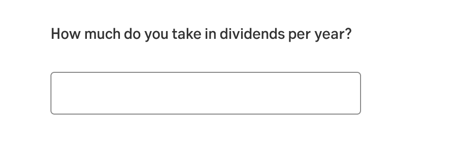
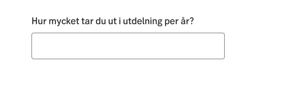
The texts should be as short as possible. Labels can but need not, be complete sentences. In some situations, we use the query format to push the information that customers need to leave, such as What do you want to buy? How much do you earn? How do you get your main income?
Query format example (Eng)
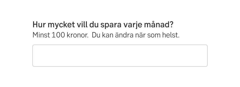
Query format example (Swe)
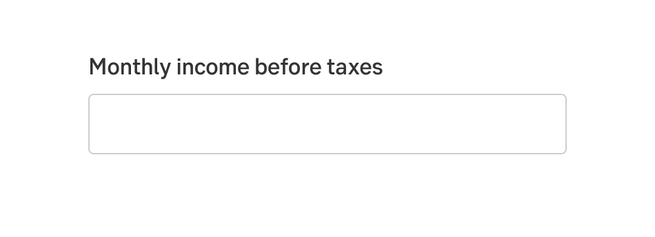
Complete sentence example (Eng)
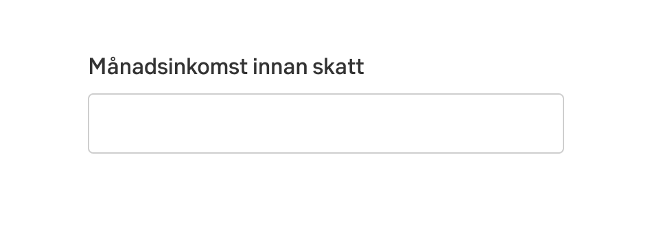
Complete sentence example (Swe)
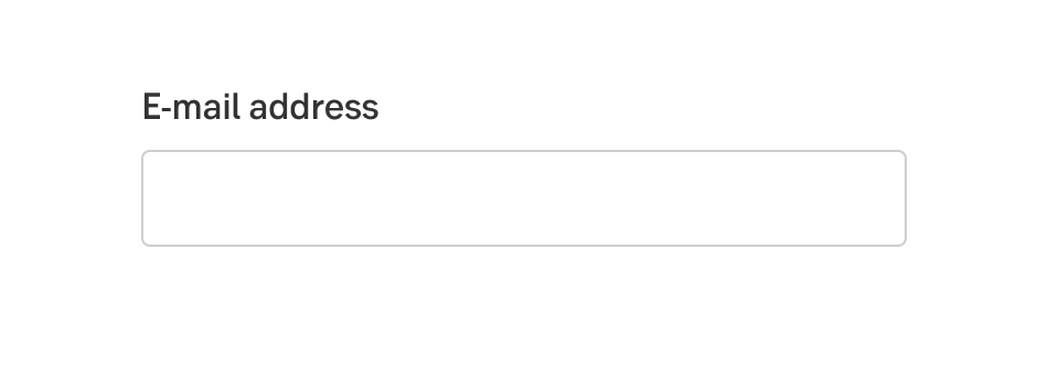
Single word example (Eng)
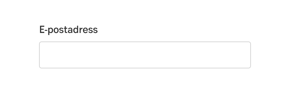
Single word example (Swe)
In the label itself, you do not need to use verbs such as Enter, Fill in, Write, or Choose that tell the customer what he or she is supposed to do. For instance, write Recipient's name instead of Fill in the recipient's name. And when the recipient's name is displayed in a summary, it is sufficient to only write Recipient.
An exception to the rule is labels for search fields, where the text often uses the verb Search or a verb + noun, such as Search industry. Read more about search fields
The label information is used to explain input field labels, column headings, and subheadings. Ideally, the short text should be self-explanatory so that no field assistance is needed. Only use the label information when something needs to be explained that is not clear from the label.
Explain what the customer needs to know to fill in the field or understand the data displayed. Be brief.
Do not use placeholder text, a text within the input field that disappears when the user starts entering text. If you want to give the user more important information about how to fill in the field, put it in the label information.
Placeholder text example
In interfaces where the customer can't enter different currencies - or we don't show other currencies than Swedish kronor (or another domestic currency) - we don't show kronor in the field. It also does not need to be clarified in the label or label information. Should we ask for another currency, it is rather what we specify.
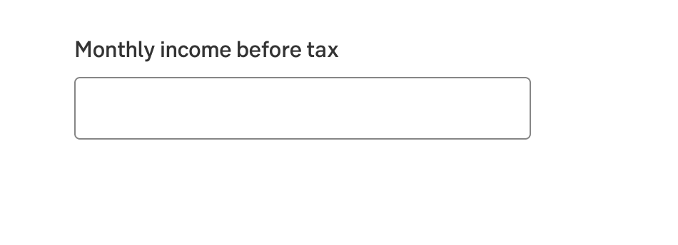
Do this (Eng)
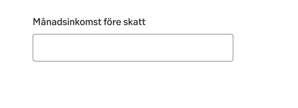
Do this (Swe)
If for some reason you still want to show kronor in the field and abbreviate it to kr, remember that it will be read out by a screen reader just as you write it. Make sure it is read out as kronor.
Do this (Eng)
Do this (Swe)
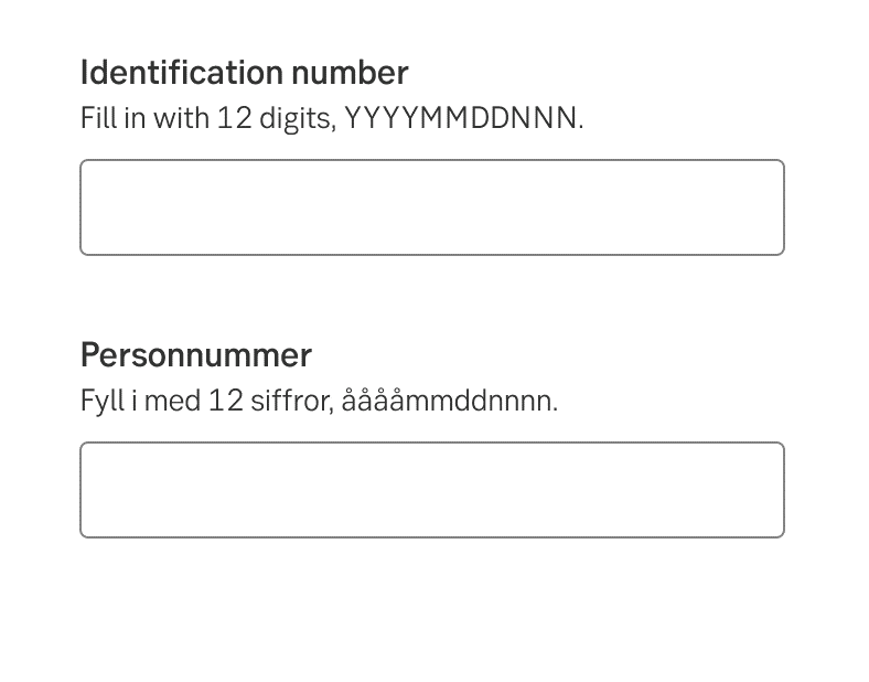
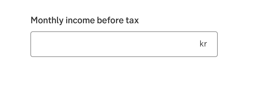
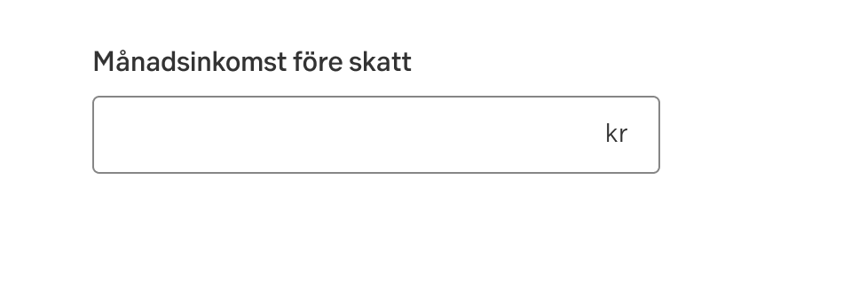
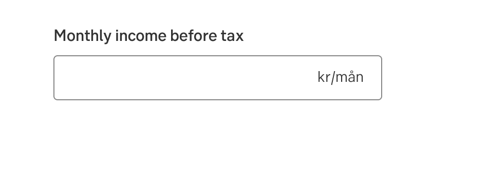
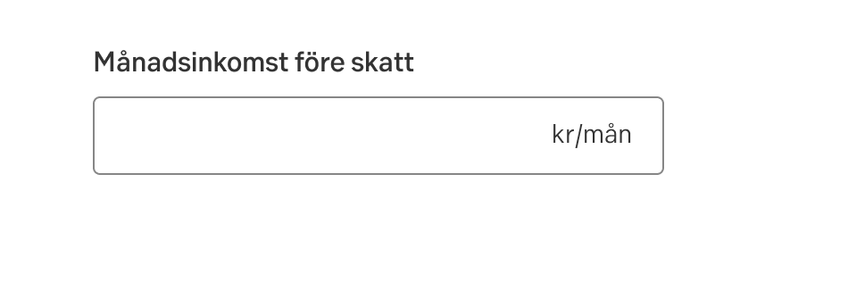
Don't write time periods such as month or year in the field. Instead write month or year in the label, since it is more accessible.
Do this (Eng)
Do this (Swe)
Don’t do this (Eng)
Don’t do this (Swe)
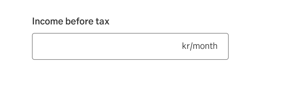
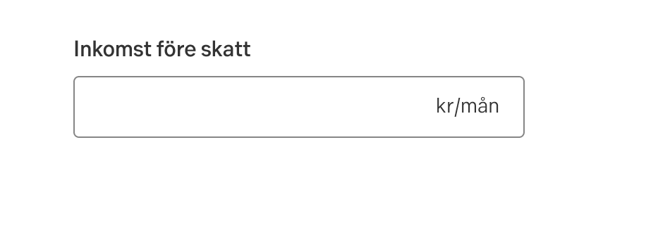
Don't reiterate the month in both label and field.
Don't do this (Eng)
Don't do this (Swe)
There is not much space adjacent to the input field. Therefore, provide a constructive suggestion on how to solve the problem instead of telling what the customer has done wrong.
Result from the latest accessibility review of the component (Chlorophyll+React): 2024-07-30