Chlorophyll
Styles
The last version of Internet Explorer, version 11, was released on October 17, 2013. This is a very long time ago when taking into account the rapid development of web technologies. These days it is often difficult and time consuming to get modern technologies to work well in this old browser. More and more frameworks are dropping support, and even Microsoft themselves has announced that they will fully drop support for IE in their own services in 2021.
Consequently, we have decided to not include support for IE in the Design Library website.
Luckily, there are modern options in active development. Please use Firefox, Edge or Chrome instead.

A component that navigates between data that has been divided into separate pages.
Styles
Javascript
We use pagination to divide data into several pages and let the user navigate between them. By doing this we prevent pages from becoming too long and overwhelming. Pagination is similar to physical books with page numbers.
Use it when you have a lot of data that can't be easily presented on one screen. Divide the data automatically with an algorithm that adjusts the data to the amount of space it is given.
The placement of the component varies but is very important. The component should be placed at the top and the bottom of the data set, if the amount of data is so long that the user can't see the top and the bottom at the same time. By doing so you eliminate the unnecessary activity of scrolling up and down only to navigate between pages. If the user can see the top and the bottom at the same time it is enough with placing the component at the bottom or the top.
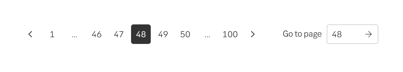
The pagination component is transparent so that it can be discretely placed on both a grey or white background. The first and last pages are always visible in the component. This gives the user an understanding of the total amount of data. The page that the user is currently viewing is identified by a dark grey square that is not clickable. All of the other squares are transparent and clickable. If the user hovers a square a discrete shadow appears around the square. There are two squares with arrows, they help the user to navigate to the next or the previous page.
It can be a good idea to combine pagination with filtering and the possibility to search within the data set. If the user needs to be able to jump straight to a page there is an optional component that is placed on the right-hand side that allows the user to enter a page number and go straight there.
Default placement is under the data-set to the left. However, place it where it makes sense (left, centered, right) related to other components and layout of content. If the data-set is so long that user has to scroll to see it, place a pagination both at the bottom and the top, or perhaps sticky to the bottom.
For screen reader users to understand the pagination functionalities we use ARIA regions, properties, or states as follows
Result from the latest accessibility review of the component (Chlorophyl): 2024-07-30