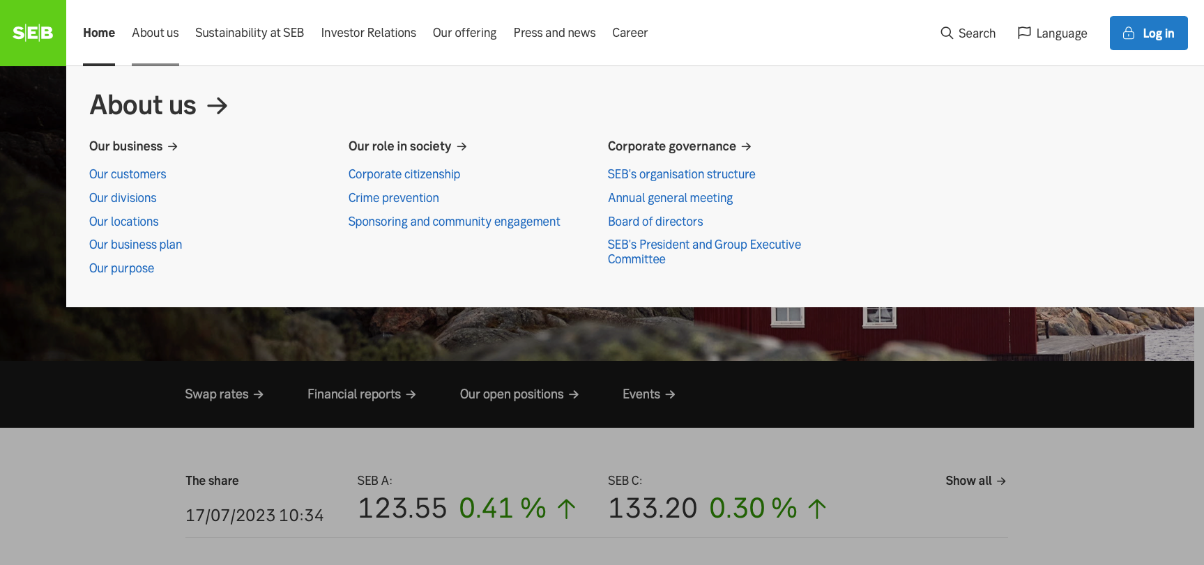
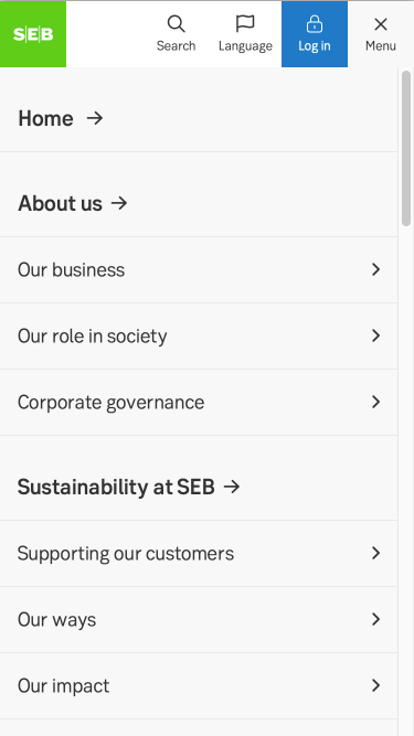
Mega menu
An expanded navigation menu featuring multiple columns of categorized content and visual elements, providing users with a comprehensive and visually appealing way to access information on a website.

Component meta
Component identifier
- component-megamenu
Design principles
- Everyday firstFrictionless
Guidelines
Short description
A "mega menu" is a type of expanded navigation menu that typically displays multiple columns of content, providing users with a more extensive set of options and information compared to traditional drop-down menus. It often includes images, icons, and additional descriptive text to enhance the user experience. Mega menus are commonly used on websites with a large amount of content or complex hierarchical structures.
When and how to use it
They are particularly useful when:
- Navigation hierarchy is deep: If your website has numerous categories and sub-categories, a mega menu can help users quickly find and access specific sections without having to navigate through multiple pages.
- Content variety: If you offer a wide range of products, services, or resources, a mega menu can display a selection from each category, enabling users to see more options at once.
- Visual hierarchy: Mega menus can incorporate visuals such as images or icons to create a visual hierarchy, making it easier for users to scan and locate the information they need.
- Engaging users: Mega menus can serve as a platform to showcase featured or popular content, promotions, or important announcements, encouraging user engagement and interaction with your website.
However, it's important to consider the usability and design aspects when implementing a mega menu. Proper organization, clear labelling, and intuitive navigation are crucial to prevent overwhelming users with excessive information and to maintain a user-friendly experience.
Remember that the decision to use a mega menu should be based on your specific website's needs, content structure, and user expectations. It's recommended to conduct user testing and gather feedback to ensure the menu is effective and enhances the overall user experience.
Placement
It’s always accessed via the top bar.
Do's and don'ts
Do
- Group similar items: Arrange menu items into logical categories and subcategories, making it easier for users to find what they're looking for.
- Use clear and concise labels: Ensure that menu labels accurately represent the content they link to, using familiar and easily understandable language.
- Provide visual cues: Incorporate icons or images to enhance navigation and make it visually appealing.
- Highlight important or popular content: Feature important announcements, promotions, or popular items to catch users' attention and increase engagement.
Don'ts
- Avoid overwhelming users: Do not overload the mega menu with excessive options, as it can confuse and frustrate users. Keep it focused and prioritize the most important content.
- Avoid long lists: If a category has an extensive list of subcategories, consider using a combination of columns and submenus rather than displaying them all in a single long list.
- Don't rely solely on mega menus: Supplement the mega menu with other navigation elements, such as breadcrumbs or a sitemap, to provide alternative navigation options.
- Avoid ambiguous or generic labels: Use descriptive labels that clearly indicate what each menu item represents, avoiding generic terms that may confuse users.
- Don't hide critical content: Avoid burying essential or frequently accessed content deep within the mega menu. Ensure important information is easily accessible from the main navigation.

Mobile

Desktop
UX text
-
Accessibility
-
