Chlorophyll
Styles
The last version of Internet Explorer, version 11, was released on October 17, 2013. This is a very long time ago when taking into account the rapid development of web technologies. These days it is often difficult and time consuming to get modern technologies to work well in this old browser. More and more frameworks are dropping support, and even Microsoft themselves has announced that they will fully drop support for IE in their own services in 2021.
Consequently, we have decided to not include support for IE in the Design Library website.
Luckily, there are modern options in active development. Please use Firefox, Edge or Chrome instead.

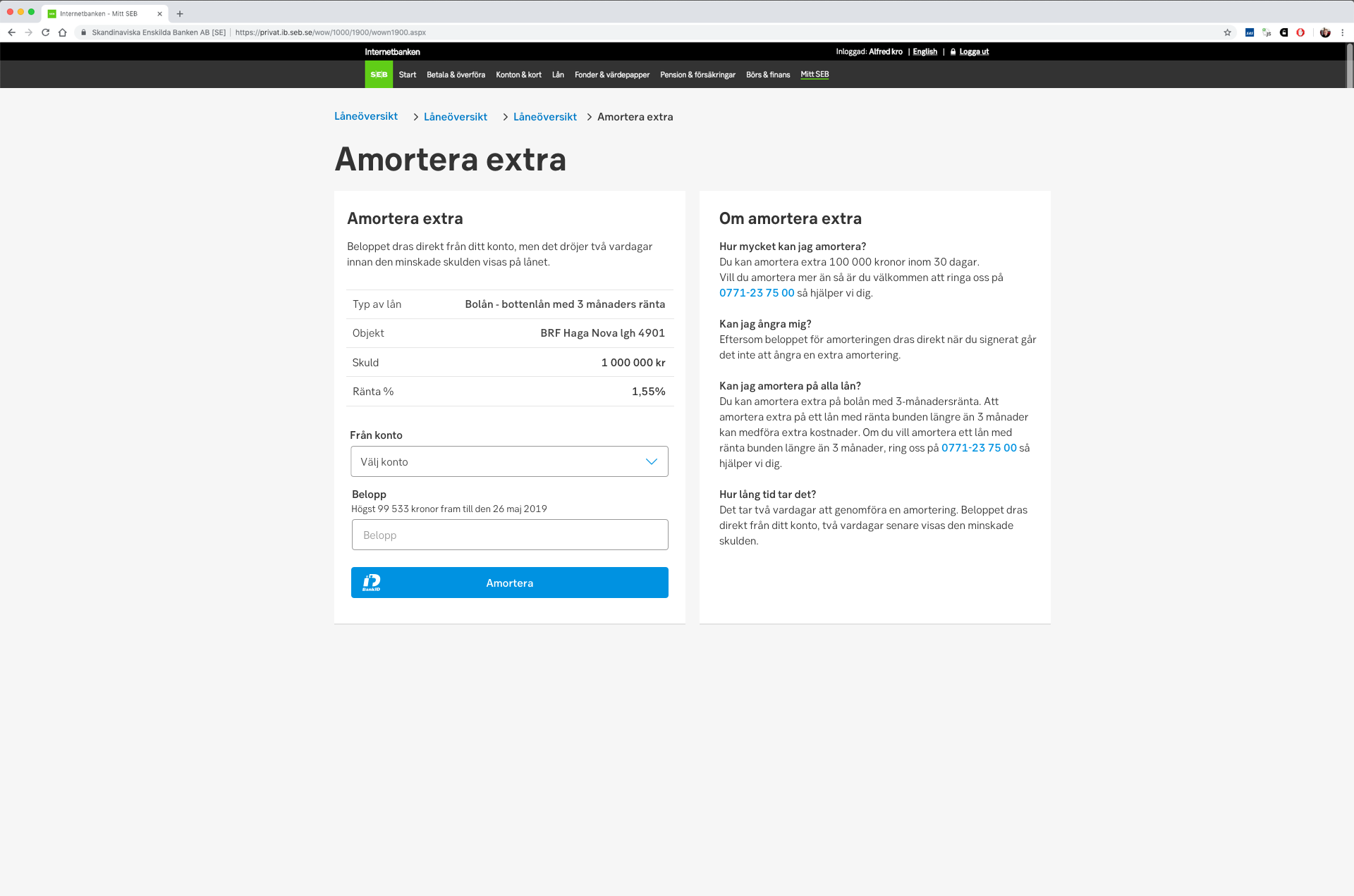
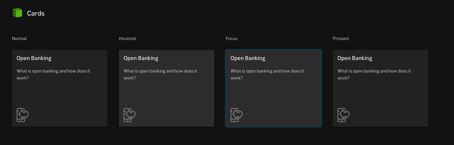
A card is container for short content, related pieces of information, and action on a specific content.
Styles
Javascript
A card's purpose is to serve as a clear entry point to more detailed content located on another internal or external page or application. To guide and make it easy for the user to scan and find relevant information, the content within the card should be clear, concise and easy to understand. Cards could also contain content such as forms, graphs, images, buttons, icons and text links.
When serving related content available on another section, page or articles, cards could be a good choice to use. Cards could also be an entry point for starting user flows such as onboarding, wizards, input, signing etc.
Cards is an element without a determined place in the interface. Where is decided on context, purpose and need. There could also be multiple cards within the same screen with different places (hierarchy) depending on which device it is displayed on.
Cards might be expanded to display additional content inside the card.
The whole card could be linked, otherwise there could be text links or buttons within the card that sends the user to the related page/sections/application.
To add contrast between its background and the surface it appears on, the cards have a smooth drop shadow.
Result from the latest accessibility review of the component (Chlorophyll+React): 2024-07-30
Read about Pattern: Dark mode