
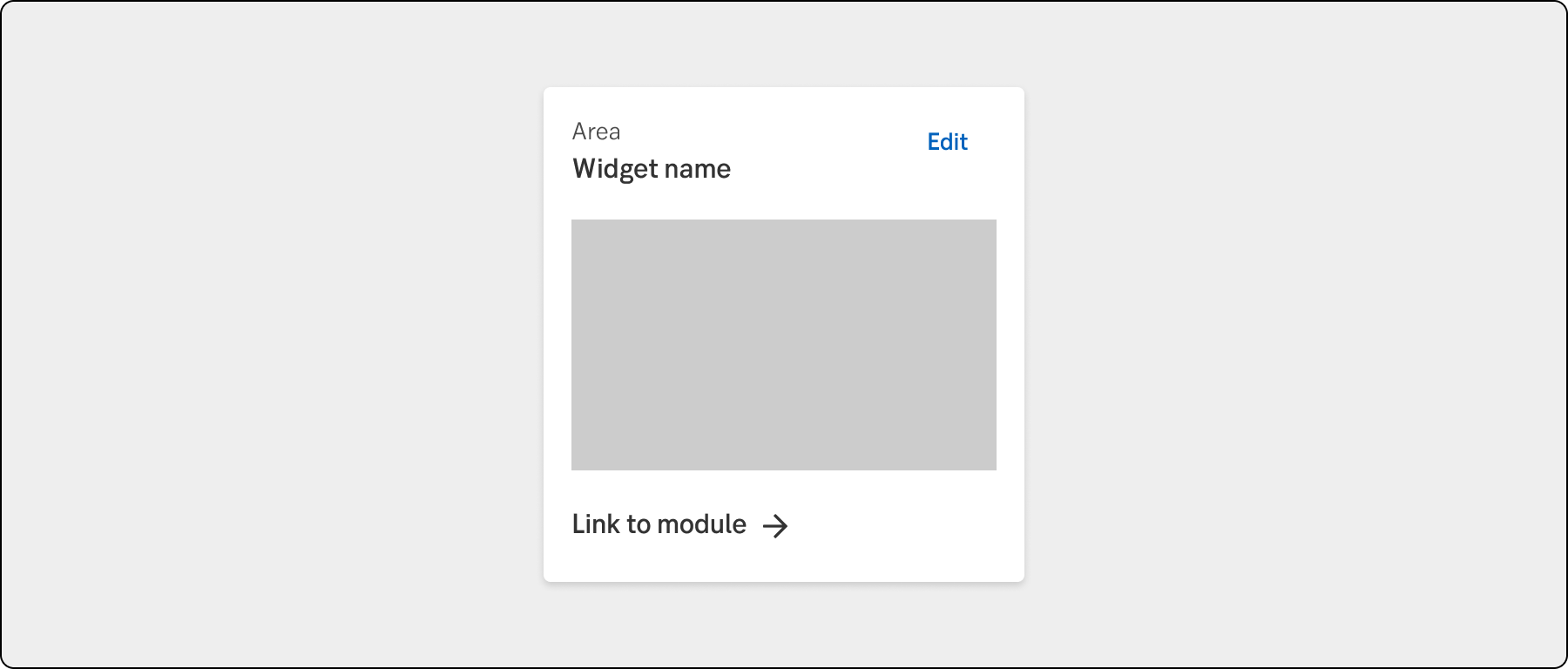
Widget
A widget acts as a configurable preview for a module and/or page.
Component meta
Component identifier
- component-widget
Design version
- 2023-08-02
Design principles
- Trigger insight
Guidelines
Short description
A widget is a small, interactive element that provides a glimpse of useful information from an application or page within the channel to the user. It adapts to its context, displaying dynamic and relevant content that is specific to the user’s needs.
When and how to use it
Some guiding principles
Less is more
Limit the amount of information in the widget. By only displaying the most relevant and important information, users can more easily find what they are looking for and get a clear overview.
Simplicity
Widgets should be designed with simplicity in mind, avoiding unnecessary complexity or features, the MFE page that the widget belongs to hold the more complex functions.
Flexibility
Widgets should be flexible enough to be used in a variety of contexts and scenarios, This includes responsiveness in size and information as well as allow for customization to meet the specific needs of different users.
Widget customization
We want to let the customer add and manage their widget information. This could be on different levels, for example adding or removing widgets on the page or customizing the information inside the widget.
Example of widget customization
To avoid cluttering the account widget on the start page by displaying all the user's accounts, we will limit the widget to show four accounts. However, we will allow the user to select which four accounts they wish to view. This type of customization should be done in a slide out.
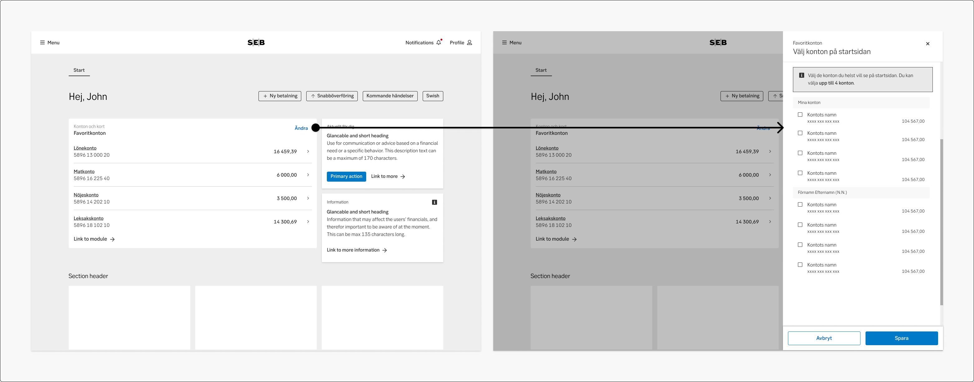
Example of widget customisation
Do's and don'ts
Do
- Show a narrow selection of information
- Show contextual actions
- Be specific and contextual if the widget requires attention from a user
Don't
- Try to not overcrowd the widget with information, less is more
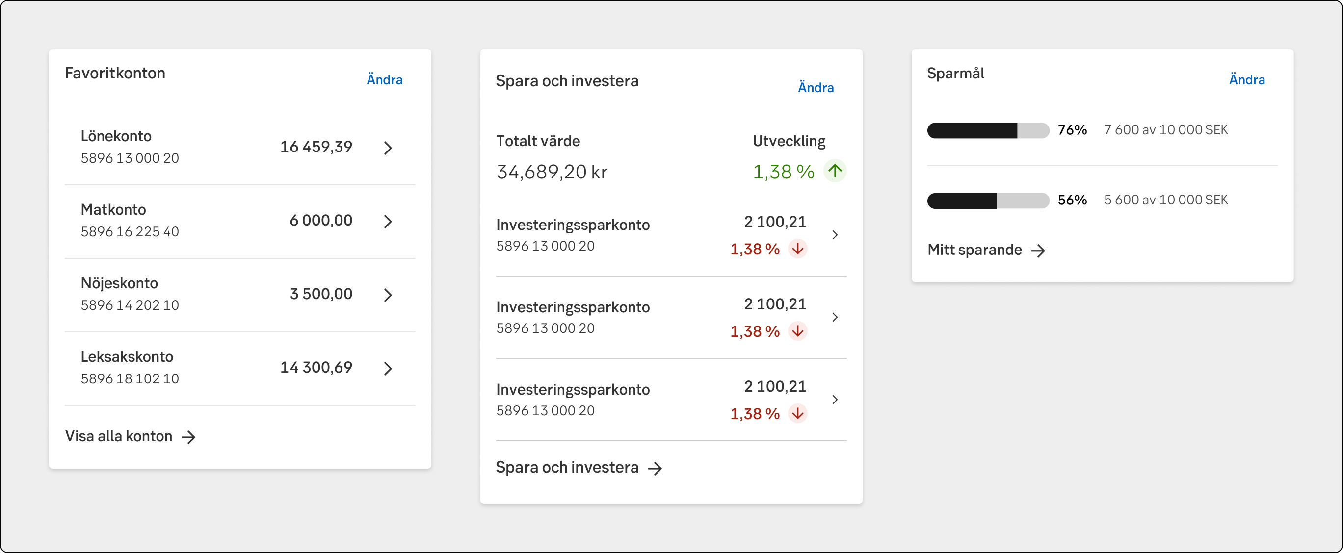
Example
UX text
-
Accessibility
-
Specification
- Details: Specification in Figma
- Instruction: How to access Figma