Chlorophyll
Styles
The last version of Internet Explorer, version 11, was released on October 17, 2013. This is a very long time ago when taking into account the rapid development of web technologies. These days it is often difficult and time consuming to get modern technologies to work well in this old browser. More and more frameworks are dropping support, and even Microsoft themselves has announced that they will fully drop support for IE in their own services in 2021.
Consequently, we have decided to not include support for IE in the Design Library website.
Luckily, there are modern options in active development. Please use Firefox, Edge or Chrome instead.

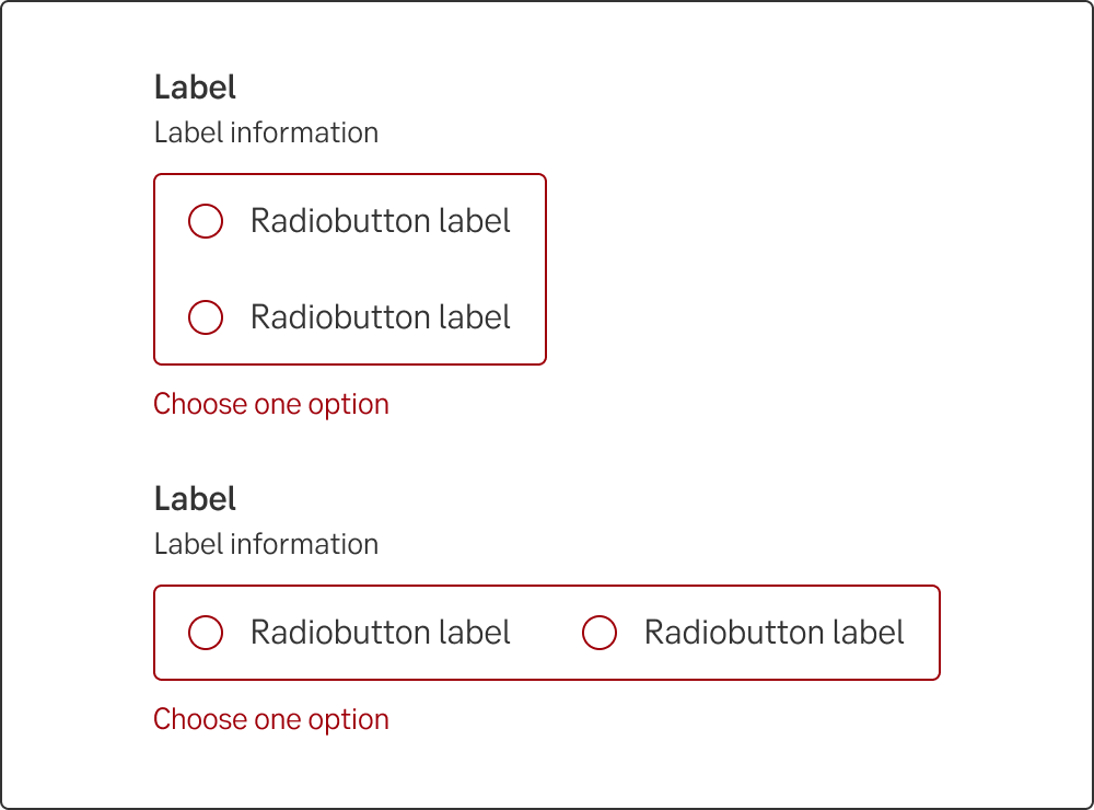
The radio button, always used as a set of at least two, allows the user to select only one of the presented options.
Styles
Javascript
A radio button allows a user to select a single item from a predefined list of options. Radio buttons are common to use in forms, i.e when you apply for a loan and need to enter "Yes" or "No".
Users should be able to understand their options as well as undo and redo their actions. For that reason radio buttons should always have one option pre-selected.
The radio button component should be used when the user are presented with a list of options where only one choice can be selected. A user can immediately scan how many and what options there are. If you have to present a lot of options or have a lack of space, use a dropdown.
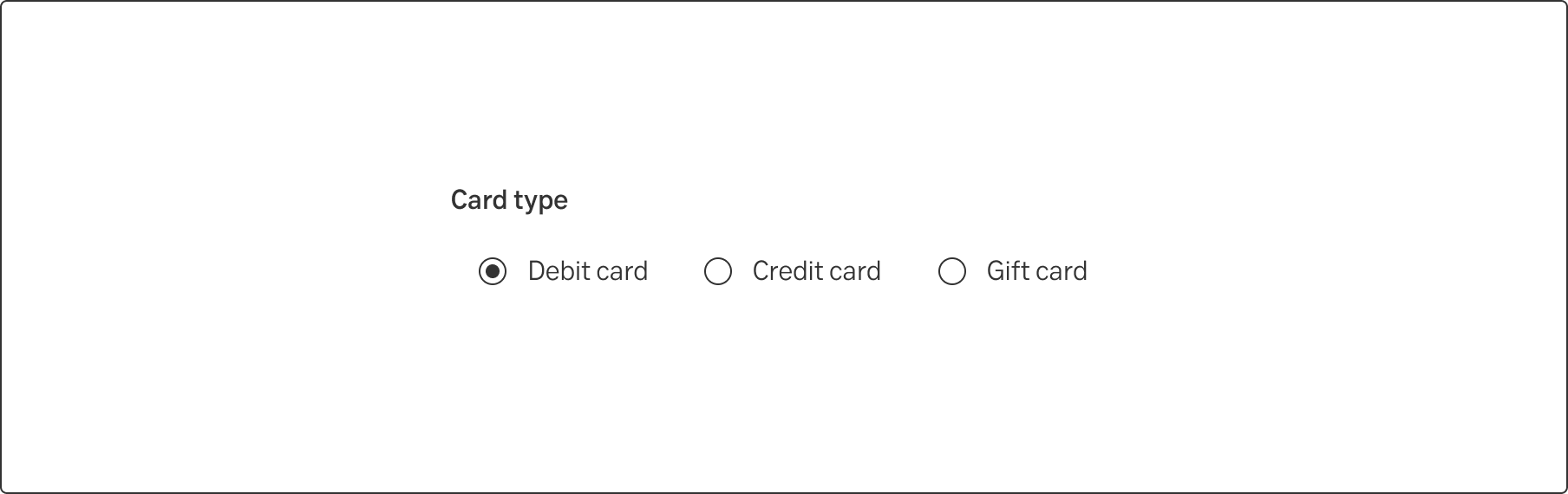
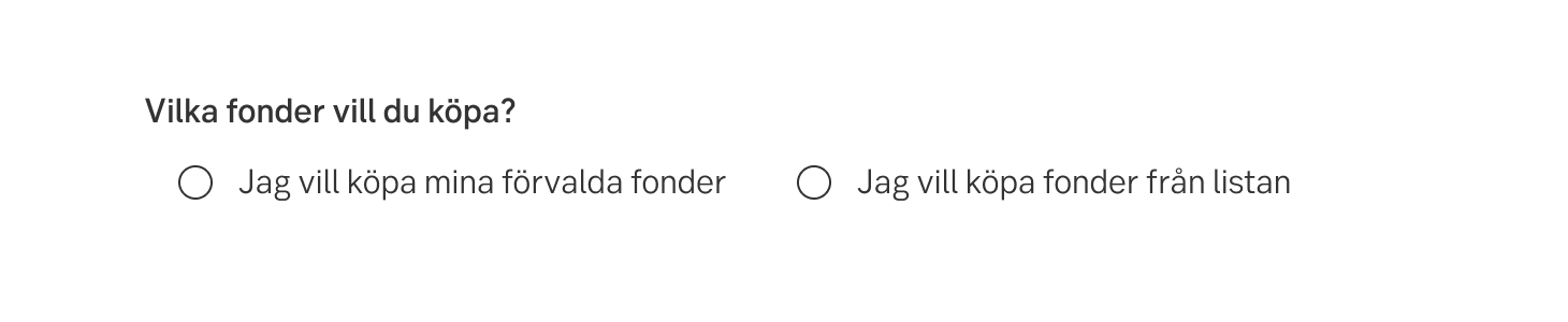
There are perks with both vertical and horizontal placing. If there are two options, it’s recommended to place them horizontally. When there are more than two options, place the radio buttons vertically.
Some components are available in two sizes to support different layout needs and use cases:
Note.The small variant is fully supported only in the interim design, which visually aligns more closely with DV23.
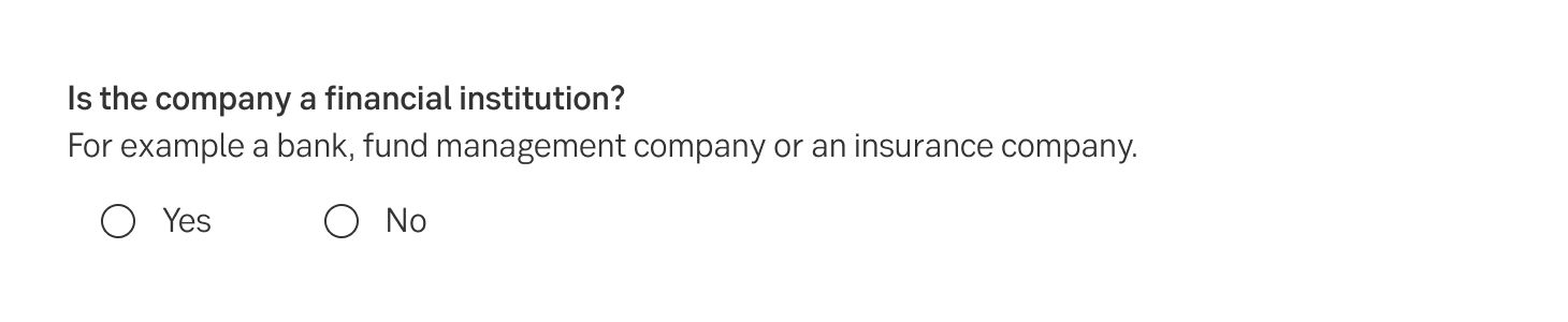
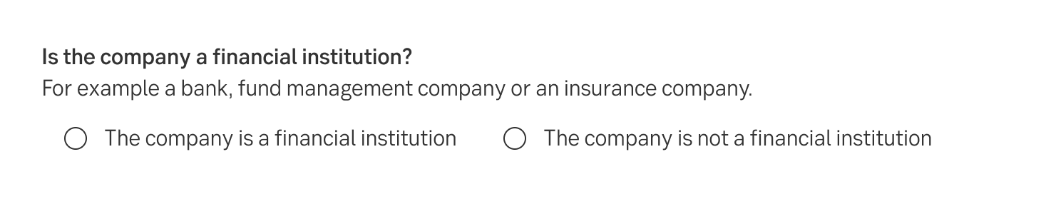
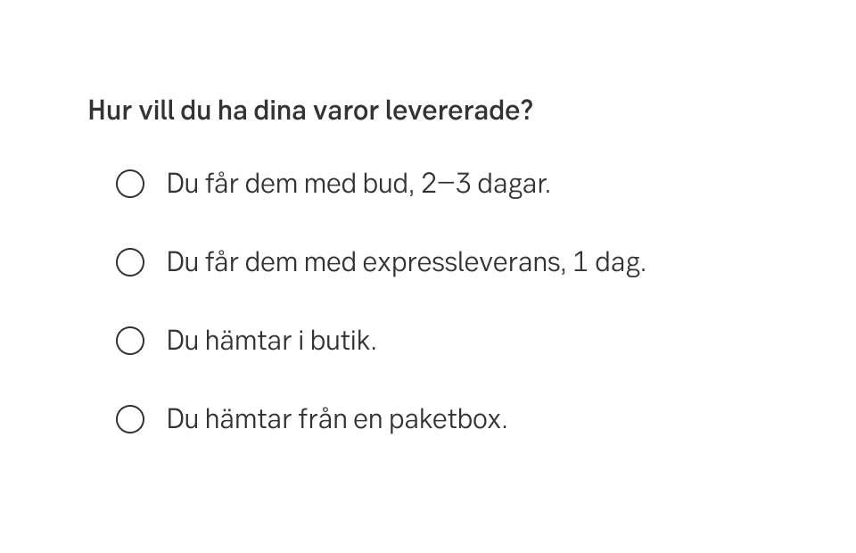
Adapt the radio button options to the field label. If the field label is a yes or no question, the answer options should be yes and no and nothing else.
In English:
Do this
Don't do this
In Swedish:
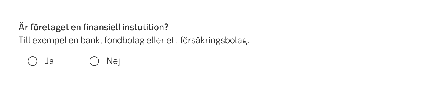
Do this
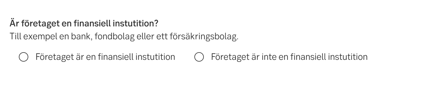
Don't do this
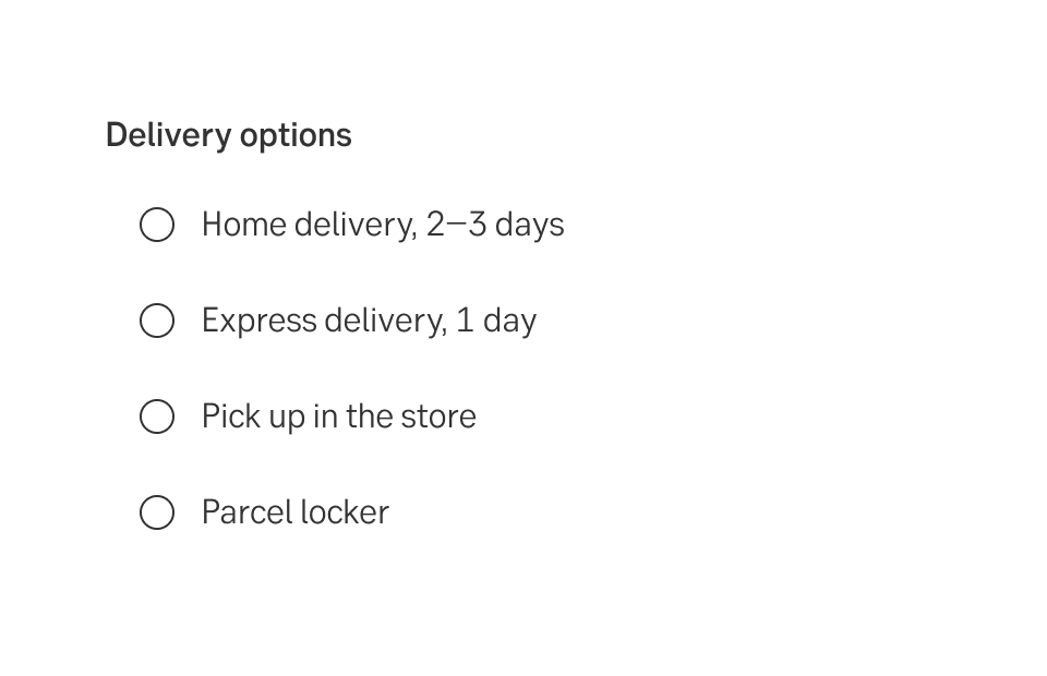
Write consistent options. Decide if they should
In English:
Do this
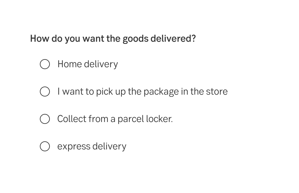
Don't do this
In Swedish:
Do this

Don't do this
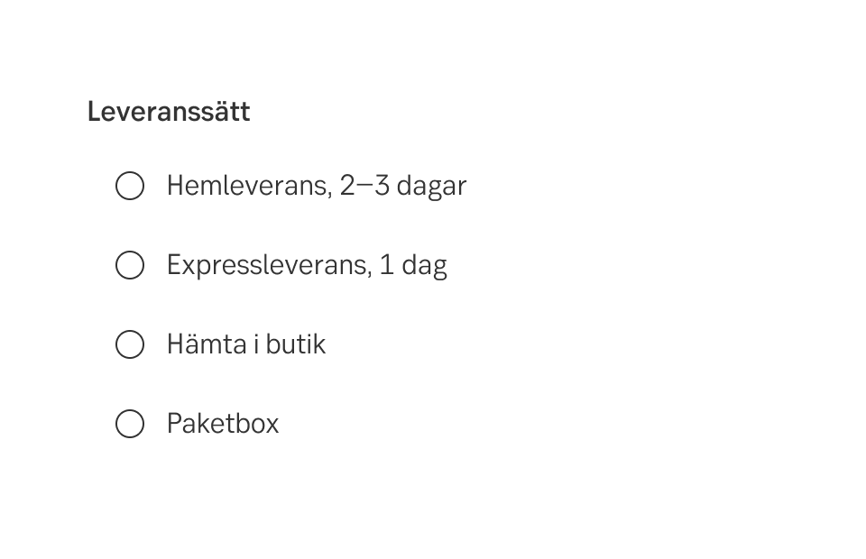
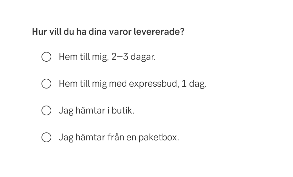
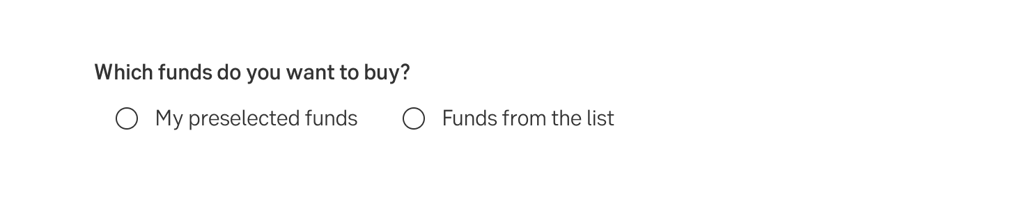
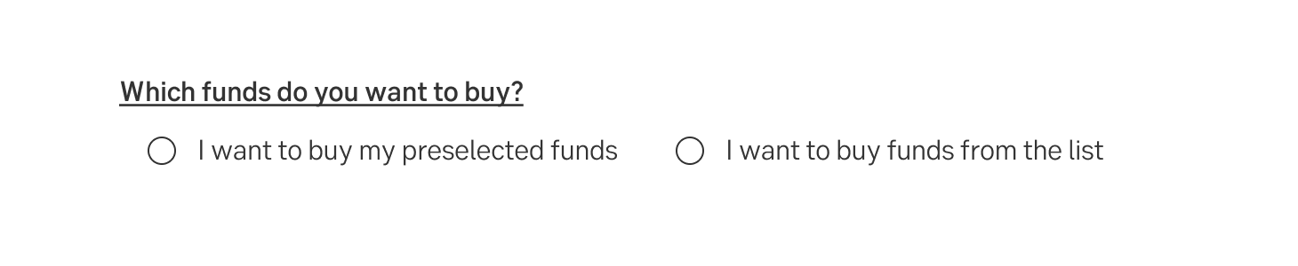
Remember, it is the bank that asks the question and the customer who answers. Therefore, the label should be in the you-form and the answer in the I-form. However, most of the time, the answer does not include the I-form because that becomes redundant, you understand that it is the user who answers.
In English:
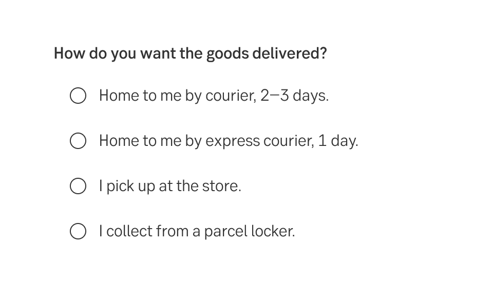
Do this
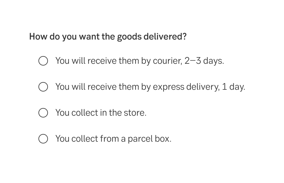
Don't do this
In Swedish:
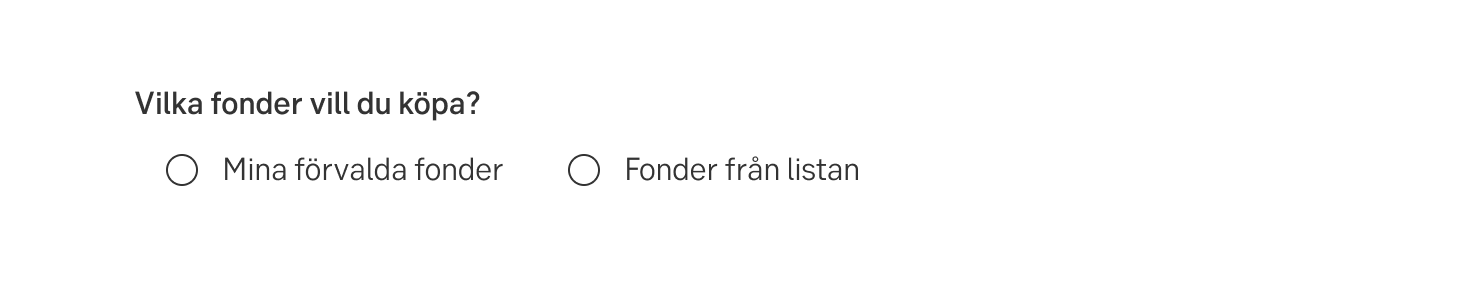
Do this
Don't do this
Keep the text to the point by excluding the I-form in some contexts.
In English:
Do this
Don't do this
In Swedish:
Do this
Don't do this
Plain texts are as important as always. The customers must understand both the words and the context. Make sure that the options cover all possible choices and are explicit so that all intended customers can fill in the form. If there could be other options, add the option Other and an input field where the customer can explain.
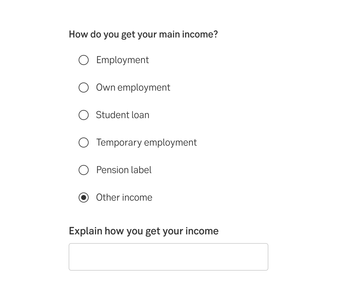
In English
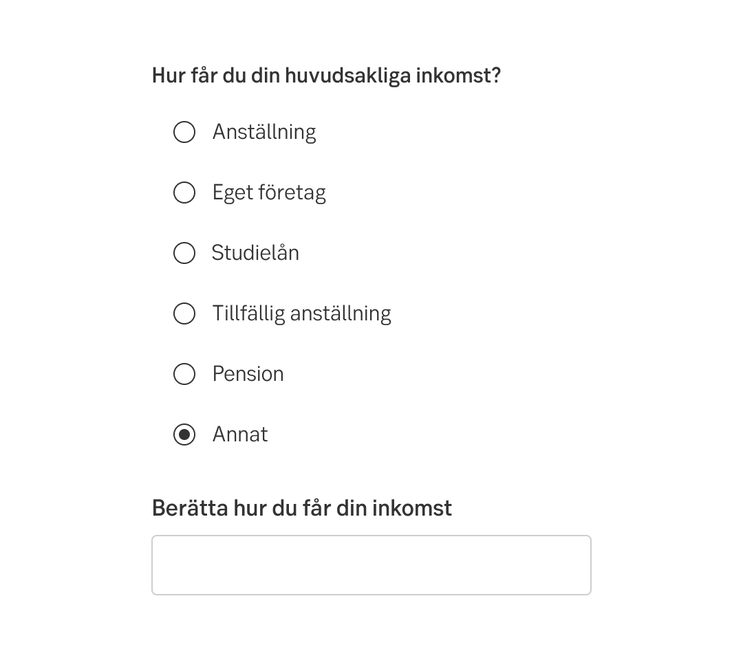
In Swedish
From accessibility perspective it is recommended to place radio buttons vertically, to make it more obvious which label corresponds to which option.
Have one option default selected.
Result from the latest accessibility review of the component (Chlorophyll, React): 2023-02-22