
Form design
A form is a structured page with spaces in which to write or select.
Component meta
Component identifier
- pattern-formdesign
Design principles
- Everyday first
Guidelines
Short description
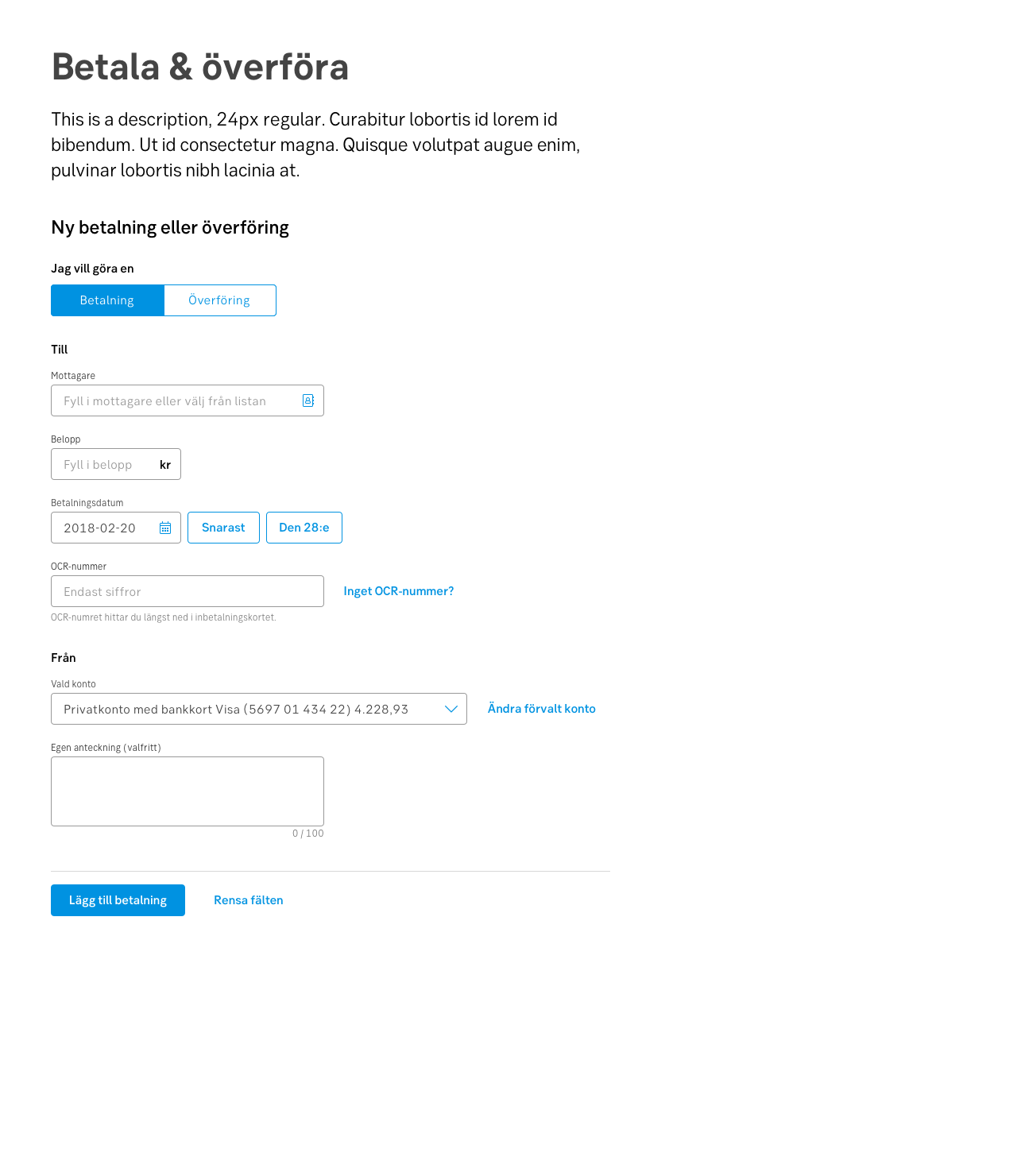
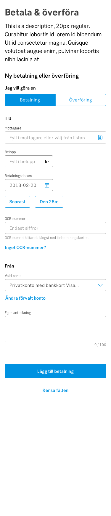
Forms are a great way to simplify complex processes, while also being able to validate the requested input. Forms can come in a single page or as a part of a multipage flow/wizard.
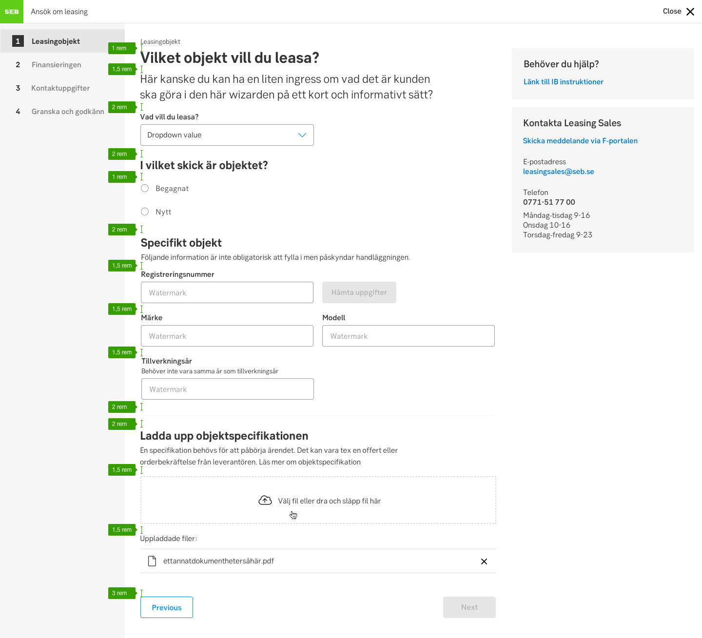
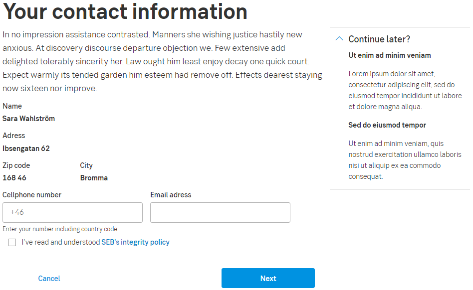
Form example
When and how to use it
A form is a type of conversation between the user and the app. Users can be reluctant to fill out forms, so make the process as easy as possible. Make sure to ask only what you really need and always test your form design on real people.
Group the information
Group related information into logical sets and use a logical order from the user's perspective. The flow from one set of questions to the next, will then better resemble a conversation and make more sense to the user.
Keep it simple and down to a bare minimum of fields. Use the ability to show/hide parts of a form depending on the answer to a question.
Mandatory or optional?
Consider all input fields carefully so they are all mandatory. But if you do need an optional input, add the word “optional” (or "valfritt") for non-required fields.
Component: input fields
Error handling
Pattern: Error handling
Behaviour
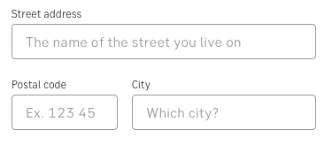
Use the space wisely:
- In narrow resolutions (such as for mobile) expand the input elements and buttons to make use of the whole viewport width.
- There is no need to use the whole width of a wide viewport. Stack the form elements on top of each other in new rows instead of aligning them horizontally.
Component: Button
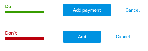
Do's and don'ts
Do
- Make CTAs descriptive and state the intent
- The user will make sense of the form much faster if there are logical groups
- Use positive inline validation - reinforce a positive behaviour while typing
Don't
- Don't stack fields horizontally, keep it below two or three at the most
- Avoid making input fields too long - they should match what is required
Accessibility
Make sure users can focus on and edit every field using only the keyboard.
Components
- Form components: Button, Checkbox, Dropdown, Input field, Radio button, Stepper, Section expander, Sticky bar
- Form patterns: CRUD-pattern, Contextual help-pattern
- Feedback: Alert ribbon, Progress indicator, Tooltip
Templates
Form
Desktop
Mobile