
Widget areas
Rules and guides about the context where we place widgets.
Component meta
Component identifier
- pattern-widgetareas
Tags
Design principles
Guidelines
Types of areas
Widgets can be used in a few different contexts:
- Start pages: The first page a user lands on in a channel, summarizing and guiding for the full site.
- Landing/theme pages: Pages dedicated to a certain theme i.e. savings.
- Complementary content: As related content on a page next to the main functions.
- Dashboards: User controlled dashboards where it's possible to change widgets and layout.
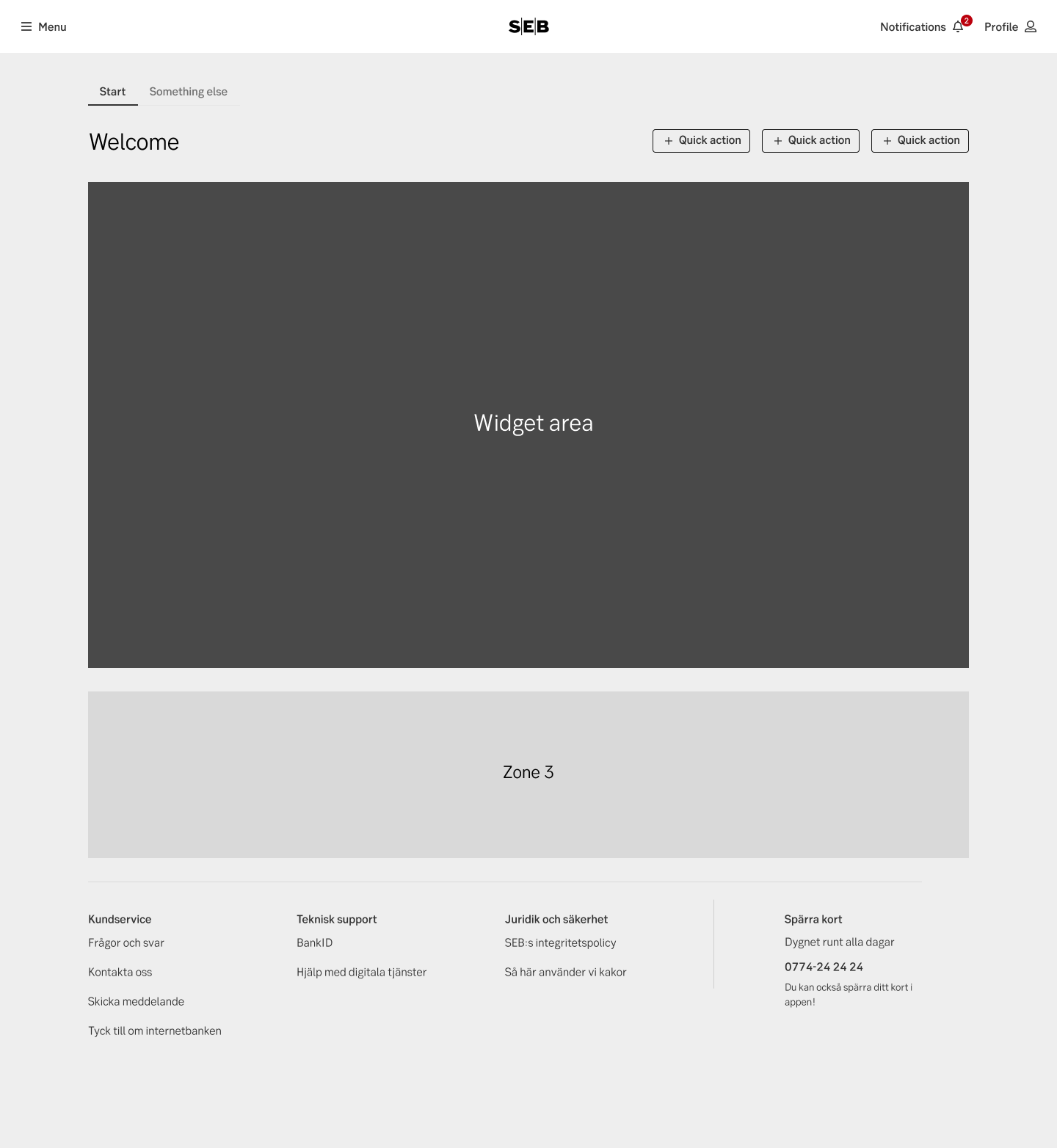
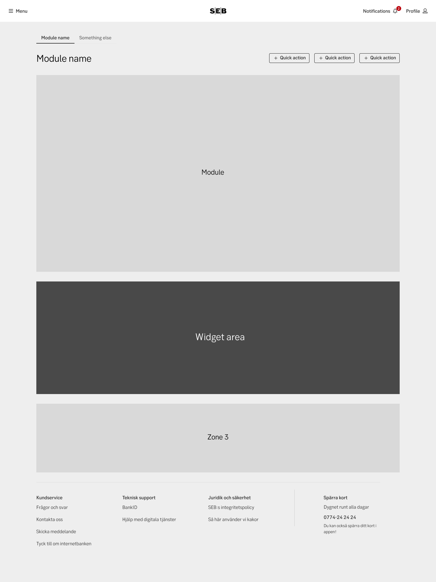
Start pages
The start pages are controlled by the channel owners. They follow strict business rules regarding layout for where which widget may go, and how they are combined with other content areas. Sizes and position on the page may vary across different responsive viewports. The flow of widgets are in essence hard-coded by the shell team to follow these rules.
Start page
Examples
Example: Nexus
Example: IBP
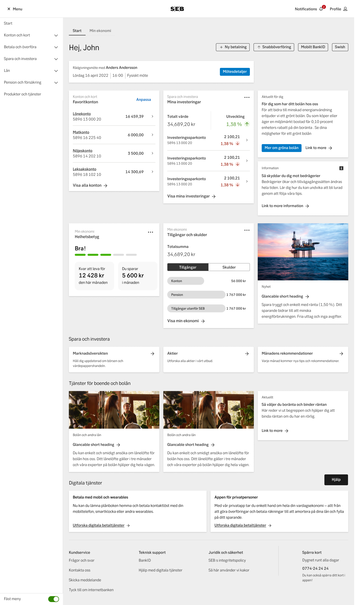
Landing/theme pages
Landing/themes pages are controlled by a product area. They typically follow business rules regarding placement of widgets and how different holdings or engagements affects the view. Sizes and position on the page may vary across different responsive viewports. How much control is left to a user is up to the area.
Landing page
Complementary content
On module pages there may be an additional area with widgets. These widgets will act as complementary content and related navigation. How much users will be able to customize these widgets will be up to the designer/owner of that module-page. An example might be showing an ISK you might want to place widgets for savings-accounts or how the stock-market is going.
Complementary content
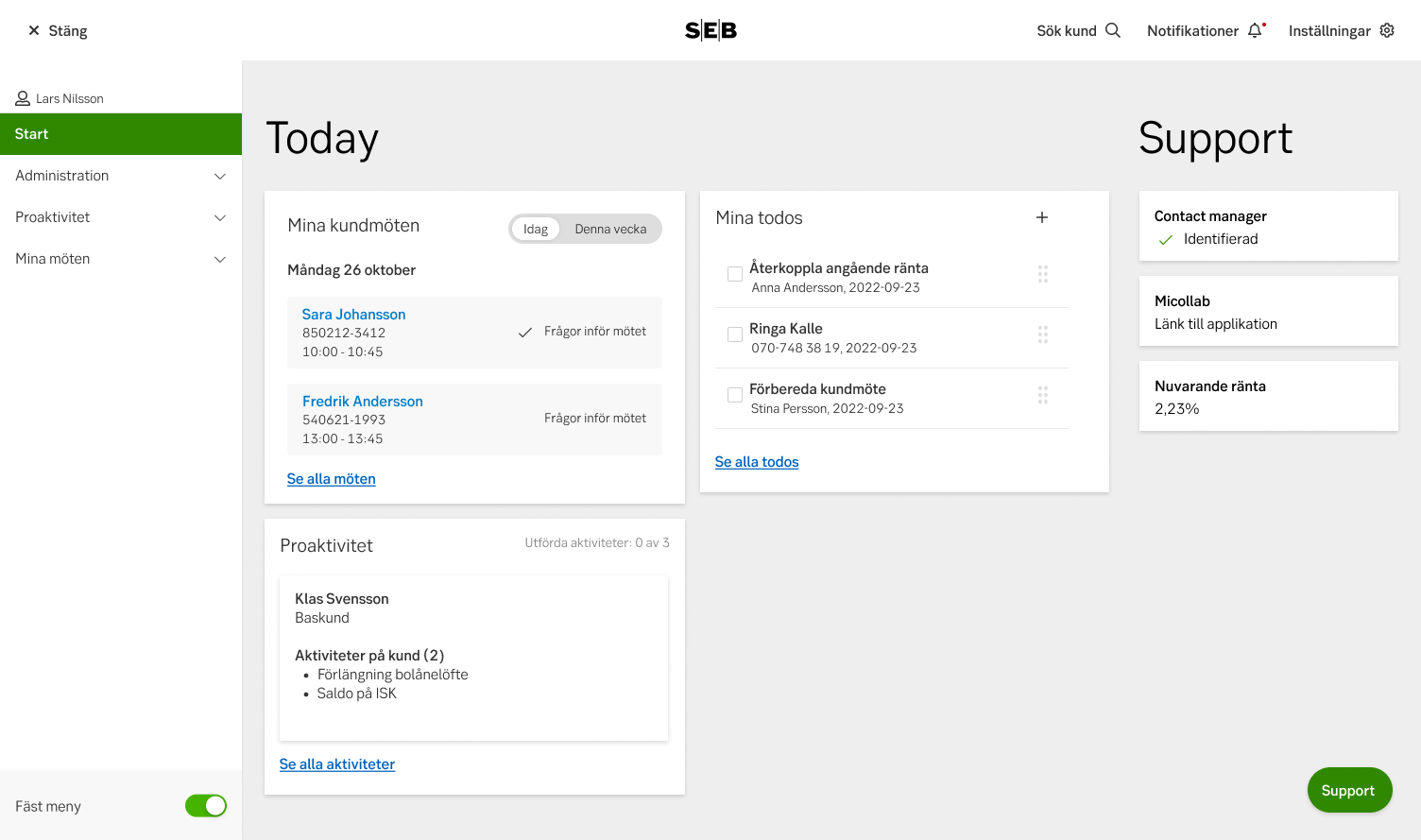
Dashboards
On dashboards, users are free to customize a lot, if not everything. Users can decide what widgets are used, where they are placed, how big they are, as well as customizing the content inside. Typically only used for advanced user groups.
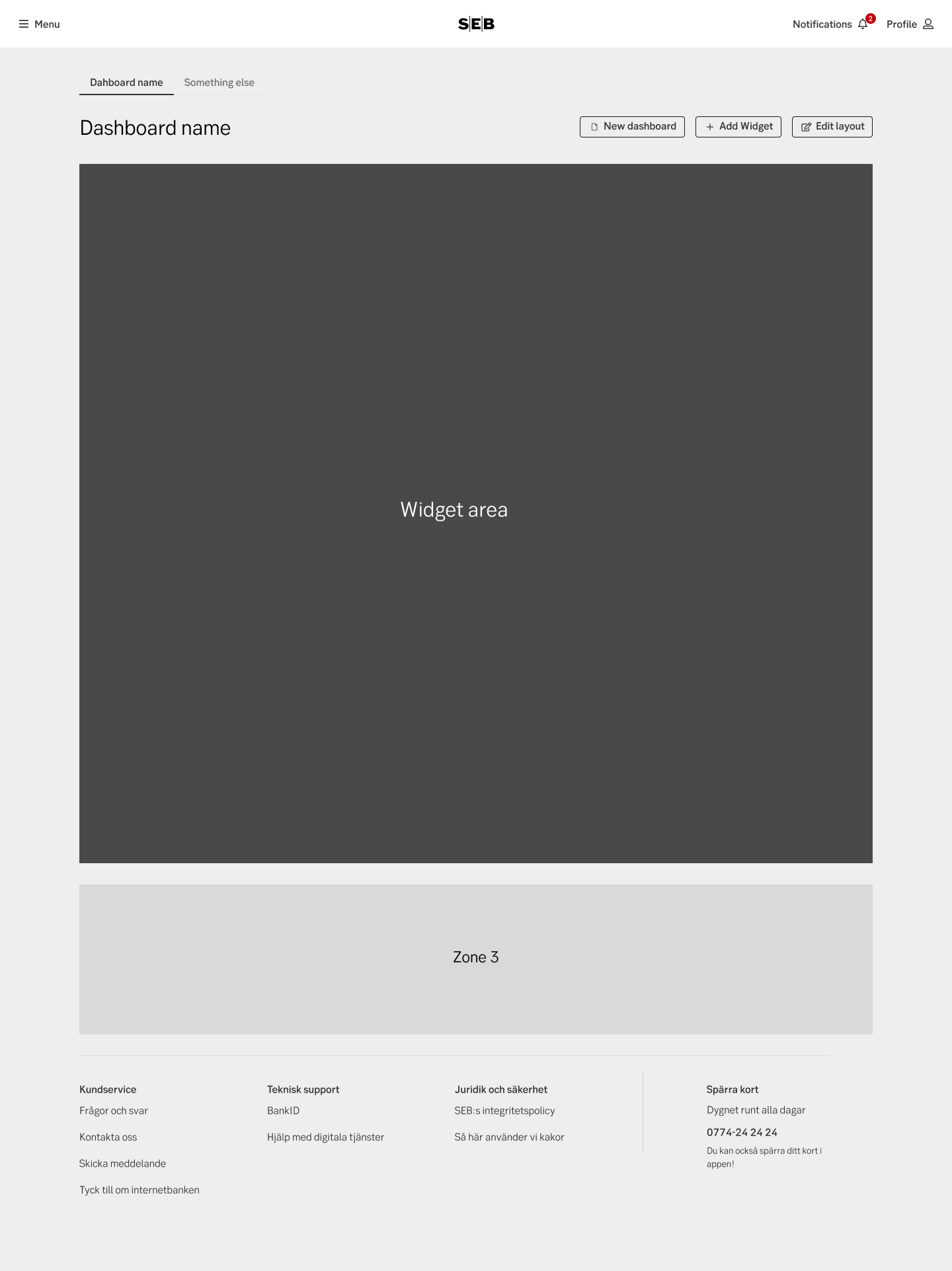
Dashboard
Examples
Example: Dashboard