
Focus state
Any keyboard operable user interface has a mode of operation where the keyboard focus indicator is visible.

Component meta
Component identifier
- pattern-focusstate
Tags
- Pattern
Design principles
Guidelines
Short description
When an interactive element in an interface is focused, it should have a clear visual representation of its focused state. It is essential for navigating with a keyboard. Users who rely on this state may include those who have physical mobility limitations, attention limitations, short term memory limitations, or a power user that uses the keyboard for faster navigation.
Behaviour
Focus visible
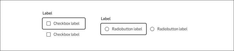
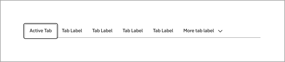
The default focus visible for interactive components is a dark border around the element that has a minimum of 2px offset from the interactive element.
Special use cases
In some use cases, components may need special adjustments in order to meet the requirements and be visually appealing.
Example
- A button on an image. Its focus visible outline might not fulfill the contrast ratio between the focus visible outline and the image so an alternate visual indication must be created.
Examples
Checkbox and radio buttons
Tabs
Inline text link
Accessibility
WCAG
At SEB we comply with WCAG Level AA for Focus Visible. All focus states in our application should live up to the success criteria for Focus Visible.
Techniques
This focus state pattern has also been created with these techniques in mind:
- Use HTML elements that are highlighted by the user agent when they receive focus.
- There needs to be a distinct visual change to draw attention to the element.
- Focus states need to have at least a 3:1 contrast ratio against the background color.
- All interactive elements in the interface need to have a focus state, not only buttons and links.
- The thickness of lines used for a focus state are not smaller than 2px. Smaller lines may be technically accessible but will be hard to see. Try using a squint test to see how low vision users might be viewing your site.