
Navigation overview
An overview of our navigational features.
Component meta
Component identifier
- pattern-navigation
Tags
Design principles
- Everyday firstFrictionless
Guidelines
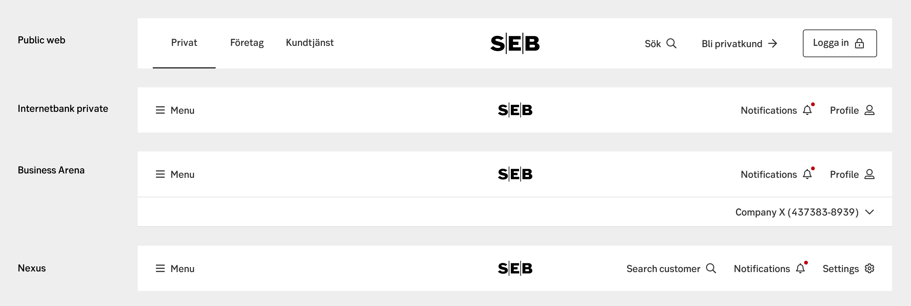
At SEB we have many components handling navigation. This page gives an overview of the different features we use, and some rules about how to combine them. We made them into three categories: main navigation, sub navigation, second navigation and micro navigation.
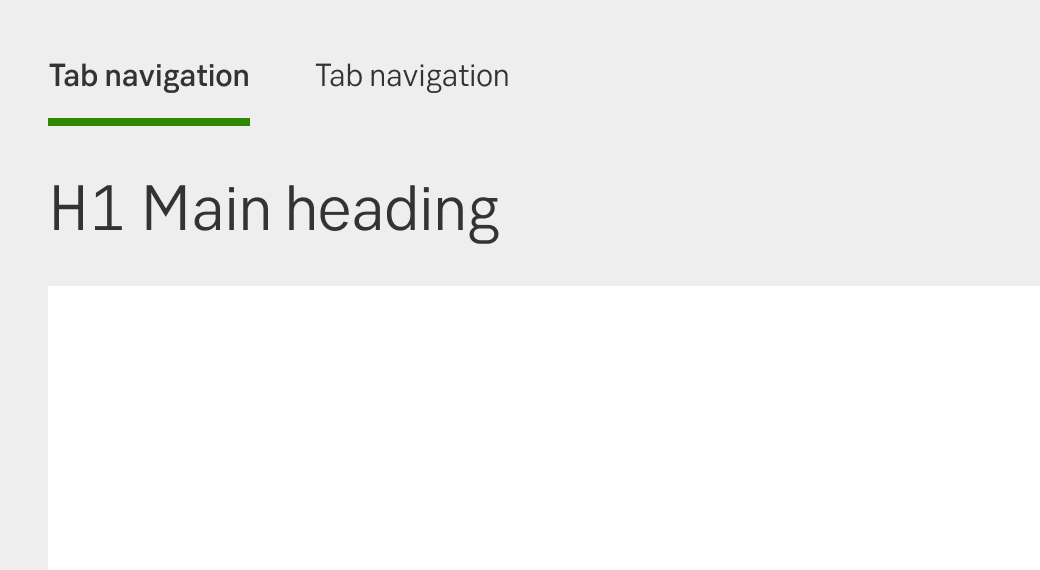
Main navigation
The main navigation of a site acts as the backbone for connecting pages and functions within a site. It’s important to not overflow the main navigation with links, as it will only lead to confusion and difficulties selecting where to go.
Top bar
The top bar of a site is a holder of global actions. These may include mega/left menu, search, profile navigation and notifications. It always holds the SEB logo.
Component: Top bar
Top bar
Mega menu
Some sites want to display a rich offer of pages quickly allowing easy access to many levels and lateral navigation from every page. It’s typically used by very content rich sites.
Component: Mega menu
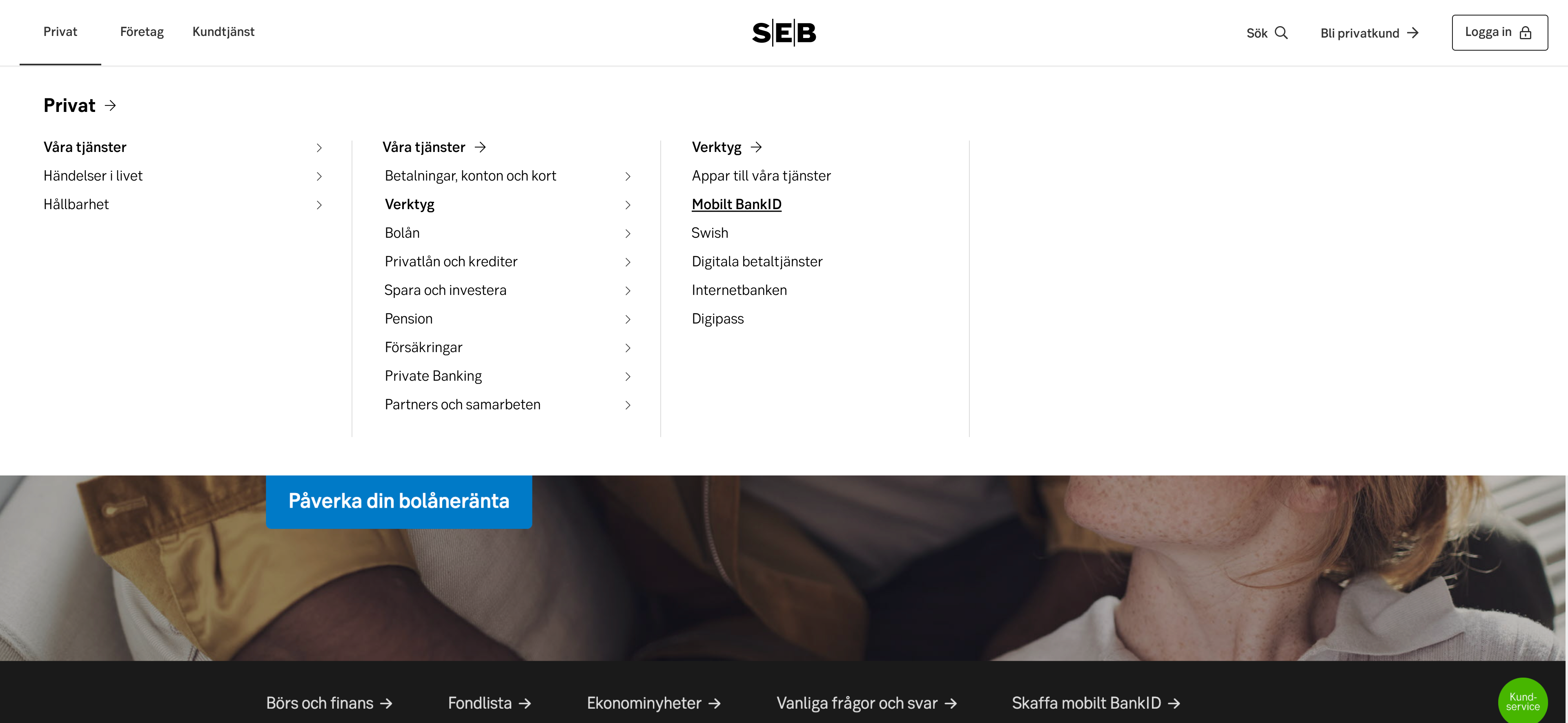
Mega menu
Side navigation
The left side navigation acts as toolbar grouping together related functions. Right now, it's mostly used for tools such as internet banks.
Component: Side navigation
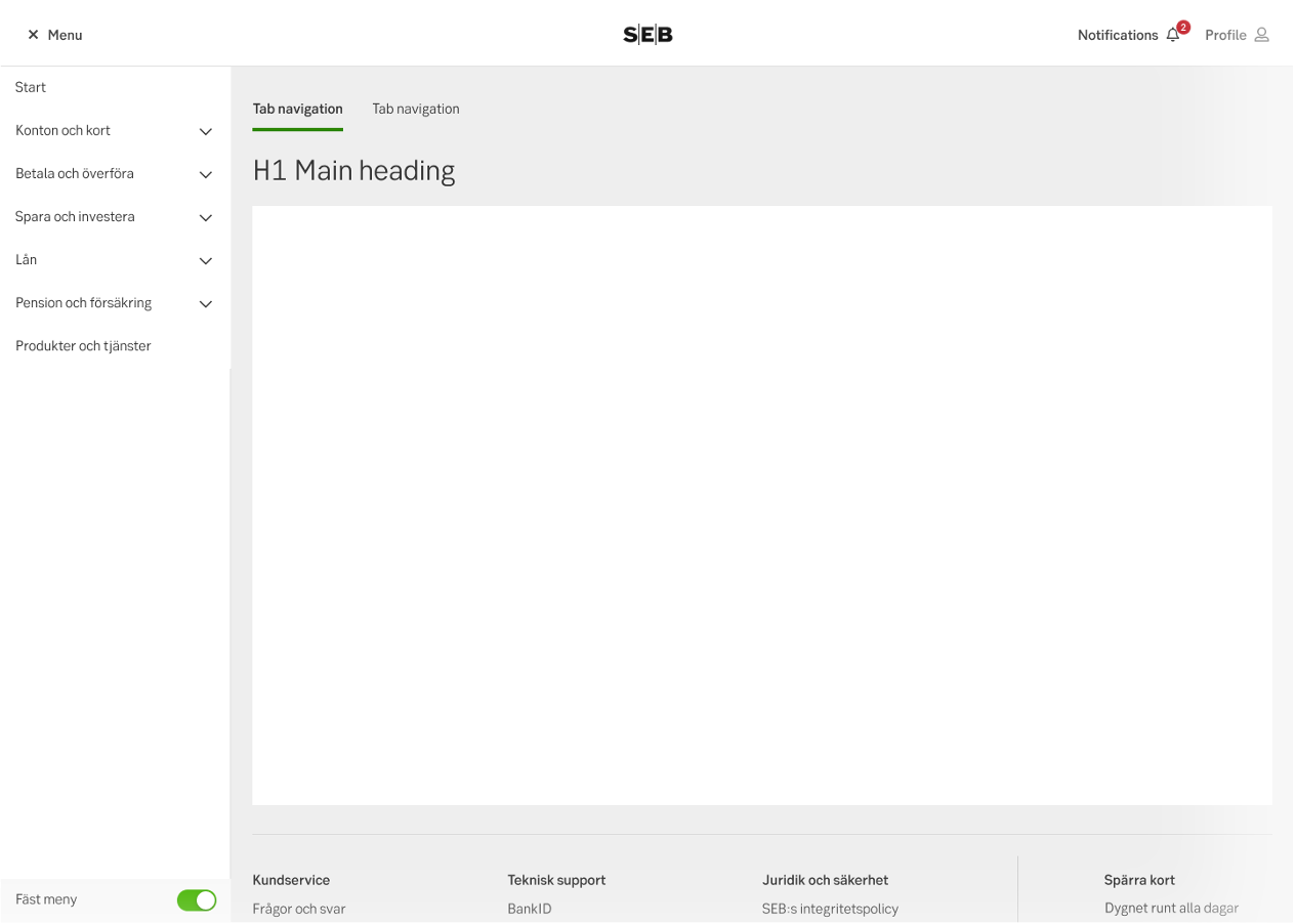
Side navigation (pinned)
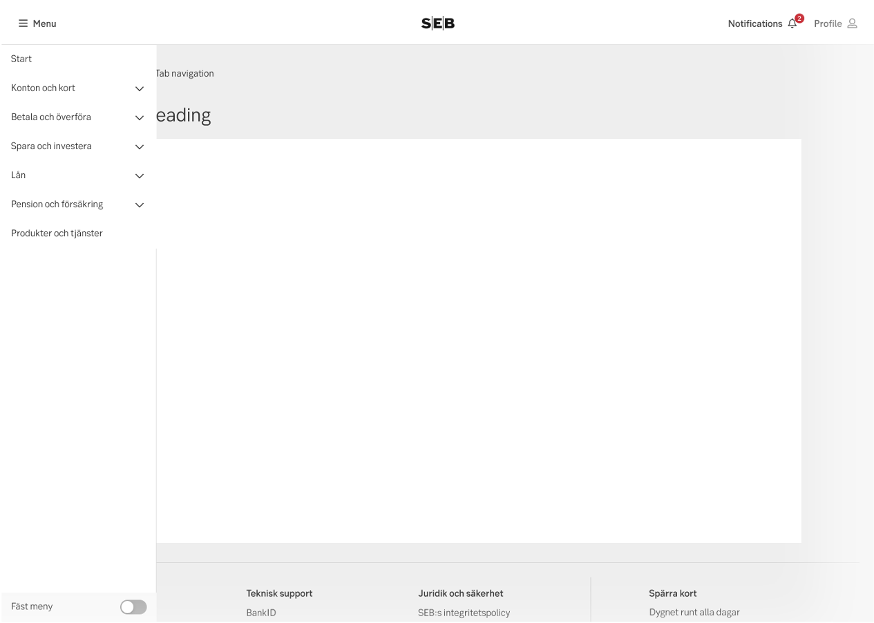
Side navigation (not pinned)
Sub navigation
The sub navigation supports navigation for functions that are related, but perhaps don’t live up to the level of importance to be promoted to the main navigation.
Cluster navigation
Holds together a set of separate pages that are closely related to each other.
Component: Cluster navigation
Cluster navigation
Secondary navigation
Used as complementary navigation next to the main navigation. Gives users options to move in different directions than just deeper in an hierarchy, including sideways.
Breadcrumbs
Breadcrumbs provide users with a trail of links that show the location of the current page within the site hierarchy.
Component: Breadcrumbs
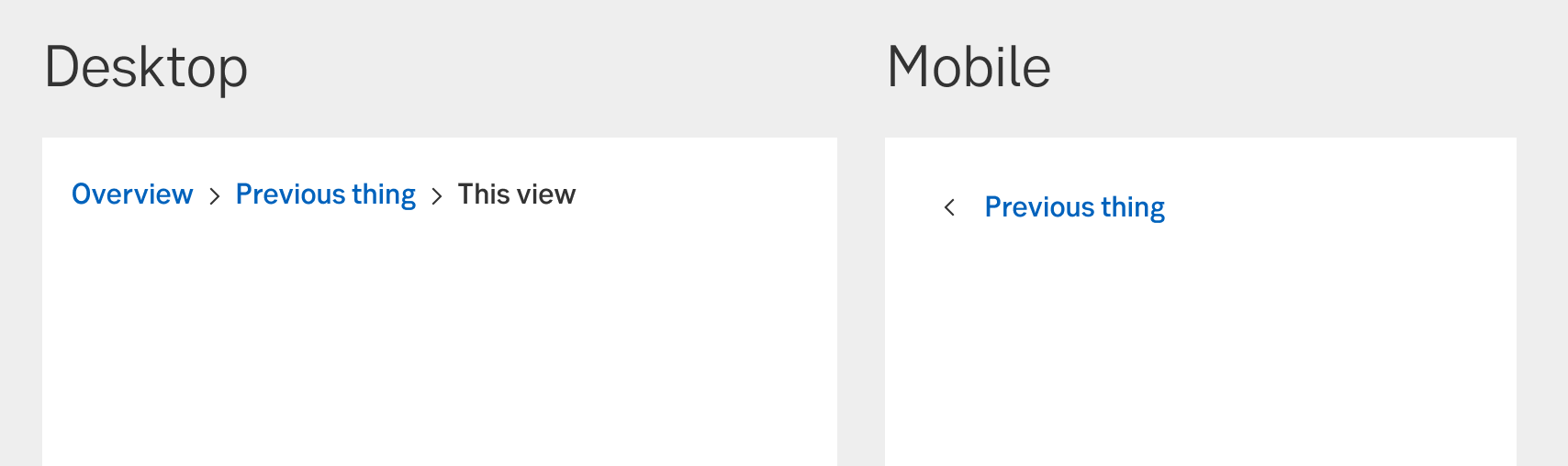
Breadcrumbs
Search
Some users never use traditional navigation, and some never figure out how smart we think we’ve been when making a structure. Search is a very important way of navigation for these groups.
Component: Search
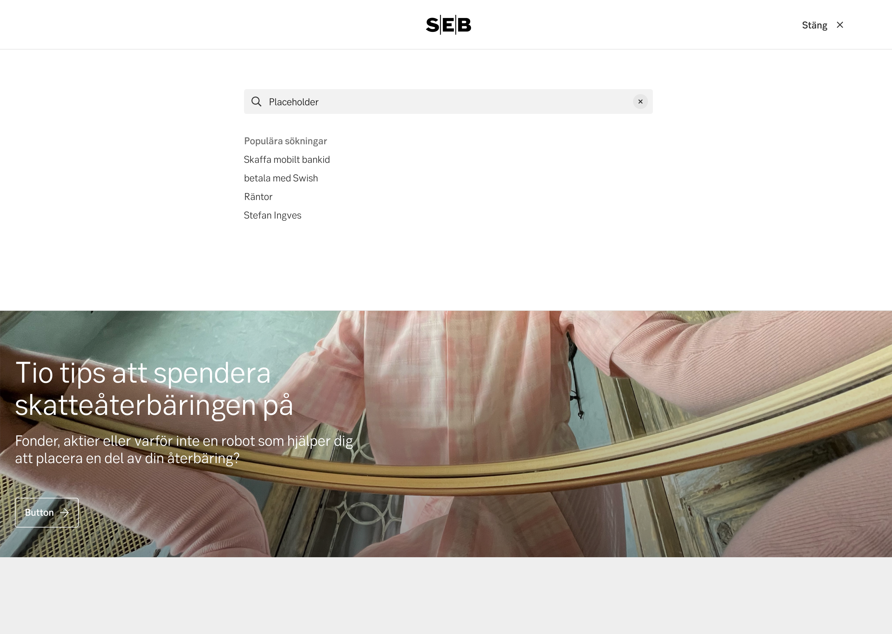
Search
Profile navigation
The profile menu holds the items that are closest related to the active user/customer. This may include personal information/documents or settings as well as the log out function.
Component: Profile navigation
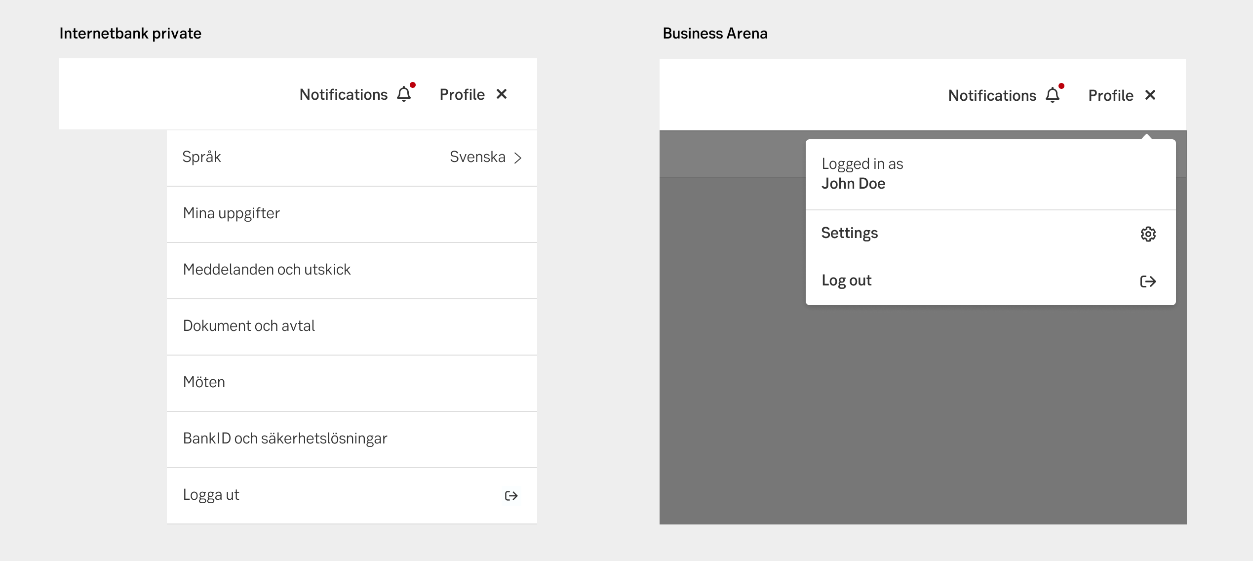
Profile navigation
Notification dropdown
The notifications bell, with the lingonbrerry, shows how many notifications there are. Available from the top bar is the notifications component displaying what the user needs to do.
Component: Notification dropdown
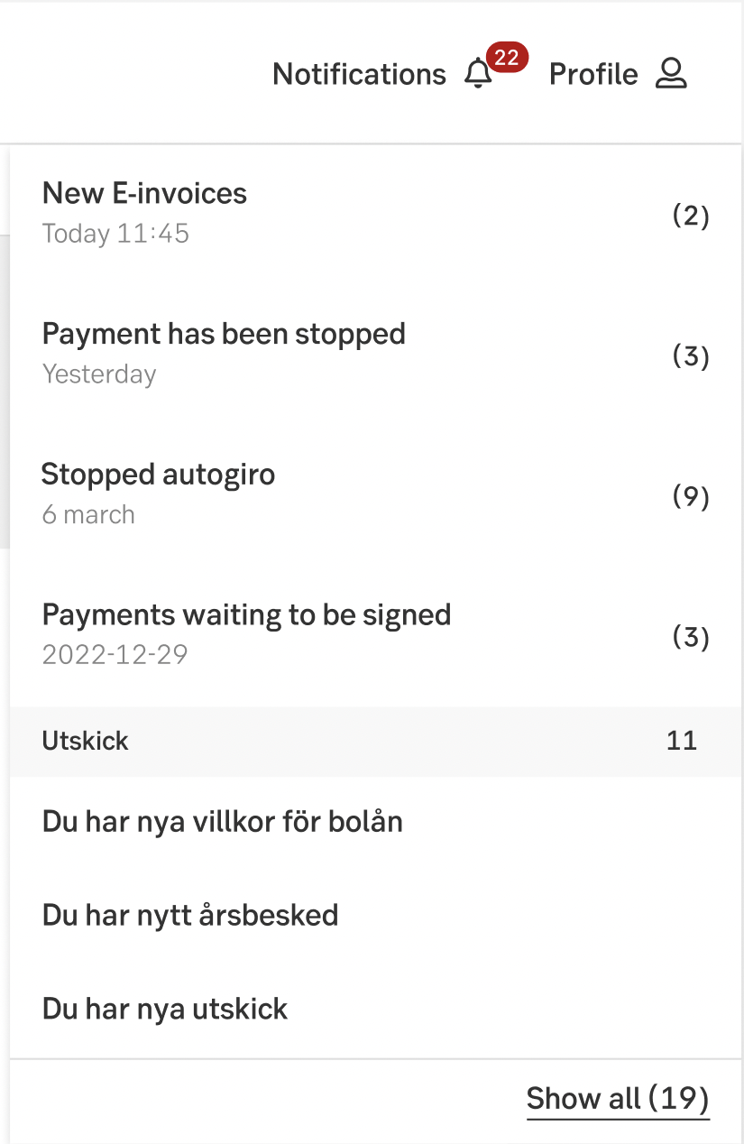
Notifications dropdown
Micro navigation
A set of navigation links used to either tie together a small subset of pages as a micro-site inside a site, or as lateral navigation to complement main navigation
Quick links
Some actions need to be readily available from many pages. These quick links may act as lateral navigation to either sought after functions, or related features.
Component: Related mini
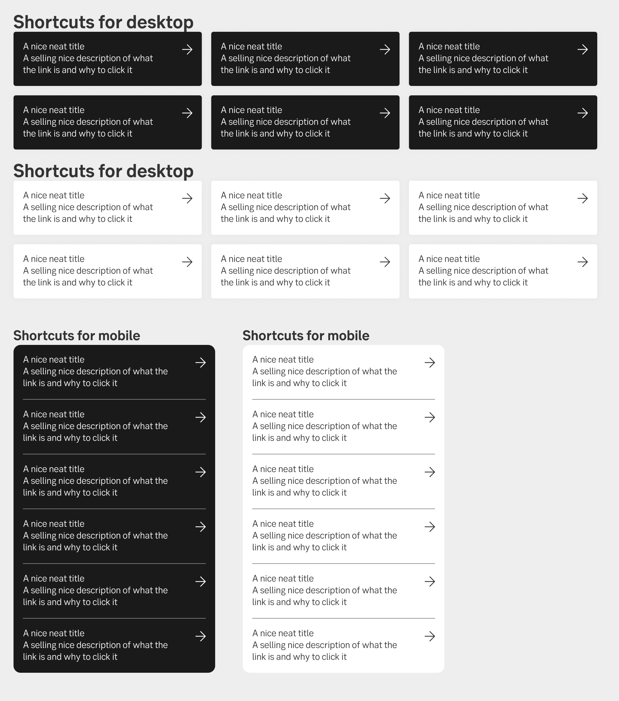
Quick links