Related Mini
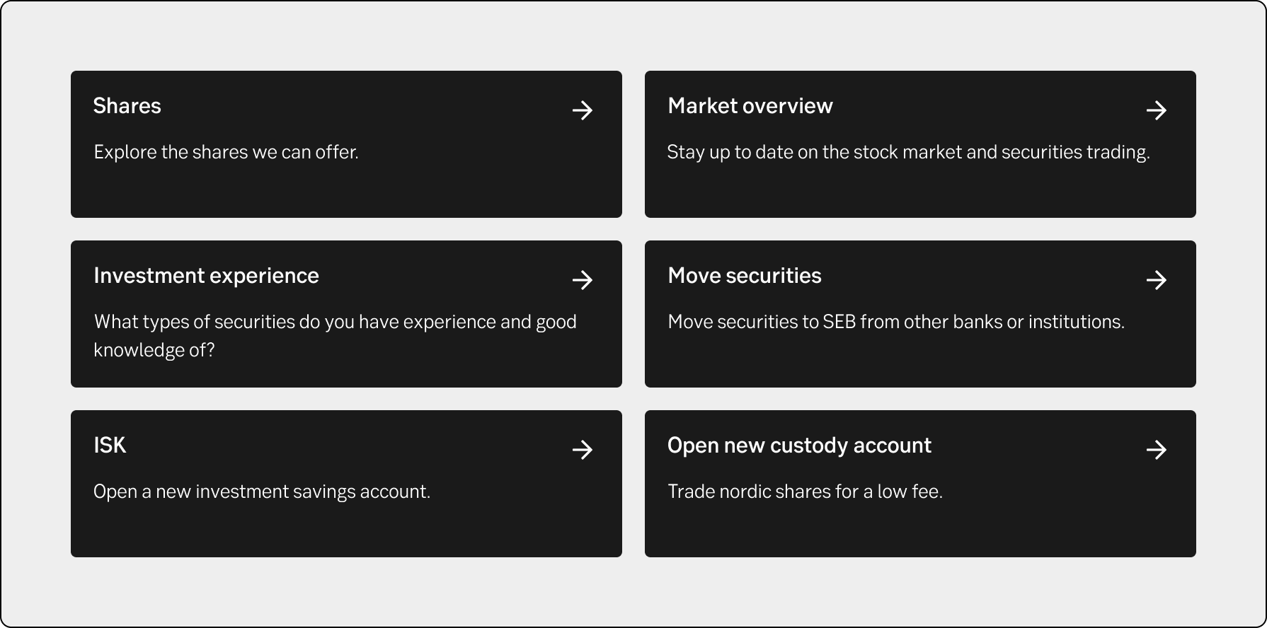
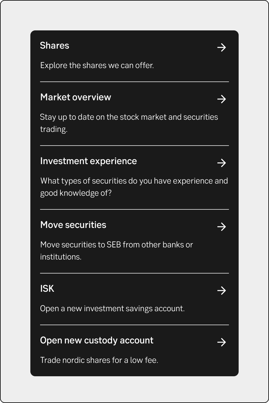
A block of 1-6 links guiding users to related content or functions.

Component meta
Component identifier
- component-related-mini
Tags
- Internet banking
Design principles
- Everyday firstTrigger insightFrictionless
Short description
In internet banking it’s used as a supporting navigation giving extra lateral navigation, as well as being entry points for some seldom used pages, that may be relevant to access from some pages. It supports cross selling and alternate ways of thinking for the user. They may not follow the same hierarchy in their interaction as we may think.

When and how to use it
Normally placed below the main content of the page. It can hold 1-6 links, placed in a wrapping pattern. It always have a headline, but may also have a short description. Try to be consistent with using/not using description for all the links in the block. There’s one light and one dark version available. The dark is normally chosen for quick links further down on the page, while the light is used higher up.
Behaviour
On desktop its always 3 items divided in two rows. In tablet we show two items on 3 rows. And finally on mobile it’s 6 rows of single items grouped together in one block

Desktop (ex IBP Savings)

Tablet (ex IBP Savings)

Mobile (ex IBP Savings)
Placement
Normally placed below the main content of the page. If used without description it may be placed higher on the page.
UX text
-
Accessibility
-
