Chlorophyll
Styles
The last version of Internet Explorer, version 11, was released on October 17, 2013. This is a very long time ago when taking into account the rapid development of web technologies. These days it is often difficult and time consuming to get modern technologies to work well in this old browser. More and more frameworks are dropping support, and even Microsoft themselves has announced that they will fully drop support for IE in their own services in 2021.
Consequently, we have decided to not include support for IE in the Design Library website.
Luckily, there are modern options in active development. Please use Firefox, Edge or Chrome instead.

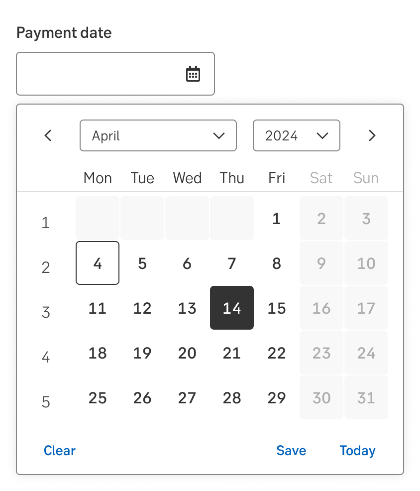
Date pickers simplify the task of selecting a date in a visual representation of a calendar.
Styles
Javascript
Javascript
Date pickers are used when users need to enter a date. The user can enter the date as text, but the date picker also allows the user to select the date in a visual representation of a calendar.
By using a date picker, many errors concerning format and wrong characters can be avoided.
Always use a date picker when the user should enter a complete date. If only a year, a month, a day (or a combination of two options) is needed, use separate input fields. For example, a credit card expiry month. Dropdowns could optionally be used if the range of values is limited.
The date picker can be equipped with a variety of features, on top of the base component:
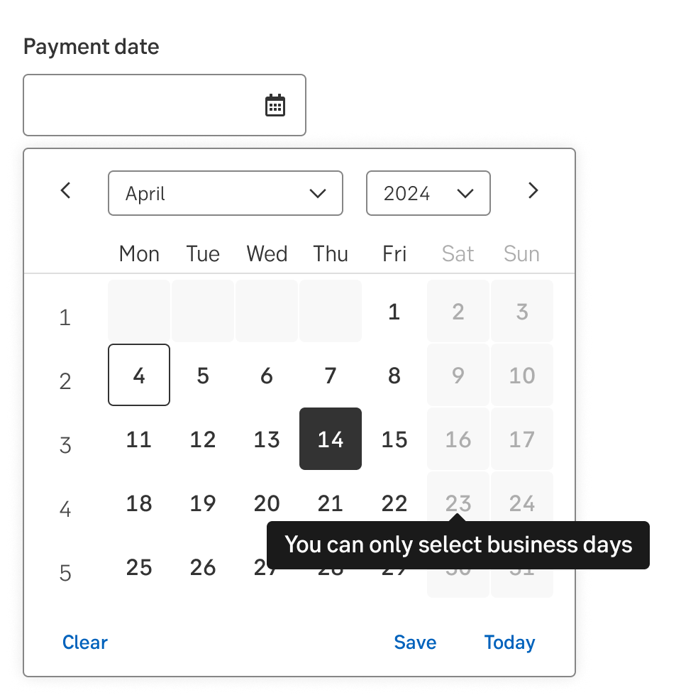
Sometimes there is a need to show days which are not selectable, for example a bank holiday which can not be chosen when initiating a cross border payment. The dates which are not selectable should then have a light grey background with a grey number. If the user tries to select a not selectable date, there will be a tooltip telling the user the date is not available.
The last days/first days of the previous month/next month should be light grey boxes with no text. If the user click on one of those days, the datepicker will change to that month.
Quick actions to select dates may be added at the bottom of the picker. These may be used to simplify common choices, such as today, earliest possible date, or payday.
If a user has to enter a time period, instead of two separate date pickers, use the date range picker.
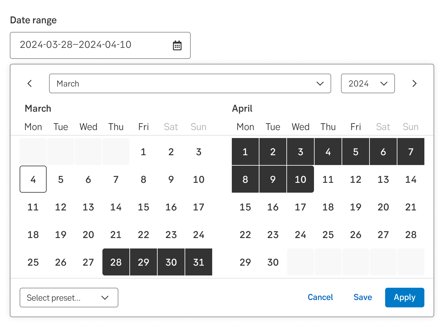
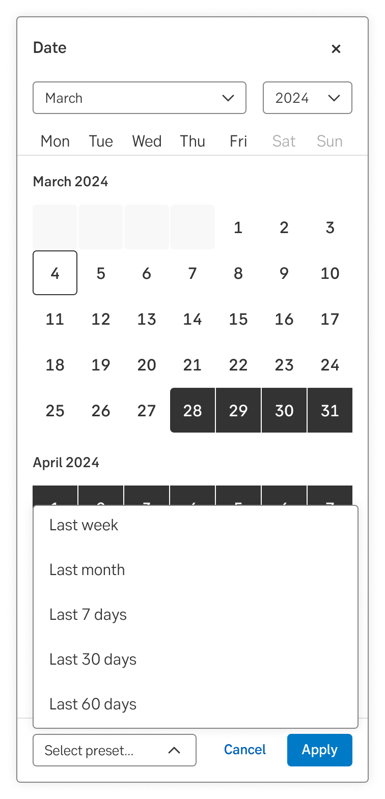
This feature lets users quickly and easily select a set range of dates. It should be used when it is necessary for users to quickly select commonly used range of dates.
When using the range-picker users also get a visual representation of ALL the selected dates, not just the start and end.
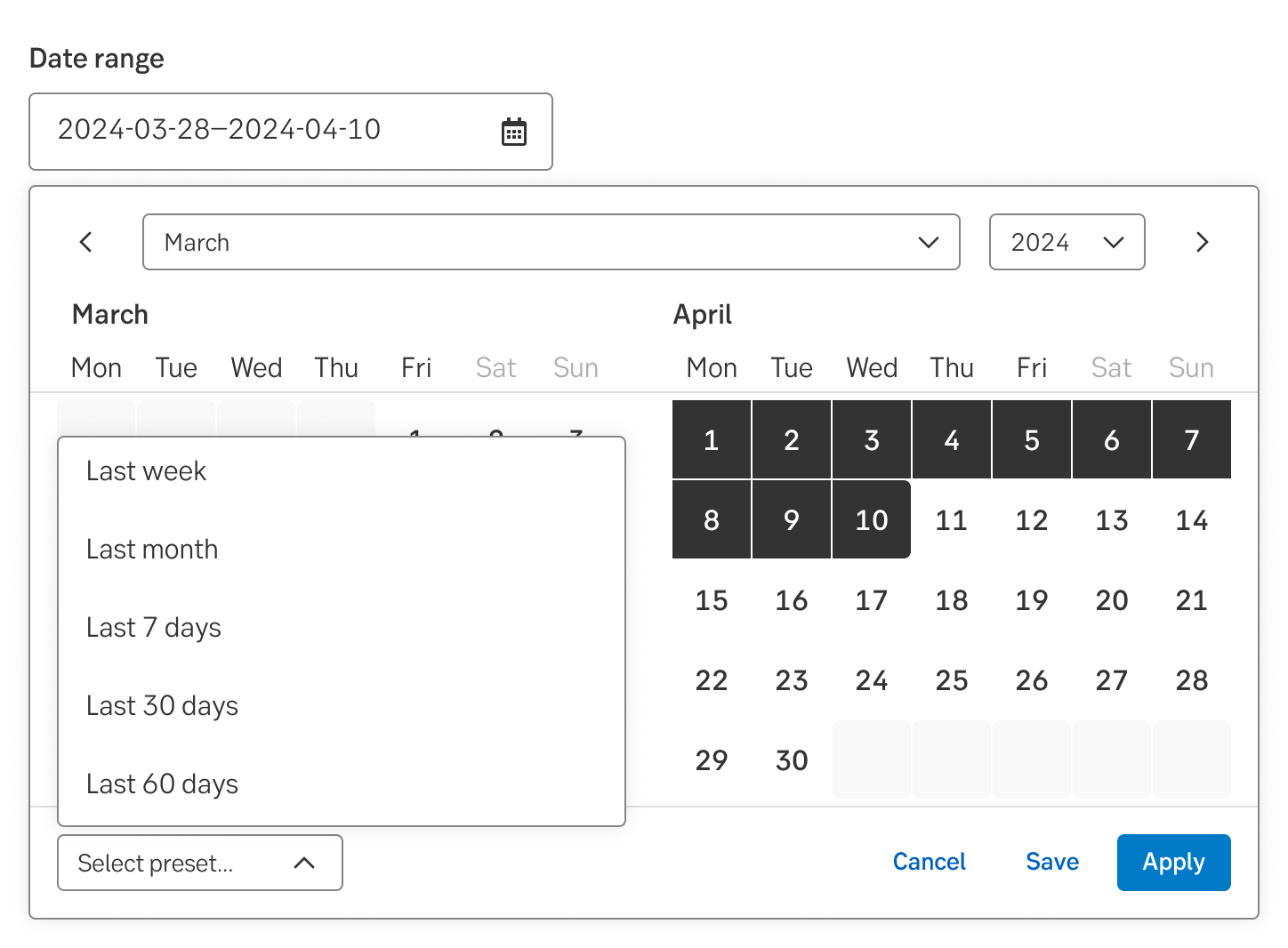
Range preset for desktop
Range preset for mobile
Note: Not yet available in the Green design system.
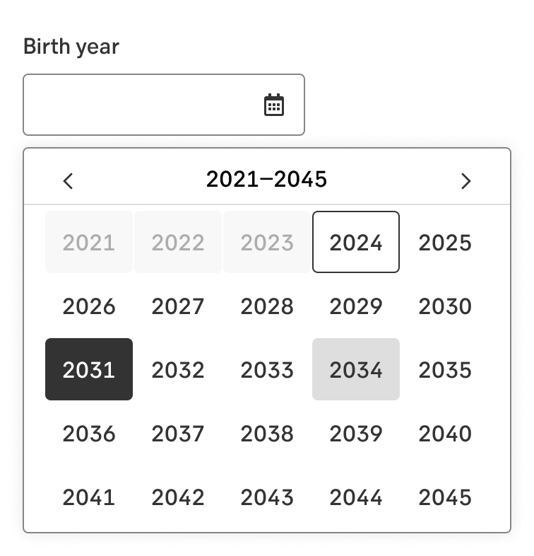
On rare occasions we only ask for year. This too can be easier to fill in using a picker.
Note: Not yet available in the Green design system.
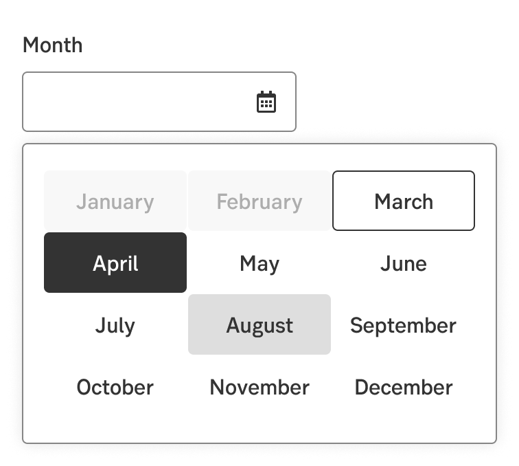
If we are only looking for a month you may use the month picker.
The date picker can be used as Normal or with a few options:
The dates in the calendar can be presented with a few different styles:
On desktop and tablet, the date picker is displayed below the date input field.
On mobile, the date picker cover the whole viewport as a takeover. The header part (headline, dropdowns, and day labels) and bottom part (actionable options) are fixed.
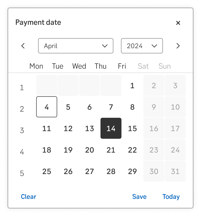
The user is able to increase or decrease the date by pressing the up/down arrows on the keyboard:
Some components are available in two sizes to support different layout needs and use cases:
Note.The small variant is fully supported only in the interim design, which visually aligns more closely with DV23.
Result from the latest accessibility review of the component (Angular+React): 2024-07-26