
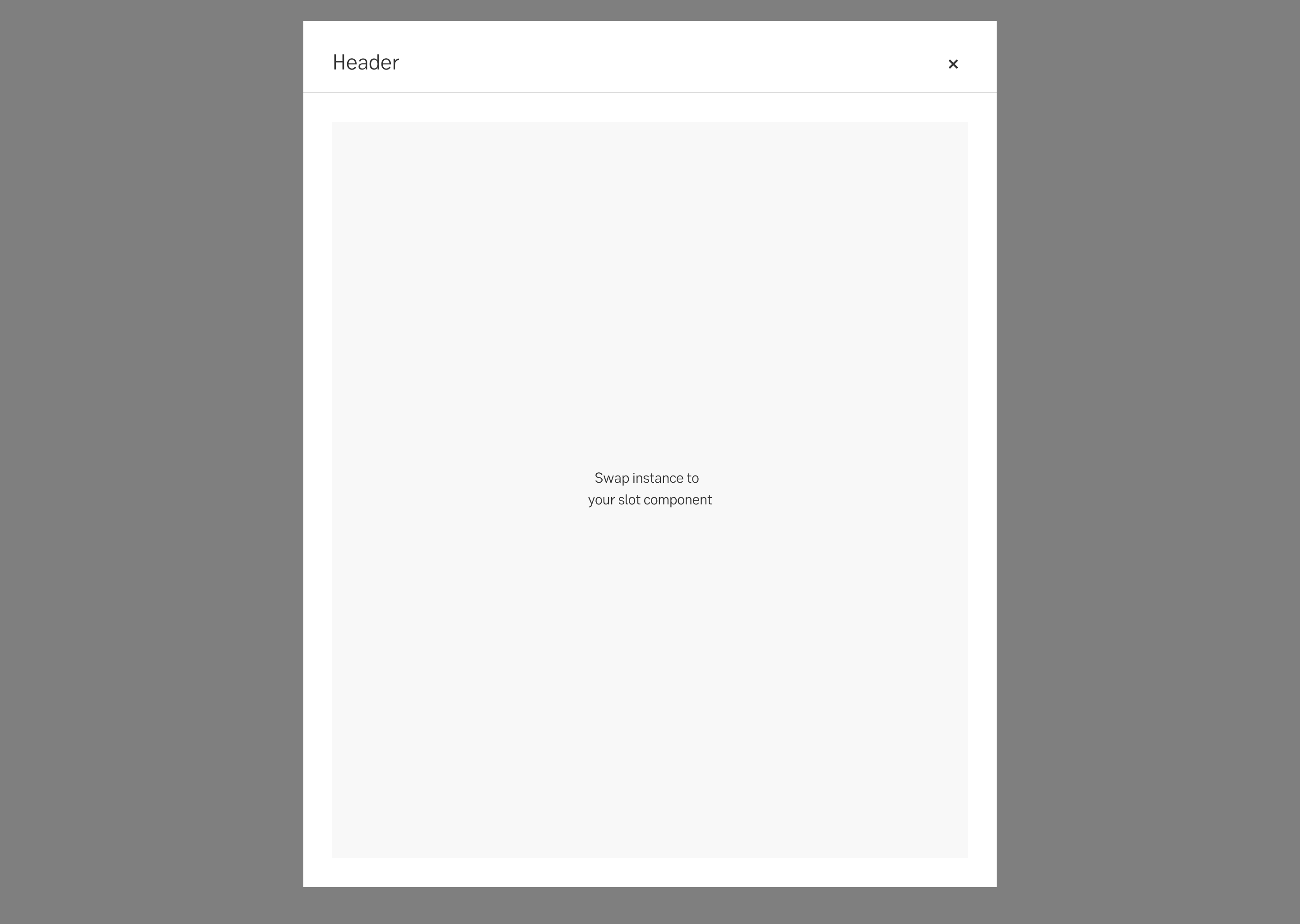
Centered modal
Centered modal for full focus editing or display of important functions and information.
Component meta
Component identifier
- component-centeredmodal
Tags
- Global
Design principles
- Everyday first
Guidelines
Short description
A centered modal appears in the centre of the screen and usually overlays the existing content. It is positioned in the middle, with the background content dimmed to bring focus to the modal.
Centered modals are useful when you want to capture the user's attention and focus solely on the modal's content. They work well for tasks that require user input, confirmation, or displaying critical information.
When and how to use it
Use this type of modal when you want the modal to be in full focus for user interaction or attention.
Behaviour
It's displayed in the centre of the screen. Its content should only scroll vertically. The modal is always full take-over when it’s a mobile viewport.
Closing a modal
A modal can be closed in multiple ways depending on context.
- Clicking the close button in the upper right corner.
- Clicking outside the modal (possible to disable for critical flows)
- Clicking an explicit cancel or close button inside the content of the modal.
- Pressing ESC on the keyboard.
Sometimes you may want to stop involuntary closing of the modal. This is especially important if users have filled in information in a form and risks to loose data. A dialog may be triggered to confirm that the user did want to close and is aware of the consequences.
Placement
It’s displayed in the centre of the screen. If the modal doesn't fit, it shrinks with the screen leaving only a 32px margin with the overlay surrounding the modal.
Centered modal
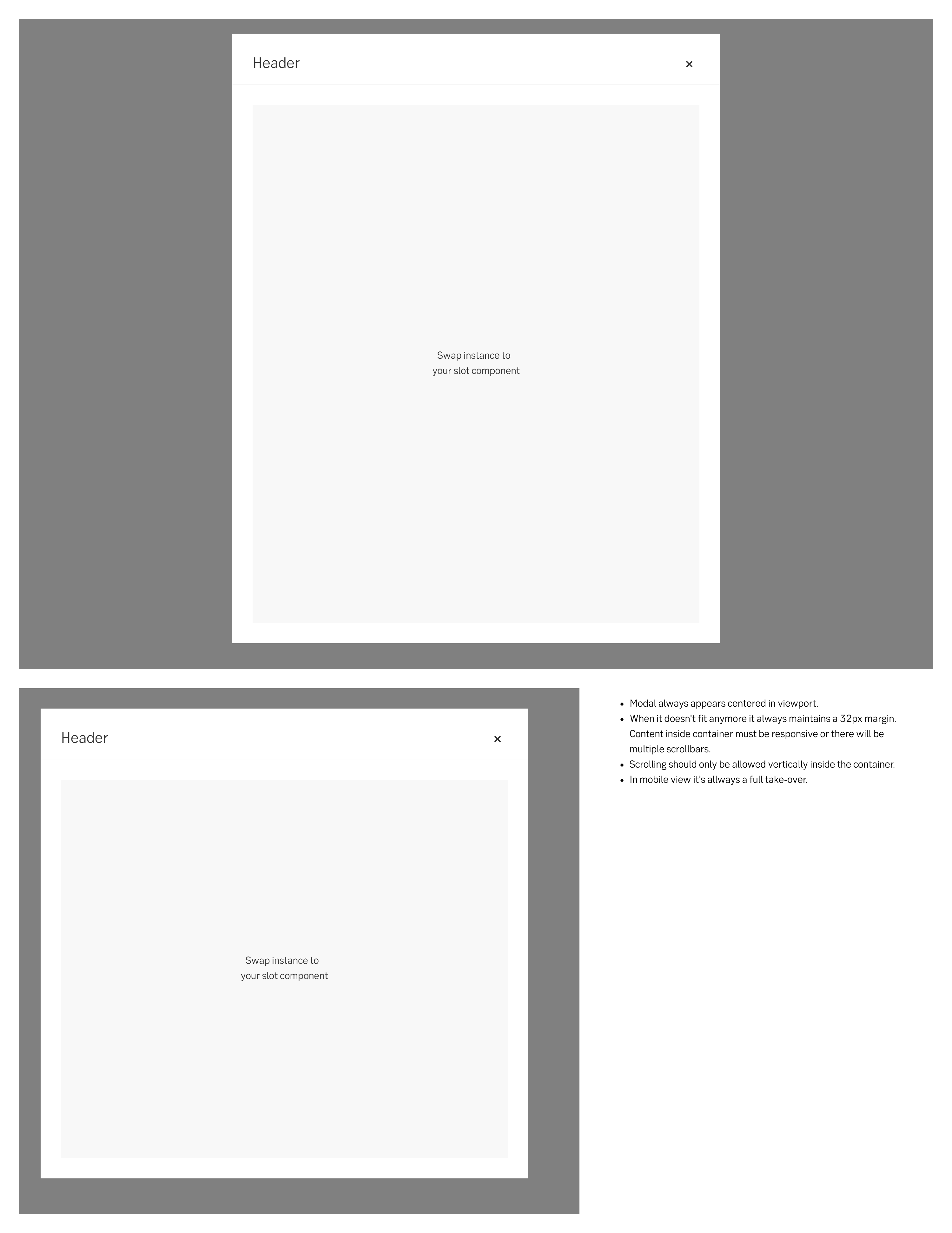
Resizing behaviour
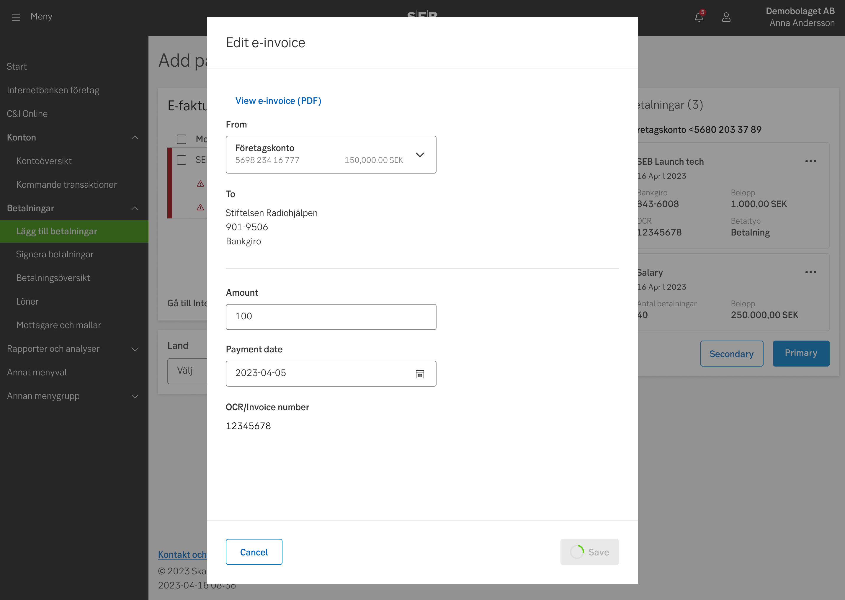
Example for Payments
Do's and don'ts
Do
- Use the centered modal when you need the user’s full attention.
- Design the content of the modal to be responsive to the screen size.
Don't
- Use the centered modal when users should be able to get a context of the page underneath the modal.
UX text
-
Accessibility
See examples and full accessibility guide on W3’s ARIA pattern guide for Modals
Tabbing order
Make sure the modal is announced, and that the focus and tabbing order is limited to the modal. The user should not be able to reach content outside of the modal without exiting the modal (same as for mouse-users).
Heading structure
A modal’s main header always be a H2. While it is not wrong to make it a H1 since it is technically a new context, it is still experienced by the user as within the same context as the triggering page. Hence a H1 might be confusing. All following headers within the modal should descend below H2 as on a main page.
Navigation
Some modals include navigation. This could be pagination, Previous/next buttons for modals with several steps etc. Putting these in a <nav> element allows the user to find the navigation buttons more conveniently. If you cannot use <nav> in your context, aria role="navigation" can be used as a fallback.
Specification
General specification
- Details: Specification
- Instructions: How to access Figma
Specifically for logged-in web
The modal will be implemented in 4 fixed widths, and 3 fixed heights. This needs to be fixed from the channel, because the content in the modal will be delivered from other sources.
Widths
- Medium (default) 512px
- Large 768px
- X-Large 960px
- XXL 1400px
- In mobile viewports the modal become a full takeover: 100% width
Heights
- Small 512px
- Medium 740px
- Large 960px
- In mobile viewports the modal become a full takeover: 100% width