
Side navigation
A menu that is accessed from a top bar. It is used as a main site navigation in logged-in channels.
Component meta
Component identifier
- component_sidenavigation
Design principles
- Be the good guyFrictionless
Guidelines
Short description
The navigation pattern enables the user to navigate in the web channels in a frictionless way. A common navigation pattern makes it easy for the user to navigate in multiple channels. Sharing common patterns makes for a coherent and easy to understand experience.
Behaviour
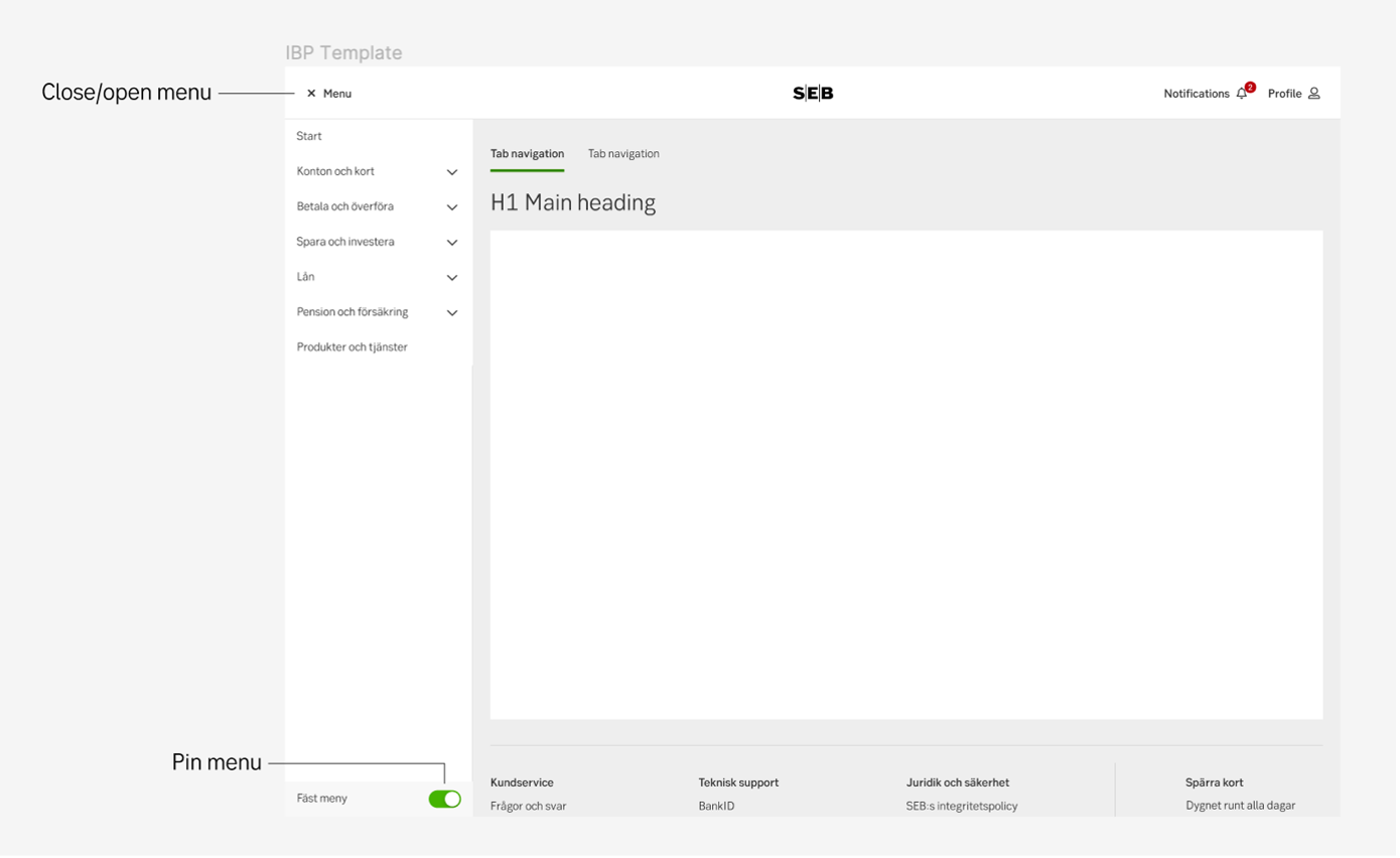
Menu
Closed, open and pinned
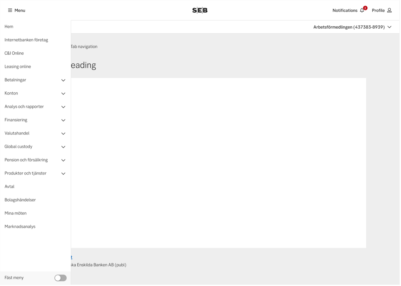
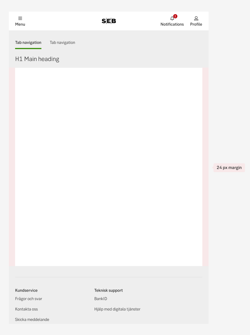
When the user logs in for the first time, the menu is by default open and pinned. The menu opens on top of content, keeping the content width the same if closed or opened. Pinning the menu places the menu besides the content instead of op top of it, the content decrease in width, keeping 24px to each side.
- The state of the menu; if the menu is pinned or not is remembered at log out/in.
- If the menu is opened, but not pinned, it is closed when the user clicks a menu item or outside the menu.
- If the menu is pinned, the user can press the menu option in the top bar to close it.
Breaking points
If the device is more than 992px wide, the menu can be pinned. If the device is less than 576px wide, the menu will open as a takeover
How the menu effects available space
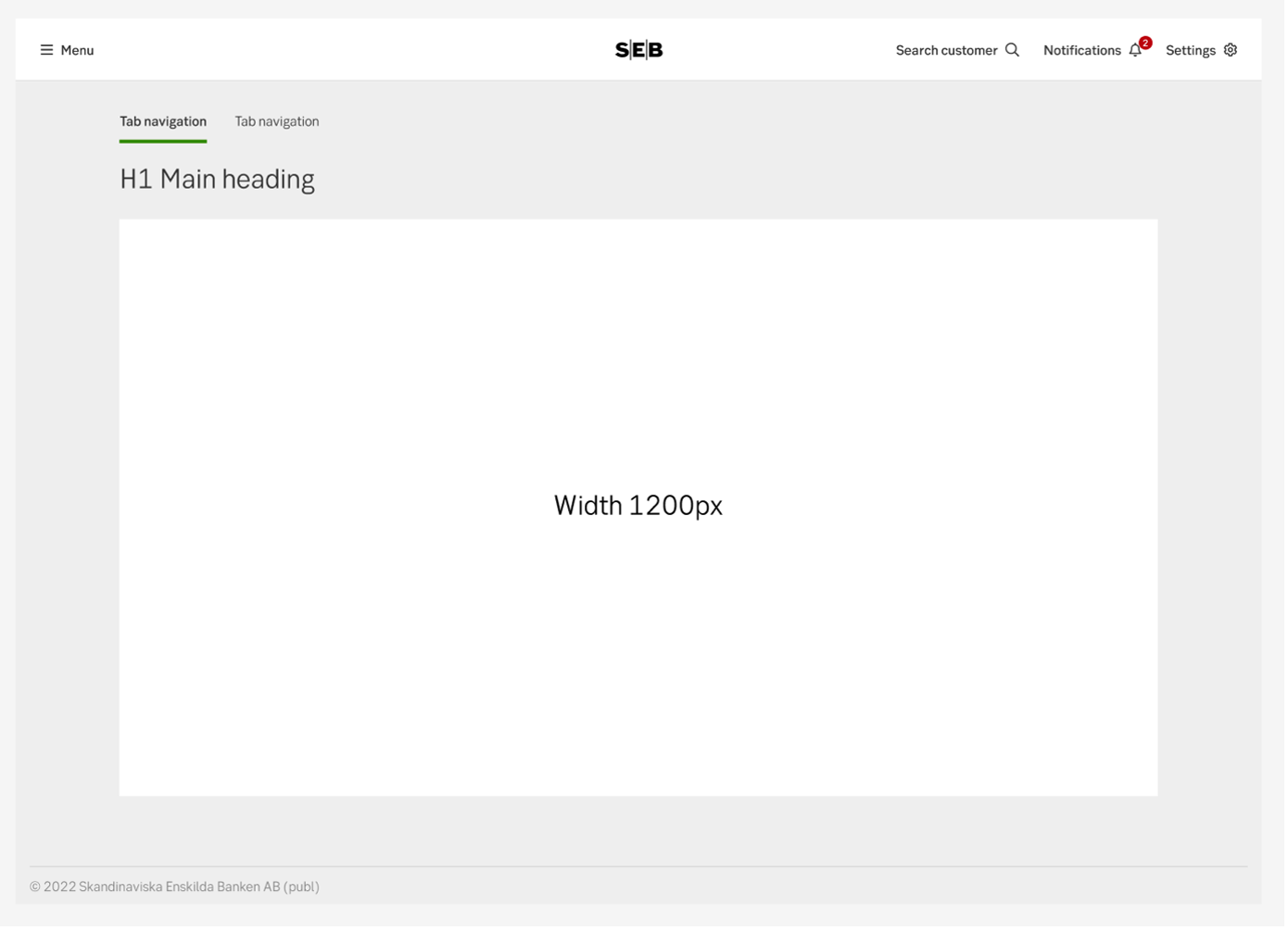
The content is always centered, when the menu is open, pinned and closed. The max width of content is 1200px.
For some products more space is needed, the max width can then be 1600px or 100% (full width). If your MFE needs more space, contact the shell team.
Nexus
Nexus customer menu
Nexus has an additional customer menu for when a customer is open, placed under the user menu which is always there. When a customer is opened, the user menu will collapse and the customer menu will open automatically.
If you choose an MFE in the user menu, then the customer's menu will fold in and the user menu will stay folded out, the same way it would work if an MFE in the user's menu would be chosen.
Examples
Content width in iPad
Content width in mobile
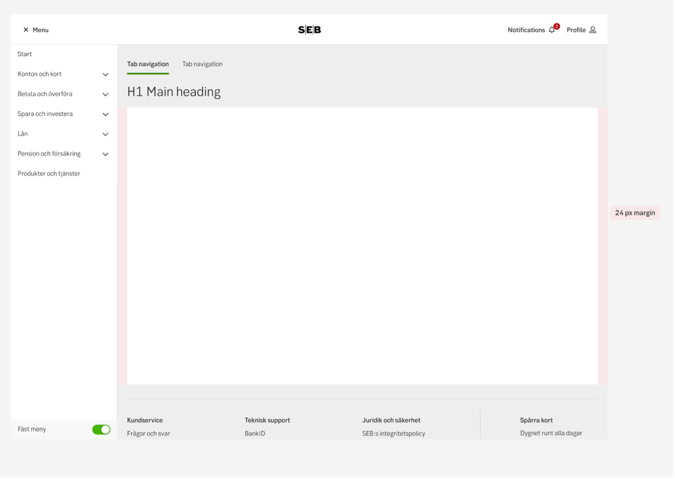
Content width in desktop (pinned menu)
Content width in desktop (unpinned menu)
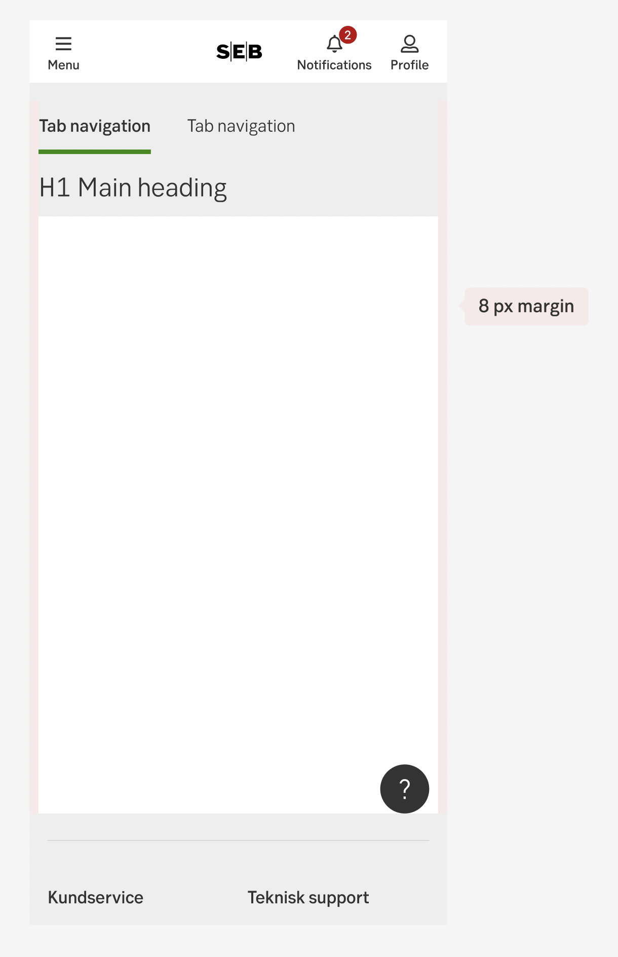
Close, open and pin menu
Menu opened but not pinned
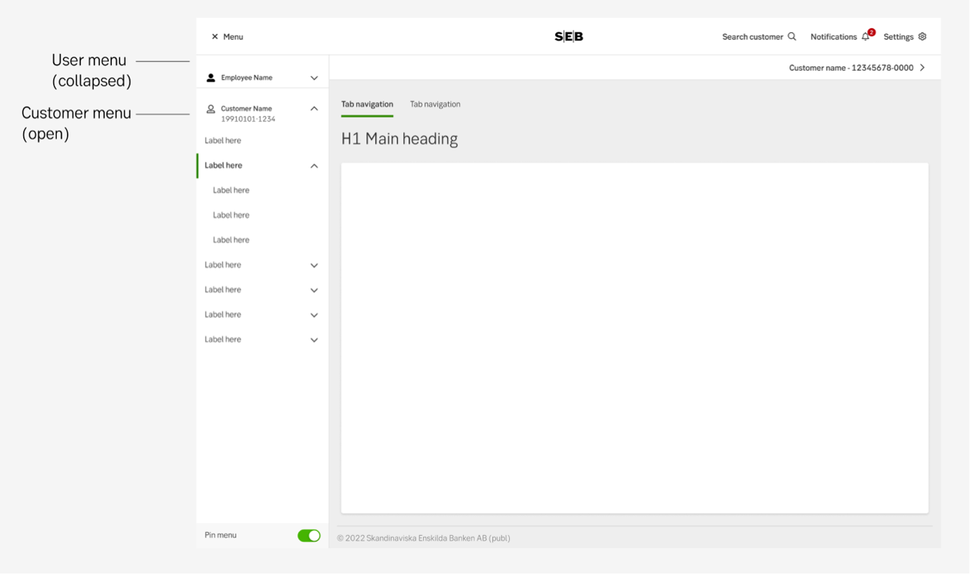
Nexus user and customer menu
UX text
-
Accessibility
-
Specification
- Details: Specification in Figma
- Instruction: How to access Figma