
Top bar
The top bar gives easy access to navigation and global functions.
Component meta
Component identifier
- component-topbar
Design principles
- Everyday firstFrictionless
Guidelines
Short description
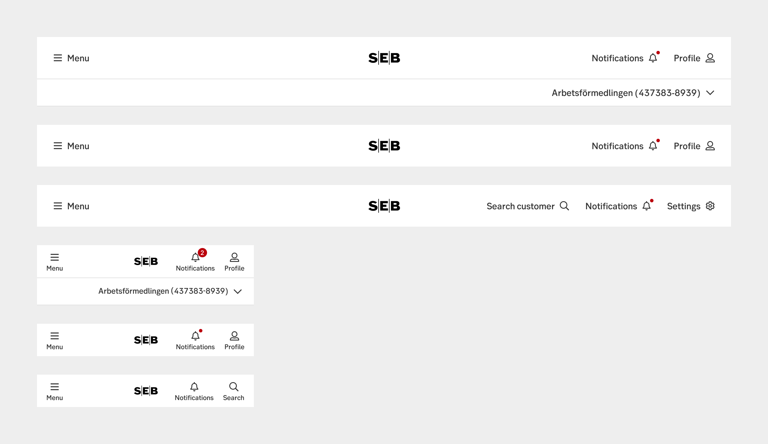
The top bar navigation is a concise and prominently positioned horizontal menu at the top of a webpage or application interface, providing quick access to essential sections or features.
Top bar navigation tends to be concise, containing only the most critical navigation items. It avoids overwhelming users with excessive options, focusing on key sections or actions. Less is more!
When and how to use it
The logo is always centred in the middle ensuring a brand security.
To the right in the bar we place navigation. It may either be a hamburger-menu triggering side-navigation, access to mega-menues, or in small sites direct links to specific pages.
The left side of the bar holds access to global functions relevant to the site. This may include settings, logout, profile, search. It’s the most important functions that user need access to at all times.
We also have an optional sub-bar that may be used for global functions that need to take up more horizontal space. This is uses for company selector for Business Arena.
Behaviour
The top bar is always visible in the top of the page. It remains sticky when scrolling.
In mobile views we may need to hide options due to lack of space, but we may never remove relevant functions completely. If they don’t fit in smaller devices, consider moving them into a menu that can be toggled.
UX text
-
Accessibility
To ensure accessibility in coding the top bar, consider the following best practices:
Semantic Markup
Use appropriate HTML elements to semantically structure the top bar. Utilize <nav> for the navigation container.
Keyboard Navigation
Ensure that users can navigate through the top bar using keyboard controls alone. Make sure that the focus is properly managed, and users can access all menu items and interactive elements through keyboard tabbing and activation (e.g., Enter or Spacebar).
ARIA Roles and Attributes
Implement ARIA (Accessible Rich Internet Applications) roles and attributes to enhance the accessibility of interactive elements within the top bar. For example, use `role="menu"` for the navigation container and 'role="menuitem"' for individual menu items. Additionally, apply appropriate ARIA attributes such as 'aria-haspopup' and 'aria-expanded' to indicate submenus or dropdown functionality.
Review
Result from the latest accessibility review of the component (Chlorophyll): 2024-07-31
- Contrast: ok
- Colour-blindness: ok
- Code + aria: ok
- Touch + keyboard: ok
- Dark-mode: n/a
- Focus: ok
- Reader: ok
Specification
- Details: Specification in Figma
- Instruction: How to access Figma