
Search
A search field enables users to enter input in order to search for specific data.
Component meta
Component identifier
- component-search
Design version
- 2021-03-08
Design principles
- Everyday firstFrictionless
Guidelines
Short description
The component enables the user to search for specific data by entering input in the field.
When and how to use it
Use the search component to help users find data. For example, in connection to pages growing in size and complexity. The search component might not be necessary where there are limited amounts of data.
Placement
Place the search component where users expect to find it. There is no correct way where to place the search component. Normally the user might expect a search field to be placed in the upper right corner, however, depending on the page and its context the placement can differ.
Behaviour
Functional or decorative?
The component can be implemented in two different ways, functional or decorative.
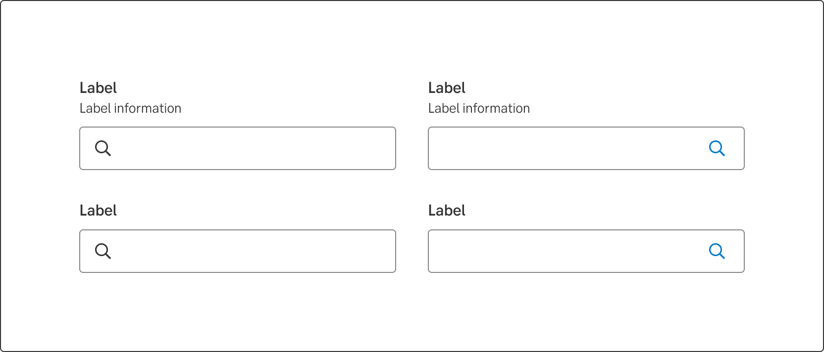
The functional way
A button is placed to the right in the input field. Use the functional way if the search action will lead to a specific search result. This button should be clickable and have its own states.
Specifics about the button:
- Use the tertiary variation of the button
- For more information about the buttons states, go to Button
- Use enter as a shortcut for the search action.
- When a user has initiated a search (enter or clicked the button) the search button is replaced by the close button variant. Clicking the close button clears the text and returns the button to the default state of the tertiary variant. The focus moves to the input field.
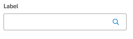
The decorative way
The search icon is placed to the left in the input field and is not functional, just decorative. Meaning the search icon is not there to be interactive.
Use the decorative way when the search field is accompanied with auto complete.
For mobile or tablet use
Although the user can press enter/ search from the keyboard on both mobile and desktop, the functionality of being able to search by pressing the search button should still be included if using the field with an interactive button. Rather let the potential accompanied functionality of the search field decide whether you need the search field with a decorative icon or an interactive button.
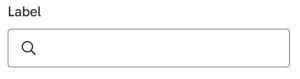
Smart search
It's preferrable to use the decorative search when auto-complete is being used.
Above: Examples of smart search, from https://m2.material.io/design/navigation/search.html#expandable-search
Do's and don'ts
Do
- Place the search component where users expect to find it.
- Consider whether you need the input field containing a decorative search icon, or the interactive search button.
Don't
- Don't use the search component where there are limited amounts of data
UX text
The search field should have a label that explains to the user what they can search for. To give the user instructions or examples on what to search for, we can use the label information. The label information should only be used if it adds extra value to the user, don't use it to repeat what the label already says.
Label information
When there is a limited number of keywords to search for, use the label information to inform the user on what those keywords are. If they all fit in the label information, write them all out.
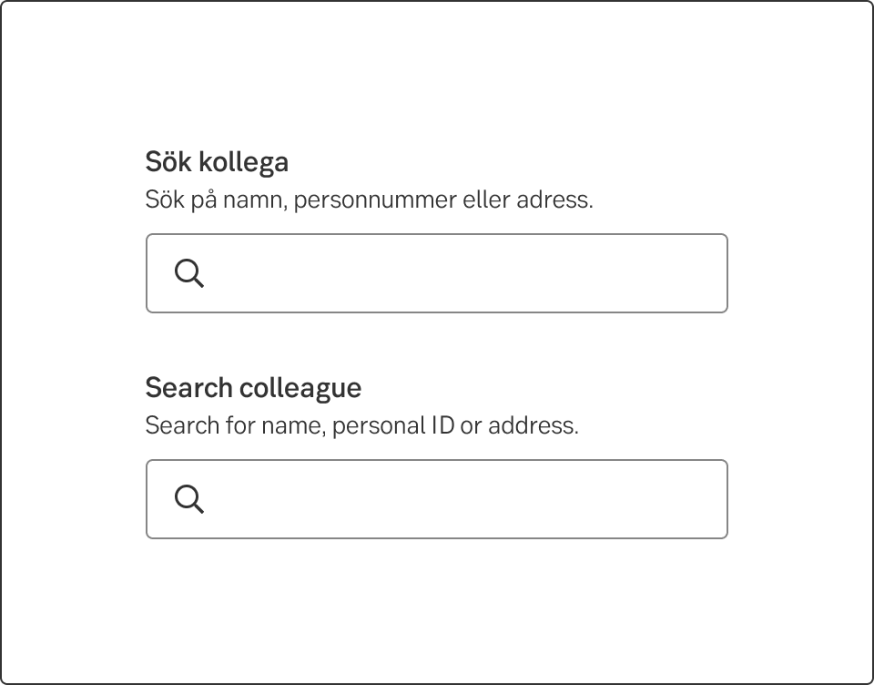
In Swedish
- Label: Sök kollega
- Label information: Sök på namn, personnummer eller adress.
In English
- Label: Search colleague
- Label: Search for name, personal ID or address.
Give ideas with examples
Many times there are multiple keywords to search for and it would not fit in the label information. Then write a few examples, as different from each other as possible to give the user ideas of what to search for.
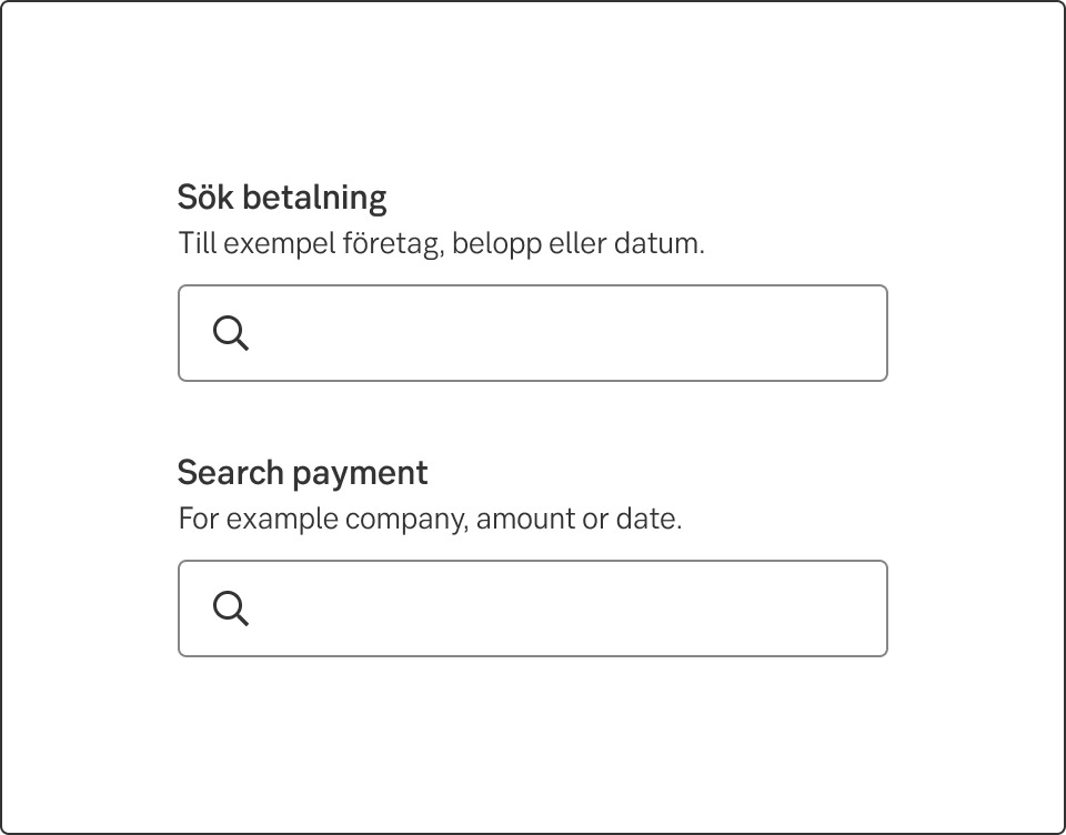
In Swedish
- Label: Sök transaktion
- Label information: T.ex. företag, belopp eller datum.
In English
- Label: Search transaction
- Label: E.g. company, amount or date.
Accessibility
-
Specification
- Details: Specification in Figma
- Instruction: How to access Figma
Examples
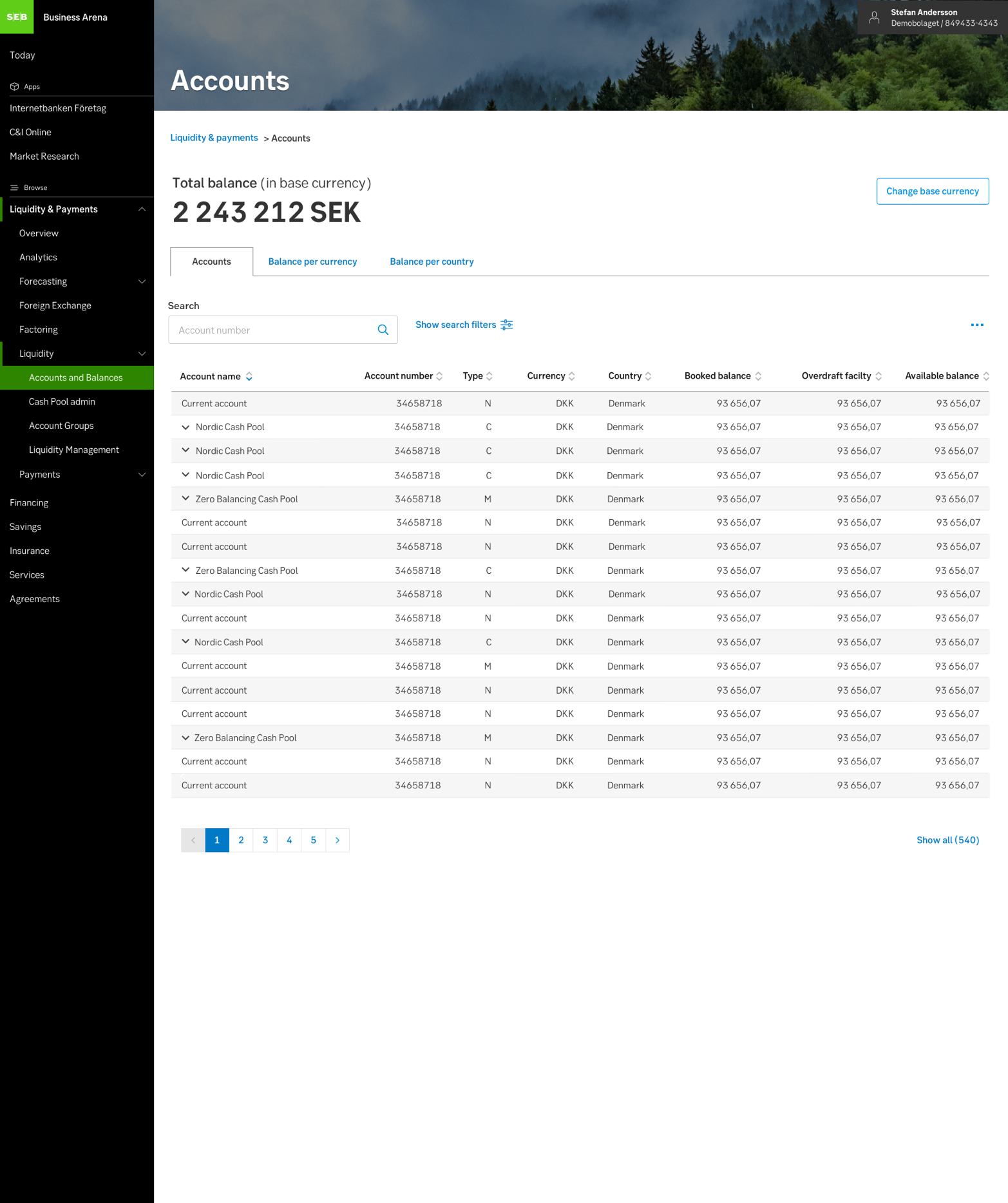
Above: Example of search with interactive button
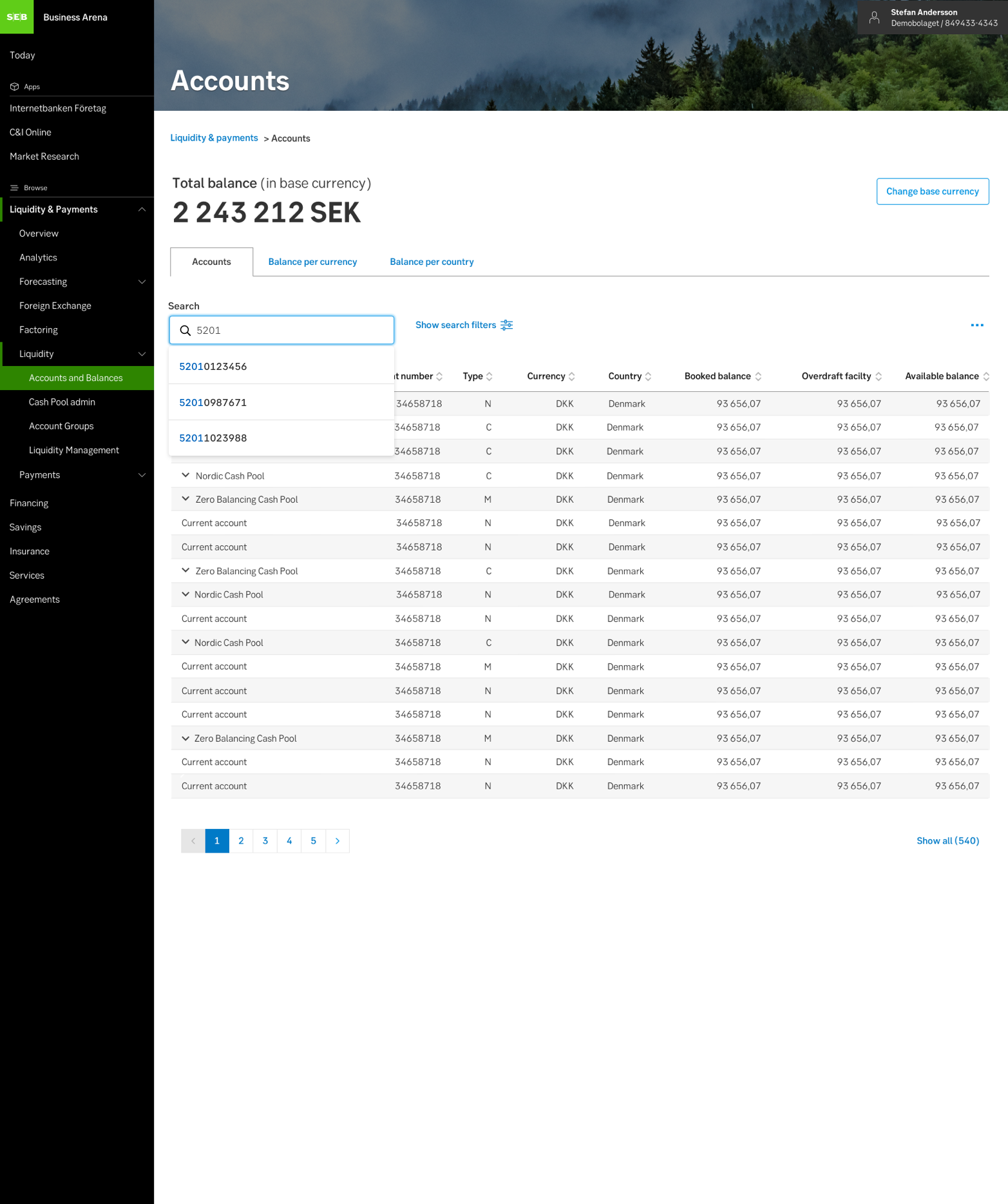
Above: Example of search with decorative button, accompanied by autocomplete.
Related
- Article: Babich, N. (2017). Best Practices for Search