Chlorophyll
Styles
The last version of Internet Explorer, version 11, was released on October 17, 2013. This is a very long time ago when taking into account the rapid development of web technologies. These days it is often difficult and time consuming to get modern technologies to work well in this old browser. More and more frameworks are dropping support, and even Microsoft themselves has announced that they will fully drop support for IE in their own services in 2021.
Consequently, we have decided to not include support for IE in the Design Library website.
Luckily, there are modern options in active development. Please use Firefox, Edge or Chrome instead.

A dropdown enables the user to choose one or multiple options from a list. It's ideal for situations where there are numerous predetermined choices and space is limited.
Styles
Javascript
Javascript
A dropdown enables the user to choose one or multiple options from a list.
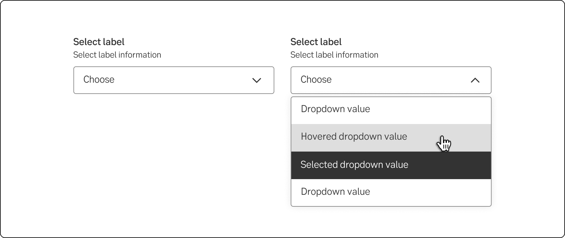
The standard dropdown allows a user to select one value from a series of options.
Dropdown Multi-select allows multiple selection and is commonly used in forms and filters.
The account dropdown is different in the layout and size. The non-active component is higher to be able to show more data. Each item in the list has two rows of data.
Standard dropdown
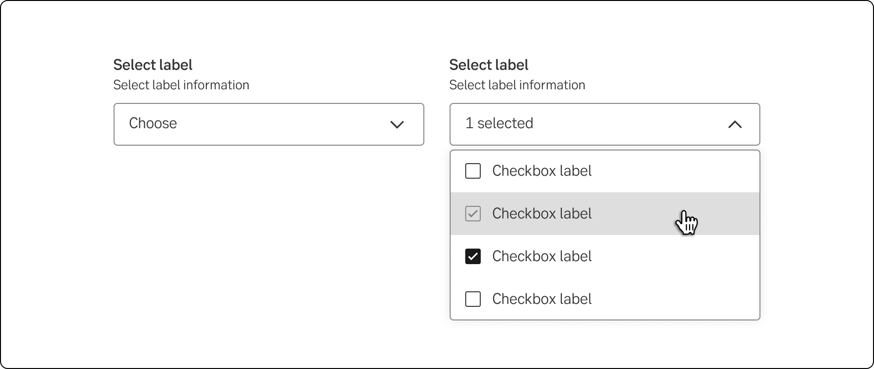
Multi-select dropdown
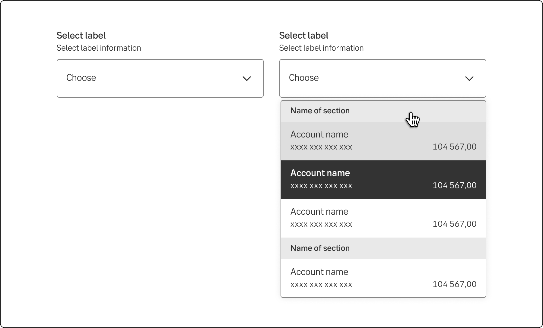
Account dropdown
The select and dropdown components can look similar, but they have different functionality and use cases:
A key difference between the components is the underlying code for the components. The select component is based on the native select HTML Element thus making the appearance of the component being determined by the browser, the dropdown component can be styled as needed.
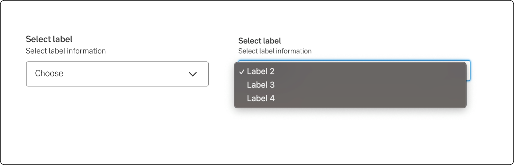
Select
Dropdown
Sort the list by placing the most important or common choices in the top. If there is no internal order, sort alphabetically or numerically.
If the list is sorted alphabetically and very long, the most common choice can be at the top. For instance, when a user is asked to choose nationality.
The expanded list with options is generally the same width as the dropdown. Follow the grid when deciding the width of the dropdown. If content in the list of options is wider than the dropdown, the list will increase in width.
Some components are available in two sizes to support different layout needs and use cases:
Note.The small variant is fully supported only in the interim design, which visually aligns more closely with DV23.
If the user can choose several values in a dropdown, it is preferable that this is indicated in the label.
The values in the dropdown must be as short and self-evident as possible.
When there is no default option in a dropdown, the first value (which can’t be chosen) should give information about what the user is supposed to choose, for example Choose type of employment. In these cases, we also need an error message, in case the user tries to proceed without choosing an option.
Don’t start each word in headings and labels with upper case. Only use upper case in:
-