
Dark mode
What to consider and do when designing with dark mode
Guidelines
Short description
Dark mode is a dark-themed user interface where colours are used sparsely. The background is dark and the text is light. Components are mainly in a dark grey shade but some components are light or coloured. It has some advantages for low-vision users, users in dark environments, or users who spend a lot of their daily hours in front of a screen. Dark mode can help with improving battery life as applications with dark mode use less energy than applications with light mode.
When and how to use it
Use dark mode when it is important to give the user the option to choose between dark and light mode. Design for both light mode and dark mode if you are working with a hybrid design. Note that some things are different between dark mode for native and dark mode for web and hybrid (see below).
Behaviour
Dark mode uses the same patterns and components as SEB's light mode, the only difference is the colours.
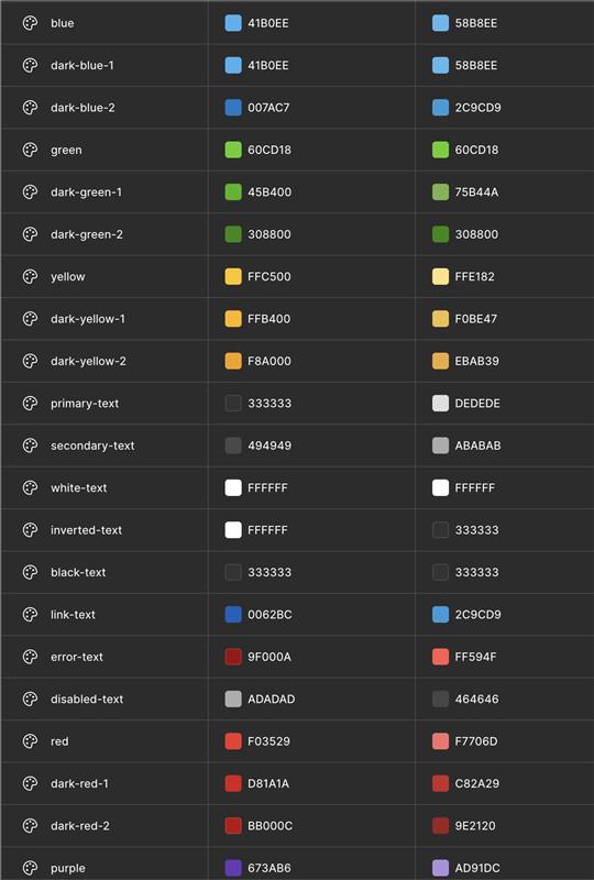
Colours
The colours in dark mode are similar to SEB's default colours but slightly different. They are desaturated to improve readability and prevent visual vibration against the dark background. Colour is used sparingly, mainly on smaller surfaces, while most of the theme relies on grey tones. The grey scale is also adjusted for dark mode, with more dark shades and fewer of the lightest ones.
To ensure the correct colours in both light and dark mode, use variables in Figma and code (CSS variables). In Figma, you’ll find these in the SEB Design System library. In code, they are available through Chlorophyll or Green's token package.
Create a feeling of depth
Using dark grey (#121212) instead of pure black as the background helps create subtle shadows and improves contrast. White text on pure black can cause eye strain due to the high contrast.
In light mode, we use shadows to create a sense of depth. In dark mode, shadows are more subtle, so we achieve depth by using lighter shades of grey. Each element should be slightly lighter than the one beneath it to maintain this effect.
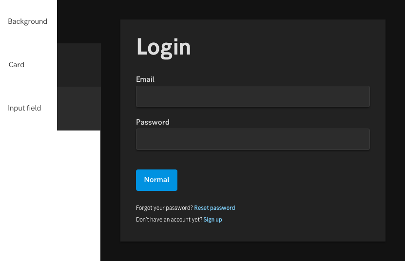
An example of elevation in dark mode
Allow the user to choose between dark and light mode
Dark and light mode has different advantages depending on the users’ vision, environment and preferences. Let the users choose the theme by themselves.
Component design principle
Dark mode uses the same patterns and components as SEB’s light mode, the only difference is the colours.
Do's and don'ts
Do
- Allow users to choose between dark mode and light mode.
- Use colour with care – mainly for smaller areas or highlights.
- Apply colours using tokens/variables, not fixed colour values.
Don't
- Avoid placing darker elements on lighter backgrounds.
- Don’t mix components from dark and light mode in the same layout.