Chlorophyll
Styles
The last version of Internet Explorer, version 11, was released on October 17, 2013. This is a very long time ago when taking into account the rapid development of web technologies. These days it is often difficult and time consuming to get modern technologies to work well in this old browser. More and more frameworks are dropping support, and even Microsoft themselves has announced that they will fully drop support for IE in their own services in 2021.
Consequently, we have decided to not include support for IE in the Design Library website.
Luckily, there are modern options in active development. Please use Firefox, Edge or Chrome instead.

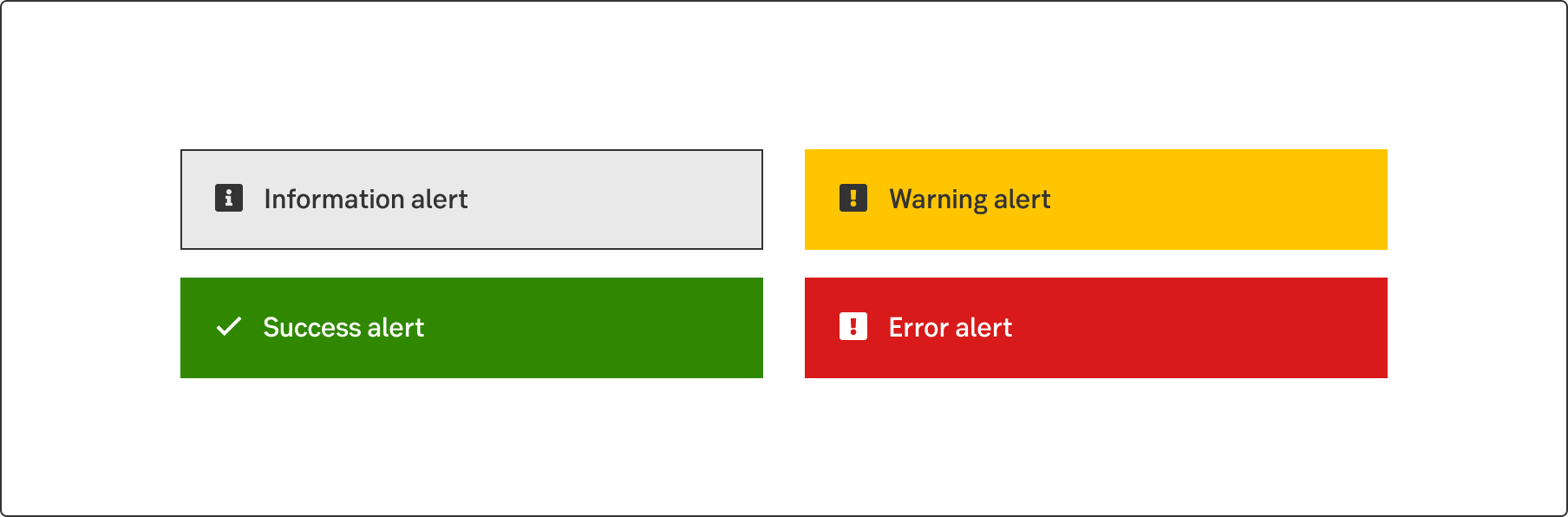
An alert ribbon is a message used to inform the user about the state of a system, page or function. Icons and color indicate the type and urgency of the information within the message.
Styles
Javascript
Different kinds of alert messages need different designs. For a passive notification, such as information “good to know”, use the Information alert ribbon. An action-required notification such as a warning or an error needs more emphasis, use the Warning alert ribbon to attract user’s notification when needed or the Error alert ribbon for immediate action.
The four types of alert ribbons are used for four different types of information:
The Alert ribbon can be a fixed, time set, action required or a dismissable message. All types can contain a link for more information. An action required alert always contains a button or a link. The dismissable type use the Close button in upper right corner.
Generally, there are four types of placements that depends on the contex. The rule is to place the alert near the issue that triggered it.
Global
Page
Group
Specific
Write short and to the point. Always think mobile; 1.5 rows on desktop becomes 3.5 rows on mobile. Maximum 75 characters or 500 pixels wide in the desktop version.
Don't start each word in headings and labels with upper case. Only use upper case in:
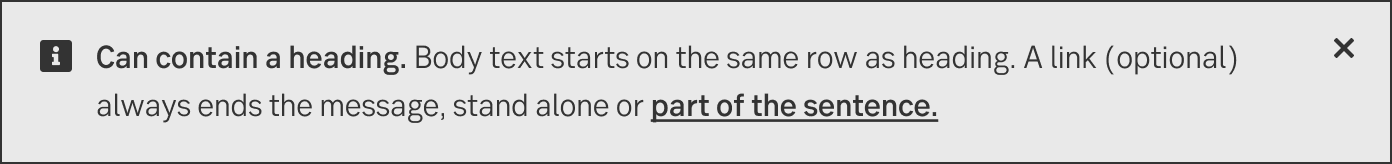
Feel free to use a header if it reinforces the message and gives the customer a quick and good understanding of what the message is about. Don’t just write, for example, "Information" followed by the important message. The header should always be on the same row as the rest of the text, never separated above.
Do
Don't
It is fine to write the message without a title. Perhaps the first sentence is so informative that it can be placed first, but will be too long as a heading. Remember to start the message with the most important and informative sentence so that the customer gets a quick understanding of what the message is about.
Do
A close button (X) is often used so that the customer can delete the message. When the customer receives a message and does not need to act on it, it's possible to have no action (X, button or link). The message then disappears by itself. An example can be when the customer has logged out of the internet bank and receives a confirmation for this.

Do
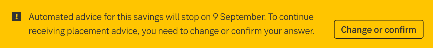
Use a button when the customer needs to act on something. For example, if the customer needs to switch funds, change or confirm answers to continue using a service.
There are exceptions when a button should not be used even though there is something important to act on. An example of this is when the customer needs to choose new loan conditions on their mortgage loan, then a link is preferable.
Read more under the section about links below.
Do
Use a link when you want to allow the user to read more or when the user needs to act on another page, but it may not be critical. The link can also be used for critical actions if a button may be perceived as "scary", meaning that the customer might think that something will happen at the same moment that the button is clicked. An example is when it is time for the customer to re-commit their loans, and the customer must act on this to be able to choose the committing period and interest rate, but a button can be perceived as committing them immediately.
The link must always be on the same row as the last sentence. Do not put it into a separate row, remember the limited space. The link must always end the message but can be integrated with the last sentence or as its own sentence.
Do
Preferably, do not use both link and button together. There is limited space to talk to the customer. We need to choose what the main message is and avoid giving different kinds of information in the same alert. If the customer needs to act on something but needs more information to make a decision, we should first lead the customer somewhere they can get more information and then act.
Information ribbons may be used to inform the users, for instance about new features, or to give proactive advice.
In information ribbons, the message may consist of:
Success ribbons may be used to confirm that the customers action was successful.
Why should we confirm?
In success ribbons, the message should consist of:
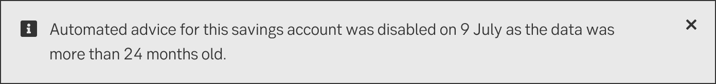
Warning ribbons may be used for different types of non-critical information, for instance that the due date of an upcoming transaction is close, that the stock market prices aren’t properly updated or for information about planned maintenance of the service.
In warning ribbons, the information normally consists of:
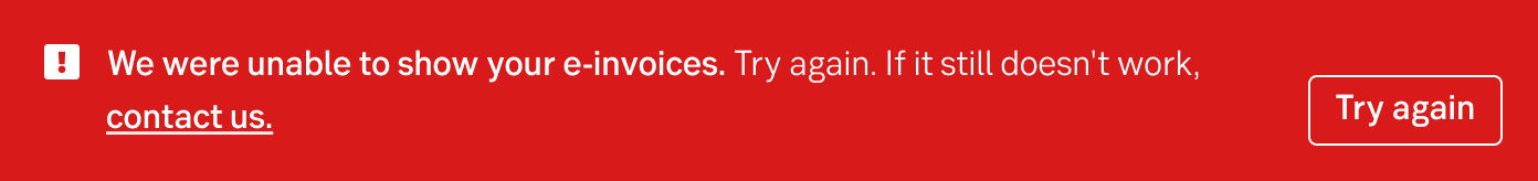
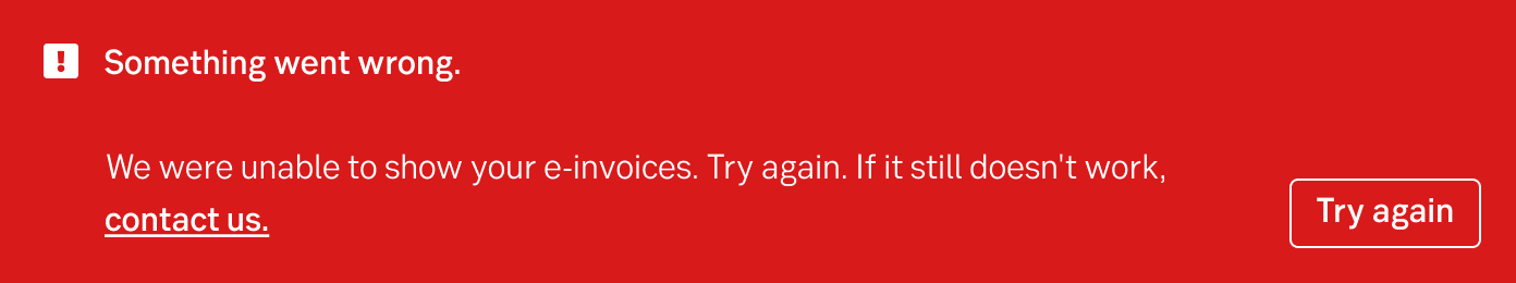
Critical and error ribbons may be used for information that is crucial for the users to be able to do what they want, for example if a system is closed, the service cannot be used or if there is a system error.
In critical and error ribbons, the information about the problem normally consists of:
Result from the latest accessibility review of the component (Chlorophyll, React): 2023-02-22