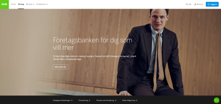
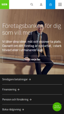
Welcome block
A block to highlight and show the most important or prioritised message for a start or landing page.

Component meta
Component identifier
- pw-welcome
Design version
- 2019-08-19
Design principles
- It's for youEveryday firstTrigger insight
Guidelines
Short description
The ‘Welcome block’ is supposed to show the most important message or conversion of the page. Prioritising is therefore very important; only one such block can be used per page.
An example would be to use it to highlight a new mortgage campaign on the start page. But it could also be used on a landing page to highlight a new article that could be of importance for the visitors.
Remember that the block will set the tone for the rest of the page, make sure it is welcoming.
When and how to use it
Only place on top of a start or landing page. Consider if a ‘Promo block’ might be good enough for your use-case - we do not want to overuse the ‘Welcome’ block. The block also has an option to show some shortcuts underneath it. These should be used to direct visitors to important sub-pages of the same theme/context.
Behaviour
The ‘Welcome’ blocks mainarea has one interactive component, either a link or button that can be used in connection with the text field. This is usually to promote an action or conversion, but could be used to guide the user to important or interesting information. You can add a contrast box behind the heading/text/button area if the image that is being used is of a light tone and thus the contrast between text and image low.
Do's and dont's
- The text must be written by copywriters to assure that we have the right tonality.
- When using the Welcome block for a campaign there must be a button for conversion.
- Do use it to promote important products or messages.
- Do use it on start and landing pages, but only at the top.
Desktop

Welcome block - desktop
Mobile

