Chlorophyll
Styles
The last version of Internet Explorer, version 11, was released on October 17, 2013. This is a very long time ago when taking into account the rapid development of web technologies. These days it is often difficult and time consuming to get modern technologies to work well in this old browser. More and more frameworks are dropping support, and even Microsoft themselves has announced that they will fully drop support for IE in their own services in 2021.
Consequently, we have decided to not include support for IE in the Design Library website.
Luckily, there are modern options in active development. Please use Firefox, Edge or Chrome instead.

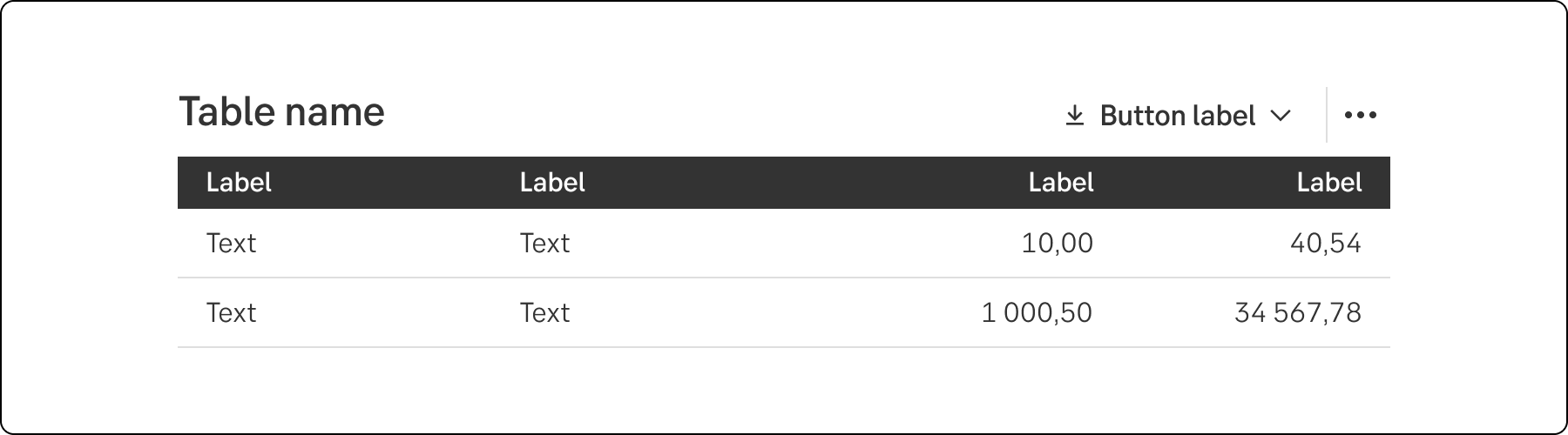
A table displays collections of raw data grouped into rows and columns with supporting headers.
Styles
Javascript
Good data tables allow users to scan, analyze, compare, filter, sort, and manipulate information to match their needs.
Use tables to structure information and provide an overview, allowing the user to spot patterns and possible issues without being overrun with all the details.
A table row can serve as a navigation point leading to a subpage or view.
Depending on the size of the tables, the amount of data in it, and what you can do with it. Primarily we see the following three ways to do responsive tables:
This is the way that makes most sense. Make careful choices as to what columns should be presented or hidden in smaller viewports. Usually it is possible to hide more than you think! When you hide columns, make sure users can still access that information, but in a different view (the detail view).
The table size is fixed and our user can scroll in horizontally to view all columns. This is considered a fallback approach when no other option is doable.
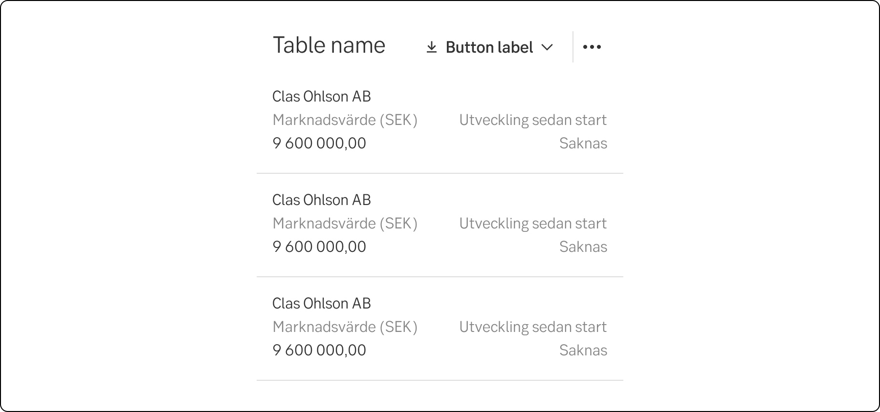
All, or prioritized columns, are grouped into one cell that may be spread on multiple lines to summarize the columns of the table. Make sure this table is still readable in good accessible way for all users (including screen readers). Make sure this table is still readable in good accessible way for all users (including screen readers).
Cell table
Do
Don't
Use short column labels, preferably one word, but no more than three if there is enough space. Use tooltips if you need further explanations.
Don’t start each word in headings and labels with upper case. Only use upper case in:
In need of hyphenation, use soft hyphens (­), so that the word is hyphened only if needed.
Show the character en dash (–) – instead of empty values.
While plain text normally should be left-aligned, values that are numbers should be right-aligned.
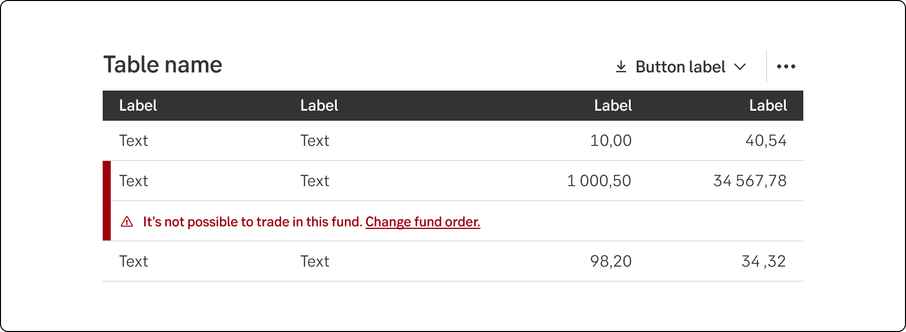
In some cases error handling might be needed in tables. Remember to be concise as space is usually extra limited. If the message is short it can be shown in one of the table columns, longer messages are shown in a separate row below the data it concerns. Messages may contain a link to the help page or another page. Messages below should be limited to two rows, including the link.
When a mutual fund has been removed from our range, but the customer still hasn’t changed her or his default fund distribution. When the customer wants to buy funds in accordance with the default fund distribution or change the distribution, an error message is shown in under the old fund.
It is no longer possible to trade in the fund. Change the fund distribution
Tables can be more or less comlex. While simpler tables don't require much in terms of accessibility, they can quickly become messy when functionality is added.
For more complex tables with plenty of interactive elements, it might be good to code the table as a grid to ease keyboard navigation.
To create an interactive widget that has a tabular structure, use the grid pattern instead. If the interaction provides for the selection state of individual cells, if left to right and top to bottom navigation is provided, or if the user interface allows the rearranging of cell order or otherwise changing individual cell order such as through drag and drop, use grid or treegrid instead.
Result from the latest accessibility review of the component (Chlorophyll): 2023-06-13