
Native app - Button
Buttons are an essential element of interaction design. Their primary role is to help people take actions quickly.
Component meta
Component identifier
- native-button
Tags
- Native
Design principles
Guidelines
Short description
A button serves as an interactive element that enables users to perform an action or make a choice with a simple click or tap. To decide which kind of button/buttons and putting them in the right order is key to make sure users know how to take the right action. A good rule of thumb is to use only one primary action in each context.
When and how to use it
Differentiate the buttons in the context if you have more than one action. Primary buttons require the most attention from your users. Secondary, as the name says, is the second most likely choice.
- Put buttons where users expect to find them.
- Label buttons with what they do.
- Use only one primary action if possible.
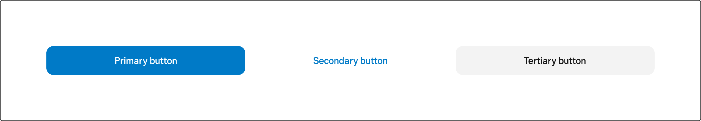
Button variations
Primary
Use this button for the primary call-to-action. Strive to use only one primary button in the same context.
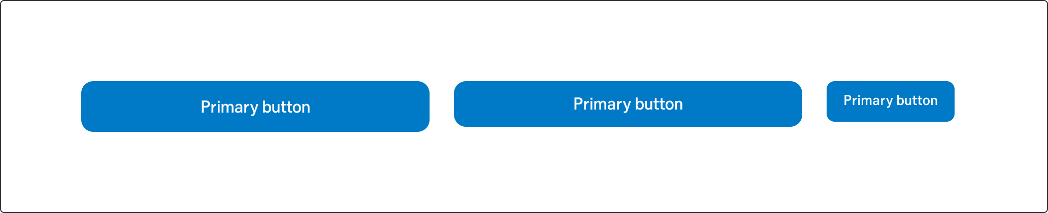
Primary button
Secondary
The secondary button is often used together with a primary button. For example, in a step flow the Next button is primary, whilst the Previous button is secondary. This is because we want to lead the user forward.
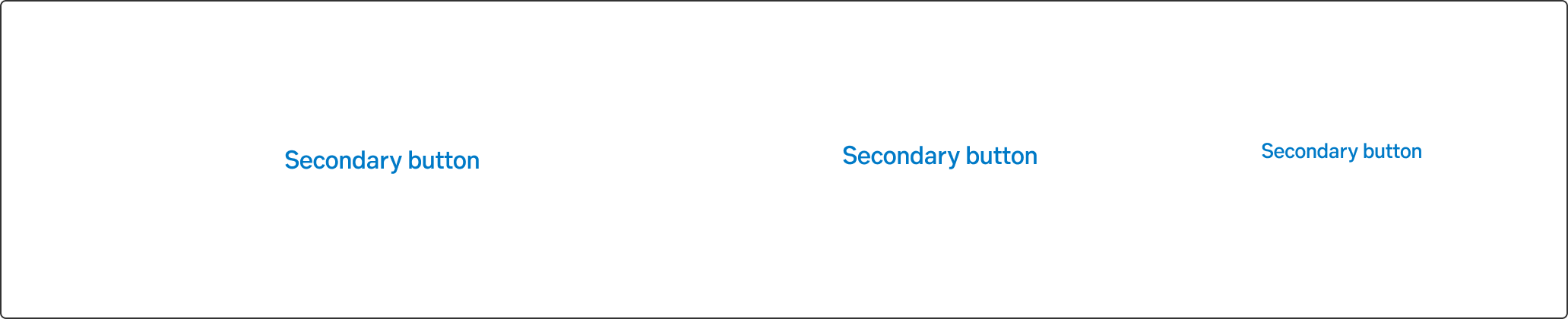
Secondary button
Tertiary
Use for less prominent, and sometimes independent, actions. Tertiary buttons can be used in isolation or paired with a primary button when there are multiple calls to action. Tertiary buttons can also be used for sub-tasks on a page where a primary button for the main action is present.
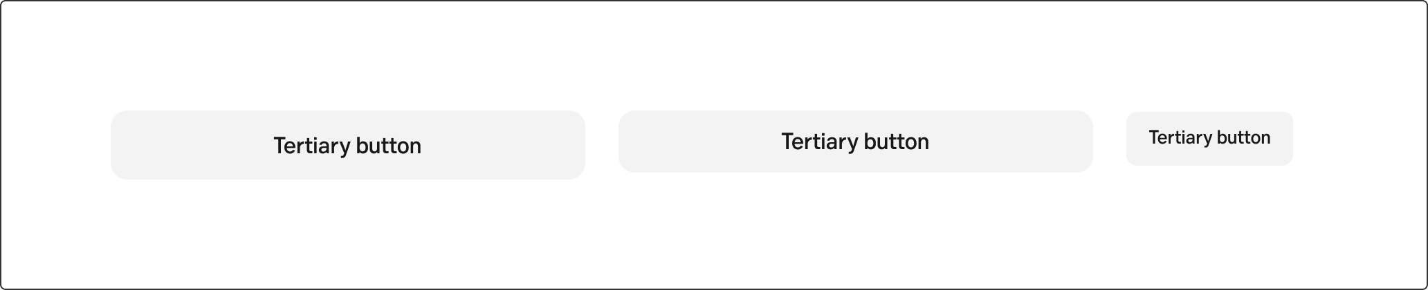
Tertiary button
Destructive button
Destructive buttons are used when the user can perform an action that is removing/deleting something in the interface.
You make a button destructive by changing the text colour to red on either a secondary button or a tertiary one. If the actions is placed by itself directly on the grey background use the secondary button with red text, since it doesn't have any background.
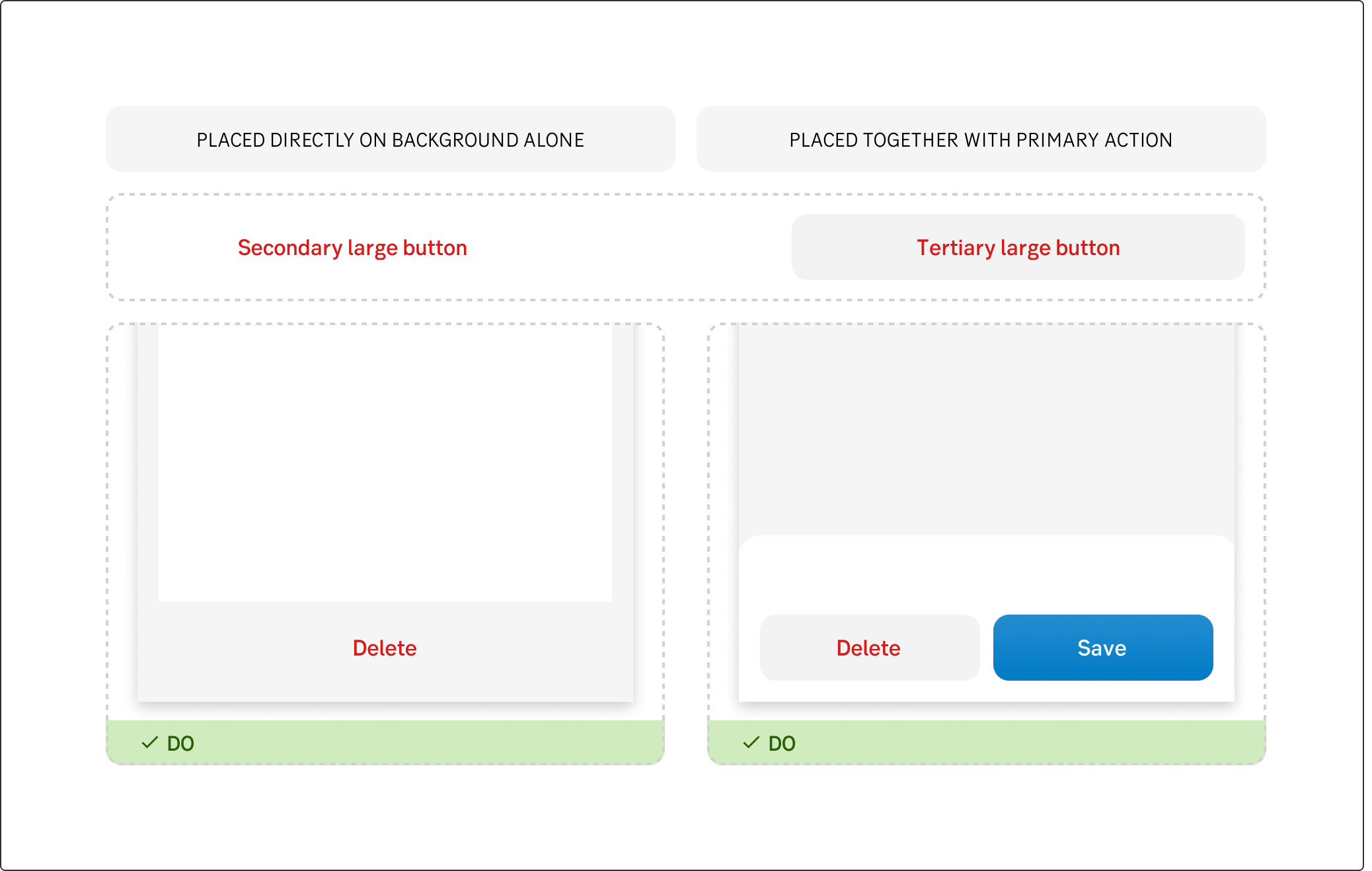
Destructive button
Placement
One button: In most cases, use the full width of the content area.
Two buttons: Look at the context of what you're showing, stack if there should be a very clear primary action to take. Place side by side if it is "Next" and "Back" or "Save" and "Delete".
Three buttons: Consider the need for all of them. "Cancel or close" might be "x" in the top right corner. Worst case scenario: place two buttons side by side and one tertiary button under.
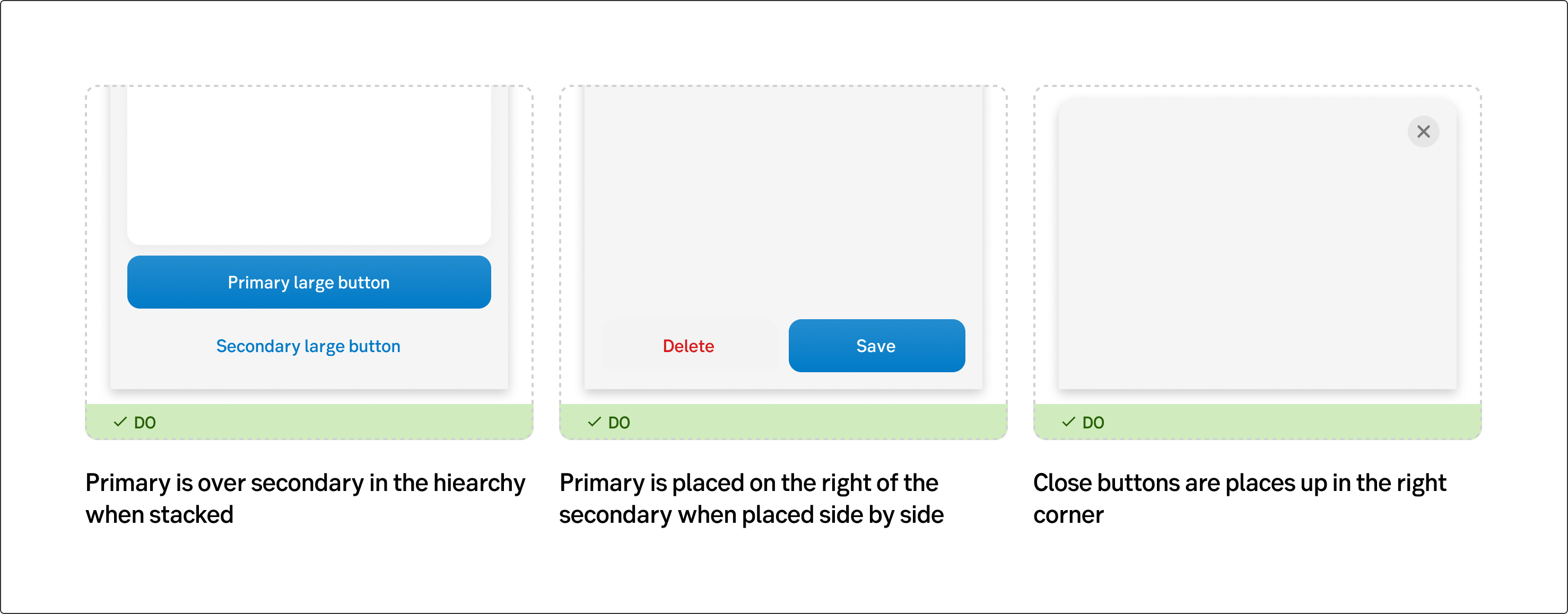
Placement of buttons
UX text
See writing guidelines for buttons here.
Accessibility
.