
Tooltip
A tooltip provides additional brief information about a page element or feature. On hover or via touch. This component is one part of our contextual help pattern.

Guidelines
When and how to use it
Use a Tooltip to describe the meaning for example on a label. Keep it brief! Short text fragments intended to be selfsufficient.
Behaviour
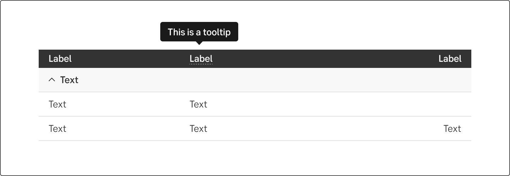
The tooltip is presented via hover on desktop and touch on mobile. The tooltip should always be visible within the viewport. The arrow on the tooltip should point at the target beeing hovered.
Use the icon button with the information-icon to inform the user there is more information. You can also use a dotted line under the label/content if the space is too small for an icon.
Do's and don'ts
Do
- Use a tooltip to add brief messages that act as helper texts.
Don't
- Don't add images or formatted text into a tooltip.
- Don't use a tooltip to describe a complex process.
- Don't use it too frequent in a form. If many fields need extra instructions, you probably need to revise the design or move the help to a central location.
Related links
https://uxplanet.org/tooltips-in-ui-design-f63e117aa3d1
UX text
Note!
The tooltip is small and highly contextual. We recommend a maximum of 140 characters; hence it is quite a challenge to keep it short but still friendly.
- Use it to add brief information about the specific element.
- Use it to providing specific information, for example how to change tax domicile.
Helpful questions
The user will probably need information that answers these questions:
What is this?
Use the tool tip to briefly explain a word or subheading:
What does it do? How does it work?
Use the tool tip to help the customer understand the interface:
How do I use it?
Use the tooltip to help the customer understand the service, and make knowledge-based decisions:
Upper and lower case
Don’t start each word in headings and labels with upper case. Only use upper case in:
- The first letter of the first word
- The first letter of proper names
- Abbreviations
Do's and dont's
Don't
- Don't write crucial information in a tool tip.
- Don’t write the obvious, eg. Enter your name in a field tagged Name. Tooltips with obvious or redundant text are not beneficial to the customers.
- Don't explain in a logical loop, eg. xxx
Accessibility
-