
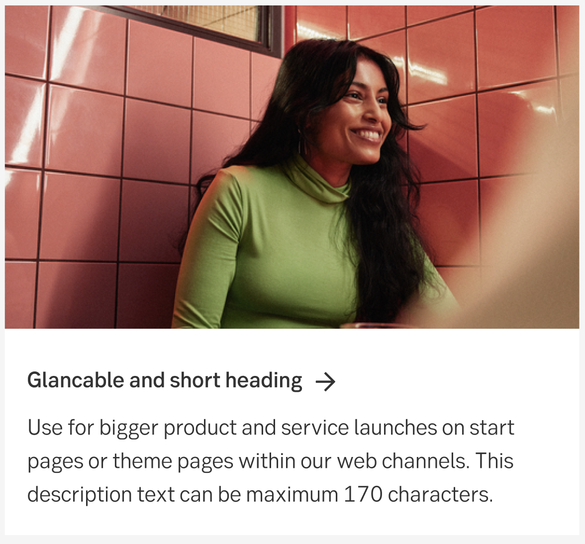
Teaser block with image
Creates awareness and trigger an interest about a new product/service launch in our web channels logged-in environments.
Component meta
Component identifier
- component-teaserblock-image
Design principles
- It's for youTrigger insight
Guidelines
Short description
This block is used for bigger product/service launches on start pages or theme pages within our web channels. The intention is to inform the user about the offering and possibly persuade them to read more and buy or activate the service.
When and how to use it
The purpose of this block is to drive conversion and digital sales. It's used for communicating messages like:
- Marketing of a new significant and relevant product/service launches from SEB that is available within the channel (i.e Digital Advisory, SEB Bot Advisor)
- Marketing of a new significant and relevant product/service launches that is provided by other another provider (i.e Oxid, Apple Pay)
Where does it take the user?
If the product/service is available within the channel (i.e Digital Advisory) the block should link to that sub page. (which should have a "product/service onboarding" state if the user doesn't have the product)
If the product/service is not available within the channel (i.e Apple Pay) the block should link to the product/service page on seb.se or mobile app (in mobile devices only).
Placement
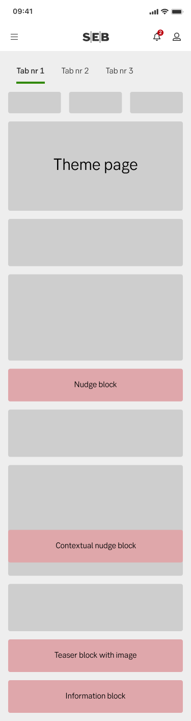
The exact placement of the content block varies depending on the page layout. These images show roughly where we aim to put the content blocks.
Desktop
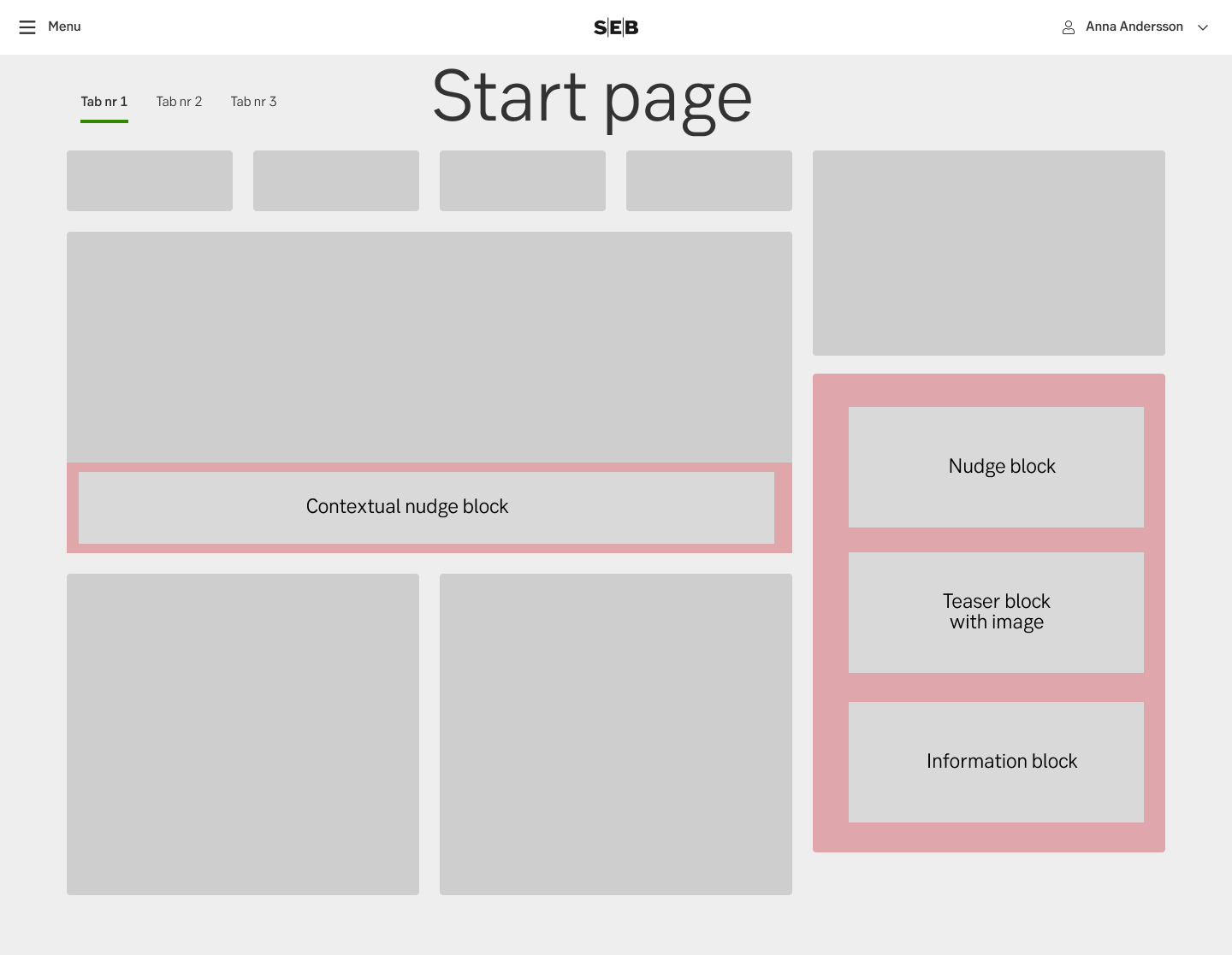
Start page
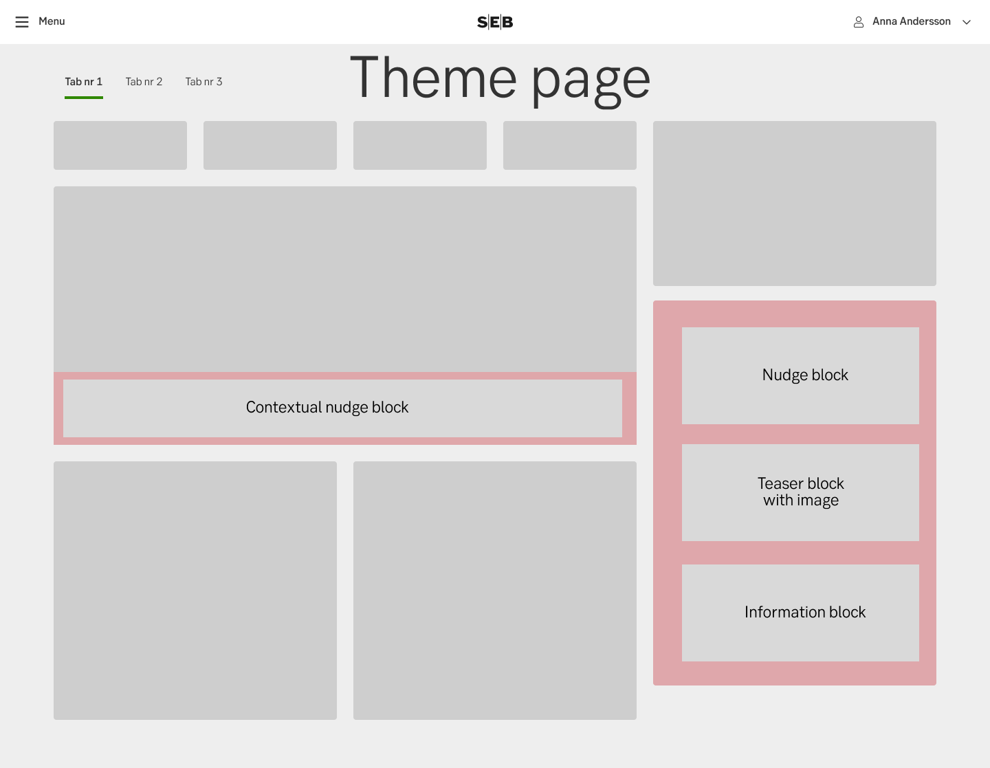
Theme page
Mobile
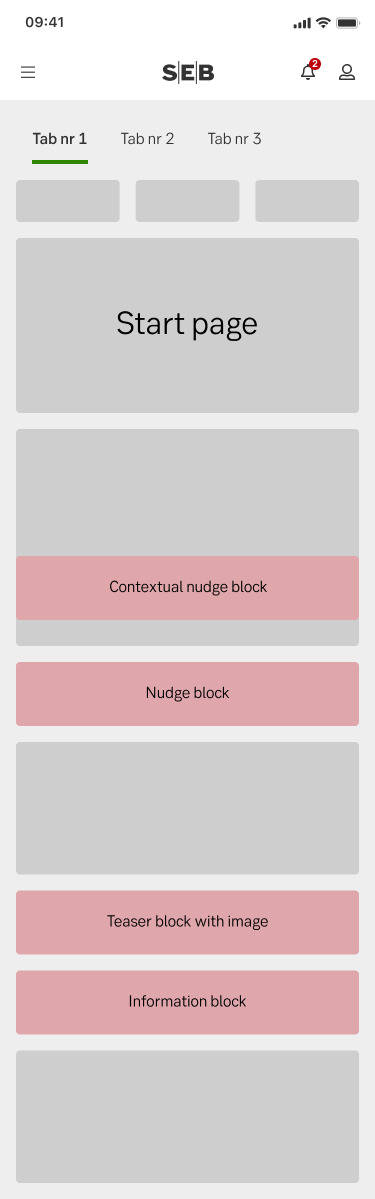
Start page
Theme page
Do's and don'ts
Don't
- Don’t use this block for minor product/service updates on existing products/services. Don’t use this when marketing new features in another channel (i.e "Block cards in mobile app) since this is more considered as a "Tips" for self-service efficiency).
- Don’t use this block for other message categories than product news/service launches.
Web channel notes
- Editorial guidelines and more technical information can be found in Confluence: Channel communication - Channel Platforms - SEB Confluence (sebank.se)
- Remember to always follow the Nonfunctional requirements for our web channels: Non Functional Requirements - Channel Platforms - SEB Confluence (sebank.se)
Specification
- Details: Specification in Figma
- Instruction: How to access Figma