
Slide-up
Slide-up modals are used in a hybrid/mobile context to view more details, subviews or to make a selection.
Component meta
Component identifier
- component-slideup
Design version
- 2020-03-09
Design principles
- Frictionless
Guidelines
Short description
Slide-up sheet is a white area sliding up from bottom of the viewport. The purpose is to mimic the native mobile behaviour of the slide-up component.
When and how to use it
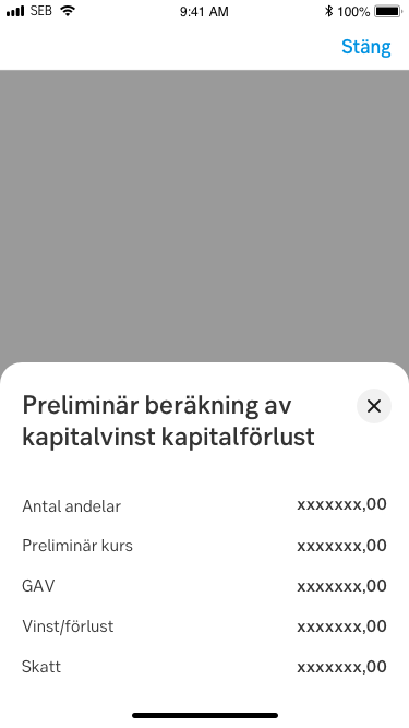
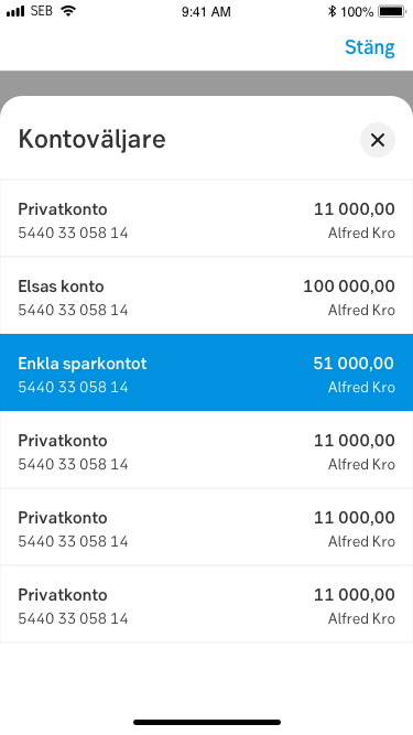
The component is used when you want the user to take action from a list of options (e.g. select bank account) or present a set of data, without requirement of further actions (e.g. further information or clarification).
Behaviour
The Slide-up sheet is based on the native component and aims to have similar behaviour and pattern. It can be triggered from different components like a default link, a button, selector etc. Slide-up sheet is only available on mobile devices regardless app or responsive framework.
On desktop, the equivalent component is the Slide-out modal.
The height of the slide-up sheet should be dynamic in that sense that it adjusts its height to the content. The max height of the component should be X% of the view port since the "Close"-icon can be easily mistaken by the “Close”-link in the native navigation bar. When the sheet is set to max-height, additional content should be scrollable. The title and "Close"-icon should be sticky when content scrolls beneath it.

The component is closed by performing the following:
- Tap "Cross"-icon in upper right corner
- Tap outside of component
- Select an actionable option (if that is the case of content)
- Vertical drag or flick-gesture on component area
Do's and don'ts
Do
- Use when you want to present a list of actions where every single option requires extensive amount of data and headings/paragraphs
- Use when it is preferable for the user to stay in context
- Use defined components in the sheet, e.g. list with several columns and rows, heading, paragrap
Don't
- Don't make it full height to top of viewport
- Can be overkill to use if you have one word or short sentences as a selection option. Use instead native scroll wheel behaviour
- Avoid having more than two slide-up sheets active at the same time
Specification
- Details: Specification in Figma
- Instruction: How to access Figma
Examples
Kontoväljare
Calculating loss of capital