Error summary
A summary of all the errors in a form

Component meta
Component identifier
- component-errorsummary
Tags
- Global
Design principles
- Everyday first
Guidelines
Short description
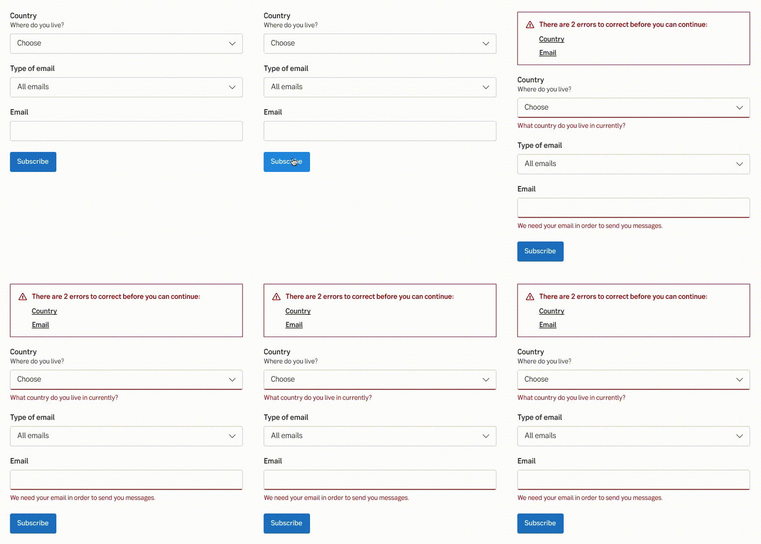
When a user attempts to submit a form with errors, this component displays a summary of those errors above the form. Including an error summary greatly assists users in promptly identifying and addressing multiple errors in a consolidated manner. It provides a clear indication of what went wrong and what needs to be corrected.
Each form component that contains an error is listed as a row, displaying the name of the field and linking it to the corresponding form element.
When and how to use it
After trying to submit the form and it doesn’t validate, the summary is displayed.
Behaviour
The headline always has a summary of how many errors the form contains included in the sentence. When it’s displayed, the focus is set to the text and the viewport of the browser is scrolled so it's visible on the top.

Behaviour of error summary
Placement
Always above the form, after trying to submit a form containing errors.
Do's and don'ts
Do
- Always use together with error-states for each field with errors.
- Consider adding "Error: " to the page-title when the message is displayed, this guarantees that a screen reader notifies the user.
Don't
- Display the error summary dynamically, neither as they occur or as they are corrected.
UX text
The list of errors is the same as the field labels for each field containing errors.
Multiple fields with same name
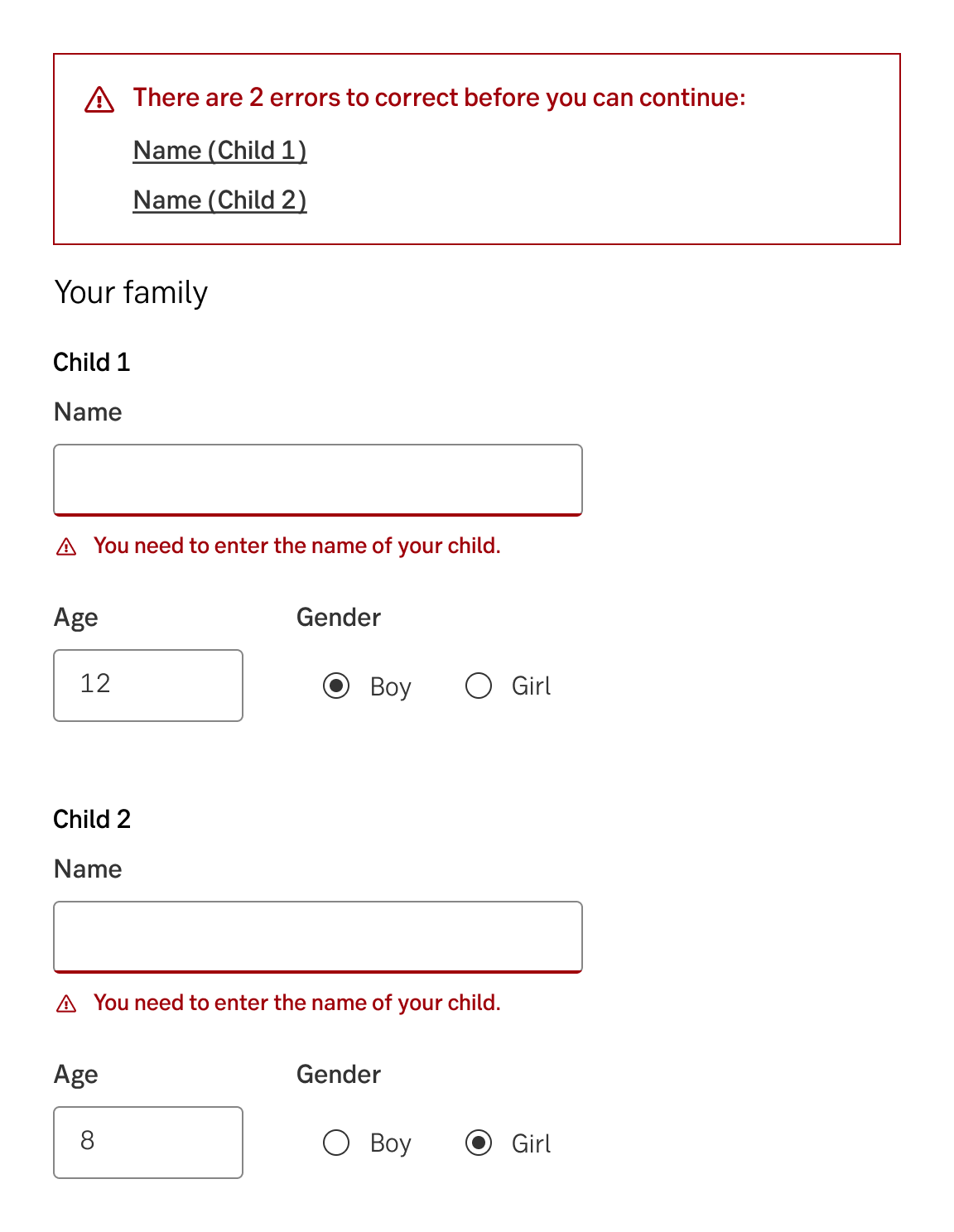
When there are multiple fields with the same name, they should be grouped together within an area (fieldset). The name of the area is then used as a reference in parentheses in the error summary.

Example of multiple fields labelled "Name"
Accessibility
Semantics
The error summary should be presented as a navigation landmark (<nav> or role="nav"), and contain a list of links. The links should have empty href attributes to signal that they refer to the same document. When a link is activated, focus should be moved to the corresponding control in the form.
Live region
The error summary should be placed in a 'polite' live region (aria-live="polite")
Specification
- Details: Specification in Figma
- Instruction: How to access Figma
