
Error handling
Error handling guides the customer to fulfil their task successfully or understand the situation.
Component meta
Component identifier
- pattern-errorhandling
Tags
- Global
Design principles
- Everyday firstBe the good guy
Guidelines
The first principle of creating a great user experience is to make users feel secure. Guide them intuitively by designing the interface so it's easy to do the right thing, and provide clear, positive feedback that reassures them they are on the right path.
Key guidelines for effective form validation include:
- Communicate clearly with the user—offer guidance on how to fill out the form correctly.
- Use colour to highlight important information and alert users to errors.
- Display error messages directly beneath the corresponding input field.
- Keep the user on the same page until the error is resolved, ideally providing feedback immediately after the data is entered.
- Incorporate positive, real-time inline validation as users type (optional).
UX text
Validation errors
Messages below input fields
All error messages should follow these:
- Written in plain language rather than technical terms.
- Constructive so the customers know what needs to be done to fix the problem.
- If it is helpful and there is enough space, explain what went wrong.
4 main principles
- Focus on how to enter the data correctly
- Principles for mandatory fields
- Principles of invalid characters or formats
- Something is wrong but we don’t know what it is
1. Enter correct data
Focus on how to enter the data correctly
Space below the entry fields, is often limited. Therefore, the message needs to be short. Avoid telling what the customer has done wrong – unless it is needed. Instead, focus on the solution, that is how to fill in the field correctly.
Use verbs like these:
- Fyll i …, Välj …, Skriv …
- Enter…, Select…, Fill in…, Type… or Write…
Or, if the customer can choose to either type or select in a list or date selector:
- Fyll i eller välj …
- Enter or select…
When the message needs to be explicit:
Situations when the message needs to be explicit are for instance, when the same message needs to be displayed for more than one type of error or when the characters that can be used are unusually constraint. In these cases, it is helpful to tell both what is wrong and how to enter the field correctly.
When you need to display the same message for more than one error:
- Datumet har fel format eller så finns det inte. Du kan använda formatet ååååmmdd.
- The date is in the wrong format or does not exist. Please use the format YYYYMMDD
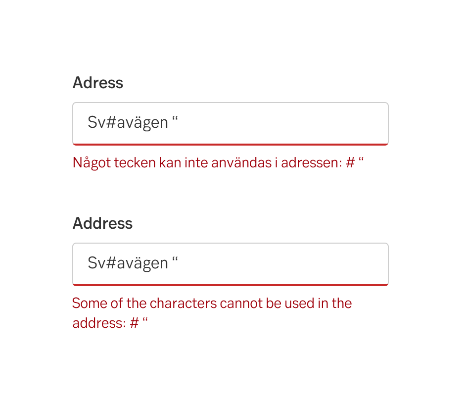
When the user types a character that cannot be used:
Tell the user that there are characters that cannot be used, and specify what characters.
- Some of the characters cannot be used in the address: # “
- Något tecken kan inte användas i adressen: # “
When the error is helpful enough and the solution is over explicit:
However, the message does not need to be over explicit when it is obvious how to do the right thing. Such situations are for example when the customer needs to choose another date because the date is not a business day or a day in the past.
When the date must be a business day:
Do this
- Datumet måste vara en vardag.
- The date must be a business day.
Don't do this
- Datumet måste vara en vardag. Välj en annan dag.
- The date must be a business day. Choose another day.
When the date must be in the future:
Do this
- Datumet måste vara senare än idag.
- The date must be later than today.
Don't do this
- Datumet måste vara senare än idag. Välj en annan dag.
- The date must be later than today. Select another date.
2. Mandatory fields
Principles of mandatory fields
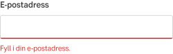
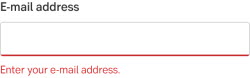
Never use messages such as Mandatory field or Must not be empty. Ask the customer to fill in the field. But just Fill in this field is not enough. You should also mention what kind of information the customer should enter. For each field.
Example 1
- Fyll i din e-postadress.
- Enter your e-mail address.
Example 2
- Fyll i eller välj mottagarens kontonummer.
- Enter or choose the recipient’s account number.
Example 3
- Fyll i betalningens OCR-nummer.
- Enter the payment OCR number.
3. Invalid characters or formats
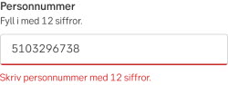
Principles of invalid characters or formats
Never use messages such as Invalid characters or Illegal data. Instead, encourage the customers to fill in the field and mention what kind of data they should enter, for example:
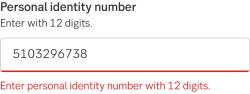
Example 1
- Skriv personnumret med 12 siffror.
- Enter the personal identity number with 12 digits.
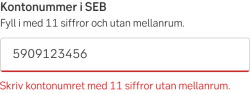
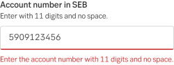
Example 2
- Skriv kontonummer med 11 siffror utan mellanrum.
- Enter the account number with 11 digits and no space.
4. Something is wrong
Something is wrong but we do not know what
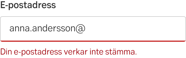
We know something is wrong, but we don't know what. We ask the customer to check the input data again:
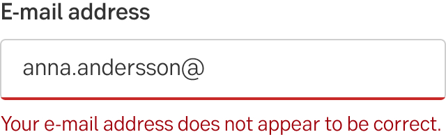
Example 1
- Din e-postadress verkar inte stämma.
- Your e-mail address does not appear to be correct.
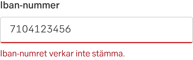
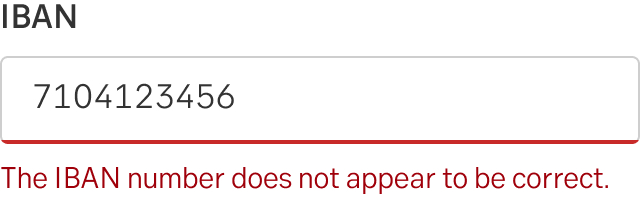
Example 2
- Iban-numret verkar inte stämma.
- The IBAN number does not appear to be correct.
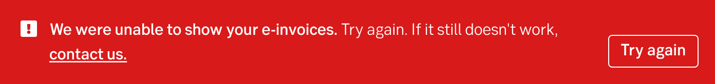
Something went wrong and we know what it is
In the case we know what went wrong we tell the costumer what in the heading. Avoid "Something went wrong" and be more specific, as an example: We were unable to show your e-invoices.
If the user cannot do anything to solve the problem, encourage the user to try again or contact us if it does not work.
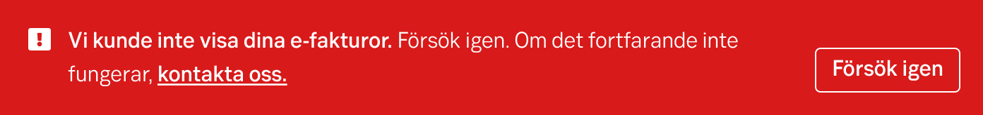
- We were unable to show your e-invoices. Try again. If it still doesn’t work, contact us.
- Vi kunde inte visa dina e-fakturor. Försök igen. Om det fortfarande inte fungerar, kontakta oss.
Eng
Swe
Something went wrong but we do not know what
Use a heading saying that something went wrong. Encourage the user to try again or contact us if it doesn’t work. Link the user to our contact page.
- Something went wrong. Try again. If it still doesn’t work, contact us.
- Något gick fel. Försök igen. Om det ändå inte fungerar, kontakta oss.

Eng

Swe
Contact the UX writing team
The validation error is one of the most important interactions the users have with us. It is often tricky to get the tone-of-voice, the instructions and the vocabulary correctly in such a tiny space. This is what our UX writers are trained for, so please don’t hesitate to contact the UX writing team for error handling. Reach out in the Teams channel “UX writing” in Green Design System, send an e-mail to cx-skribenter@seb.se, or if you already have a connection, simply contact that person.
Error handling in forms
Error messages in forms can be visualized in three different ways, depending on the type of error:
- Field error
- Error summary
- General form error
1. Field error
If there is an error connected to the input in the field, the user will get an error message. The field with the error is marked red and an explanatory text is displayed right next to it.
Generally we want to inform users of errors as fast as possible; when leaving the field, but not whilst typing. If the user does not enter anything in the field, the field is not validated when they leave the field. The validation for an empty field happens when the user tries to go forward in the flow, Next, or click the final CTA button such as Apply. When we don't know if it's wrong before submitting, the error is displayed after submitting.
Examples of error states:
2. Error summary
When submitting a form that contains error we need to summarise all the errors in the form above the form. This is used to help users find everything that’s wrong, something that is particularly hard when using a screen-reader or zoom-tools, but can be equally hard in a long form. Each field with an error is listed in a bullet list and each item is an anchor-link to the field.
Component: Error summary
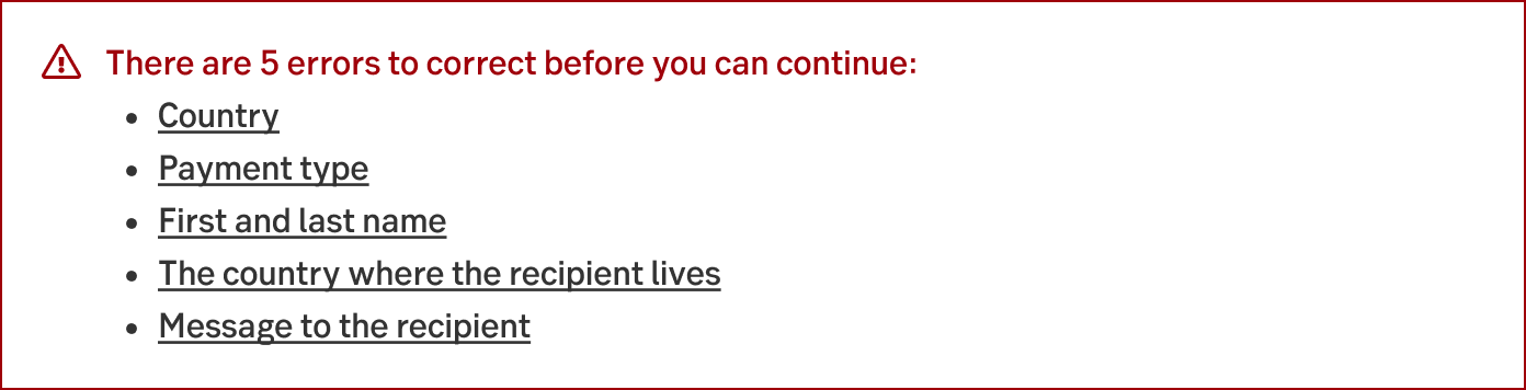
Eng
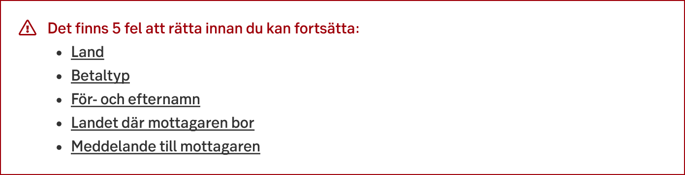
Swe
3. General form error
When we can not tie the error to a specific field we may need to add a general error. The error is placed above the area affected by the problem using Alert ribbon. If it's not possible to place the message in a layout, use the Toast notification.
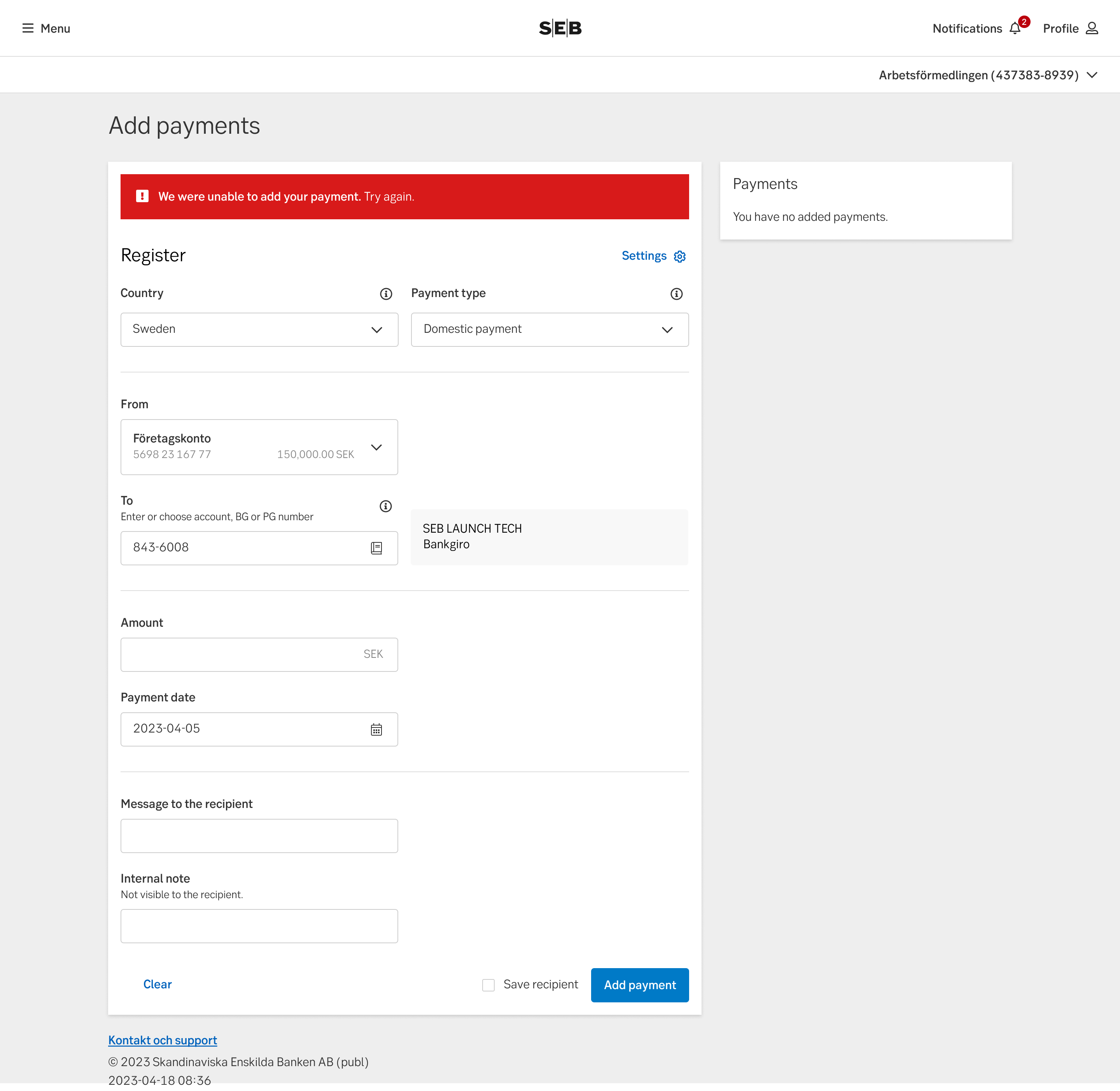
Example of general error
Use alert with CTA button
When the error occurs on a page that does not have a CTA itself. The label should say "Try again".
As an example, you enter a page and something goes wrong. The alert ribbon tells the customer something went wrong, and gives the customer the CTA button in the alert message to try again.

Eng

Swe
Use alert with dismiss
If there is a CTA on the page that the customer clicked and the error occurred. The customer can use the same CTA again and therefore it is not necessary with another button in the alert.

Eng

Swe
Application errors
Application errors happens inside a function in a site, typically an MFE. This can be triggered by a user interaction (when clicking a link or function) or from a server/programming error. This type of message is also used for error pages such as 404.
Errors should always be monitored so that we as a bank knows that things are broken. If we start learning more about a certain problem we may change the text of the error to be specific of the situation that is happening right now or if there is an alternate way to handle the users task right now.
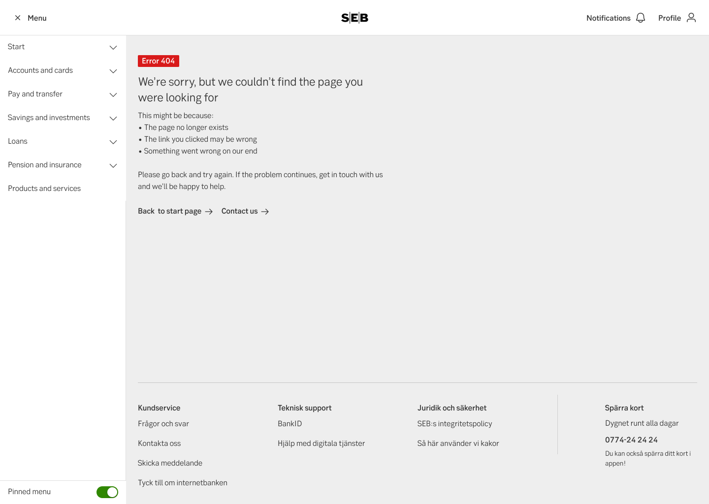
Error 404 (English)
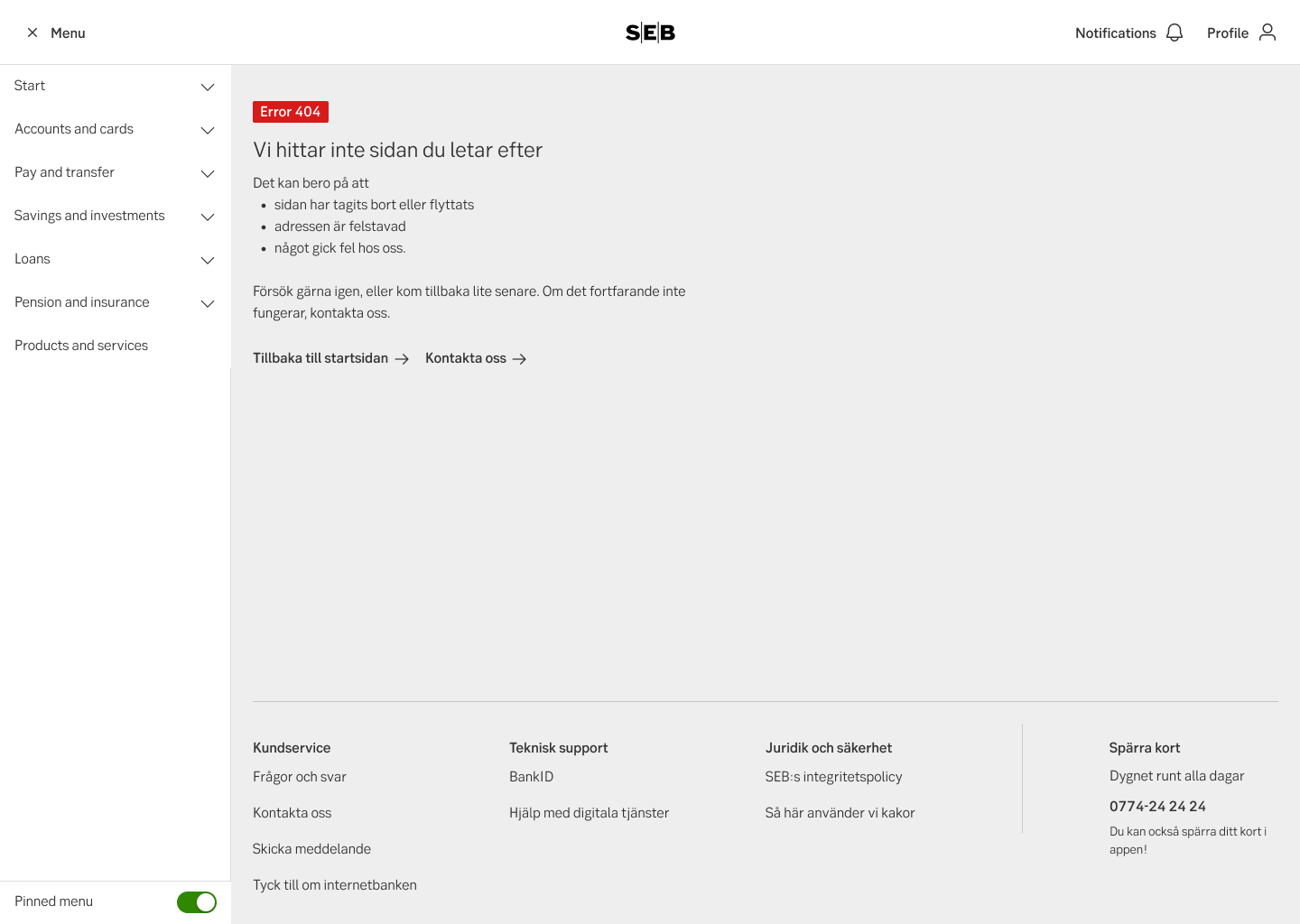
Error 404 (Swedish)
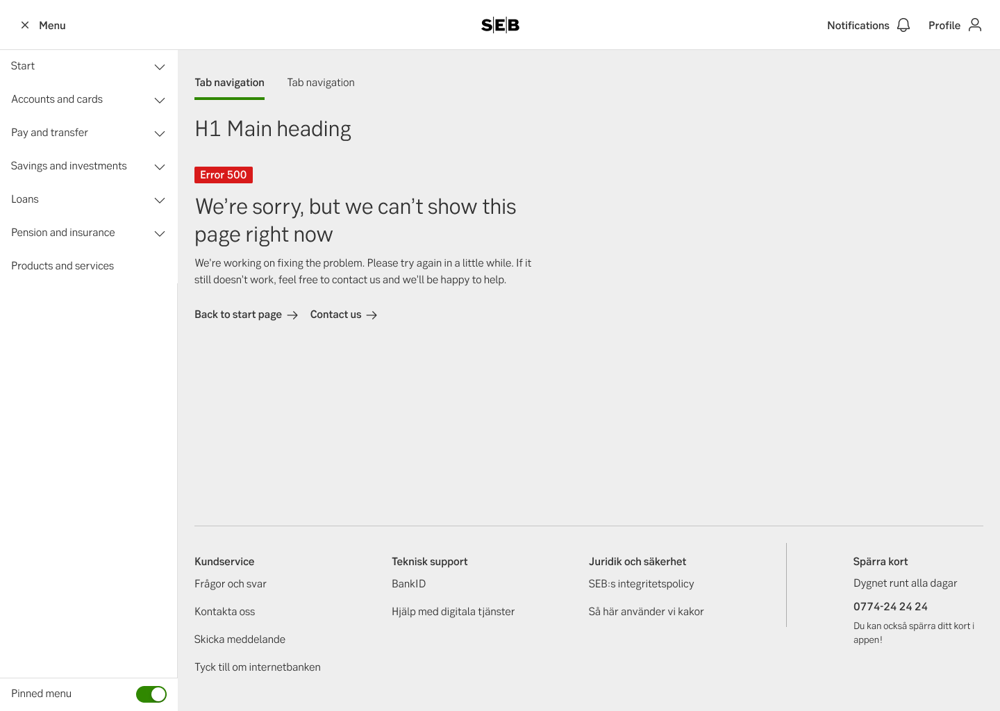
Error 500 (English)
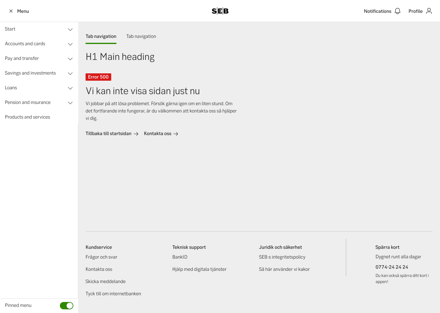
Error 500 (Swedish)
Closed application/pages
When a part of the site is temporary closed due to maintenance or an ongoing error SEB may choose to close the page or a part of a site.
Stop pages should include information about why the page is closed and information about when it’s planned to open again (if possible). Also include option for the user to continue using other features or if it’s possible to perform the task through another channel.
At a further point we wish to add the possibility for the user to be contacted when the problem is fixed.