
Contextual help
Contextual help is the help the user finds closely integrated in the interface she is working in.
Component meta
Component identifier
- pattern-contextualhelp
Tags
Design principles
- Frictionless
Guideline
Short description
Contextual help is a group of techniques use to help the user in close relation to the feature she is using right now.
- Tooltip: A quick explanation of a word or feature.
- Expandable areas: A slightly larger description but you may need to be able to read it whilst using the feature.
- Modals: Used when the help connected to the feature requires a longer read or a deap dive into the functions rules.
- Coach marks: Used to guide users to new features added to the page/site.
When and how to use it
Before using the Contextual help pattern, with hidden information, consider if it is really needed. We should not hide information if we don’t have to. Would it instead be possible to shorten the information, so it fits in for example as label information or in another visible area?
Use the Contextual help to give users who quickly want to look up a particular fact about a product/content or when an explanation, for example a label most users most likely understands but for some users' needs a more precise explanation.
Use for onboarding for new users who are not familiar with an interface and need assistance, (the best way to assist new users is to provide onboarding tutorials). To update users on a new or updated feature that is redesigned. Or for a function that changed placed in the ui.
Do's and don'ts
Do
- Always show important (critical for the context) information to the user from start.
Don't
- Never hide important (critical for the context) information to the user from start. Only if the space is to limited.
- Don’t explain every detail on every field, it may actually make the interface harder to understand.
- Don’t use many variants on the same page.
Components
What component should I use for which type of information?
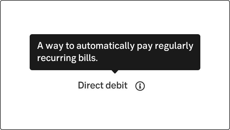
Tooltip
Provides brief information related to the content. Tooltips are triggered when users hover their cursor over an underlined label, an icon or an image. Tooltips are text based. Best used for short information on for example what a label means.
Link to Component: Tooltip
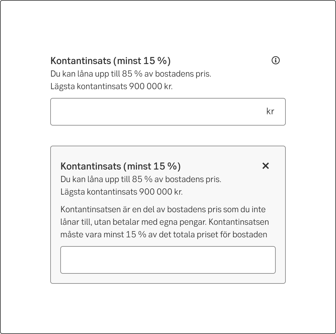
Expandable lable information
Use when important information does not fit in a label or in default label information. It is for when the text is too long for a tooltip but too short for a slide-out modal. Expandable label information suits well in a form where the user works their way down, like in an in-page wizard. The text information expands under the label information.
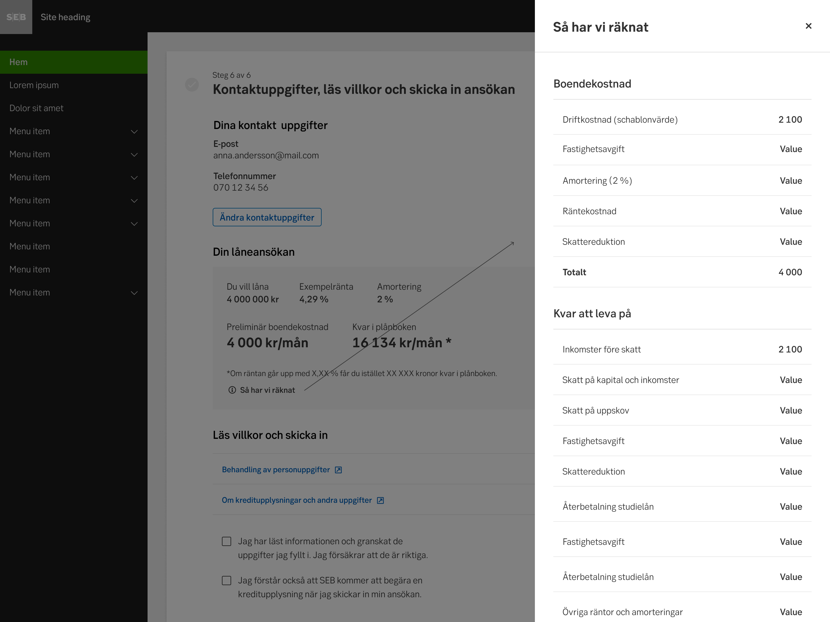
Modals
Contextual help in a modal can contain more information. The SEB contextual pattern prefer the Slide-out modal. Use it for example as a central help for a form when several input labels need more information, or for the presentation on a loan application on how we have calculated. Often used more of a “dig deeper” type of Contextual help.
Link to Component: Slideout
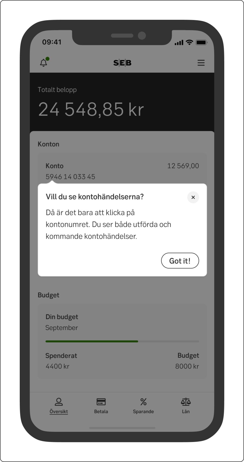
Coach marks
Contextual help in coach marks is presented as short, informative text. Can contain more information than in the Tooltip. For example an action or link. Best used in an Onboarding pattern for new users that needs a tour or for new features or layouts.
Link to Component: Coach marks
UX text
For screen readers, the "i" icon should be read as "More information." There's no need to include extra text from the associated label, as the screen reader already reads it out, making it repetitive for the user.
Accessibility
-