
Help
When our users need help or guidance to fulfil a task
Component meta
Component identifier
- pattern-help
Design principles
- Be the good guyFrictionless
Guidelines
Short description
This page is an inventory of the available components used for help and general guidelines for when to use which.
Our customers are different when it comes to prior knowledge and digital maturity and some may need help at different times. Ideally, the interface in our digital services should be as intuitive and self-explanatory as possible. Fields and form elements should be forgiving, i.e. allow the user to enter data in all common formats.
When to use help
The primary recommendation for when to provide help or guidance is: don't make it a problem if it isn't a problem. Try to define if it is a have to know or a nice to know thing. Only tricky situations should have help texts. To identify where, when and if help is needed, get the expertise from CX-writers and CX-designers.
Components
These components are especially suitable to help users.
Field instruction
A field instruction adjacent to an input field. Use this type of help when it's valuable for all users to see the help quickly.
Component: input field and other form fields
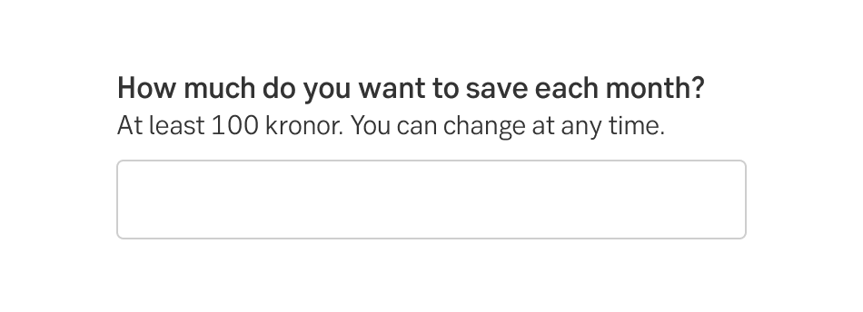
Field instruction
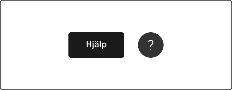
Contextual help
A help icon next to a form-field. Use this type of help when there is a lot more to tell about the field, but everything is not needed for all users all of the time. Clicking on the icon may lead to several endings: tooltips, expandable information or a slide-out.
Pattern: Contextual help
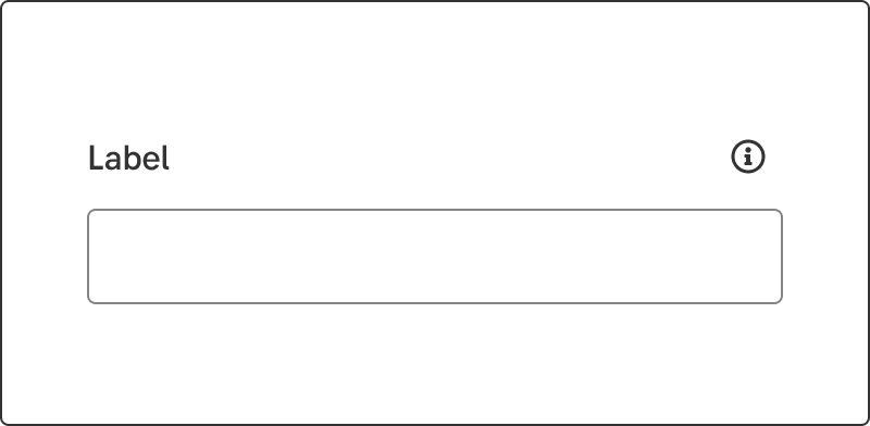
Form field with contextual help
General form help
A help link or button. Some help is not tied to a particular field or area, but rather paints the wider strokes or give overall information about the flow/actions/products.
Component: Button
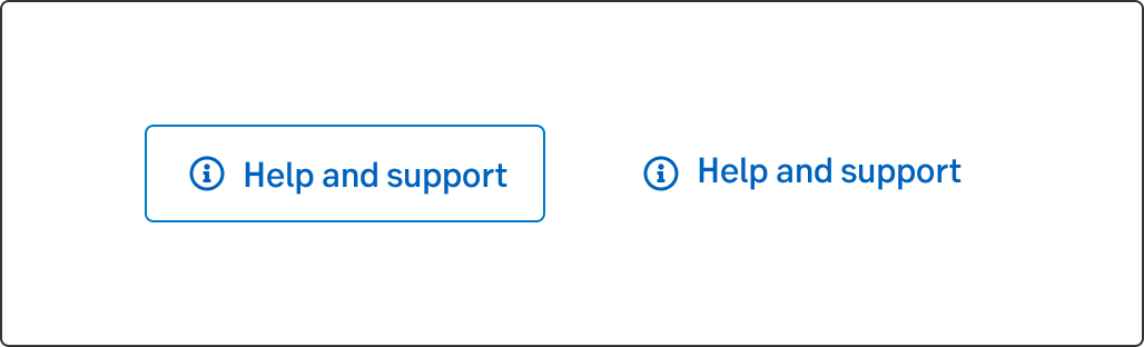
General help as secondary/tertiary buttons
Wizard
Used in complex cases. When it's difficult to describe many fields for a user, it might be better to split the form in multiple steps in a wizard. In the take-over wizard there are also areas for supporting content to further explain the fields.
Pattern: Wizard
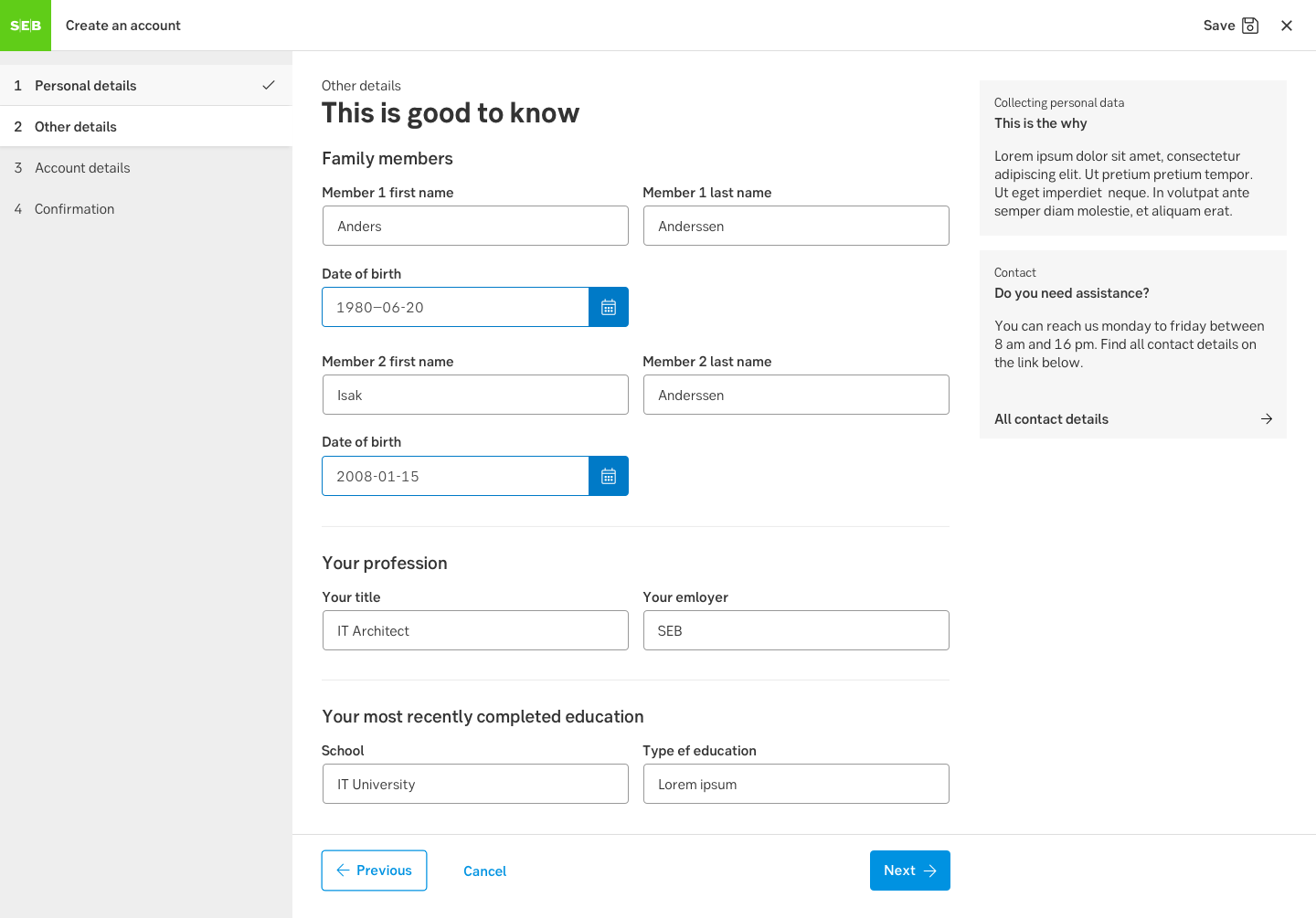
Wizard
Support corner
All general help information in logged-in channels may be transferred to the support corner. It's a floating button visible on all pages in the lower right corner. Currently it's available in Internetbanken Private
Support corner, desktop/mobile
Use cases
Common situations when customers need help
Instead of focusing on which component to use, focus on the user's problem. Consider the following list a suggestion and help to reason (rather than rules).
Explain wordings
A difficult or unusual word e.g. SNI-code, acquisition value.
a) Field instruction
b) Tool tip
Interface is unclear
When the interface is unclear or not obvious, e.g. what format should I use for amounts, how many characters can I use in an input field, how do I filter a list.
a) Field instruction
b) Tool tip
What is happening
Help to understand what is happening behind the scene, e.g. how does SEB process a loan application (comprehensive), when is the money deducted from my account (concise).
a) Tool tip
b) Slide out/up
How things work
Educational help to understand how things work, e.g. laws, taxation rules, bank-id, UC.
a) Tool tip
b) Slide out/up
c) Support corner
We inform on topics
Legal, various topics that we must inform the customers about even though they are not that interested, e.g. There’s a risk involved when you invest in funds. You might not get back what you put in.
a) Tool tip
b) Slide out/up
c) Support corner. Customer questions such as How do I get Swish or How much does the credit cost are considered customer service questions and left out of the help categories.
Do's and don'ts
Do
- Discuss help with different expertise; copy, design and business. Define if it is a have to know or a nice to know thing.