
Take over wizard
The most complex and complete type of wizard we have, used mainly for complex tasks in logged in channels.
Component meta
Component identifier
- component-wizard
Design version
- 2021-05-05
Design principles
- Frictionless
Guidelines
Short description
Wizards are a powerful design pattern that can be used to simplify complex processes. By showing less information at a time, they allow users to focus better on the content. The steps can vary depending on the user's input.
When and how to use it
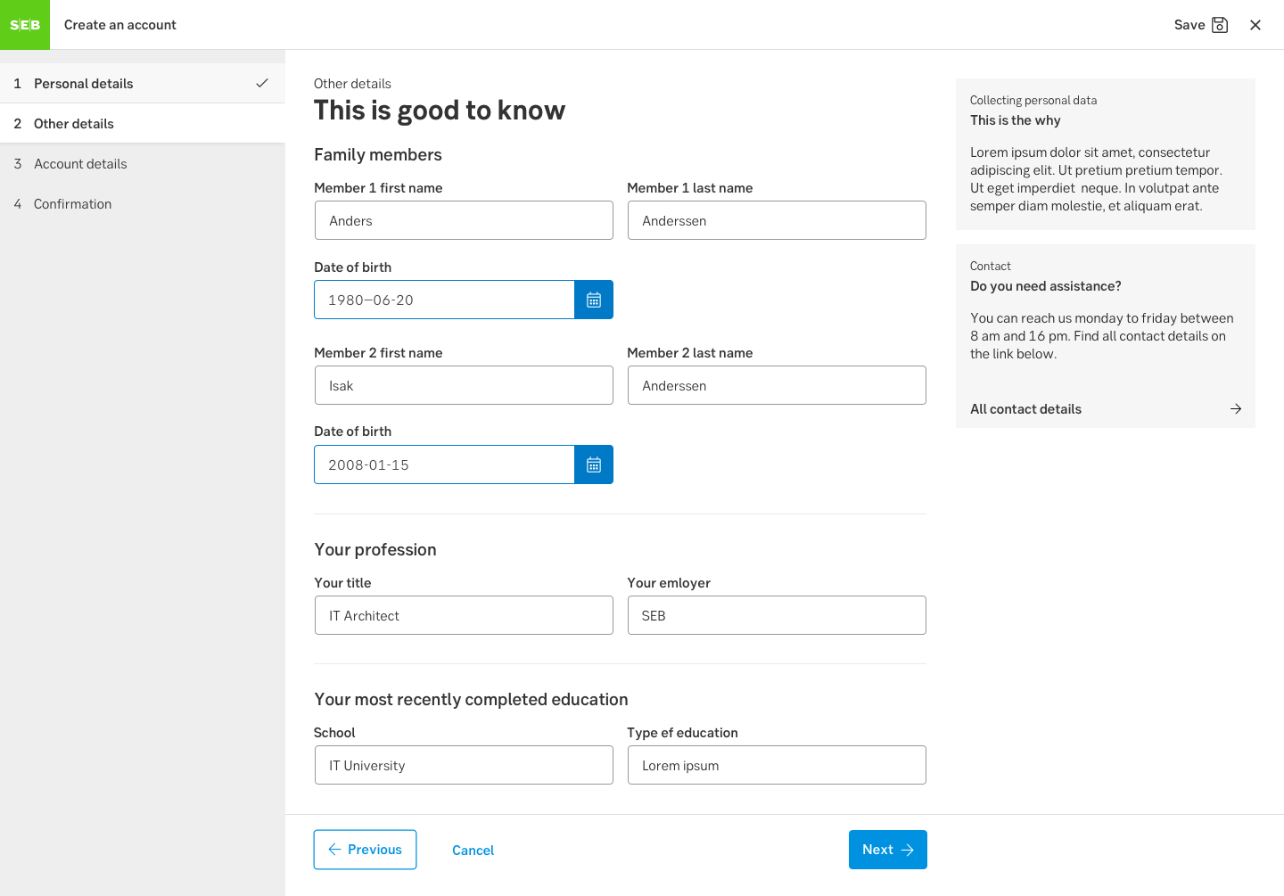
Use a wizard when a user has to complete steps in a specific sequence, or when a complicated task needs to become simplified. Be specific on what information a user is required to supply at each step. Use the supporting content area to give hints on what is required or provide a short FAQ relevant to that step. Try to group related questions (i.e. personal information) in one step.
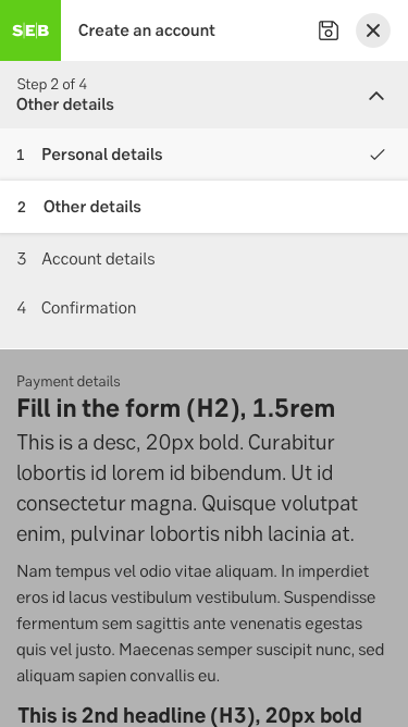
Steps
Each step in the wizard may have a state. The states are:
- Normal, used for the subsequent steps in the wizard
- Active, this is the current step the user is filling out
- Disabled, a subsequent step that user may not access without completing steps before. These are used if you may not jump to steps further ahead.
- Completed, these steps have already been visited and are filled to satisfaction
- Error, visited steps that contain form errors, such as missing information.
For advanced cases a step may hold sub-steps. These are numbered as sub-chapters: i.e “2.1 Adress details”. Steps may occur based on user input. For example, if a user states she also own a company, a completely separate step may be needed to supply all information about this.
Behaviour
The take over wizard relies on the behaviour of a takeover modal, where it acts as an added layer on top and uses the whole width and height of the viewport.
Step buttons
The Previous and Next buttons should be placed in their direction (previous - back, next - forward). The buttons contain an arrow icon placed centred aligned with the text in the direction.
- Since we want to lead the user to the next step, the Next button is the Primary button.
- The Previous button is a Secondary button.
- In some cases we also need a Cancel button which is a Button link.

Desktop
Desktop step buttons can be sticky to the bottom of the browser (optional). The buttons are placed within the width of the main content area.
Mobile
Mobile step buttons are not sticky and placed at the bottom of the main content area.
Grid
A grid is applied on the main and secondary content areas, whilst the step navigation is fixed at 320 px. The content is always left-aligned. Subtle animations are used to enhance actions in the step navigation.
The width of the main content area varies depending on screen size but it is not wider than 768 px. In some cases, for example when a wide table is needed, you have the possibility of using the whole content area.
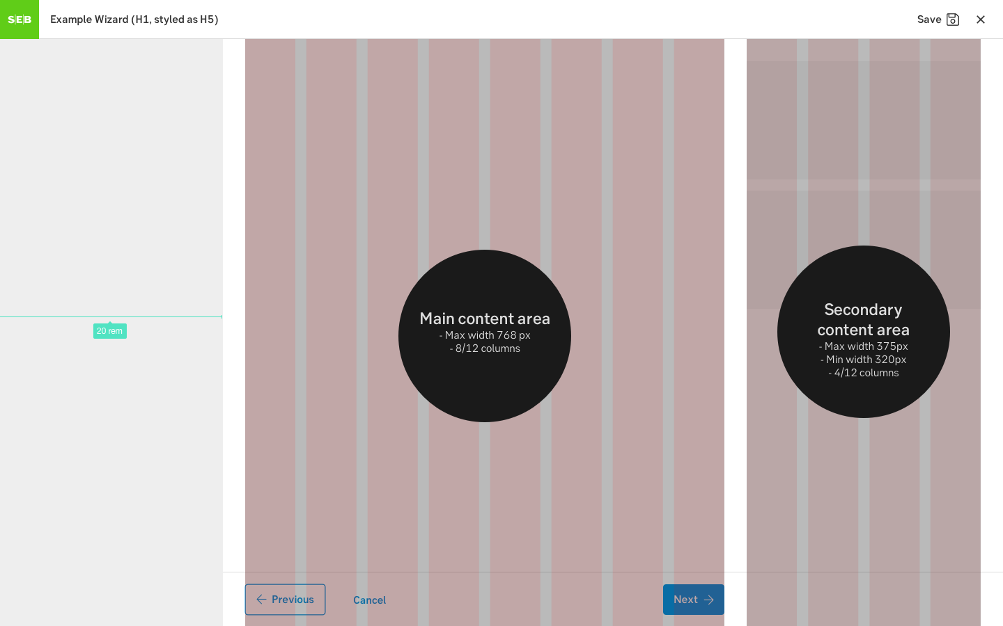
Grid for desktop
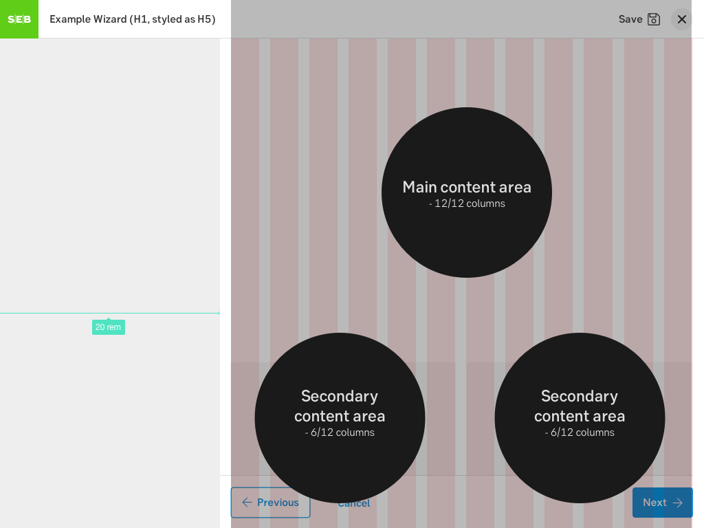
Grid for tablet
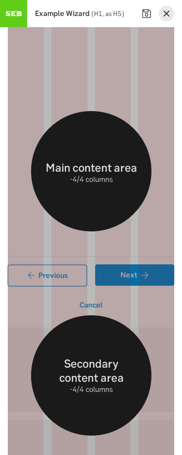
Grid for mobile
Do's and don'ts
Do
- Allow users to exit the wizard midway and save status when needed
- Allow them to resume the process at a later time
- Group related questions into one step
Don't
- Don't show steps, information or questions that are irrelevant to the user, due to what we already know
Demo
Tutorial and demo: https://sebgroup.github.io/ng-wizard
Examples
Wizard - desktop
Step navigation - mobile
Accessibility
Review
Result from the latest accessibility review of the component (Chlorophyll): 2024-07-30
- Contrast: ok
- Colour-blindness: ok
- Code + aria: ok
- Touch + keyboard: ok
- Dark-mode: n/a
- Focus: ok
- Reader: ok
Specification
- Details: Specification in Figma
- Instruction: How to access Figma