
Select
A select allows users to choose an option from a predefined set of choices. It is often used in forms.
Component meta
Component identifier
- component-select
Tags
- Global
Design principles
- Everyday first
Guidelines
Short description
The select component allows users to choose one option for a list of values. With the select component a user can give an input based on a list of options. Selects are often used in form when choosing one out of many values.
When and how to use it
Use the select in forms when users are selecting from a list of values and submitting that data. Don't use the select component if there are fewer than three values. Then it’s prefered to use radio buttons.
Select versus Dropdown
The select and dropdown components can look similar, but they have different functionality and use cases:
- The select component presents a list of values where users can select one option. It’s preferred to be used in forms that will be submitted.
- The dropdown component presents a list of values where users can select one or more options. Dropdowns can be used outside of forms to take an action or sort content. A dropdown’s list-box items have custom styling and can contain custom content such as icons or badges.
A key difference between the components is the underlying code for the components. The select component is based on the native select HTML Element thus making the appearance of the component being determined by the browser, the dropdown component can be styled as needed.
Select
Dropdown
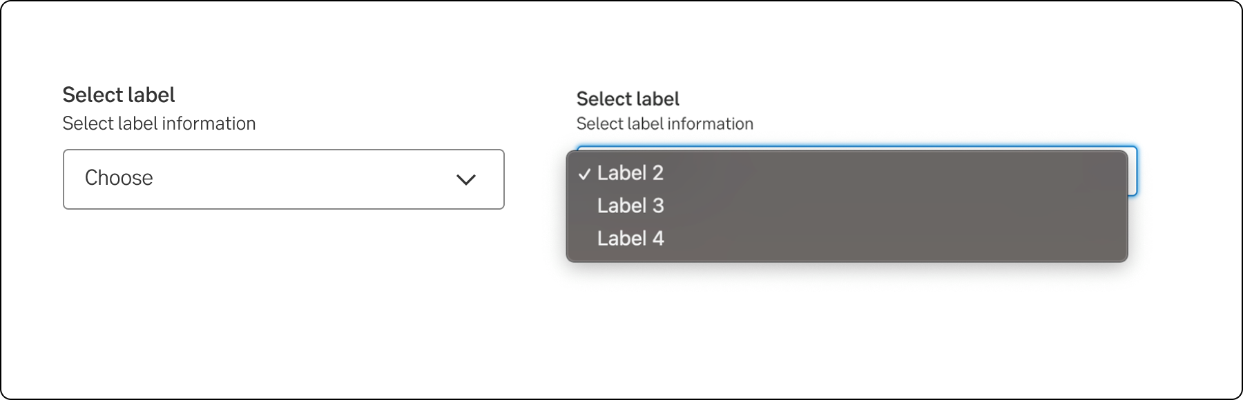
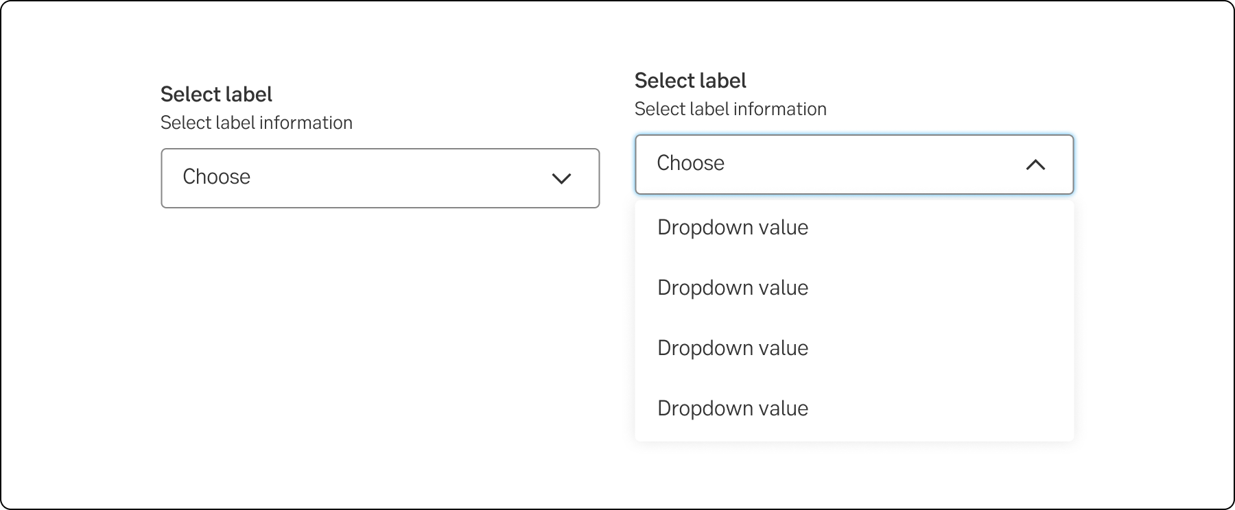
Behaviour
The general styling of the component will differ slightly in different browsers. The collapsed select looks fairly similar, but the dropdown list is platform dependent.
If the text inside the select is longer than the element the text will get truncated with three dots (…)
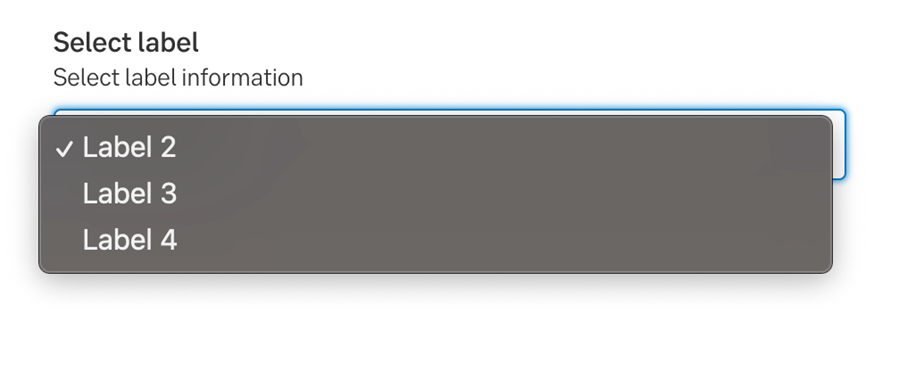
Select in Chrome MacOS
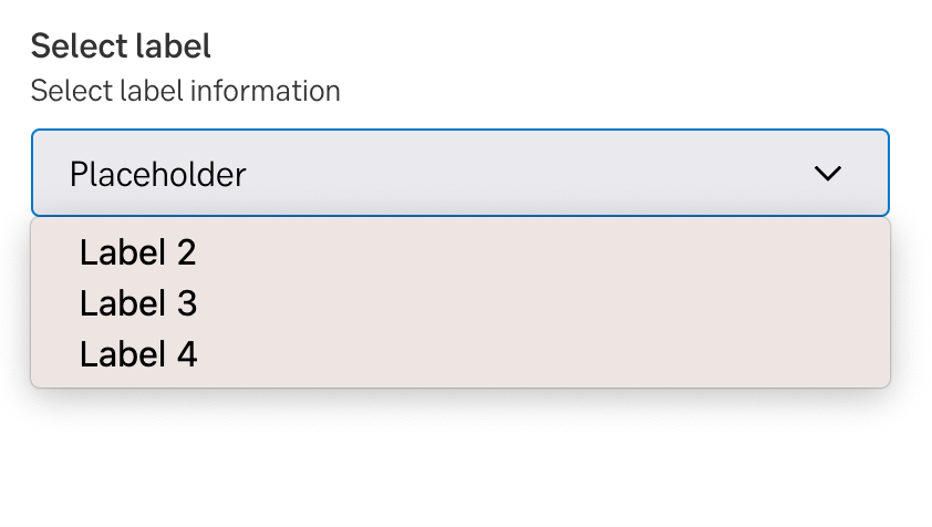
Select in Firefox MacOS
Size variants
Some components are available in two sizes to support different layout needs and use cases:
- Large (default): This is the default size for input fields.
- Small: This size is intended for confined spaces, such as tables, or in situations where optimising screen space is important for professional users.
Note.The small variant is fully supported only in the interim design, which visually aligns more closely with DV23.
Writing
-
Accessibility
Result from the latest accessibility review of the component (React): 2023-02-28
- Contrast: good
- Colour-blindness: good
- Code + aria: ok
- Touch + keyboard: ok - a bit unlogical with space/enter
- Dark-mode: n/a
- Focus: ok - need new style
- Reader: ok
Specification
- Details: For sketching we use the same component as Dropdown. The specification is in Figma
- Instruction: How to access Figma