
Walkthrough modal
A walkthrough modal with slides containing informational text and images.
Component meta
Component identifier
- component-walkthrough
Design principles
- Trigger insightBe the good guy
Guidelines
Short description
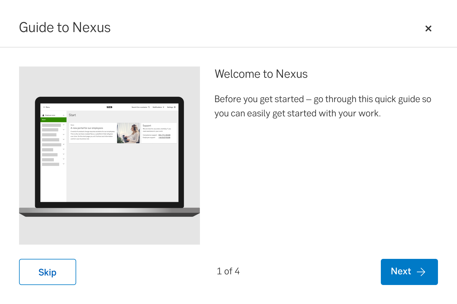
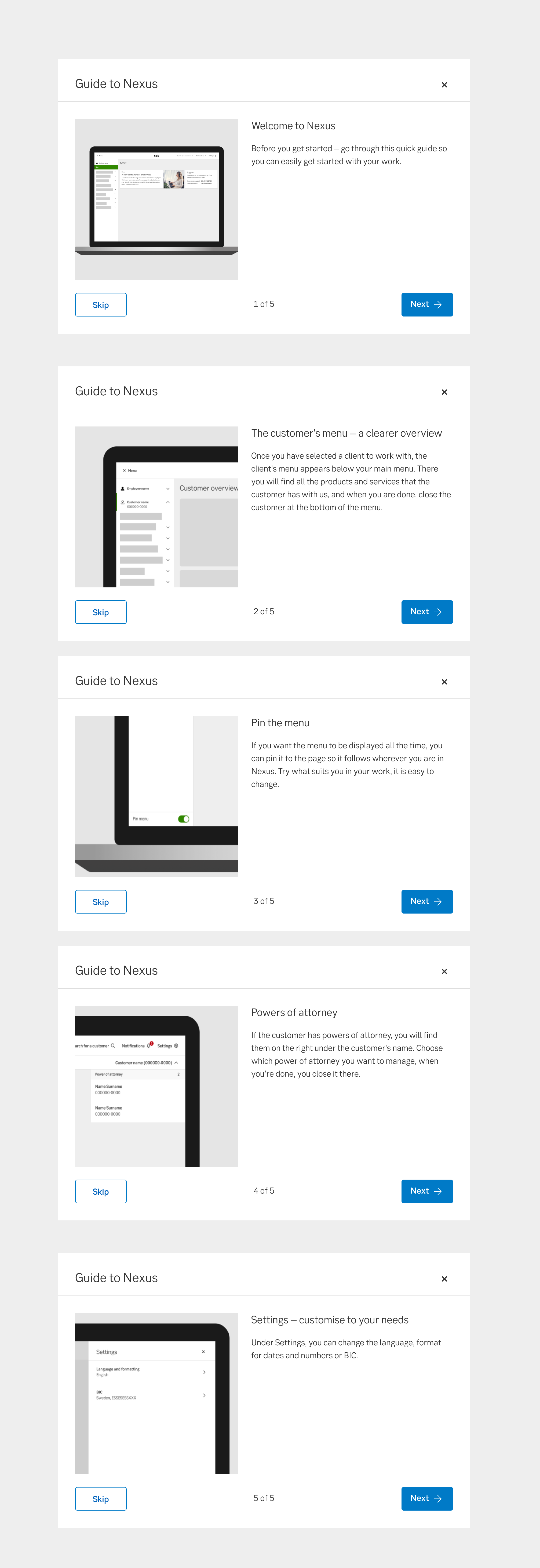
A walkthrough modal has slides with information (text and images), and is used to transfer knowledge to the user and them a chance to learn about a channel or product.
When and how to use it
Use this component to onboard new users to a channel or product, or when presenting major news in the channel that are important for the user to understand.
Do not use it for communicating minor news or changes.
Behaviour
The modal automatically pops up for the user. The user can choose to skip the walkthrough - the modal is then closed and a coachmark tells the user where they can find the walkthrough for later use. If the user goes through the entire walkthrough, in the last slide of the modal, the user should be informed where they can find the tour again if they need it.
The modal can contain up to 6 slides. Each slide always contains: Heading, Body text, Image. At the bottom it says how many slides there are and which slide is active. By pressing next/previous, the user can go back and forth between slides.
Images
- The images should not be screenshots.
- The images should be simplified so it only focuses on the details of the new feature and doesn't obscure the view with other features.
- The user should be able to easily understand where in the interface the function is.
- Don’t zoom in much, as this makes it hard to understand where on the screen the function is places
- Use a mockup to demonstrate where on the device the function is placed (see images).
- It should be clear where to look in the image, so just keep the important parts in focus (see images).
Examples
Walkthrough examples
Mobile
Desktop
Do's and don'ts
Do
- Explain only one thing per slide.
- Use the module when there are major news or changes.
- Keep the walkthrough short and sweet.
Don't
- Don't use the modal for all news and changes.
- Don't explain more than one function/part in one slide.
UX text
- Write short and concise, to the point.
- Avoid to write directions or placements. Instead write the name of where it is placed, for example "in the menu you can find..".
- The heading can be a maximum of 30 characters.
- The body text can be a maximum of 210 characters.
Accessibility
- Images should always have an alt text that informs users with screenreaders what the image contains. e.g. "Image showing the profile menus location"
- Avoid to write directions or placements
Specification
- Details: Specification in Figma
- Instruction: How to access Figma