
Icons
How to use icons in our applications.
Short description
At SEB we have decided to use a commercial icon library. It’s called the Central icon system.
The Central icon system was designed to be as universally applicable as possible and utilises Figma variants and properties to offer a completely customisable icon set. This allows for greater flexibility and consistency across all our design projects. Since the package offers complete customisation, we've set a style that we feel matches our typography and design.
Transition from Font Awesome
After having used Font Awesome as our icon library, we are not transitioning into using the Central icon system. We have carefully selected icons that match those in our old library. This ensures a smooth transition with minimal disruption to your workflow. If additional icons are needed, it’s easy to expand the library to include more.
- Only use the Central icons. You find them in Storybook.
Icon library in Figma
The library in Figma is called Icons & logotypes.
Regular and solid
In the future design system (DV2023), the solid icons are mainly used for active components.
An example could be when a meny item is selected the icon changes to a solid variant.
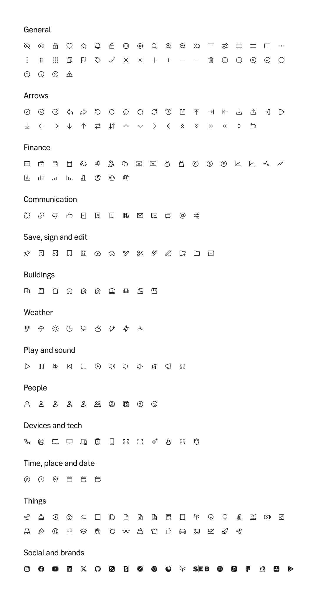
Regular icons
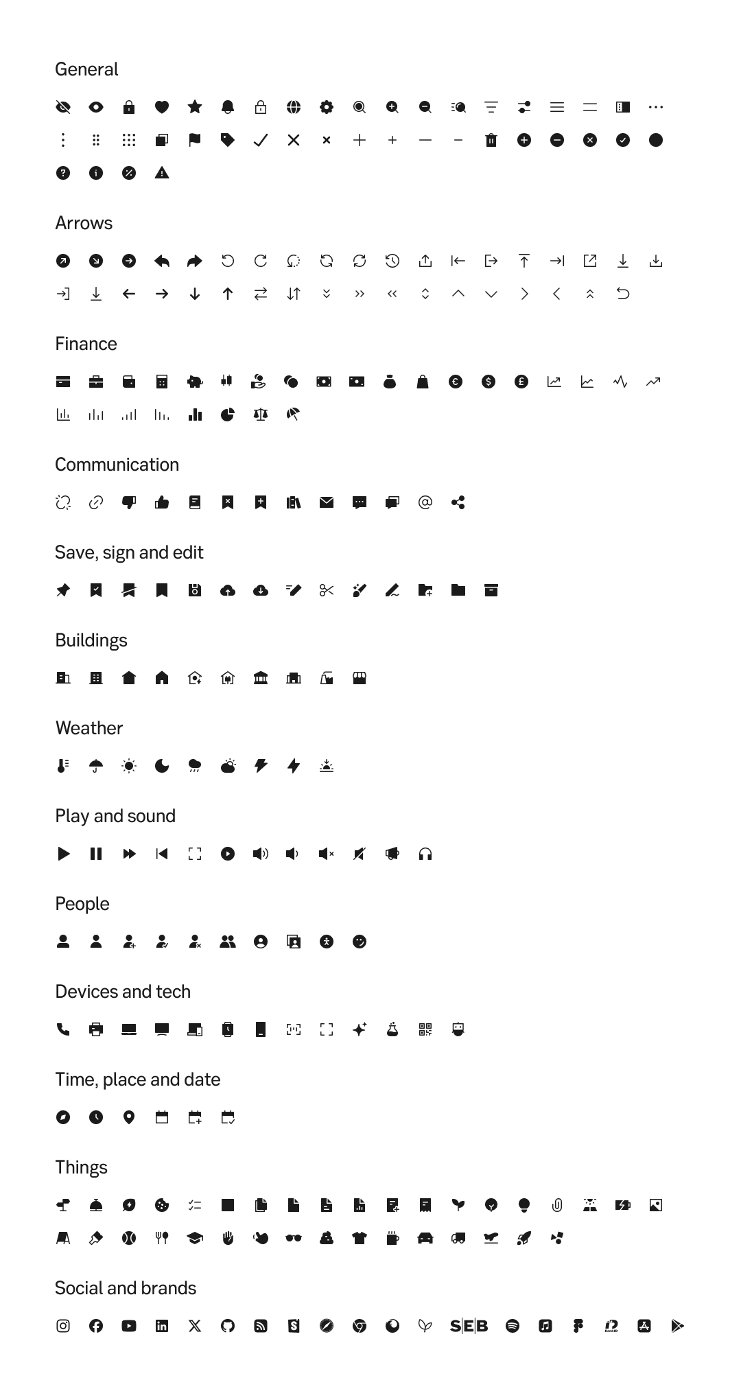
Solid icons
Placement
See Icons and actions for guidelines of placing and icon next to a label or action.
Do's and don'ts
Do
- Use icons when they add value
- Only use one size for icons when they are together
- Shift to Central whenever redesigning a page or feature
Don't
- Don't stack icons on top of each other
- Don't combine icons to build meaning (i.e a lock inside a computer to describe secure application)
- Don't only rely on icon to convey meaning (i.e button with icons only)
- Don't use icons from both Central and FontAwesome. Always upgrade to Central
- Don't use pictograms
Learn about the Central icon system here.