
Filtering
The filtering pattern allows users to narrow down specific data and its scope.
Component meta
Component identifier
- pattern-filtering
Design version
- 2020-08-19
Design principles
- It's for youEveryday firstTrigger insightFrictionless
Guidelines
Short description
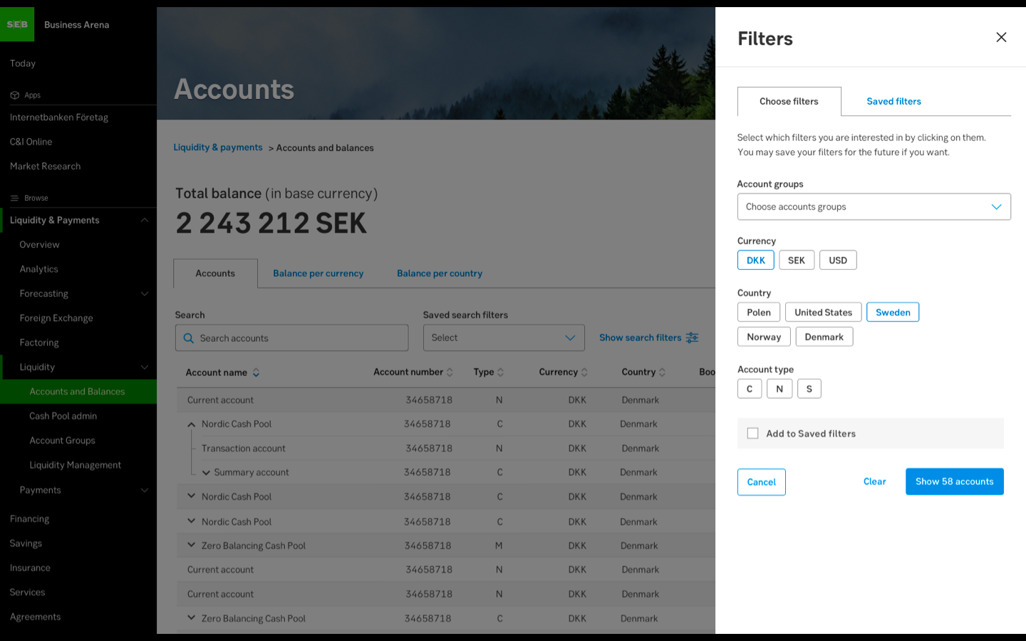
The filter pattern enables the user to further specify a query as filters are applied to large data. The pattern can include different components to customise the view.
Slide-out for the filter pattern on desktop
When and how to use it
The filter pattern is useful where a lot of data is presented in order to present relevant information by narrowing down big volumes of data. With predetermined options the user’s query can easily be presented using the filter pattern. A good example is in connection to a search field to enable the user to precise a query.
Related features and components
Related feature: Save filter
The filter pattern offers optional features such as “Save filter”. Saved filter is shown as a separate tab next to the filter tab in the slide-out. This feature is good to include in the filter pattern when the user frequently wants to reuse a combination of filter tags. When the user has added a filter to saved filters, the user can easily reuse the saved filter.
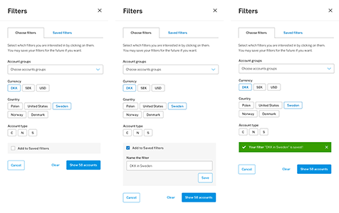
Step-by-step example of how “Save filter” can be used
When the user has no saved filter, the dropdown for saved filters is not shown until a saved filter is created.

Without dropdown for saved filters when there are no saved filters
With dropdown for saved filters when there is at least one saved filter
Related component: Filter tag
A filter chip is a component used to display a property in an intuitive and easy way. When including the filter tags, include the chips component for the user to easily see what choices were made.
Related component: Chips
The chips component displays a chosen property (filter tag). Chips enables the user to remove the property directly in the current view for a smoother usage.
Behaviour
The filter pattern and its content can differ depending on the context (see Related to).
Do's and don'ts
Do
- Use a slide-out for filter application.
- Provide relevant predetermined options, customised with relevant components. Consider which categories and options are necessary? Which components are optimal for each category?
- Allow multiple selections.
Don't
- If a customer only has one choice within a category, no choice needs to be made. Therefore, the category can be excluded from the filter.
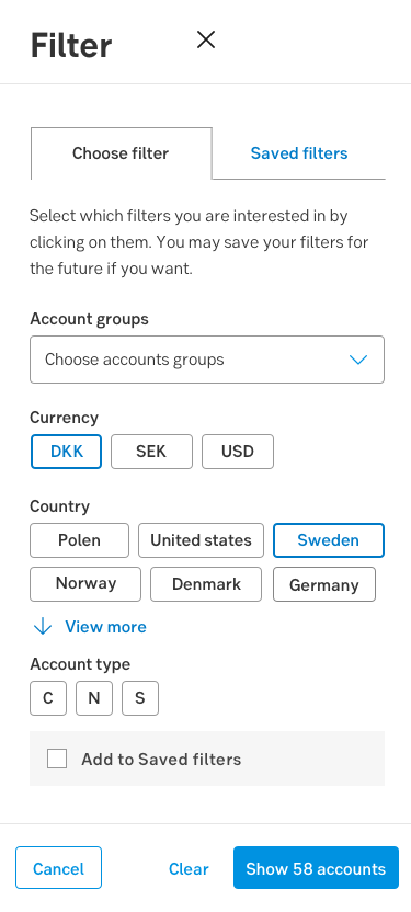
- Use too many options per filter category, consider the section expander component if necessary. See example below.
Related article
- Cunha, L. (2017), How to craft a kickass filtering UX. https://uxdesign.cc/crafting-a-kickass-filtering-ux-beea1798d64b
Specification
Sizes
For size specification for components, see related components.