Confirmation
People expect digital interfaces to behave according to social norms and feedback is an important part of social interaction.
Component meta
Component identifier
- pattern-confirmation
Design version
- 2021-01-15
Design principles
- Be the good guyFrictionless
Guideline
Short description
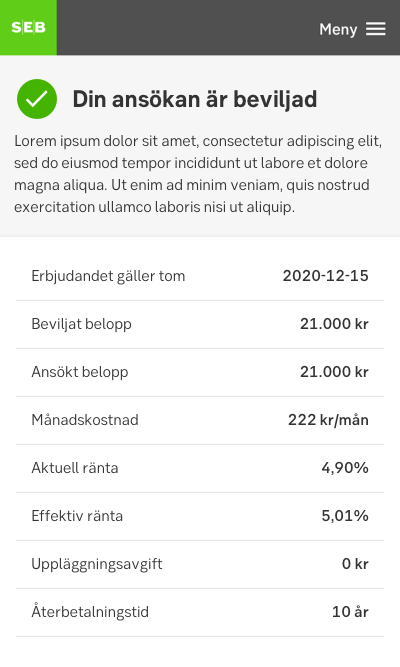
When a user has gone through a flow of one or several steps, for example made a transaction, applied for a loan or connected their business system with the bank, it is important to give the user clear feedback of a happy flow. Therefore we use the confirmation icon placed together with informative text/step/label/bodytext.
When and how to use it
Use the confirmation to give the customer clear feedback that the task they have implemented is done.
Behaviour
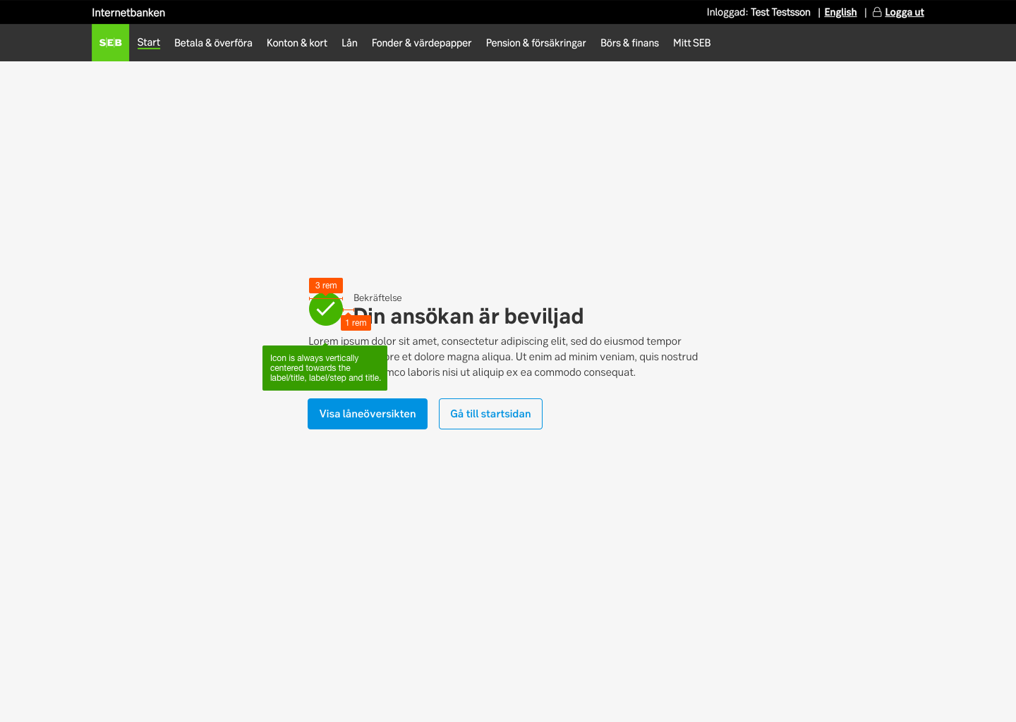
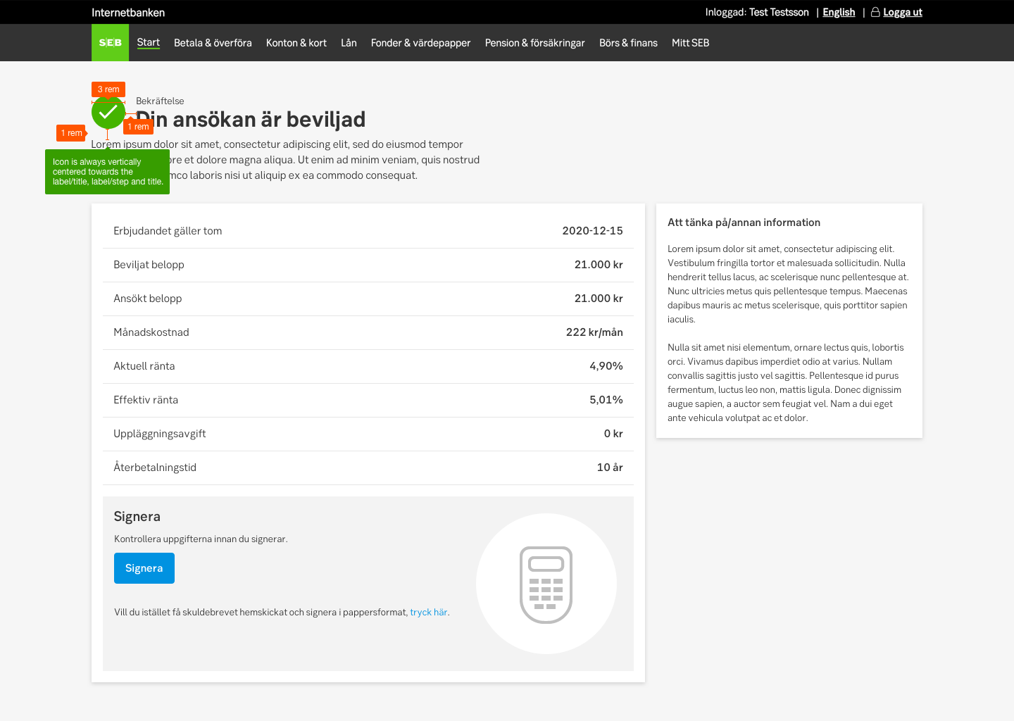
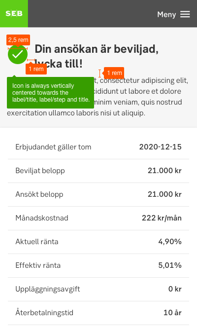
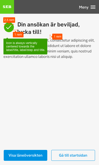
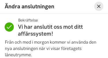
The icon is always placed to the left. The confirmation group can be placed in different ways depending on what other content the page contains.
The confirmation group should always contain the confirmation icon and a header. It can also contain different set ups like:
- A step title and a header
- A label and a header
- A step number with a step title placed with the confirmation icon (see examples)
All combinations can also contain a body text. Keep the copy short and clear!
Placement
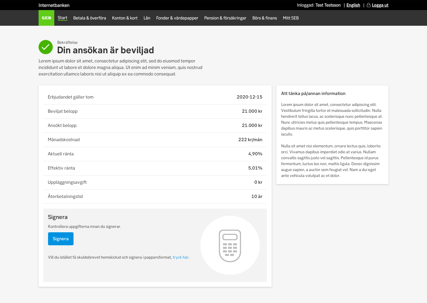
The confirmation layout is always placed in the top of content area:
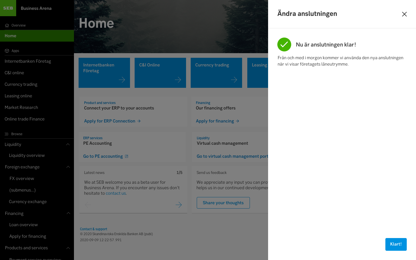
- In smaller devices, the button or button group is always placed at the bottom for better reachability.
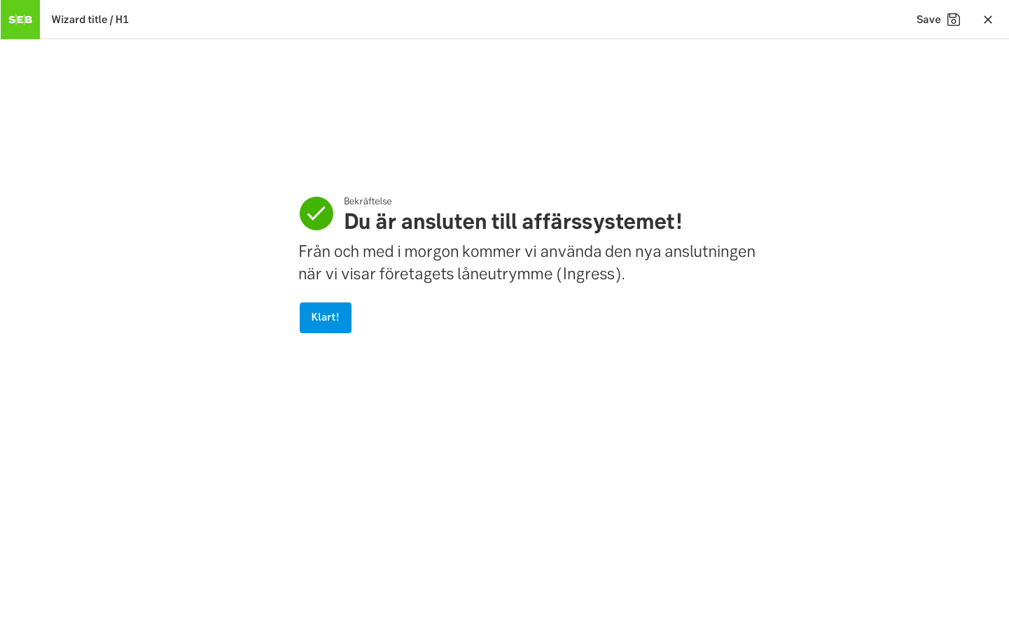
- In desktop, if the page contains no summery or secondary content etc, consider placing the confirmation layout centred on the page, still left aligned.
Examples
UX text
Confirmations
The text in confirmations should be short and to the point. It may, but must not, consist of three elements:
- Confirmation. Tell the customers that the task has been completed and that everything went well.
- Instruction or information. If needed, tell the customers what will happen next. Do they need to do anything more? Or will SEB do something more?
- Added value. If appropriate, this might be a good opportunity to point out added value to make the customer feel satisfied with the order or application and give a positive feeling for SEB's brand.
Confirmation header
We don’t write thank you everywhere. It becomes excessive and monotonous to the customer. In the header of the confirmation that follow application flows, we only state that the task is completed successfully.
Examples
We have opened the account for you
Nu har vi öppnat ditt konto
On some occasions, however, we do have a reason to say thank you. For example, when the user has helped us in our ethical endeavours or has answered a survey.
Examples
Thank you for cancelling paper notices and helping us in our environmental work.
Tack för att du avbeställt pappersavier och hjälper oss i vårt miljöarbete.
Upper and lower case
Don't start each word in headings and labels with upper case. Only use upper case in:
- The first letter of the first word
- The first letter of proper names
- Abbreviations
Confirmation body
The body should focus on further instructions or maybe to boost the customer. Or both.
Tell the user what will happen next:
Examples
We will process your application and answer it next weekday.
Vi behandlar din ansökan och ger besked nästa vardag.
Tell the users what a good choice they have made:
Examples
Now when you have a savings account you can start building a buffer for unforeseen expenses.
Nu när du har ett sparkonto kan du börja bygga en buffert för oförutsedda utgifter.
Specification
Measurements
