Angular
Javascript
The last version of Internet Explorer, version 11, was released on October 17, 2013. This is a very long time ago when taking into account the rapid development of web technologies. These days it is often difficult and time consuming to get modern technologies to work well in this old browser. More and more frameworks are dropping support, and even Microsoft themselves has announced that they will fully drop support for IE in their own services in 2021.
Consequently, we have decided to not include support for IE in the Design Library website.
Luckily, there are modern options in active development. Please use Firefox, Edge or Chrome instead.
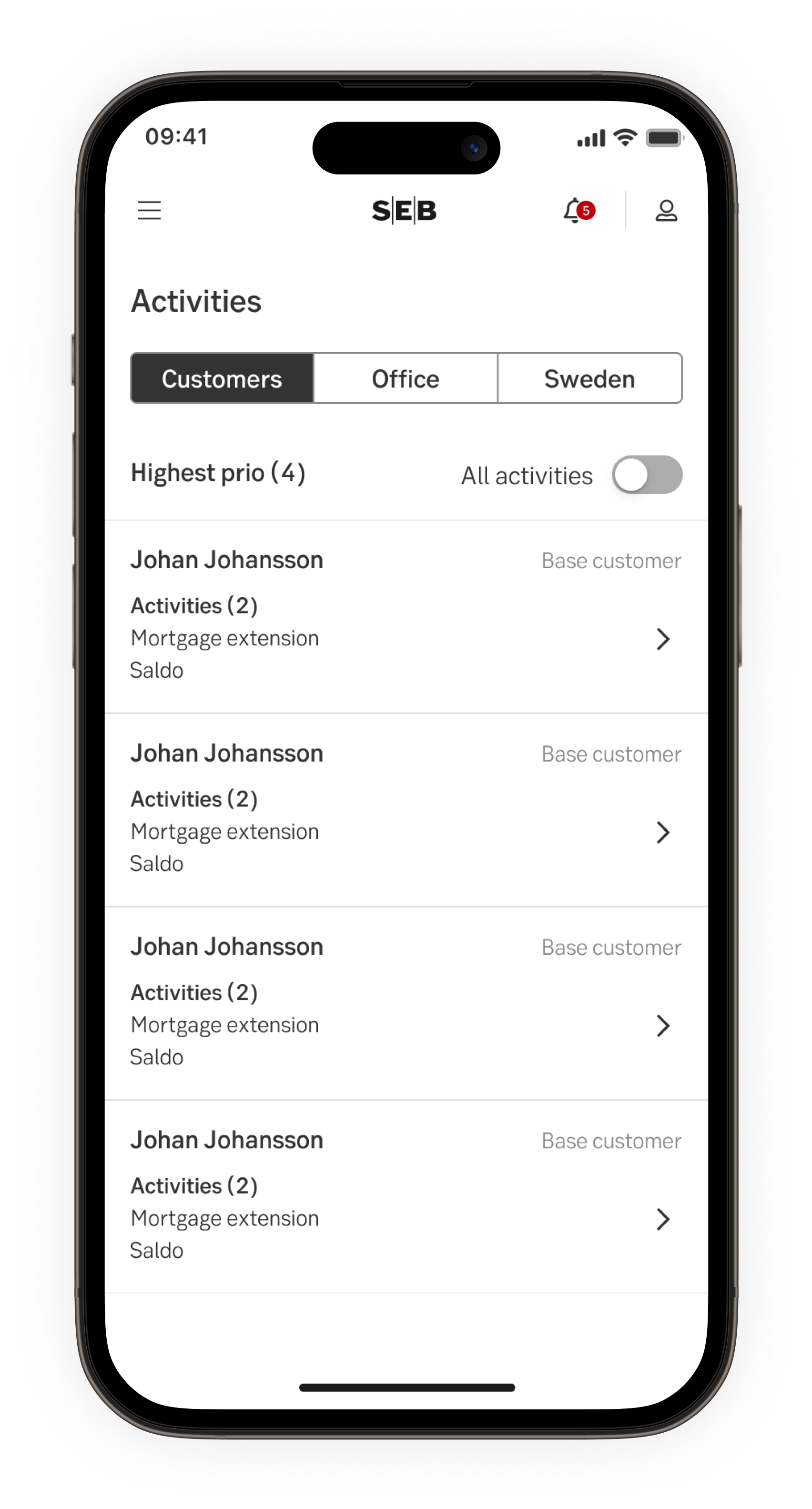
A segmented control is a group of 2-5 buttons that lets the user switch views or sort elements.

Javascript
Javascript
The segmented control switches between views of some data or sort elements.

The segmented control is good to use to provide the user with closely related choices that affect an object, state or view.
The segmented control feels balanced when all segments have equal width. There are two sizes available (same as the Button component).
Component acts as button and trigger a change on click. One option need to be pre-selected, most likely the first. Only one segment can be active simultaneously.
Result from the latest accessibility review of the component (Chlorophyl): 2023-11-29