
Onboarding
To introduce users to new features, products or functions.
Component meta
Component identifier
- pattern-onboarding
Tags
Design principles
- Trigger insightBe the good guyFrictionless
Guidelines
Short description
The purpose is to guide or introduce users to new features, products or functions. This pattern is still being discovered and open to feedback.
When and how to use it?
This design pattern should be considered when introducing something new or a change to the user. It can be be either a big introduction or a small feature in a product page.
Big onboardings:
- New customer at SEB, first time logging in to for e.g. IBP
- A new platform is launched (Business Arena, Morning and Nexus).
Small onboardings:
- A new option in the menu is available
- Something has moved its' location
- A new feature on a product page is implemented
Don’t overdo it and use onboarding components only once. However, consider providing the information from the onboarding to the customer at a later stage.
If the task the user needs to complete is especially complicated, you may need to complement with "help components", which could include the same information as in the onboarding.
Onboarding components
We see the following types of components:
- Coach marks
- Walk-through tour
- Blank-slate tips
1. Coach marks
Coach marks are contextual tooltips that focus' on the benefits of a feature. They can appear automatically when users see a new feature. Once they are dismissed, they don't appear again.
Component: Coach marks
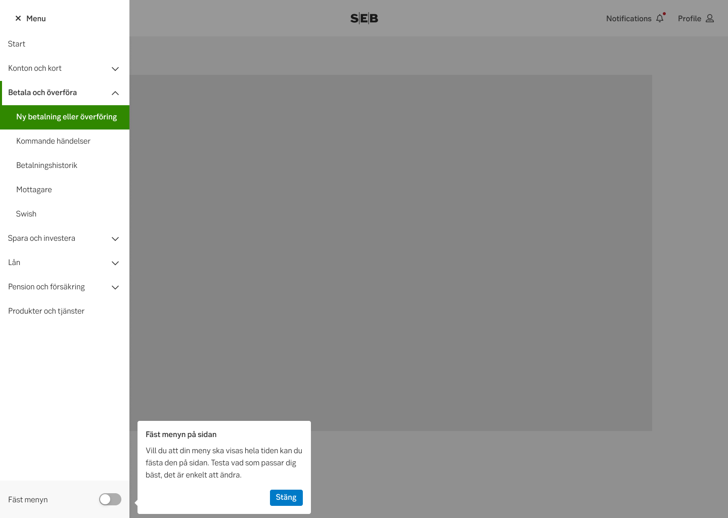
Coach marks ex
Coach marks ex
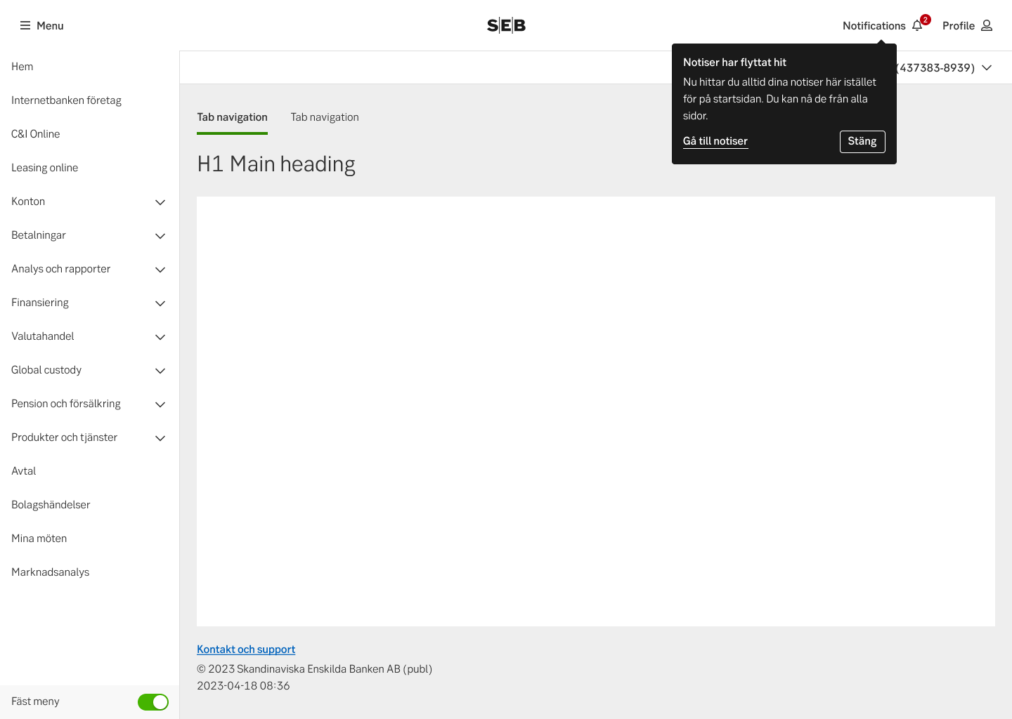
2. Walk-through tour
Use the walk-through tour when you want to motivate the user to start using the system, or help them understand major news. Think of it as a wizard to give the users the best start.
When to use?
- Onboarding new users to a channel or product
- When there is major news or changes that the user needs to know about.
- Do NOT use for every new or changed function, this can lead to the users not reading it and finding it annoying
Component: Walkthrough modal
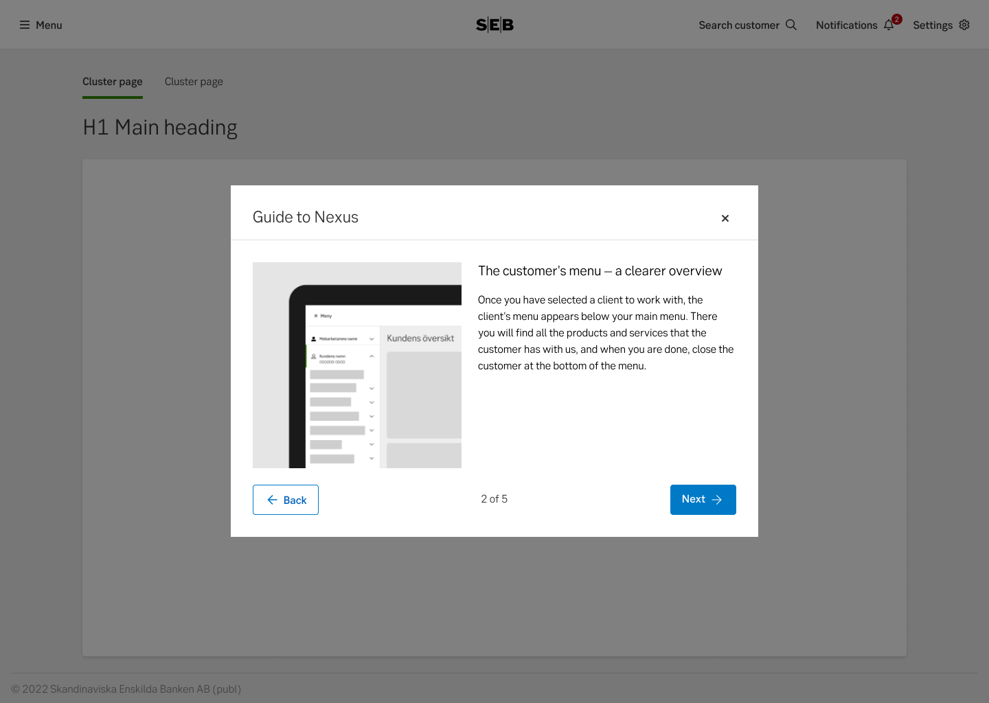
Walk-through
3. Blank-slate tips
These are used when you want to guide the user AND give them some foundation to start with. It's an interactive guide where the user is using the product itself, so you give them more than an empty state.
lookback.io example
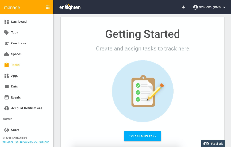
manage.ensighten.com example
Do's and don'ts
Do
- Only use this pattern if the user benefits to know about the information communicated.
- Keep it short and sweet.
- If repeated help is needed, use "help components" instead.
Don’t
- Show the same user more than two news per login, for example one walkthrough at start page and one coach mark in a product page.
- Avoid showing the same customer the onboarding component more than once.
- Don't rely too much on onboarding components, the design should be easy to understand on its own.