
Grid & spacing
A grid system is used to harmonize negative space in a layout
Component meta
Component identifier
- pattern-gridandspacing
Design version
- 2021-08-25
Design principles
- Everyday firstFrictionless
Guidelines
Short description
In short, our grid system is a structure containing rows and columns to layout and align content such as elements, text, imagery, graphics, and data within our channels, in a structured and consistent way. Our grid also provides guidelines to maintain a responsive, uniform visual presence within our channels.
Columns, margins, and gutters depend on the actual width of a browser's viewport, to adapt content to any possible screen size with set UI breakpoints. The grid is based on Bootstrap and modified to align with the SEB experience.
Behaviour grid
The grid is based on a fluid 12-column grid. If there is a sidebar, it is fixed and excluded from the 12 columns in the grid. SEB works with a fluid grid which is defined by the specified number of columns that are proportional to the browser's viewport width or height, instead of fixed pixel dimensions. For example; when a browser window is resized, the elements within will adjust their widths and/or heights accordingly to their container.
As designers, we need to think of our components as dynamic and not static pixels. However, some objects, such as text fields and forms, have a maximum width to comply with accessibility. Communicate with your developer if you have components with a maximum width. At our smallest viewports, every pixel counts, but when we look at viewports that are 1920px and above it might be a good idea to not fill the entire viewport.
There might be a grid inside a grid, this happens when a component has a grid of its own and is placed in the big grid. A widget placed on a dashboard is a good example of this.
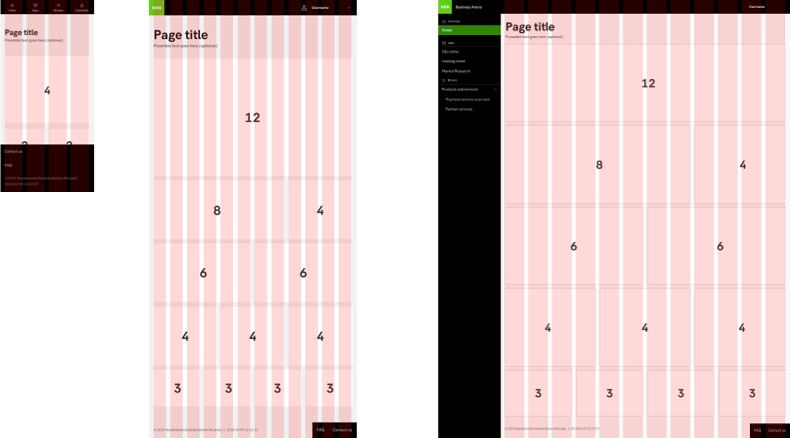
Breaking points
It is common to think of the breaking points as specific devices, but at SEB we think of breaking points and resolution as an area of space that is not necessarily tied to one specific device. The main reason for this is that one breakpoint can be a possible viewport for several devices. For example, a user can resize the browser window on a desktop to fit several browser windows in one screen.
Even though the viewport has a size of e.g 1200 pixels, the area that can be used for design is less because there is a scrollbar. The size of the scrollbar differs depending on the browser but you should always leave at least 1,875 rem (30px) on the right-hand side.
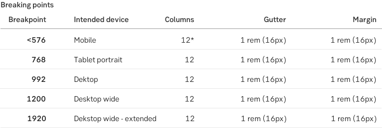
* There are 12 columns, but no element should be narrower than a fourth of the grid (3 columns).
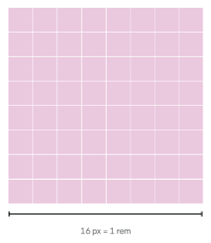
Unit system
The base unit in our system is 16 pixels for both font-size as well as spacing. This equals 1 rem. This unit is used to create space, margins, and dimensions within our grid and layout, but also dimensions of our components and patterns. To do this, we use multiples or divided parts of the base unit to ensure coherency and consistency.
If needed, the base unit can be divided into 2, for instance in our spacing scale for elements, due to the size of the elements that demand smaller values.
Example: 8, 16, 24, 32, 40 pixels, etc.
Specification
>1920px
Desktop wide - extended
Behaviour?
Specification
- 12 columns
- 1 rem (16px) gutter
- 1 rem (16px) margin
- Side menu excluded from grid
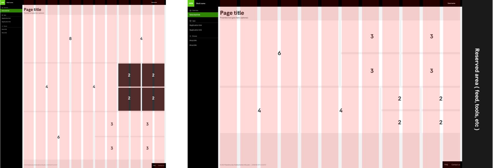
1440px - 1919px
Desktop wide
Behaviour
- Side menu: Is fixed to the left side, the side menu and content area are scrollable within separately. The left sidebar with navigation is fixed and displayed at 1200px resolution and above. The sidebar is excluded from the grid.
- Header: Fixed at the top.
- Footer: Placed at the bottom of all content.
Specification
- 12 columns
- 1 rem (16px) gutter
- 1 rem (16px) margin
- Sidemenu excluded from grid
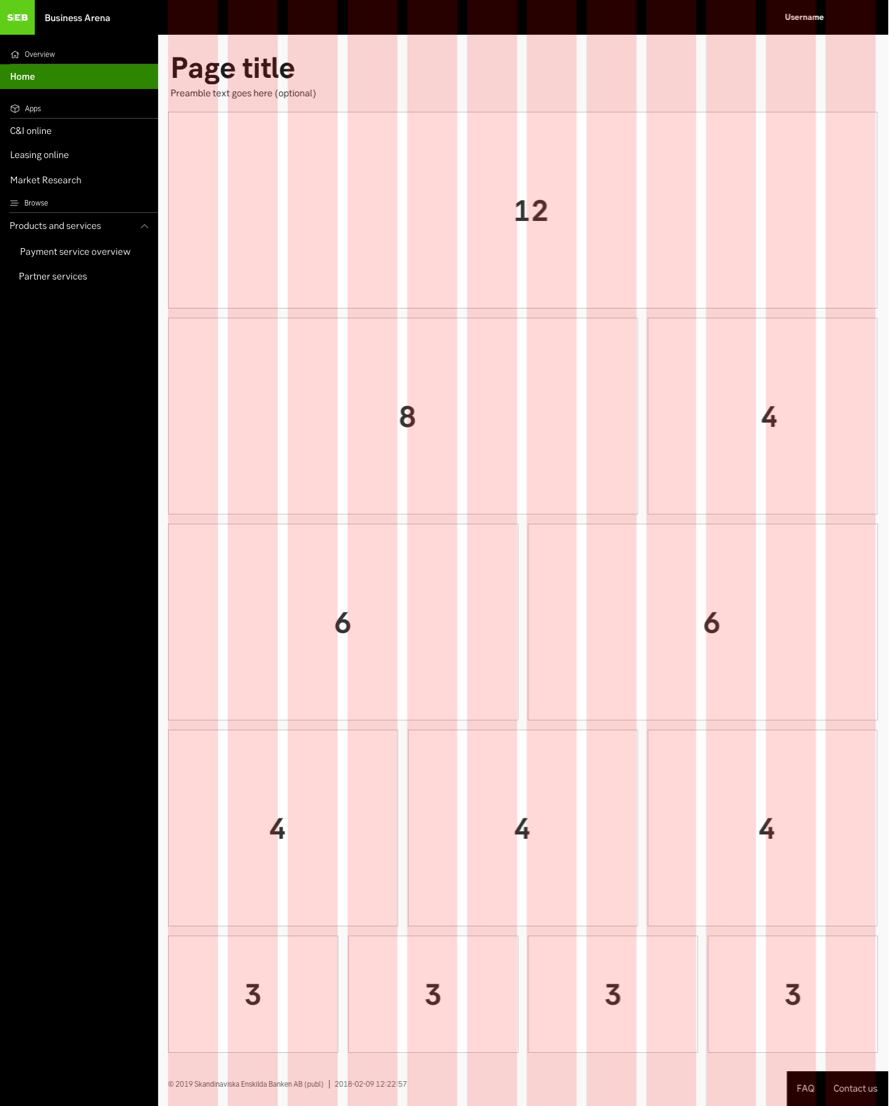
1190 px - 1439 px
Desktop & Tablet landscape
Behaviour
- Side menu: Is fixed to the left side, the side menu and content area are scrollable within separately. The left sidebar with navigation is fixed and displayed at 1200px resolution and above. The sidebar is excluded from the grid.
- Header: Fixed at the top.
- Footer: Placed at the bottom of all content.
Specification
- 12 columns
- 1 rem (16px) gutter
- 1 rem (16px) margin
- Sidemenu excluded from grid
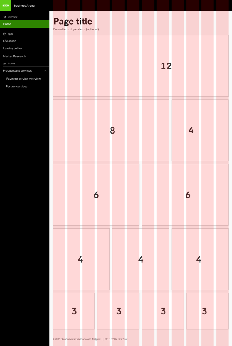
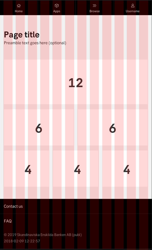
768 px - 1189 px
Tablet portrait
Behaviour
- Side menu: Is divided into tabs residing in the header.
- Header: Is fixed at the top of the viewport.
- Footer: Placed at the bottom of all content.
Specification
- 12 columns
- 1 rem (16px) gutter
- 1 rem (16px) margin
- No side menu (resides in the header)
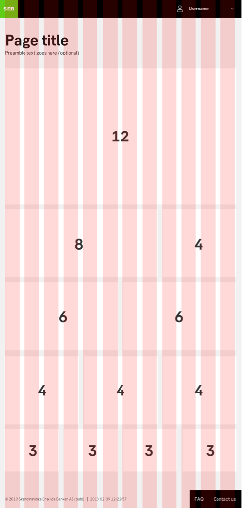
320 px - 767 px
Mobile & Standing tablet
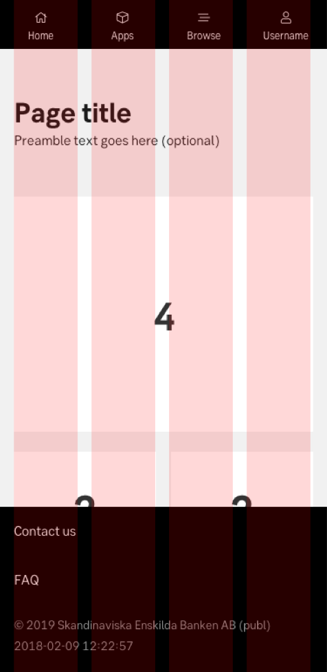
Behaviour
- Side menu: Is divided into tabs residing in the header.
- Header: Is fixed at the top of the viewport.
- Footer: Placed at the bottom of all content
- Note: Generally everything is stacked on viewport this narrow
Specification
- 4 columns (12 columns)
- 1 rem (16px) gutter
- 1 rem (16px) margin
- No side menu (resides in the header)
What is rem?
Spacing
Space between components
The grid only applies for the placement of objects horizontally, the placement of objects horizontally is fixed and communicated with rem. See examples below for the amount of space between different objects.
1 rem is our most common measure for the margin between objects or content and the edge of the component (e.g. the margin between the edge of a button and the button text or the margin between the edge of a card and the content inside the card).
Examples
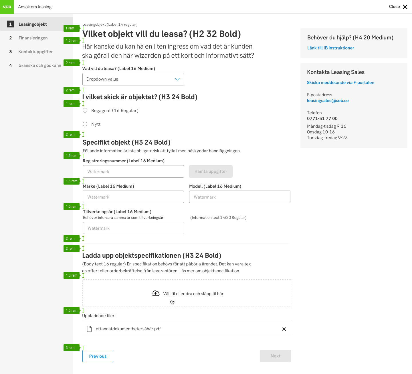
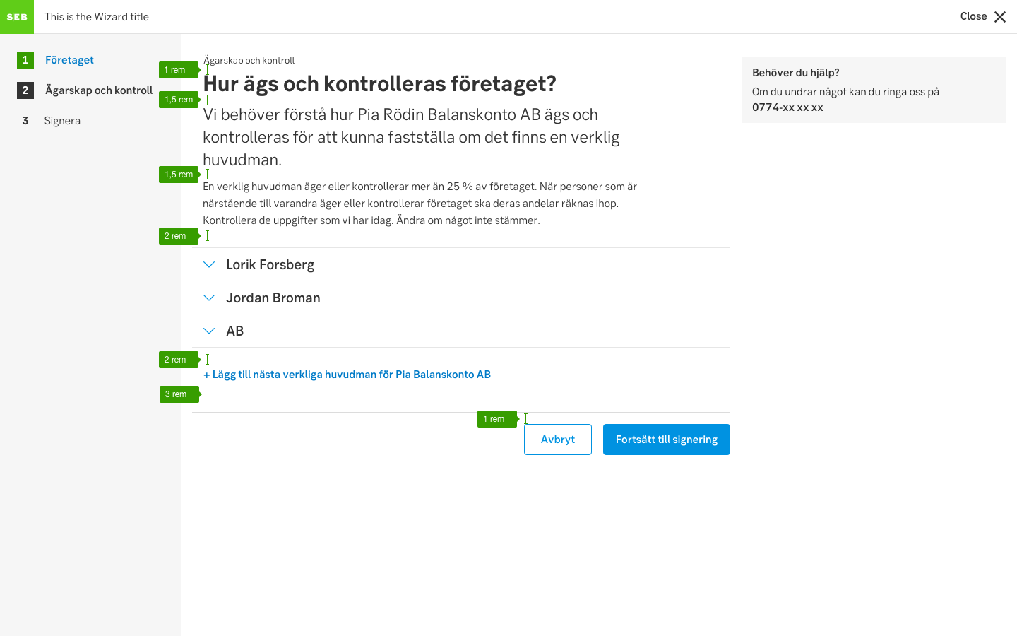
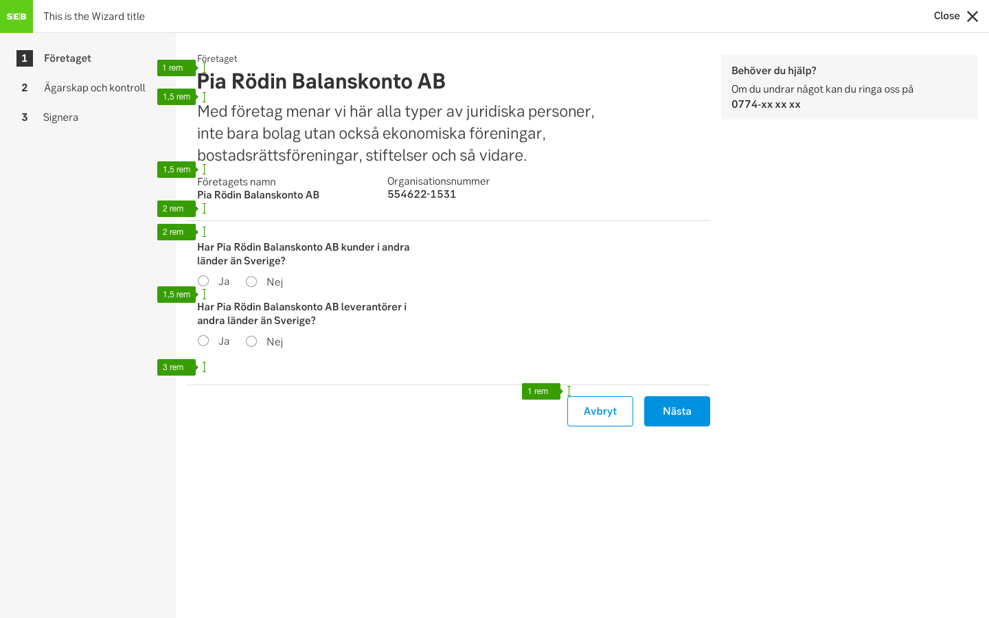
Above: Spacing and typographic size details in a form/wizard
What is rem?